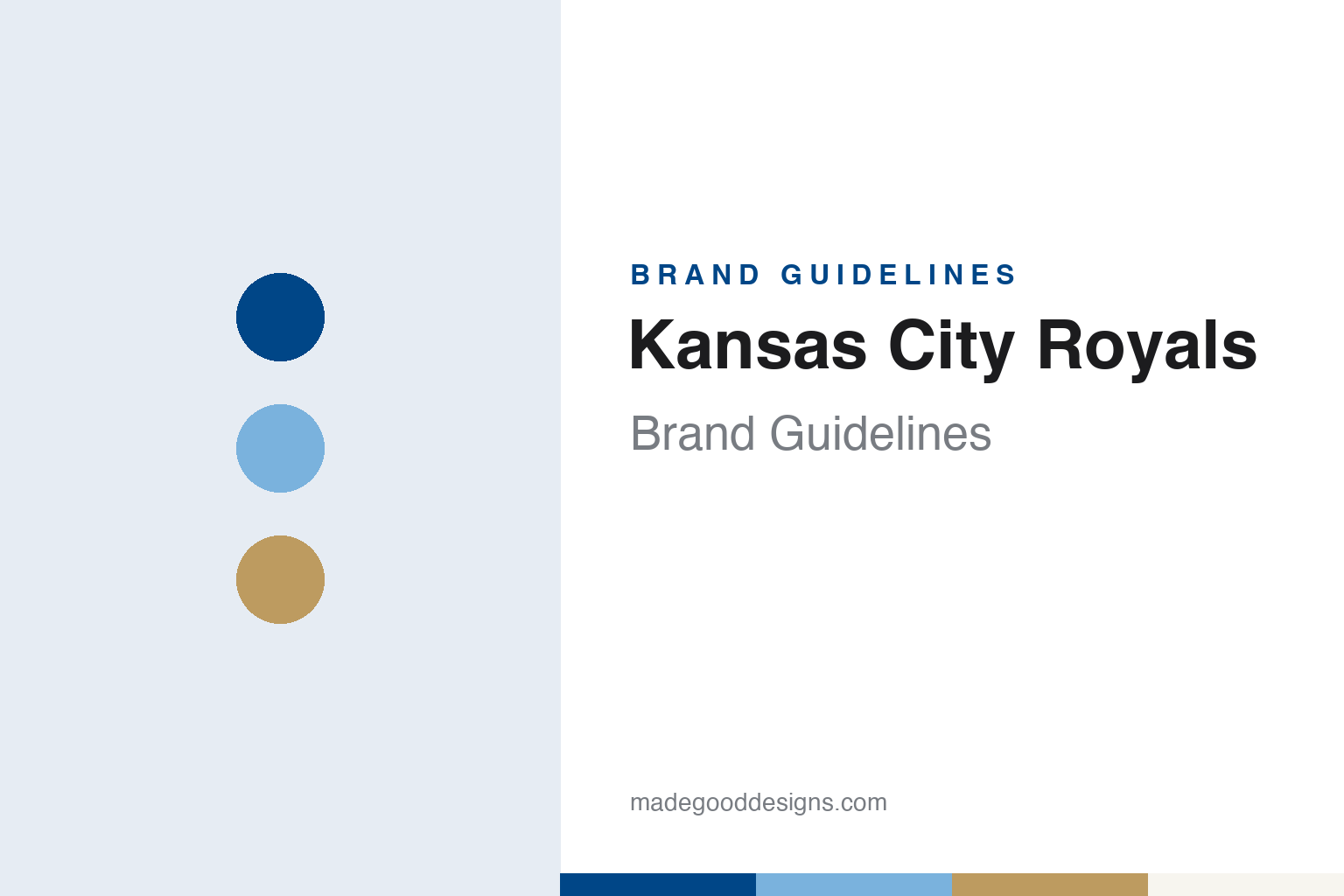
Kansas City Royals Brand Guidelines
A name from a livestock show, a crown over a shield, and a blue lighter than the sky.
Aa
Two constants: a royal blue, powder blue and crown gold palette and a script wordmark and crowned shield register. Abstract homage — not a Kansas City Royals mark; no cap logo, script or wordmark is reproduced.
A name from the American Royal
A senator’s demand, a pharmaceutical founder and a name-the-team contest.
The Kansas City Royals were created to fill a gap. English Wikipedia records that when the Kansas City Athletics moved to Oakland after the 1967 season, Missouri senator Stuart Symington pressed for a new franchise for the city, and that the Royals entered the American League in 1969, in the same expansion that created the Seattle Pilots. The winning bidder was Ewing Kauffman, a Kansas City businessman. Writing for the Society for American Baseball Research in a biography dated 5 March 2013, Daniel R. Levitt says Kauffman had launched his pharmaceutical company, Marion Laboratories, in June 1950, working at first out of his basement.
The name came from a contest. In a SABR history of the club’s ballpark, posted on 20 June 2019 and first published in the book Kansas City Royals: A Royal Tradition, Curt Smith writes that the team held a naming contest in 1968, and that the winning entry, “Royals,” came from Sanford Porte, a bridge engineer from suburban Overland Park, Kansas. Porte pointed to the region’s livestock trade and to the American Royal, the livestock show, horse show, rodeo and barbecue competition held in Kansas City every year since 1899, with its parade and pageant. Wikipedia adds that Kauffman himself first voted against the name and came round to it later.
The mark followed the name. Wikipedia says the team’s logo, a crown atop a shield with the letters “KC” inside, was created by Shannon Manning, an artist at Hallmark Cards, the greeting-card company based in Kansas City. The crown has stayed with the club, on cap patches, sleeve roundels and the ballpark itself.
The ballpark made the crown architecture. Smith writes that ground was broken on Royals Stadium on 11 July 1968, with Kivett and Myers as architects and Charles Deaton as design associate, and that the club moved there from Municipal Stadium in 1973. Beyond the outfield fence rose a scoreboard shaped like a crown, carrying the Royals insignia in light bulbs, and beside it a water display of cascades, pools and falls. Those fountains later gave a City Connect uniform its theme.
Colour
From Ewing Kauffman to David Glass to John Sherman.
Kauffman kept the team for the rest of his life and planned its handover in detail. Daniel R. Levitt’s SABR history of the club’s ownership, published on 17 January 2017, records that Kauffman died on 1 August 1993, and that a month before his death Royals Stadium was renamed Kauffman Stadium in his honour. Under his succession plan the franchise passed to a five-person limited partnership of members he had chosen, with the aim of finding a local owner who would keep the team in Kansas City. His longtime friend David Glass, then chief executive of Walmart, led that group.
Glass then bought the club himself. Levitt writes that Glass stepped down as Walmart’s chief executive in January 2000, reached agreement with the board that March, and formally became owner of the Royals on 18 April 2000. The Glass family, with his son Dan Glass prominent in the club, ran the team until 2019. Wikipedia records that on 30 August 2019 it was announced that John Sherman, then a minority owner of the Cleveland club, had agreed to buy the Royals from Glass. Sherman has owned the club since 2019, alongside a group of other Kansas City business owners.
The ballpark has been rebuilt around its own symbols. Smith’s SABR history says a renovation began with a groundbreaking on 3 October 2007 and was complete by Opening Day 2009. A high-definition video board replaced the older matrix board shaped like the team logo, and from 2008 a crown has sat on top of the new board, with lights at its peak. Wikipedia calls that board “CrownVision.” It also records that Sherman announced in November 2022 that the team planned to leave Kauffman Stadium before its lease runs out at the end of the 2030 season.
The club mascot is a later addition. Wikipedia says Sluggerrr, a lion, made his first appearance on 5 April 1996; he wears a crown, keeping the royal theme in costume form.
Typography
Design and documentation.
Baseball identity is built from a small set of parts that recur across the sport. The cap insignia is a compact version of the identity: often a single letter, a monogram or a small emblem, it has to read on a cap front, a sleeve patch, a scorebook and a phone icon alike, which is why club marks are often drawn as heavy, closed shapes rather than fine linework. Behind it usually sits a fuller crest or primary logo, a roundel or shield that carries the club name, a founding date or a piece of local symbolism, and which appears on programmes, tickets and signage rather than on the field.
Mascot heads form a second layer. Many clubs have used a cartoon figure with a baseball for a head or a costumed character, and these drawings change with the illustration fashions of each decade, from the thin pen line of mid-century sports cartoons to the thicker, flatter shapes of later digital work. Ballpark scoreboards and wayfinding then turn the palette into architecture, setting club colours in lights, painted steel and large-format type. Throwback uniforms close the loop: clubs reissue older lettering, cap marks and colour combinations for single games or whole seasons, so a design guide for any team has to treat its past wordmarks as live material rather than archive.
Rr
A looping, upright script — the register of a club whose home jersey has carried a “Royals” script since 1969. (Specimen set in Lobster, a script STAND-IN; NOT the Kansas City Royals logo, script or wordmark.)
Kansas City Royals
A home script that barely moved, and a road uniform that kept changing colour.
The home uniform has stayed close to its first version. Wikipedia says the original design of 1969 had blue piping at the arms and neck and “Royals” in blue script across the chest, while the road uniform carried “Kansas City” in script, set in an arch. In 1971 the road lettering became block letters, both uniforms gained a sleeve roundel containing the team logo, and the blue cap with a white “KC” arrived; Wikipedia says that cap is still in use.
Colour is where the road set has moved most. In 1973, the year the club moved into its new ballpark, the Royals switched to pullover uniforms and the road uniform turned powder blue with white letters. Buttoned jerseys returned in 1983, when “Royals” script replaced “Kansas City” on the powder blue. Grey came back for the road in 1992 and a royal blue alternate appeared in 1994. Before the 2002 season the club added black to its colours, with black drop shadows, sleeveless jerseys, a black alternate and a black crown on the shield. In 2006 black was taken out again and the crown went back to gold, though the black drop shadows lasted on the logo until 2019. A powder blue alternate returned in 2008, and in 2025 the full powder blue uniform became the regular Saturday home look, worn with a batting-practice cap bearing the old “KCR” crown logo.
Recent work draws on the city as well as the archive. A 2022 refresh brought back the block “Kansas City” used from 1971 to 1982. The same year’s City Connect uniform took Kansas City’s “City of Fountains” nickname for its theme: navy with powder blue accents and a “KC” insignia shaped like a jet of water. In 2026 a second City Connect kept the fountain theme on a white base with fuchsia and blue gradient accents and a crowned “R” on the chest, recalling the club’s earliest logo, Wikipedia says.
For a design guide, Kansas City Royals shows how one emblem can travel from cap patch to scoreboard to fountain, and how a single colour, powder blue, can be retired and revived as the club’s mood changes. Compare the city’s football neighbour in our Kansas City Chiefs guide, and the league-wide marks in the MLB guide. For this guide we use royal blue, powder blue and crown gold with a script, an unofficial interpretation; no product or logo is reproduced.
Explore & save
Keep Kansas City Royals’s identity on hand — save it to a board in the Made Good inspiration library.
Kansas City Royals identity set
Pin the Kansas City Royals royal blue, powder blue and crown gold palette and the script wordmark and crowned shield register to your own board.