Pittsburgh Pirates Brand Guidelines
A nickname thrown as an insult, kept as a name, and dressed in the colours of the city flag.
Aa
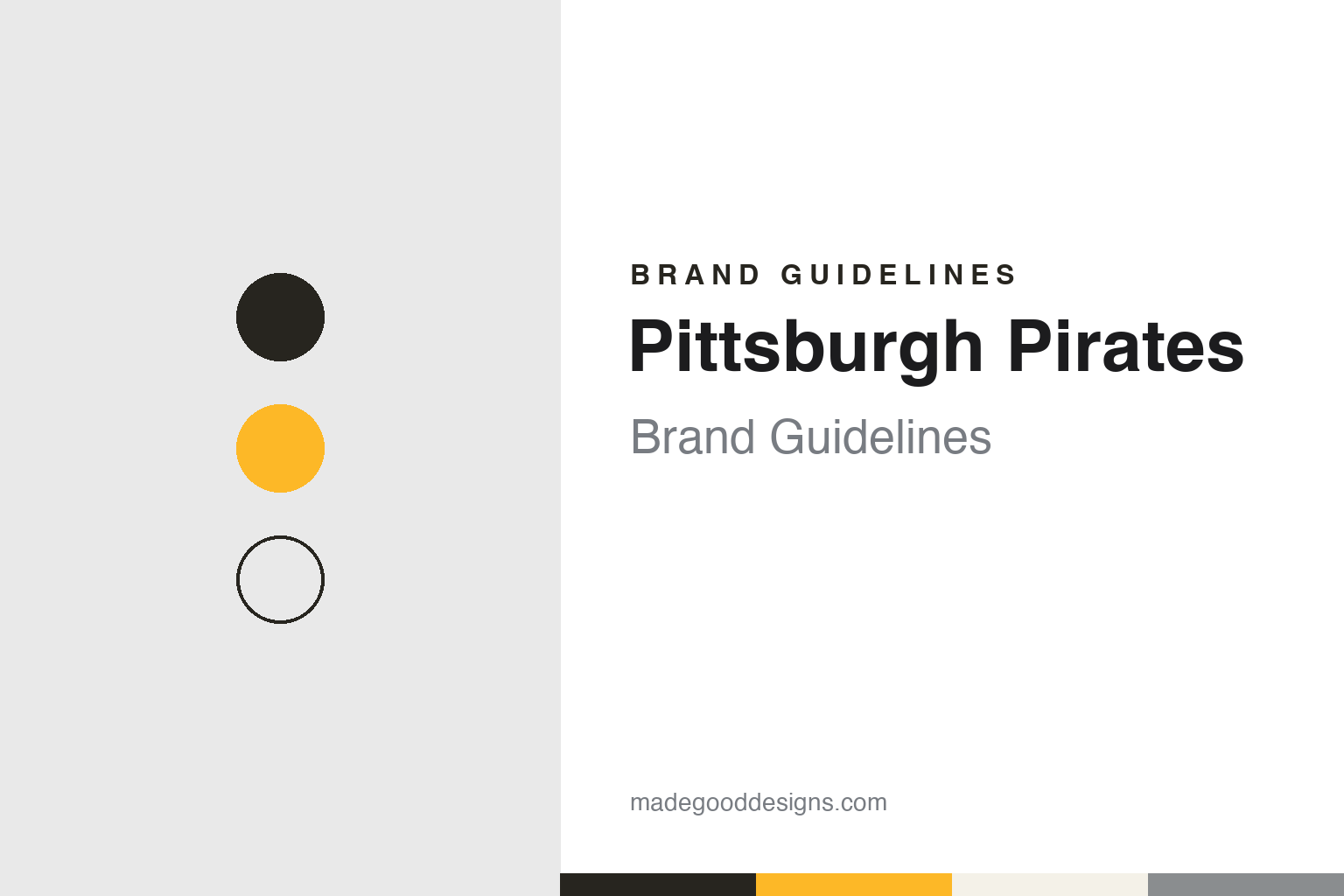
Two constants: an Allegheny black, Bucco gold and home white palette and a block initial and road script register. Abstract homage — not a Pittsburgh Pirates mark; no cap logo, script or wordmark is reproduced.
A name thrown by rivals
The Alleghenys, a second baseman left off a list, and a word from a complaint.
The Pittsburgh Pirates began under another name. English Wikipedia records that an earlier Allegheny club, based in what was then the separate Allegheny City across the river, had come and gone in the 1870s, and that on 15 October 1881 Denny McKnight held a meeting at Pittsburgh’s St. Clair Hotel to organise a new one. That club began play in 1882 in the American Association, chartered as the Allegheny Base Ball Club of Pittsburgh. It was listed as “Allegheny” in the standings and often called the Alleghenys, in the custom of the time of naming a team by its city or club. In 1887 it moved to the older National League.
The new name was an insult that stuck. Before the 1890 season, Wikipedia says, many of the club’s players left for the short-lived Players’ League, and when that league folded after one season the players were allowed to return to their old clubs. Pittsburgh also signed a second baseman, Lou Bierbauer, who had played for the American Association’s Philadelphia Athletics. In a SABR biography of Bierbauer dated 29 August 2014, the historian David Nemec writes that the Philadelphia club had neglected to reserve him for 1891, that he was awarded to Pittsburgh after a heated fight between the two leagues, and that the press in rival cities began calling the Pittsburgh club the “Pirates” for having snatched him. Nemec quotes Sporting Life in June 1891 mocking “J. Palmer O’Neill and his pirates.” Wikipedia says an Association official called the signing “piratical” in a formal complaint, that the club was never found to have done anything wrong, and that within a few years Pittsburgh’s own newspapers had taken up the nickname.
The club was slow to put it on a shirt. Wikipedia says the word first appeared on the uniform in 1912, running vertically down the placket of a pinstriped jersey, and did not return until 1933, when it was written across the road jersey in a more ornate style. The nicknames “Bucs” and “Buccos,” from buccaneer, followed. A pirate’s head appeared on the jerseys in 1940 and 1941, and that drawing was brought back as the club logo in the 1980s and 1990s. “Pittsburgh” itself first appeared on the road uniform in 1942.
The ballparks track the city. Wikipedia says the club split its early years between Exposition Park and Recreation Park, moved to Forbes Field in the Oakland neighbourhood in the middle of the 1909 season, and in 1970 moved to Three Rivers Stadium, which it shared with the Pittsburgh Steelers.
Colour
From Kevin McClatchy to Bob Nutting, and a ballpark by the river.
The current ballpark opened in 2001. Wikipedia says PNC Park stands on the banks of the Allegheny River in the city’s North Side, replacing Three Rivers Stadium, and is named for the Pittsburgh-based bank PNC Financial Services. Wikipedia notes its limestone and steel façade and its views of the downtown skyline, and fans can walk to it from downtown across the Clemente Bridge.
The owners of the modern era have each left marks on the uniform. Wikipedia records that after Kevin McClatchy bought the team in 1996, the club added a third jersey and brought in red as an accent colour, including red brims on caps; red stayed in the scheme from 1997 until 2009. Bob Nutting has been principal owner and chairman of the board since 2007, Wikipedia says; he is also president and chief executive of Ogden Newspapers. Under his ownership the club dropped red, added a black alternate jersey with a gold “P” in 2009, and from 2013 to 2019 wore throwback uniforms for Sunday home games: the early-1970s pullovers for three seasons, then the late-1970s gold tops with black trousers.
The mascot dates from the late 1970s. Wikipedia says the Pirate Parrot, a costumed bird, was introduced in 1979, a year after the Philadelphia Phillies had introduced the Phillie Phanatic. The Parrot still appears at games and at Piratefest, the club’s winter fan event held each January.
Typography
Design and documentation.
Baseball identity is built from a small set of parts that recur across the sport. The cap insignia is a compact version of the identity: often a single letter, a monogram or a small emblem, it has to read on a cap front, a sleeve patch, a scorebook and a phone icon alike, which is why club marks are often drawn as heavy, closed shapes rather than fine linework. Behind it usually sits a fuller crest or primary logo, a roundel or shield that carries the club name, a founding date or a piece of local symbolism, and which appears on programmes, tickets and signage rather than on the field.
Mascot heads form a second layer. Many clubs have used a cartoon figure with a baseball for a head or a costumed character, and these drawings change with the illustration fashions of each decade, from the thin pen line of mid-century sports cartoons to the thicker, flatter shapes of later digital work. Ballpark scoreboards and wayfinding then turn the palette into architecture, setting club colours in lights, painted steel and large-format type. Throwback uniforms close the loop: clubs reissue older lettering, cap marks and colour combinations for single games or whole seasons, so a design guide for any team has to treat its past wordmarks as live material rather than archive.
Pp
A condensed, heavy sans — the register of a club whose cap letter is a plain capital P. (Specimen set in Oswald, a condensed STAND-IN; NOT the Pittsburgh Pirates logo, script or wordmark.)
Pittsburgh Pirates
Red, white and blue, then the colours of the flag.
For half a century the Pirates dressed much like other clubs. Wikipedia says they mostly wore the patriotic red, white and blue through the first half of the twentieth century, usually with a blue cap carrying a red or white “P,” and with plain uniforms that often showed nothing more than that letter. The “P” on the cap is the element that has lasted through every change since. A switch to black and gold in 1924 lasted only that season.
The lasting change came in 1948. Wikipedia says the team adopted black and gold that year to match the colours of the flag of Pittsburgh, and, to a lesser extent at the time, those of the city’s football club. The city’s hockey club, the Pittsburgh Penguins, also wears black and gold. In the late 1950s the Pirates wore sleeveless jerseys. With the move to Three Rivers in 1970 the club went to a darker gold, switched its caps from black to gold with a black brim, and brought in pullover jerseys and beltless trousers.
The 1970s brought more variety. In 1976 the National League marked its centenary with old-style pillbox caps with horizontal stripes, and the Pirates kept them after the season, in black and in gold. From 1977 the club used a brighter gold and three interchangeable sets, all-black, all-gold and white with black-and-gold pinstripes, so that tops, trousers and caps could be mixed. That ended in 1985, when the club went back to home whites and road greys. The solid black cap with a gold “P” returned in 1987 and has been the primary cap since, Wikipedia says; buttoned jerseys came back in 1991.
Script has come and gone on the road. A script “Pittsburgh” appeared on road jerseys from 1990 to 2000 and was revived on 24 January 2020 for a new grey road set and a black alternate, the latter with a pirate figure in a yellow bandana. A camouflage alternate, worn from 2015, was retired in 2023. The 2023 City Connect uniform paired a gold top with black trousers, put the abbreviation “PGH” on the chest, and worked in three small symbols: an inverted Y for the three rivers that meet in Pittsburgh, a four-pointed star recalling the Steelers’ Steelmark, and a check mark taken from the city seal.
For a design guide, Pittsburgh Pirates shows how a borrowed civic palette can bind a club to its city more tightly than any logo, and how an insult can become a name. Compare the other black-and-gold club in our Pittsburgh Steelers guide, and the cap-making side of the sport in the New Era guide. For this guide we use Allegheny black, Bucco gold and home white with a condensed sans, an unofficial interpretation; no product or logo is reproduced.
Explore & save
Keep Pittsburgh Pirates’s identity on hand — save it to a board in the Made Good inspiration library.
Pittsburgh Pirates identity set
Pin the Pittsburgh Pirates Allegheny black, Bucco gold and home white palette and the block initial and road script register to your own board.