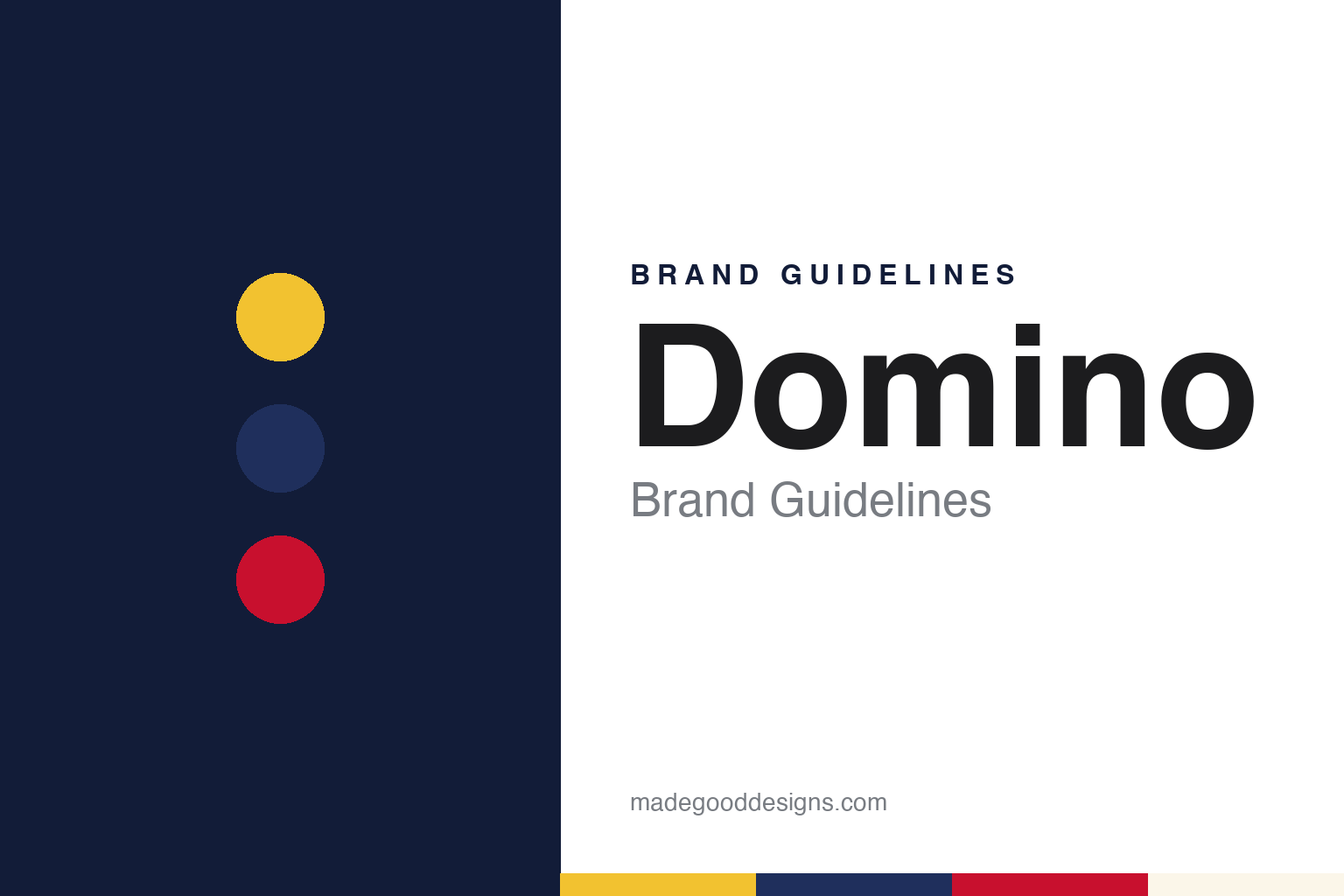
Domino Brand Guidelines
A Brooklyn refining family, a yellow carton and a red sign over Baltimore.
Aa
Two constants: a carton yellow, refinery navy and neon red palette and a slanted display serif register. Abstract homage — not a Domino product or mark; no package, sign or logo is reproduced.
From Vandam Street to the East River
A family of refiners, a fire in Williamsburg and a name taken from the shape of things.
Domino is an American brand of cane sugar, sold in granulated, brown, powdered and other forms, and owned today by American Sugar Refining, Inc., part of the ASR Group of West Palm Beach, Florida. Its story begins with a family of New York refiners. ASR Group’s own history page says that William Havemeyer, whom it calls the founder of what would become Domino Sugar, began a career in the New York City sugar business in 1799 with his brother Frederick, and that the brothers opened a refinery of their own in the city in 1807, which passed to their sons in 1828.
The next generation moved the business across the river. Writing on the New York Times City Room blog in May 2007, Sewell Chan reported that Frederick C. Havemeyer Jr., son of the company’s founder, began operating a refinery on the waterfront in Williamsburg, Brooklyn, in 1856. Trading as the Havemeyer & Elder Sugar Refinery, the article said, it prospered and grew until a fire destroyed much of the plant in January 1882. A new facility rose under Theodore Havemeyer, and its capacity led to the creation of the Sugar Refineries Company in 1887, later known as the American Sugar Refining Company.
The rebuilt plant is a piece of design history in its own right. Chan wrote that its architect has not been identified, but that the buildings were probably planned by the company’s chief engineer, John van Vorst Booraem, who joined the firm in the year of the fire. The complex was built in the Rundbogenstil, or round-arch style, a variant of the Romanesque Revival, with monumental brick façades and rows of round-arched windows that let daylight into the work floors. A tall oval smokestack rose from the Filter House; its upper section, the article said, was added during an expansion of the refinery in the 1920s.
The brand name arrived at the turn of the century. ASR Group says the name Domino was officially adopted by a New York sugar company in 1901 and that Domino Sugar received a United States trademark in 1906. Explore Baltimore Heritage, a project of the preservation group Baltimore Heritage, gives the same two dates, saying Domino was produced in New York from 1901 and trademarked in 1906. The brand’s own packaging today carries the line “Crafted by Experts Since 1901”.
Brooklyn eventually stopped refining. Chan reported that Domino ceased refining sugar in the three historic buildings in the 1970s, that the plant closed in 2004, and that the site had passed to the Community Preservation Corporation, which planned homes there. On 22 May 2007 the city’s Landmarks Preservation Commission voted unanimously to schedule a hearing on designating the Filter, Pan and Finishing Houses. CityLand, published by New York Law School, noted that the action did not include a nearby building from the 1960s that carried a yellow neon “Domino Sugar” sign.
Colour
Amstar, two buyouts, Tate & Lyle and a Florida sugar family.
Domino’s second home was Baltimore. The Baltimore Sun reported on 19 June 2001 that the American Sugar Refining Co., by then known as Amstar, opened its Baltimore plant on 17 May 1922. A year after the opening, the paper recalled, the company president Earl D. Babst wrote an open letter in The Sun thanking the city and praising the response of Maryland households to Domino package sugars in cartons and cotton bags, under the slogan “Sweeten it with Domino.” Explore Baltimore Heritage says the refinery campus at Locust Point was built in 1921 and opened for business in 1922, and that its buildings remain largely unchanged.
The company then changed hands several times. The Baltimore Sun reported in the same 2001 article that Amstar was sold to the investment firm Kohlberg Kravis Roberts & Co. in 1984, which sold it two years later to Merrill Lynch Capital Partners, and that the British refiner Tate & Lyle PLC bought the Domino business in 1988. By June 2001, the paper said, Tate & Lyle was in advanced negotiations to sell Domino, and Florida news outlets had named the buyer as Florida Crystals Corp. of Palm Beach.
That buyer came from a sugar family with Cuban roots. ASR Group’s history page says Florida Crystals was founded by the Fanjul family in Florida in 1960 as a sugarcane farming and milling company, and that it began large-scale refining in the late 1990s, acquiring a refinery in Yonkers, New York, in 1998. The same page says Domino Sugar was acquired in 2001, when the business took the name American Sugar Refining, Inc. Explore Baltimore Heritage likewise says ASR acquired Domino Sugar in 2001 and owns the Domino refineries at Locust Point, in Yonkers and in Chalmette, Louisiana. American Sugar Refining has owned Domino since 2001.
The group grew around the Domino name. FoodIngredientsFirst reported in August 2005 that American Sugar Refining had completed its purchase of the West Coast refiner C&H Sugar, and that Domino Foods, its sales and marketing arm, would add C&H to a portfolio that already included Domino, Florida Crystals and Jack Frost. BBC News reported on 1 July 2010 that Tate & Lyle had agreed to sell its sugar business, including refineries in the United Kingdom and Portugal and the Golden Syrup factory in London, to American Sugar Refining, which would keep using the Tate & Lyle name on its sugar. ASR Group says it introduced that corporate name in 2013.
On ownership, ASR Group’s own statements are worded two ways. Its press release of 18 July 2022 says the group is owned by Florida Crystals Corporation and the Sugar Cane Growers Cooperative of Florida; its history page says Florida Crystals owns the ASR Group family of companies. The network is still changing. In a press release dated 20 June 2025, ASR said it would close its Yonkers Refinery at the end of 2025, had moved its Chalmette and Baltimore refineries to continuous operation, and was adding smaller production sites in the Northeast and Mid-Atlantic.
Typography
Design and documentation.
The brands in this group sell three of the plainest things in an American kitchen: sugar, cooking oil and fruit spread. Each sits on a different shelf, in a different kind of pack. Sugar usually travels in a paper bag or a carton, oil in a clear or tinted bottle, and fruit spread in a glass jar with a lid, so the look of the brand is carried by a label, a name, a colour and the shape of the container.
Many names on these shelves have also outlived their first owners. A refinery, a press or a family kitchen may have started the brand, and a different company may now make, bottle or pack it, sometimes far from where it began. That makes the plain questions worth asking: who started it, who owns it now, and where it is made.
Each guide separates what independent sources record from what the company says about itself — its founding story, its owners over time, where its products are made and how its packs and labels have changed — and marks plainly what rests only on the company’s own word.
Aa
A high-contrast display serif set on a slant — the confident, pantry-shelf register of an old American grocery name. (Specimen set in DM Serif Display, a serif STAND-IN; NOT the Domino logo.)
A yellow carton, a star and a sign
An angled wordmark, a dot that changed shape and letters on a harbour roof.
On the shelf, Domino is a yellow brand. When ASR Group announced a refresh for the brand’s 120th anniversary in a press release of 19 April 2021, it described an updated logo and streamlined brand colours that still kept the yellow associated with Domino. The company said the logo kept its classic angle and its D while adding the line “Crafted by Experts Since 1901”. Products were given colour cues so shoppers could pick a type of sugar at a glance, and some were renamed: Demerara became Domino Turbinado Sugar and Confectioners became Domino Powdered Sugar. The packs also gained a Non-GMO Project seal and a how-to-recycle mark.
The smallest detail of the wordmark has the longest history. LogoLounge, the logo-design site, described the 2021 logo as using a four-pointed star for the dot on the “i”. The previous wordmark, it said, used a five-pointed star, and before that Domino used an asterisk-shaped burst. Domino’s own packaging history page tells the same story from the inside, saying the familiar asterisk over the “I” was replaced with a bolder star alongside a change of typography, and that the signature yellow kept the brand visible on the shelf as colours were added to tell its sugars apart. ASR extended the 2021 look to single-serve packets for restaurants and cafés in July 2022.
Domino’s graphic identity also sits on a refinery roof. ASR Group dates the “Domino Sugars” sign at the Baltimore refinery to 1951. Explore Baltimore Heritage describes it as a red neon sign, visible across the harbour, installed by Triangle Signs, which it says continues to maintain it, and notes that the scale is hard to grasp: a semi-truck could drive through the hole in the “O”. The Baltimore Sun, in 2001, called the sign synonymous with the Inner Harbor skyline.
Decades of weather and sugar wore it down. The Society for Experiential Graphic Design reported on 13 December 2021 that the steel framework had rusted, the giant letters needed repair and the neon was failing, to the point that the final “o” of “Domino” no longer lit. ASR Group chose the Baltimore firm Gable to redesign, build and install new letters and lighting. Gable’s Bill Sackmann told the society that coatings of sugar carried up in vapours from the plant had made the old letters costly to service, and that the decision was taken to rebuild the letters rather than repair them. The shared aim, the article said, was to keep the visual character of the sign’s design and light while using modern fabrication and lighting.
Brooklyn has its own version of the mark. CityLand recorded in 2007 that a yellow neon “Domino Sugar” sign stood on a 1960s building beside the Williamsburg refinery, outside the landmark proposal for the older brick buildings. Between them, the signs, the yellow carton and the star over the “i” form a consistent kit: a single word, an angled letterform, one bright colour and a small typographic ornament that has been redrawn rather than dropped.
For a design guide, Domino shows how a grocery staple can carry the same word, colour and angle through a century of owners, while its loudest expression stays on the buildings where the sugar is made. Compare it with Tate & Lyle, the British sugar name in the same group since 2010, and C&H, its West Coast stablemate. For this guide we use carton yellow, refinery navy, harbour neon red and granulated white with a slanted serif, an unofficial interpretation; no product or logo is reproduced.
Explore & save
Keep Domino’s identity on hand — save it to a board in the Made Good inspiration library.
Domino identity set
Pin the Domino carton yellow, refinery navy and neon red palette and the slanted display serif register to your own board.