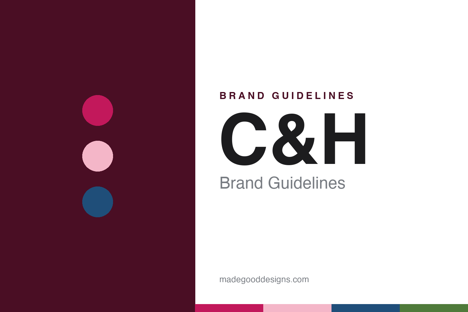
C&H Brand Guidelines
Hawaiian cane, a brick refinery on the Carquinez Strait and a hibiscus on every pack.
Aa
Two constants: a hibiscus magenta, granulated pink and strait blue palette and a heavy grotesque sans register. Abstract homage — not a C&H product or mark; no package, sign or logo is reproduced.
A refinery for Hawaiian cane
Island plantations, a wheat port on the Carquinez Strait and a brick plant built against fire.
C&H is an American brand of cane sugar, sold in granulated, brown, powdered and other forms, and refined at Crockett, California, a small town in Contra Costa County on the Carquinez Strait, north-east of San Francisco. The initials stand for California and Hawaiian. The brand is owned today by American Sugar Refining, Inc., part of the ASR Group, which also owns Domino. C&H says the California and Hawaiian Sugar Refining Company began refining pure cane sugar at Crockett in 1906, as cargo ships brought raw cane sugar from the Hawaiian Islands, and its packs carry the line “Baking Happiness Since 1906”.
The refinery existed to serve Hawai‘i’s plantations. Hank Soboleski, writing in the Kaua‘i newspaper The Garden Island on 2 November 2024, explained that until C&H was established, Hawaiian sugar plantations sold their raw sugar to a limited number of mainland refining companies on the Atlantic and Pacific coasts, which also marketed it. C&H came into being, he wrote, because the Hawaiian sugar industry needed a refining and marketing organisation of its own. Raw sugar travelled by freighter from Hawaiian ports to Crockett, where it was washed, dissolved, filtered, passed through bone char and boiled under vacuum to form crystals before being dried, screened and packed.
The Pacific Coast Architecture Database, maintained at the University of Washington, says the company was set up by Hawaiian sugar cane interests who wanted to challenge Claus Spreckels’s beet sugar monopoly in California. The site itself already had an industrial past. The Center for Land Use Interpretation’s land use database notes that Crockett grew as a wheat port in the late 1800s, shipping grain from Central Valley farms through the deep water of the strait, and that the plant now used by C&H was originally a flour mill.
The refinery buildings have a named architect. The architecture database credits the Crockett plant to William Henry Crim Jr. and quotes the writer Frederick Jennings, who in the journal Architect and Engineer in January 1919 held up the California-Hawaiian refinery as an example of Crim’s industrial work, a plant “built with a view to permanency and absolute protection against fire”. A long-time resident quoted by the East Bay Times in 2017 said her great-grandfather had gone to work at the refinery in 1906, the year it opened, followed by generations of other men from the family.
Crockett became a company town. The East Bay Times described the refinery’s shift-change whistle marking the day, and residents recalling a community pool, social clubs and Christmas gifts for refinery employees’ children. Sugar Producer magazine noted in August 2016 that the town bears the nickname “Sugar Town” because of C&H.
Colour
A private company, a growers’ cooperative, Alexander & Baldwin and ASR.
C&H spent much of the twentieth century owned by the plantations it served. The architecture database says the firm operated as a private company from 1906 to 1921 and as a cooperative of sugar growers from 1921 to 1993. The Garden Island gave the same span on 29 December 2000, describing C&H as an agricultural cooperative marketing association owned by its member sugar companies in Hawai‘i from 1921 to 1993. In 1993, that report said, the member companies sold their interests to Alexander & Baldwin of Honolulu, and the refining company changed from a cooperative to a corporation. Its main market lay west of the Mississippi River.
C&H also refined on the islands. Soboleski wrote in 2024 that C&H refined sugar for Hawaiian consumption at ‘Aiea, O‘ahu, a refinery it acquired from the Honolulu Plantation Co. in 1947. Raw sugar from Kaua‘i reached Crockett in bulk: The Garden Island reported in December 2000 that the sugar ship Moku Pahu, operated by Matson Navigation for the Hawai‘i Sugar & Transportation Co., was carrying the final harvest of Amfac Sugar Kaua‘i and sugar from Gay & Robinson to the C&H refinery.
The present owner arrived in 2005. FoodIngredientsFirst reported on 11 August 2005 that American Sugar Refining, then based in Yonkers, New York, and owned by Florida Crystals Corporation and the Sugar Cane Growers Cooperative of Florida, had completed its acquisition of C & H Sugar Company, Inc. Its sales and marketing arm, Domino Foods, would add C&H to a brand portfolio that already included Domino, Florida Crystals and Jack Frost. Sugar Producer likewise said in 2016 that Florida-based American Sugar Refining acquired C&H in 2005, and ASR Group’s own timeline gives the same year and marks the C&H centennial in 2006. American Sugar Refining has owned C&H since 2005.
The Hawaiian half of the name then lost its supply. The East Bay Times reported on 19 January 2017 that the Moku Pahu had tied up at Crockett for the last time with raw sugar from Hawai‘i, after the closure of the last sugar mill on Maui in December 2016. A packet of C&H sugar, the paper said, was now much more likely to have been grown in Vietnam or Brazil, and after that final cargo all of the refinery’s sugar would come from foreign suppliers. ASR spokesman Peter O’Malley called it a sad day for the company. The Garden Island dated the last refining of Hawai‘i-grown sugar at Crockett, from Maui’s Hawaiian Commercial & Sugar Co., to 2017.
The name stayed. The East Bay Times reported that the company had no plans to change its name, which stands for California and Hawaii, or its logo. Crockett residents marked the ship’s departure under the Carquinez Bridge, and a sign made from old sugar bags on the dock read “Thank You C&H.” The C&H website today describes the brand as part of ASR Group, with copyright held by Domino Foods.
Typography
Design and documentation.
The brands in this group sell three of the plainest things in an American kitchen: sugar, cooking oil and fruit spread. Each sits on a different shelf, in a different kind of pack. Sugar usually travels in a paper bag or a carton, oil in a clear or tinted bottle, and fruit spread in a glass jar with a lid, so the look of the brand is carried by a label, a name, a colour and the shape of the container.
Many names on these shelves have also outlived their first owners. A refinery, a press or a family kitchen may have started the brand, and a different company may now make, bottle or pack it, sometimes far from where it began. That makes the plain questions worth asking: who started it, who owns it now, and where it is made.
Each guide separates what independent sources record from what the company says about itself — its founding story, its owners over time, where its products are made and how its packs and labels have changed — and marks plainly what rests only on the company’s own word.
Aa
A heavy, compact grotesque — the bold, legible register of an initials-only grocery name. (Specimen set in Archivo Black, a sans STAND-IN; NOT the C&H logo.)
A hibiscus, a pink pack and a lit sign
Art deco cartons, island imagery, a flower added in the 1950s and a sign seen from the bridge.
C&H tells its own design history on a page titled “Then & Now”. The company says it updated its packages with an art deco design in 1931 to keep up with the trends of the early 1930s, and that during the Second World War, around 1943, its packs were simplified to use less ink. In 1947, it says, new messaging told shoppers that the sugarcane was grown in Hawai‘i and refined in California, and from 1950 recipes on the back of the pack suggested new ways to use each product.
The brand’s main symbol arrived later in the decade. C&H says it featured native Hawaiians in its advertising, and at times on its packaging, from the early 1950s, and that in the late 1950s it added the hibiscus to its packaging, a flower it says has appeared on every C&H product since. In 1970, the company says, pink was added to its granulated sugar packages, a hue that has shifted slightly over the years but remains. Colours were added to other packs from 1980 to help shoppers find the right sugar, and in 1995 images of sugarcane joined the design.
The newest look builds on the flower. C&H says that in 2021 it created a new custom pattern inspired by the hibiscus, leaning into its West Coast heritage, and added the message “Baking Happiness!” to the front of its packs. The East Bay Times noted in 2017 that the island hibiscus remained in the branding even as the sugar inside came from overseas, and that the company planned to keep its logo.
Television carried the island imagery for decades. The East Bay Times recalled that from the 1960s through the 1980s television screens regularly featured the C&H jingle, with Hawaiian children chewing on sugar cane and dancing the hula. The same report described generations of Crockett children falling asleep to the flickering lights of the C&H sign in the distance.
That sign is the brand’s piece of architecture. Sugar Producer described C&H in 2016 as recognisable for its distinctive, bright neon sign, which stands on the refinery beside the Carquinez Bridge. C&H says the sign is a recognisable landmark in Crockett and that it switched to energy-saving LED lighting in 2016. Together with the brick refinery by William Henry Crim Jr. and the hibiscus on the shelf, it gives the brand a consistent visual vocabulary: two initials joined by an ampersand, a tropical flower and a warm pink.
For a design guide, C&H shows how a brand can keep a place in its name and a flower on its pack after the supply chain behind them has moved on, letting the imagery stand for heritage rather than origin. Compare it with Domino, its East Coast stablemate under the same owner, and Tate & Lyle, the British sugar name in the same group. For this guide we use hibiscus magenta, granulated pink, strait blue and cane green with a heavy sans, an unofficial interpretation; no product or logo is reproduced.
Explore & save
Keep C&H’s identity on hand — save it to a board in the Made Good inspiration library.
C&H identity set
Pin the C&H hibiscus magenta, granulated pink and strait blue palette and the heavy grotesque sans register to your own board.