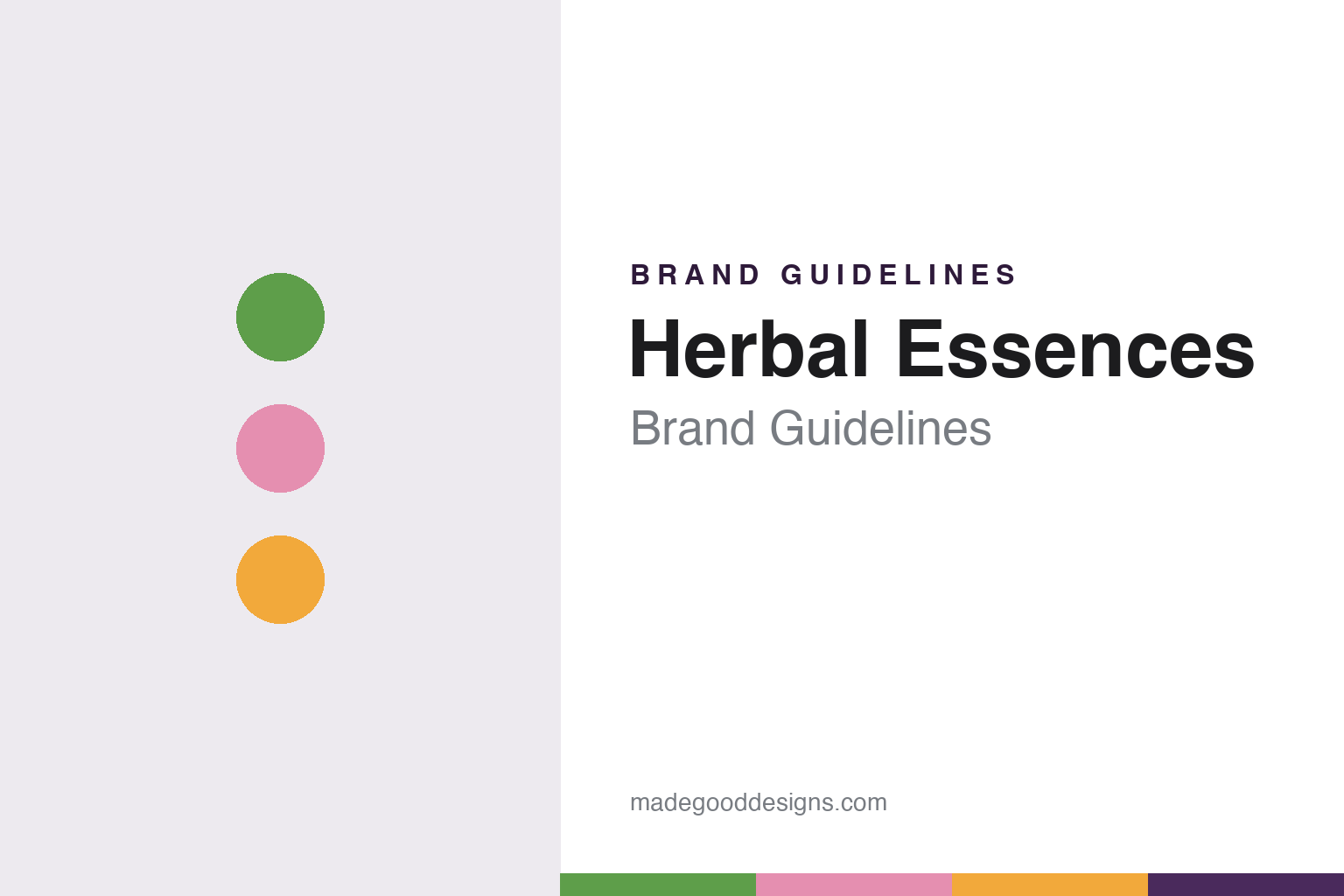
Herbal Essences Brand Guidelines
Clairol’s 1971 shampoo, owned by P&G since 2001.
Aa
Two constants: a botanical green, petal pink and marigold palette and a flourished serif register. Abstract homage — not a Herbal Essences product or mark; no bottle, label or logo is reproduced.
A green shampoo from Clairol
From one bottle with a “nature girl” to a range sold around the world.
Herbal Essences began as a single product. English Wikipedia says Clairol introduced it in 1971 as “Clairol Herbal Essence Shampoo”, a green shampoo whose label showed a cartoon “nature girl” in a pool. Clairol itself was an American hair-colour company: English Wikipedia says it was founded in 1931 by Joan and Lawrence M. Gelb, and that the Gelbs later sold it to Bristol-Myers.
The shampoo grew into a family of products and travelled. English Wikipedia says the brand reached the United Kingdom and other markets in 1997. In the same years it became known for its television advertising: English Wikipedia describes 1990s and early-2000s commercials in which women appeared to be overcome with pleasure while washing their hair, a 1998 spot featuring the sex therapist Dr. Ruth Westheimer, and the brand’s sponsorship of the first five seasons of the CBS sitcom Two and a Half Men.
The change of ownership came in 2001. In a release dated 21 May 2001 in Cincinnati, filed with the US Securities and Exchange Commission, Procter & Gamble announced that it would buy the Clairol business from Bristol-Myers Squibb, noting that “Clairol also brings some outstanding hair care brands, including Herbal Essences, Aussie and Infusium.” Procter & Gamble has owned Herbal Essences since 2001. When Clairol itself moved to Coty in 2016, English Wikipedia records, Herbal Essences remained with P&G.
Colour
A rose, a circle, a pair of nesting bottles and a code you can feel.
P&G rebuilt the brand’s look five years after the purchase. MediaPost’s Marketing Daily reported in July 2007 that P&G had worked with the Cincinnati branding agency LPK, spent 18 months on consumer research, and emerged in May 2006 with a new strategy aimed at younger women. According to the same report, the old-fashioned rose illustration was dropped in favour of a streamlined circle with a “feminine flourish” and a far more prominent brand name, and because the shampoo aisle was already so colourful, the new packaging leaned on shape: curvy shampoo and conditioner bottles designed to nest together, encouraging shoppers to buy them as a pair.
The older look did not disappear for good. The Huffington Post reported in December 2012 that P&G was bringing back two classic lines sold from 1995 to 2006 — a pink Smooth Collection and a marigold Shine Collection — and linked the decision to slow sales of the redesigned range, with advertising planned around the Grammys.
The next layer was botanical. Cosmetics Business reported in June 2018 that Herbal Essences had entered a partnership with the Royal Botanic Gardens, Kew, under which Kew would authenticate the plant ingredients in the bio:renew collection, a range the brand had launched in 2017. The magazine quoted Lynn Hicks, the brand’s North American brand manager, calling it “beauty rooted in plant science.”
The most unusual design change is one you feel rather than see. TODAY reported in October 2018 that bio:renew bottles would carry tactile markings under the label: four vertical lines on shampoo and two rows of dots on conditioner. The feature was announced on World Sight Day, 11 October 2018, and the marked bottles reached shelves from January 2019. TODAY quoted Sumaira Latif, who is blind and works as a special consultant for inclusive design at P&G, on how hard it is to tell shampoo from conditioner in the shower, and Mark Riccobono, president of the National Federation of the Blind, welcoming the move.
Typography
Design and documentation.
The seven brands in this group are all mass-market haircare names: TRESemmé, Pantene, Herbal Essences, Garnier Fructis, Aussie, Not Your Mother’s and John Frieda. Haircare brands in general sit at many different points in the trade, from names that still carry a founder’s story to ranges that now belong to much larger consumer-goods groups, and a single brand can be sold everywhere from a corner chemist to a supermarket aisle.
A haircare brand’s identity is usually carried less by a single bottle than by a name, a colour and the promise on the label, because the company behind the name may have changed hands, moved its production or grown far beyond the place where it started. That makes the questions behind each name worth asking plainly: who started it, who owns it now, and where its shampoos and conditioners are actually made.
Each guide separates what independent sources record from what the company says about itself — its founding story, its owners over time, where its products are made and how its packaging has changed — and marks plainly what rests only on the company’s own word.
Aa
A flourished serif for a brand name set inside a circle. (Specimen set in Playfair Display, a serif STAND-IN; NOT the Herbal Essences logo.)
Herbal Essences
A Clairol name inside a P&G hair-care portfolio.
Herbal Essences now sits beside other hair-care names that came to P&G by different routes. Aussie arrived in the same 2001 Clairol purchase, named in the same release, while Pantene had joined the company earlier. English Wikipedia describes the current range as running to 29 collections, and it notes a partnership with WWF Canada on planting native plants for pollinators.
Read in order, the documented design moves form a short timeline: a green shampoo and a cartoon “nature girl” in 1971; a rose illustration replaced in 2006 by a circle with a flourish and a pair of nesting bottles; the pink Smooth and marigold Shine bottles of 1995 to 2006 brought back in 2012; Kew’s authentication of bio:renew ingredients in 2018; and raised stripes and dots on bio:renew bottles from January 2019.
The name itself needs a little care. The original 1971 product was called Herbal Essence, in the singular, according to English Wikipedia, and the plural Herbal Essences is the name used today; the brand’s own site is herbalessences.com.
For a design guide, Herbal Essences shows how a mass-market shampoo can be redesigned around shape, colour and touch — nesting bottles, a circle with a flourish and a raised code for people who cannot read the label. Compare Pantene, P&G’s other long-running haircare name, and Aussie, the brand that came with it from Clairol. For this guide we use botanical green, petal pink and marigold with a flourished serif, an unofficial interpretation; no product or logo is reproduced.
Explore & save
Keep Herbal Essences’s identity on hand — save it to a board in the Made Good inspiration library.
Herbal Essences identity set
Pin the Herbal Essences botanical green, petal pink and marigold palette and the flourished serif register to your own board.