Kakao Brand Guidelines
A messenger launched by a team of four, a symbolic yellow and a radish in a rabbit suit.
Aa
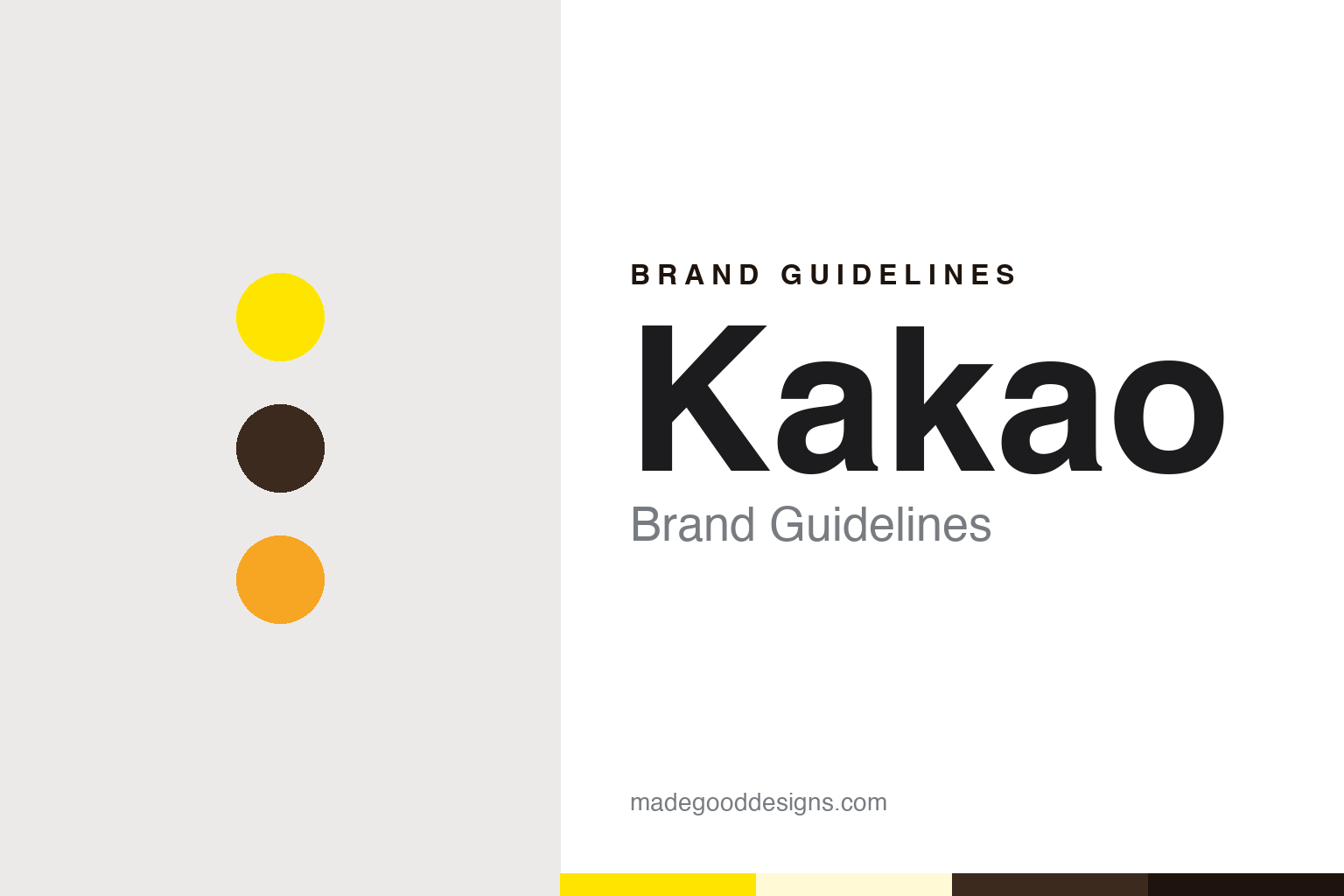
Two constants: a message yellow, cocoa and peach palette and a Rounded sans register. Abstract homage — not a Kakao asset or mark; no logo, character, icon or wordmark is reproduced.
A messenger first, a company name second
South Korea, 2010.
Kakao is a company whose public identity grew out of a single app. English Wikipedia says the business was founded in 2006 by Kim Beom-soo, who uses the English name Brian Kim and who had earlier been chief executive of NHN, the company formed when the game portal Hangame merged with Naver. Wikipedia also says that the company that operated the messenger was originally called Kakao Inc., and that today’s Kakao is headquartered in Jeju City on Jeju Island rather than in Seoul.
The app is where the public story begins. The Korea JoongAng Daily, writing on 22 March 2020 as the service turned ten, reported that KakaoTalk launched on 18 March 2010, at a time when ordinary mobile text messages in Korea still carried a charge per message. The newspaper quoted a video that Kim shared for the anniversary, in which he recalled that the service was built by a team of four: an iPhone app developer, a server developer, a designer and a product manager, who stayed up through the night to finish it and then waited to see how people would respond. Asia Economy, in an English-language article published on 17 March 2020, gave the same launch date and said a gift-sending feature followed in December 2010.
The name of the app and the name of the company then began to travel together. Asia Economy said the messenger later added payments, with KakaoPay integrated in 2014, and that KakaoTalk emoticons, which began with a set of six, became a field of work for illustrators in their own right. English Wikipedia lists later services launched under the same prefix, among them KakaoTaxi, introduced on 10 March 2015 and later renamed Kakao T, and Kakao Entertainment, formed in March 2021 when Kakao Page and Kakao M merged. The word Kakao sits in front of each of them, so a taxi app, a bank, a music business and a set of characters all carry the same opening word.
Colour
Daum Kakao, then Kakao again.
The company name changed twice in little more than a year. The Korea Herald reported on 26 May 2014 that the web portal operator Daum Communications had announced it would merge with Kakao through a stock swap, and that Daum had been looking for a way into mobile services after its own messenger, MyPeople, failed to draw the same attention. The combined company took the joint name Daum Kakao. The Chosun Ilbo later dated the merger to October 2014.
The double name did not last. Yonhap reported on 1 September 2015 that Daum Kakao would ask shareholders to change the company name to Kakao, and that the company said the new name would strengthen its corporate brand as a maker of a mobile life platform, which the existing name, built from two merged firms, did not fully express. Yonhap said the proposal would go to a shareholder meeting on 23 September. The Chosun Ilbo reported on 24 September 2015 that the name had been changed to Kakao at a shareholders’ and board meeting that Wednesday. The same change of name came with a change of leadership: TechCrunch reported on 10 August 2015 that Rim Ji-hoon, founder of the Kakao-owned venture firm K Cube Ventures, would replace the two co-CEOs who had stayed on after the merger, Choi Sae-hoon and Lee Sirgoo.
The single name has been used since. Later reorganisations took place under it, and English Wikipedia says that in December 2025 Daum itself was split off from Kakao into a separate subsidiary, so that the portal which once shared the corporate name now sits outside it again.
Typography
Group names, initials and characters.
Korean corporate identities often carry their history inside their names. Group names can grow out of older company names, shortened over decades until the original words survive only as initials or a contraction. Other identities are built around English-letter abbreviations, which read the same at home and abroad, and which leave room for a holding company to sit above businesses as different as energy, chemicals and telecoms. Founders’ names and place names also turn up, sometimes in the original form and sometimes reduced to a single syllable.
Digital companies add a further layer. For an internet platform or a mobile app, the first point of contact is often not a logo on a building but an app icon on a phone screen: a small square that has to hold a colour, a shape and sometimes a single letter at very small sizes. Many consumer-facing companies also use character mascots as brand surfaces in their own right, appearing in messaging stickers, merchandise, retail stores and advertising, so that a cartoon figure can be as recognisable as the corporate name. A design reading of these companies looks at three layers together: the name, the mark, and the characters and icons that carry them into daily use.
Aa
A rounded sans — after the soft, friendly letterforms of messenger interfaces. (Specimen set in Nunito, a rounded sans STAND-IN; NOT the Kakao logo or any Kakao typeface.)
Kakao
Yellow, and the friends drawn to carry it.
Yellow is the colour tied to the name. The Korea Herald, in a profile of the illustrator Kwon Soon-ho published on 27 May 2016, reported that when Kakao asked for a character to represent the brand, the company wanted a bunny in yellow to stand for the brand’s symbolic yellow colour. Kwon, who works under the pen name Hozo, thought rabbits were too common and drew Muzi instead: a yellow pickled radish disguised in a white bunny costume, accompanied by a small green crocodile called Con.
The Kakao Friends began as emoticons. English Wikipedia says the characters were released for KakaoTalk in November 2012. The Korea Herald said Kwon was asked in 2012 to create emoticon characters, that he initially sent four — Neo, Frodo, Jay-G and Apeach — and that he made seven of the eight original characters, adding Muzi, Con and the duck Tube. The newspaper said Kwon gave each figure a back story but avoided pushing it, so that users would not be limited in how they used the emoticons. A later lion character, Ryan, was announced in January 2016, according to Wikipedia.
The characters soon moved off the screen. The Korea JoongAng Daily reported on 7 August 2016 that Kakao Friends had become a separate company and had opened a three-storey flagship store in Seoul’s Gangnam District on 2 July 2016, with a coffee shop on the top floor; the original store had been in the Hyundai Department Store in Sinchon. The Korea Herald reported on 18 July 2018 that Kakao Friends, founded in March 2015, had changed its name to Kakao IX, short for Kakao Innovative eXperience, after taking over the branding and design consultancy Joh & Co.
For a design guide, Kakao shows how a single colour and a cast of characters can carry a corporate name across an app icon, a chat sticker and a shopfront. Compare the Korean portal Naver and the Southeast Asian super-app Grab. For this guide we use message yellow, cocoa and peach with a rounded sans, an unofficial interpretation; no product or logo is reproduced.
Explore & save
Keep Kakao’s identity on hand — save it to a board in the Made Good inspiration library.
Kakao identity set
Pin the Kakao message yellow, cocoa and peach palette and the Rounded sans register to your own board.