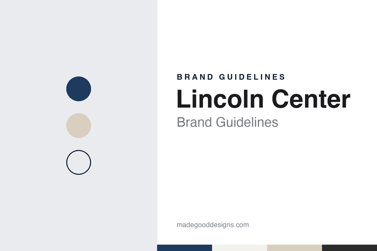
Lincoln Center Brand Guidelines
A renewal plan, a ring of halls and a campus lit in white.
Aa
Two constants: a night blue, travertine and white light palette and a Plain monochrome grotesque register. Abstract homage — not a Lincoln Center asset or mark; no logo, building image, signage or wordmark is reproduced.
A renewal plan on the Upper West Side
A civic consortium, a square named in 1906 and a groundbreaking in 1959.
Lincoln Center began as a plan for a neighbourhood rather than for a single building. Wikipedia says the complex, formally Lincoln Center for the Performing Arts, occupies part of the Lincoln Square neighbourhood on the Upper West Side of Manhattan, and that it was built by a consortium of civic leaders led by John D. Rockefeller III as part of the Lincoln Square Renewal Project, within Robert Moses’s programme of urban renewal in New York in the 1950s and 1960s.
The dates come in quick succession. Wikipedia’s timeline records that on 21 April 1955 the city’s Board of Estimate approved the designation of Lincoln Square for urban renewal, that Rockefeller was elected chairman of the effort on 8 November 1955, and that Lincoln Center for the Performing Arts, Inc. was incorporated on 22 June 1956. Rockefeller became its president in 1956 and, after stepping down from that post, its chairman in 1961. The ground-breaking ceremony took place on 14 May 1959 with President Dwight D. Eisenhower.
The name has an uncertain origin. Wikipedia says it is unclear whether the centre was named as a tribute to Abraham Lincoln or simply for its location in Lincoln Square. The square itself was named in 1906 by the New York City Board of Aldermen, and the records give no reason for the choice; Wikipedia adds that property records of the period list no landowner called Lincoln.
From the start it was a home for other organisations as much as a presenter in its own right. Wikipedia lists the New York Philharmonic, the Metropolitan Opera, the New York City Ballet, the Chamber Music Society of Lincoln Center and the Juilliard School among the resident organisations housed on the campus, alongside theatre, film and library institutions that took up their own buildings as the complex filled out through the 1960s.
Colour
A ring of 1960s halls, then a rebuilt campus from 2003 to 2012.
The buildings opened over seven years and were the work of several architects. Wikipedia credits Wallace Harrison with the master plan and the Metropolitan Opera House, Max Abramovitz with Philharmonic Hall, Philip Johnson with the New York State Theater, Eero Saarinen with the Vivian Beaumont Theater, Pietro Belluschi with the Juilliard School building including Alice Tully Hall, and Gordon Bunshaft with the library for the performing arts. Its timeline gives Philharmonic Hall’s opening as 23 September 1962, the New York State Theater as 23 April 1964, the Vivian Beaumont as 14 October 1965, the Metropolitan Opera House as 16 September 1966, and Alice Tully Hall and Juilliard as September and October 1969. Architectural Record noted in 2009 that Belluschi, with Eduardo Catalano and Helge Westermann, gave the Juilliard building a travertine coating to match the rest of the campus.
The second phase of the campus came four decades later. Architectural Record, in a project report by Suzanne Stephens published on 19 June 2009, said that Diller Scofidio + Renfro had been in charge of reconfiguring Lincoln Center’s public spaces since 2003, working with Beyer Blinder Belle on one portion, and that the practice was renovating and expanding Juilliard with FXFOWLE. The reworked Alice Tully Hall opened in February 2009; the magazine described a new extension shaped as a trapezoid in plan to follow the diagonal of Broadway, a cantilevered wedge forming a prow over a tall glazed lobby, and mullionless glass on the east and south elevations, with engineering by Arup. Liz Diller told the magazine the team was trying to work with the “DNA” of what was there while shifting it into a new idiom.
Wikipedia dates the start of the 65th Street Project to March 2006, the redesigned Revson Fountain to 30 September 2009, the Claire Tow Theater to June 2012 and the President’s Bridge over West 65th Street to 1 October 2012, which it treats as the completion of the redevelopment. The Diller Scofidio + Renfro work also took in the plazas, the Hypar Pavilion with its sloping lawn roof and the campus information system, while Tod Williams Billie Tsien designed the David Rubenstein Atrium visitor centre. Later projects followed: Wikipedia says the main concert hall reopened in 2022 after a renovation by Diamond Schmitt Architects, with public spaces by Tod Williams Billie Tsien, and that in 2023 the centre hired Hood Design Studio and Weiss/Manfredi to rework the western edge of the campus.
Typography
A name in plain type and a campus that carries it.
For an opera house, a concert hall or a theatre, the building is often the logo before any logo is drawn. A roofline, a fly tower or a facade on a riverbank turns up on tickets, in press photographs and in the background of every arrival, and many venue marks are simply a reduction of that outline or of the letters cut into the stone. The rest of the identity lives in print that changes with every season. A season brochure sets the tone for the year ahead, posters and banners name individual productions, and programmes carry cast lists, essays and rehearsal photographs into the auditorium. Each production usually has its own artwork, so the house style is mostly a frame: a grid, a typeface, a place for the venue name and a rule about how the date and the title sit together, while the image inside the frame keeps changing.
Wayfinding is the other permanent layer. Signs to auditoriums, cloakrooms, bars and box offices have to work for people arriving in a hurry, and they stay up long after the posters change. A further complication is the difference between a building and a resident company. One organisation may own the venue while an orchestra, opera company or theatre ensemble performs there under its own name, and some companies tour or move between venues, taking their identity with them. In those cases the building mark and the company mark need to appear side by side without competing. In practice, a performing arts identity is a system of fixed parts and changing parts: the fixed parts must stay recognisable, and the changing parts must leave room for each new production.
Aa
Plain monochrome grotesque — after the Lincoln Center name set in monochrome Univers. (Specimen set in Hanken Grotesk, a sans STAND-IN; NOT the Lincoln Center logo or any Lincoln Center lettering.)
Lincoln Center
White, light and transparent: an identity built into the campus.
The visual identity was designed alongside the buildings. Design Week reported on 21 May 2008 that Diller Scofidio + Renfro was working with a group of theatre, audio, lighting and graphic specialists, including the New York studios Pentagram and 2×4, and that the information and signage system across the site, which Liz Diller called the “infoscape”, was a major part of the design. The magazine said there would be very few freestanding signs: information would mostly be integrated into the buildings, with text rolling off walls and scrolling LEDs lighting up staircases, and with content produced by the consultancy Imaginary Forces. It reported that Pentagram was working on digital graphics in the Harmony Atrium based on the idea of bringing a campus map to life, and that 2×4 was handling graphics in Alice Tully Hall, the Center Promenade and Juilliard. Diller described a matrix of two levels of contrast and scale, in which smaller type would be brighter, and said the result would be neutral, coming from the materials themselves or from white light.
2×4’s own project page describes the work as a multi-year collaboration with the architects that included a systematic identity and design system. The studio says it used the theme “White, Light, Transparent” as connective tissue for the public spaces and the many venues, linking the identity to signage, wayfinding, digital displays, large façade graphics, maps and donor recognition.
The wordmark itself is plain. AIGA’s Eye on Design, in a piece by Emily Gosling published on 13 July 2017, described the incumbent identity as the 2×4 system based on “White + Light + Transparent”, with the Lincoln Center name shown in monochrome Univers. The article covered a retail collection by the New York agency Small Stuff, made with Lakeside Collaborative and the centre’s marketing team for a kiosk designed by the architects LAMAS. Small Stuff partner Joe Marianek said the simplicity of the identity gave the centre a tool to unify the campus, but that it could get lost among the cultural organisations it represents; partner Dinah Fried described archive research that turned up a varied history of the centre’s visual design. The agency set the wordmark in new configurations meant to suggest soundwaves, the movement of a baton or a dancer’s steps, and developed a version that reacts to sound.
For a design guide, Lincoln Center shows how an institution made of many tenants can let a plain monochrome name, white light and the campus architecture carry its identity, leaving colour and expression to the organisations in its halls. Compare the Metropolitan Opera, a resident company with its own house on the plaza, and Carnegie Hall, another New York concert venue. For this guide we use night blue, travertine and white light with a sans, an unofficial interpretation; no product or logo is reproduced.
Explore & save
Keep Lincoln Center’s identity on hand — save it to a board in the Made Good inspiration library.
Lincoln Center identity set
Pin the Lincoln Center night blue, travertine and white light palette and the Plain monochrome grotesque register to your own board.