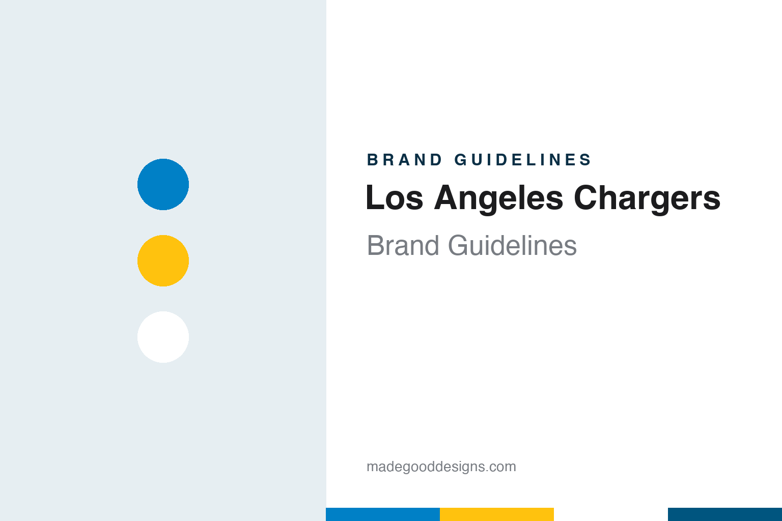
Los Angeles Chargers Brand Guidelines
From a Hilton franchise and a bugle call to a powder blue jersey and a flatter bolt.
Aa
Two constants: a powder blue, sunshine gold and white palette and a bold, italic athletic sans register. Abstract homage — not a Los Angeles Chargers product or mark; no helmet, uniform or logo is reproduced.
Los Angeles and San Diego
A hotel heir, a general manager’s name and a move down the coast.
The Chargers began as one of the clubs of a new league. The Pro Football Hall of Fame says the team was born on 14 August 1959, when Barron Hilton, a hotel executive, was awarded a franchise for Los Angeles in the new American Football League. English Wikipedia, which identifies Hilton as the son of the Hilton Hotels founder Conrad Hilton, says the Chargers were set up with seven other AFL teams in 1959 and began play in Los Angeles in 1960, at the Los Angeles Memorial Coliseum.
The name came from the general manager. Wikipedia, citing the Hall of Fame’s website, says Hilton agreed after Frank Leahy picked “Chargers”, and quotes Hilton saying he liked it because crowds were yelling “charge” and sounding the bugle at Dodger Stadium and at USC games. That origin leaves the word open to two readings, a cavalry horse or a jolt of electricity, and the club’s marks have used both: the early identity included a horse, while the lightning bolt became the sign that stayed.
The Los Angeles stay lasted one season. The Hall of Fame says that, with little fan support in Los Angeles, Hilton moved the team about 120 miles south to San Diego in 1961, encouraged by the San Diego sports editor Jack Murphy. Wikipedia says the club played at Balboa Stadium, which the city expanded for it, and moved in 1967 to San Diego Stadium, the venue later known as Jack Murphy Stadium and then Qualcomm Stadium. The team joined the National Football League through the AFL–NFL merger in 1970.
Ownership changed twice in the San Diego years. Wikipedia says Hilton sold the team in 1966 to a group of executives including Eugene V. Klein and Sam Schulman, and the Hall of Fame says Klein sold it in 1984 to Alex G. Spanos, a businessman from Stockton, California. The Spanos family has owned the Chargers since then.
Colour
One bolt, many blues and a return to powder.
The lightning bolt has been the constant. Wikipedia says that, apart from colour changes, the Chargers have essentially used an arc-shaped lightning bolt since the team’s debut in 1960. In the AFL years the club also used a shield with a horse’s head, a bolt and the word “Chargers”, and that shield returned for on-field design in the 2018 season.
The blues changed by decade. From 1960 to 1973, Wikipedia says, the jerseys were powder blue, a shade technically called collegiate blue, or white, both with gold bolts on the shoulders, and the white helmets carried the bolt in gold or navy along with the player’s number. Pants went from white to gold in 1966. In 1974 the sky blue gave way to a dark royal blue, the helmet turned dark blue and the facemasks went yellow. Navy jerseys arrived in 1985, and a 1988 revamp took the navy darker still, with white bolts trimmed in navy and outlined in gold.
Powder blue came back in stages. Wikipedia says the club wore early-1960s throwbacks in 1994 as part of the league’s 75th-season programme, and from 2002 to 2006 the powder blue jersey was a regular alternate. A March 2007 redesign kept navy as the main home colour but returned the bolt to gold, with navy outlining and a powder blue interior trim that Wikipedia describes as a nod to the 1960s, on a metallic white helmet. On 16 April 2019 the club announced that the powder blue jersey would become its primary home uniform, with the facemask switching from navy to gold.
The 2020 update finished the shift. The Associated Press reported on 24 March 2020 that the Chargers were keeping the lightning bolt as their primary logo but making it sleeker, with less of a curve, and that navy blue had been removed from the colours, leaving powder blue and sunshine gold as the predominant pair. The AP said the logotype gained a bolt in the “A” of the nickname and a bolder, more italic letterform, and quoted the team’s release describing it as a “bolt emoji” built into the wordmark. Both Los Angeles teams, the AP noted, were updating their looks ahead of the opening of SoFi Stadium, and because of the pandemic they unveiled the marks on social media and their websites rather than at events. Wikipedia says the uniforms followed on 21 April 2020, with powder blue as the primary colour and TV numbers moved from the sleeves to the helmets.
Typography
Design and documentation.
Professional football franchises are portable in a way that consumer brands usually are not. A team can keep its name, its colours and its helmet mark while changing cities, and the visual identity then has to work in a new market that did not grow up with it. Designers handling a relocation usually decide what to keep and what to localise: the nickname and the core mark often travel, while the city name, the stadium and the advertising change around them.
Colour is the other long-running thread. A shade retired in one decade can come back as an alternate uniform and then return as the primary look, and that kind of return is usually framed around heritage rather than novelty. The helmet is a compressed version of the brand, because a single mark on each side has to read clearly at distance and on screens of every size.
Stadiums add a further layer. Venue names, signage and wayfinding sit beside the team’s own mark, and when a team shares or moves venues, its identity has to hold its own against everything else on the building.
Aa
A bold, italic athletic sans — the register of a stadium wordmark and a sideline banner. (Specimen set in Oswald, a sans STAND-IN; NOT the Los Angeles Chargers logo, wordmark or numerals.)
Back to Los Angeles
A letter, a borrowed ground and a shared stadium.
The return was announced by letter. Wikipedia says the owner Dean Spanos announced the move in a letter to the city of San Diego posted on the team’s website on 12 January 2017, and that the club returned to Los Angeles for the 2017 season. The same day, Wikipedia says, the team showed an alternate logo of the letters “LA” with a bolt shooting through the crossbar of the A; it drew criticism for its resemblance to the Los Angeles Dodgers mark, and the club dropped it after two days.
The Chargers spent three seasons in a smaller venue. Wikipedia says the club played from 2017 to 2019 at the stadium in Carson, California, now called Dignity Health Sports Park and then known as the StubHub Center, home of Major League Soccer’s LA Galaxy. From the 2020 season the team has played at SoFi Stadium in Inglewood, which it shares with the Los Angeles Rams, and the Hall of Fame dates the move into SoFi to 2020 as well.
Alternates now draw on the San Diego years. Wikipedia says that on 15 July 2025 the club unveiled an all-navy “Super Chargers” uniform modelled on the early-1990s look, with a navy helmet recalling the navy helmets of 1985 to 2006, alongside an all-gold “Charger Power” set and a powder blue pants option. Navy, removed from the core palette in 2020, returns there as a throwback rather than as the everyday colour. The music has a San Diego thread too: Wikipedia says the fight song “San Diego Super Chargers” was recorded in 1979, replaced in 1989 under the new owner Alex Spanos with a cover version, and revived in 2002.
For a design guide, the Los Angeles Chargers show how a single mark can survive two moves and several palettes, with the bolt held constant while the blue around it shifted from powder to royal to navy and back. Compare a stadium neighbour in our Los Angeles Rams brand guidelines, the league itself in our NFL brand guidelines and the uniform maker in our Nike brand guidelines. For this guide we use powder blue, sunshine gold and white with a condensed sans, an unofficial interpretation; no product or logo is reproduced.
Explore & save
Keep Los Angeles Chargers’s identity on hand — save it to a board in the Made Good inspiration library.
Los Angeles Chargers identity set
Pin the Los Angeles Chargers powder blue, sunshine gold and white palette and the italic athletic sans register to your own board.