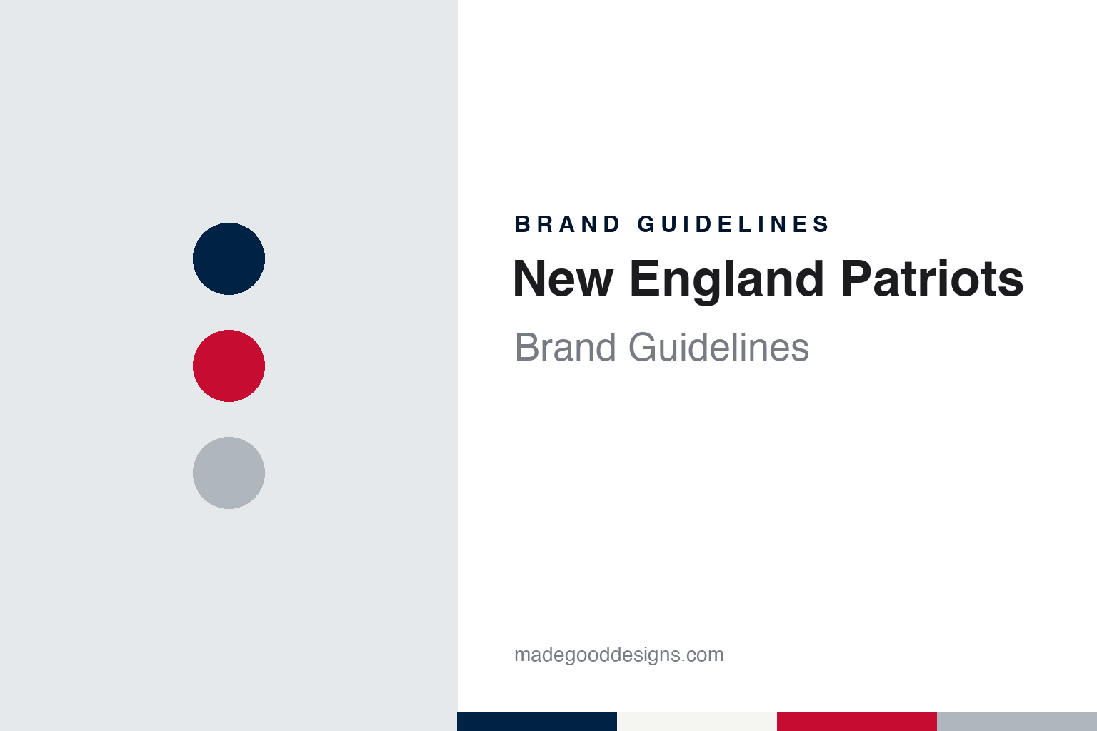
New England Patriots Brand Guidelines
A tricorne hat, a minuteman in a three-point stance, and a profile in flight.
Aa
Two constants: a nautical navy, minuteman red and helmet silver palette and a collegiate slab serif register. Abstract homage — not a New England Patriots product or mark; no helmet, uniform or logo is reproduced.
Boston Patriots
A new league, a newspaper contest and a hat.
The New England Patriots began as the Boston Patriots, a charter club of the American Football League. English Wikipedia says the Boston businessman Billy Sullivan was awarded the new league’s eighth and final franchise in November 1959; the Pro Football Hall of Fame’s team history dates the award to 22 November, Wikipedia to 16 November. Writing in The New York Times on 24 February 1998, Frank Litsky described Sullivan as a former newspaperman, printing salesman, college publicist and oil-company executive, and said that in 1960 he and nine partners bought that charter franchise. Litsky wrote that Sullivan had originally wanted a place in the established National Football League, which decided it did not want a team in Boston.
The name was chosen in public. Wikipedia says local people were invited over the winter to send in ideas for the new team’s name, and that Sullivan picked “Boston Patriots” from the suggestions, a reference to the colonists who rebelled against British rule in the American Revolution, in which the colony of Massachusetts was heavily involved. The team’s own history, published on Patriots.com on 21 February 2020 and attributed to the Patriots Hall of Fame, says the name was settled on 20 February 1960 after a contest run by The Boston Globe, in which 74 entrants suggested Patriots and others put forward names such as the Colonials, the Pilgrims, the Puritans and the Minute Men. The Pro Football Hall of Fame’s history says the nickname was selected by a panel of Boston sportswriters in a contest to name the team, in keeping with the region’s heritage.
The club’s opening mark was a piece of clothing. In a 28 July 2011 “Uni Watch” column for ESPN, Paul Lukas wrote that the team’s original helmet carried a tri-cornered hat, worn only in 1960, and that it was designed by Walter Pingree, a Boston fan who was not a professional designer and who sent his idea to Sullivan, who liked it enough to use it. Lukas wrote that Pingree’s original drawing is displayed at the Patriots Hall of Fame in Foxborough. The team says the same: the hat was submitted by a local fan who mailed in his suggestion.
The hat lasted one season. Wikipedia says the artist Phil Bissell of The Boston Globe developed the “Pat Patriot” logo, and the team says Sullivan adopted it after seeing the drawing in the newspaper. Pat Patriot, a Revolutionary War minuteman crouched over a football, was on the helmet from 1961 to 1992, Wikipedia says, alongside a western-style wordmark. The club played at several Boston grounds in its early years: the Hall of Fame lists Boston University Field in 1960 and 1961, Harvard in 1962 and 1970, and Fenway Park, the Red Sox ballpark, from 1963.
Colour
Foxborough, a regional name and four owners.
In 1971 the team moved to a new stadium in Foxborough, Massachusetts, and the move brought a new name. Wikipedia says the club first chose “Bay State Patriots”, after the state, that the league rejected it, and that in March 1971 the team announced it would be the New England Patriots. The team’s history says the change was made to represent the whole region. The Foxborough stadium opened as Schaefer Stadium, became Sullivan Stadium in 1983 and Foxboro Stadium in 1990, and Wikipedia says it was replaced in 2002 by Gillette Stadium, which also houses the team’s offices and its owning company, The Kraft Group.
Sullivan ran the club until 1988, when he sold it to Victor Kiam, Litsky wrote. Wikipedia says Kiam sold the team in 1992 to the St. Louis businessman James Orthwein. The New York Times reported on 22 January 1994 that Robert Kraft, a Boston businessman who had made his fortune in paper and paper products, had won the bidding to buy the team from Orthwein. The Times said Kraft had bought Foxboro Stadium at a bankruptcy sale six years earlier, that a rival bidder had hoped to move the team to St. Louis, and that Kraft said he would have sought an injunction to keep the team in Foxboro. Kraft has owned the Patriots since 1994.
The visual overhaul came just before that sale. Wikipedia says Orthwein and his marketing staff commissioned the league to develop a new identity, and changed the primary colours from the traditional red, white and blue to blue and silver. The 1993 uniforms paired a royal blue home jersey and a white road jersey with a silver helmet and silver trousers. The team’s history says the move from red to blue was partly a nod to the red coats worn by the British during the Revolution, and that it brought silver onto the uniform.
Later changes were steps rather than leaps. Wikipedia says the club switched from royal blue to a darker nautical blue in 2000, adding blue trousers to the white road set, and that an all-navy “Color Rush” design first worn in 2016 became the primary home uniform in 2020, with truncated shoulder stripes as a nod to the Pat Patriot era. The red throwback set returned in 2022, after the league again allowed teams a second helmet shell, and the costumed mascot, also called Pat Patriot, has been the club’s official mascot since 1995, Wikipedia says.
Typography
Design and documentation.
Visual identity in professional American football works across a few fixed surfaces. The helmet logo is a mark seen often, applied as a decal on a curved shell and read from a distance on television and in the stands, so it tends to be a compact shape with a clear outline that still works when it is small. Many helmet marks are a single letter, a monogram or a simple symbol, set on a shell colour that is part of the identity in its own right.
Uniform colours carry much of the recognition. A team usually works with two or three main colours plus white, used across home and road jerseys, pants, socks and trim, and the stripe patterns on sleeves and pants become recognisable details over time. Alternate and throwback uniforms let a team revisit older looks without replacing its main kit.
Wordmarks are the custom lettering used for team names on merchandise, signage and broadcast graphics, often paired with the helmet logo. Numerals on jerseys follow their own drawn styles. In stadiums, end-zone graphics painted on the turf repeat the wordmark and colours at large scale, and midfield logos give the field its own centrepiece. For a designer, the useful lesson is how one small mark has to hold together across a helmet, a jersey, a field and a screen.
Aa
A collegiate slab serif — the register of a varsity jersey number and a stadium sign. (Specimen set in Graduate, a slab-serif STAND-IN; NOT the New England Patriots logo or wordmark.)
Proto-Elvis and Flying Elvis
A booed sketch from 1979 and its descendant.
Pat Patriot nearly went much earlier. In his 2011 ESPN column, Lukas interviewed Mical Chamberlain, the team’s marketing director in 1979 and Billy Sullivan’s son-in-law, who said he had pushed for a new logo because the old one was a complicated illustration and difficult to market. Chamberlain told Lukas that NFL Properties, the league’s creative arm, designed the replacement, a minuteman in profile, and that Sullivan then insisted on putting it to a vote with the fans at halftime of a home game. Lukas wrote that Boston Globe articles confirm the vote took place in September 1979, and Chamberlain recalled that the crowd booed the new design. Pat Patriot stayed.
Fourteen years later the profile came back in a new form. The 1993 logo is a grey minuteman’s face under a red, white and blue hat that begins as a tricorne and streams back like a banner; Wikipedia says it became known as the “Flying Elvis” because many people saw a resemblance to a young Elvis Presley. Lukas reported that NFL Properties outsourced the job to the California designer Stan Evenson, and that Evenson’s intern Ken Loh, then a college student, executed the concept sketch that was developed into the final mark. Evenson told Lukas that NFL Properties had sent his studio a creative brief that included designs from the 1979 project. Loh said he had been shown the earlier logo, described to him as something the fans hated, and had tried hard not to copy it, aiming for something far more streamlined.
The mark has been adjusted rather than replaced since. Wikipedia says the blue of the tricorne moved from royal to nautical blue in 2000. On 3 July 2013 the team introduced a new wordmark, and NFL.com’s Marc Sessler reported that day that solid blue block letters were replacing the earlier script version, sitting above the Patriot, with no change to the helmets. Wikipedia says the new wordmark reached the uniforms in 2015.
For a design guide, the New England Patriots show how a club can carry two identities at once: a detailed newspaper-cartoon minuteman that survived a crowd vote in 1979, and a streamlined profile drawn in a design studio for 1993, worn side by side on throwback and primary uniforms. Compare it with NFL, whose licensing arm commissioned the profile, and Pittsburgh Steelers, another club whose helmet mark was borrowed from outside football. For this guide we use nautical navy, minuteman red and helmet silver with a slab serif, an unofficial interpretation; no product or logo is reproduced.
Explore & save
Keep New England Patriots’s identity on hand — save it to a board in the Made Good inspiration library.
New England Patriots identity set
Pin the New England Patriots nautical navy, minuteman red and helmet silver palette and the collegiate slab serif register to your own board.