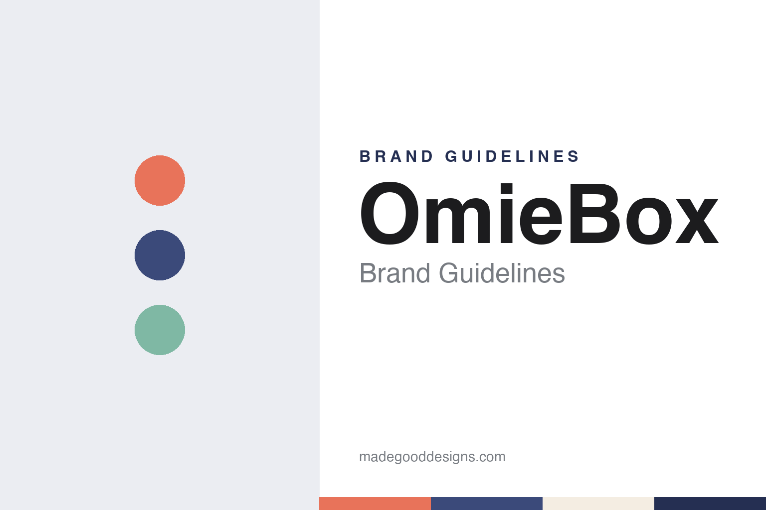
OmieBox Brand Guidelines
A bento lunchbox from South San Francisco, designed around one preschooler’s lunch.
Aa
Two constants: a coral, indigo and sage palette and a rounded friendly sans register. Abstract homage — not an OmieBox product or mark; no lunchbox, pack or logo is reproduced.
A lunchbox that started at preschool
One parent, one uneaten lunch, one new container.
OmieBox is a bento-style lunchbox for children made by OmieLife Inc., a company based in South San Francisco, California. The company’s own account of its beginnings is short and specific. It says that when founder Nancy Yen’s son started preschool, lunchtime became a challenge: he missed warm meals and struggled with his containers, and after many uneaten lunches Yen set out to change how children take lunch to school. The company sums up that starting point in one line — “It all started with the idea to transform the bento box.”
The same story was told in the brand’s first wave of press. On 18 July 2014, the product review site Reviewed published a piece by Kori Perten introducing the OmieBox. The article said Yen had noticed that her preschooler’s packed lunch was coming home uneaten every day, that she had designed a lunchbox in response, and that she had created the OmieBox with “her small OmieLife team.” It described the result as a bright, bento-style container.
The name has stayed constant. The company trades as OmieLife, and the lunchbox has always carried the shorter Omie prefix.
Colour
From a holding page to a Kickstarter launch.
The web record of the brand begins before the product existed. An Internet Archive capture of omielife.com from 22 October 2013 shows a simple holding page headed “Coming Soon”, saying that OmieLife was launching soon and that it was helping parents give their children healthy and tasty lunch options. Visitors were invited to join a beta invite list and to follow the company on Facebook for news of what it was “cooking up”.
By the following year the product had a name, a tagline and a crowdfunding campaign. Reviewed reported in July 2014 that the team was looking to Kickstarter for funding and that boxes were estimated to ship in October if the campaign met its goal. A capture of the same website from 21 December 2014 shows the finished pitch: the words “OmieBox — Healthy. Happy. Easy.”, a line inviting parents to “wrap their lunches with your love”, and a banner announcing “We’ve launched on Kickstarter!” with thanks to the project’s supporters. The footer read “© 2014 OmieLife Inc.” and “Patent Pending”.
That 2014 page explained the product under three headings. The first was an insulated bowl which, the company said, kept main dishes hot or cold without changing the temperature of the side compartments. The second was “Easy for little hands”, with the company saying children could open the box themselves. The third was compact organisation. Reviewed listed the same parts in its own words: a vacuum-insulated bowl that could be lifted out to reveal a sandwich-sized compartment, a utensil holder, a removable compartment divider and handles designed for children to use.
Typography
Design and documentation.
Lunchbox and food-carrier brands sit at a busy point in the household, between the kitchen counter and the school gate, the office desk or the picnic blanket. Some began with a parent’s own improvised prototype; others grew out of established housewares companies, and a single brand can be sold everywhere from a supermarket aisle to its own website.
A carrier’s identity is usually built less on a logo than on the object itself — its shape, its prints and colours, the way it opens and the name printed on its side — because the product is handled, washed and packed again every day. The companies behind these names may have changed hands, widened their ranges or moved where their products are made since they started.
That makes the plain questions worth asking: who started each brand, who owns it now, and where its products are actually made. Each guide separates what independent, dated sources record from what the company says about itself — its founding story, its owners over time, its manufacturing and the way its packs and prints have changed — and marks plainly what rests only on the company’s own word.
Aa
A rounded sans for a lunchbox made for small hands. (Specimen set in Nunito, a rounded sans-serif STAND-IN; NOT the OmieBox logo.)
OmieBox
One box grows into a family of mealtime tools.
Today the company presents the original box as the start of a range rather than a single product. Its website lists the OmieBox, the OmieBox UP and the OmieBox Lite, together with the Easy Scoop Plate, and describes its wider aim as making mealtime tools for children, from keeping food warm to helping children learn to feed themselves. The company still gives its address as South San Francisco and still tells the same preschool story on its About page.
The current website also shows how the brand has grown beyond a single box while keeping one naming system. Its menu sorts the bento boxes by age, listing the OmieBox and OmieBox Lite for children from three and the OmieBox UP for children from nine, and each box has its own short line: “Hearty Main, Light Side” for OmieBox UP, “Simple lunches, made special” for OmieBox Lite and “Made for self feeding” for the Easy Scoop Plate. The accessories follow the same pattern, with names such as OmieBottle, OmieChill, OmieTote and OmieGo, so that the Omie prefix does the work of a family name. The company now often styles itself OMIE in capitals, and it sets out its approach under the heading “Fewer, Smarter Things”, saying it makes fewer products but makes them better. A quotation from the founder on the same page, signed simply “Nancy, Founder of OmieLife”, says that “when you’re a parent, little things aren’t little, they’re everything.”
The company’s press page shows how it wants the product to be seen. It gathers quotations from outlets including Food Network, TODAY, CNN, Fast Company, Parents and ABC News Live. Two of those quotations speak directly to identity. The company quotes CNN as saying, “Its color-block design is perfect for the kid who has outgrown styles festooned with unicorns,” and quotes ABC News Live as saying the product “was developed by a mom of a preschooler, who really felt like she couldn’t find what she needed.” One describes the look; the other repeats the founding story.
For a design guide, OmieBox shows how a small company can build an identity from one documented origin story and one functional idea, then extend the name across a family of products without changing either. Compare Yumbox, another bento-style lunchbox for children, and Thermos, the name most associated with vacuum-insulated food and drink containers. For this guide we use coral, indigo and sage with a sans, an unofficial interpretation; no product or logo is reproduced.
Explore & save
Keep OmieBox’s identity on hand — save it to a board in the Made Good inspiration library.
OmieBox identity set
Pin the OmieBox coral, indigo and sage palette and the rounded friendly sans register to your own board.