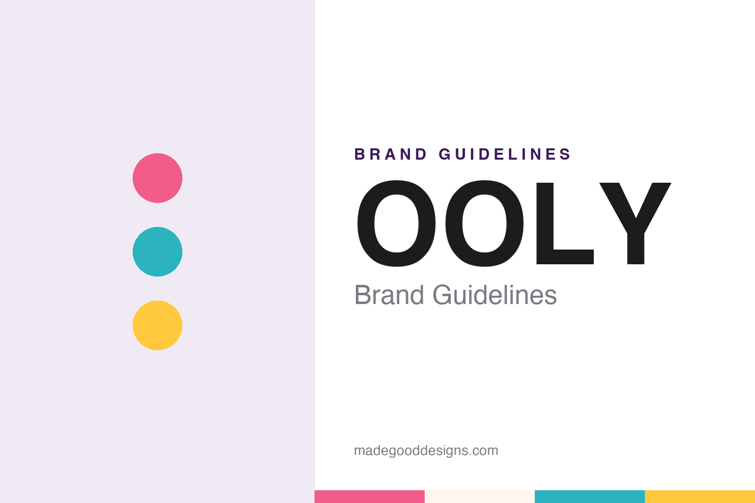
OOLY Brand Guidelines
A stationery house that renamed itself for colour.
Aa
Two constants: a pen pink, marker teal and sunny yellow palette and a rounded display sans register. Abstract homage — not an OOLY product or mark; no pen, marker, pack or logo is reproduced.
From International Arrivals to OOLY
The company is older than its name.
OOLY is a young name on an older business. On its own “Meet OOLY” page, the company says its founder, Carol Pankiw, co-founded International Arrivals in 2005, a business that brought what the company calls a design-forward touch to stationery and home office supplies. In 2017, the company says, Pankiw rebranded the business to focus on arts and crafts, and that is when OOLY was born.
That sequence explains a date that might otherwise look odd. In May 2025 the Carlsbad Chamber of Commerce congratulated OOLY on its 20th anniversary in a ribbon-cutting post, which counts the brand’s history from the International Arrivals years rather than from the 2017 renaming. The chamber’s post marked two decades of what it called “sparking creativity, building community, and spreading colorful inspiration”. The chamber described OOLY as a woman-owned, San Diego-based brand and referred to its Carlsbad headquarters, which matches what the company itself says.
The company places the start of the OOLY story in a single product. It says the line began with Yummy Yummy Scented Glitter Gel Pens, which its own timeline dates to 2011, and that those pens paved the way for the rest of the range. In the company’s own timeline, then, the gel pens predate the OOLY name by six years.
OOLY says it is headquartered in Carlsbad, California, in northern San Diego County, and the company’s FAQ gives a Carlsbad business address for its headquarters. The company describes its aim as delivering arts, crafts and school supplies that inspire creativity and self-expression, and it closes that description with its sign-off line, “Create Your Happy”.
Colour
A timeline told through products.
OOLY tells its own history mostly through product launches, and the timeline on its website reads like a catalogue of formats. After the scented gel pens of 2011, the company lists Magic Puffy Pens in 2015, Chunkies Paint Sticks in 2016 and Switch-Eroo Color Changing Markers in 2017, the year of the renaming. It then lists Rainbow Sparkle Watercolor Gel Crayons in 2018, Creatibles Air Dry Clay in 2019, Cat Parade Watercolor Gel Crayons in 2020 and Shrink-its! shrink-art kits in 2023.
Those names carry much of the brand’s voice. Several describe what the product does, from colour-changing markers to watercolour gel crayons and shrink-art kits. The company describes its products as whimsical and colourful and says it wants them to make people of all ages smile.
The range now spreads well beyond pens. The navigation on OOLY’s website groups products into activity and craft kits, colouring and drawing, and planning and organising, with categories that include stickers, temporary tattoos, sketchbooks, highlighters and fountain pens alongside markers, crayons and gel pens. The most recent entry in the company’s timeline is a licensed range, the OOLY x Peanuts Collection, dated 2025.
Not every line has stayed. OOLY’s FAQ says the company decided to pause sales of its Calico Sun line, and that while those products are no longer sold on OOLY.com, they remain available in select independent stores while supplies last. The same FAQ says OOLY products are sold in independent gift, stationery and toy stores and through national retailers, as well as on the company’s own website.
Typography
Design and documentation.
Marker brands work in a narrow visual space. The product is a tube, a cap and a tip, so much of the identity sits on surfaces only a few centimetres wide: the barrel print, the cap colour and the pack that holds a set together. Cap and barrel colours usually signal the ink inside, which means the product itself doubles as a colour chart, and the brand mark has to sit alongside that chart without fighting it.
Packs carry the rest of the work. A set is often shown fanned out in a window or on a printed card, letting the range of colours act as the main image, while a wordmark, a tip type and an ink type are named in a few short lines. Brands aimed at classrooms and children tend towards rounded type and bright primaries; office and studio lines tend towards plainer sans serifs and a single strong house colour.
Naming is a design tool too. Colour names, scent names, themed sets and tip descriptions all add a layer of language that the logo alone cannot carry, and a well-chosen name can make a single colour memorable long after the pack is gone.
Aa
A rounded, friendly display sans. (Specimen set in Baloo 2, a rounded-sans STAND-IN; NOT the OOLY logo.)
OOLY
A Carlsbad company with a local footprint.
OOLY presents itself as a founder-led company. Its website names Carol Pankiw as founder and describes the business in the first person, as a team; the Carlsbad Chamber of Commerce, in its 2025 anniversary post, called it woman-owned. The company also sets out a short list of values on its “Meet OOLY” page — ownership, innovation, community, collaboration and curiosity — each written in the same colouring-in vocabulary as the products, with phrases about colouring outside the lines and turning doodles into masterpieces.
The company ties that voice to its home region. OOLY says it supports local nonprofits focused on art and children, and names Kids For Peace, Adopt A Classroom, ArtReach San Diego and the Oceanside Museum of Art among them. It says that support takes the form of product donations, raffle baskets and financial contributions to schools and community organisations, and its website carries a page for donation requests and a separate page for wholesale enquiries.
The company writes its name in capitals on its own website, including in collection names such as the OOLY x Peanuts Collection. The site also carries a reviews page, a library of product how-to videos, a craft blog and a craft guide, along with seasonal shops such as a Halloween crafts section. Within the activity and craft kits category, the company lists shrink-art kits, colouring books, activity cards, and paint and canvas kits alongside air-dry clay.
For a design guide, OOLY shows how a stationery business can rebuild its identity around a product voice: names that describe what a pen or crayon does, a capitalised name and a sign-off line that turns the brand into an invitation. Compare a Pennsylvania colour company in our Crayola brand guidelines and a scented-marker classic in our Mr. Sketch brand guidelines. For this guide we use pen pink, marker teal and sunny yellow with a rounded display sans, an unofficial interpretation; no product or logo is reproduced.
Explore & save
Keep OOLY’s identity on hand — save it to a board in the Made Good inspiration library.
OOLY identity set
Pin the OOLY pen pink, marker teal and sunny yellow palette and the rounded display sans register to your own board.