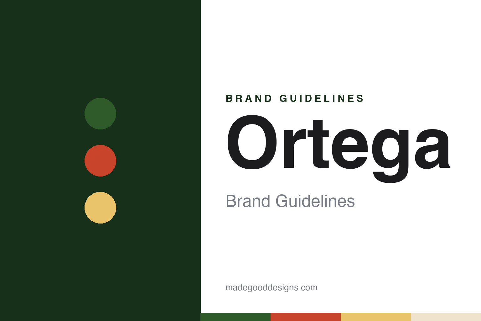
Ortega Brand Guidelines
An adobe on Main Street, a son back from New Mexico and a roasted chile.
Aa
Two constants: a roasted green, clay tile red and Ventura sun palette and a high-contrast serif register. Abstract homage — not an Ortega product or mark; no can, pack or logo is reproduced.
An adobe on Main Street
A Ventura family home, thirteen children and a son who came back with seeds.
Ortega is an American brand of green chiles, taco shells, sauces and Mexican-style meal kits, and B&G Foods has owned it since 2003. Its story is tied to a single building: a small adobe house on Main Street in Ventura, California, near the mouth of the Ventura River.
English Wikipedia says the adobe was built in 1857 by Emigdio Ortega, a grandson of José Francisco Ortega. Lumber was scarce in the Ventura area, and Wikipedia, drawing on a 1924 letter by Emigdio’s son Emilio, says the beams and rafters were hauled forty miles by oxcart from an abandoned adobe, while roof tiles and bricks were bought from the fathers of nearby Mission San Buenaventura after the 1857 Fort Tejon earthquake shook the mission’s tiles loose.
The house was a family home for decades. Emigdio and his wife, Maria Conception Jacinta Dominguez Ortega, had thirteen children, according to both Wikipedia and the company. In 1866 the Ventura River flooded and took away part of the building; Emilio later wrote that the family’s possessions and pets were swept out to sea, and Wikipedia quotes his memory of running along the beach in the hope of finding them.
The brand today tells its story through the mother of that household. Ortega’s own history, published by B&G Foods, calls her “Mama” and describes her cooking for the family on a small charcoal-burning stove in a three-room adobe, with home-grown tomatoes for sauces and corn patted into tortillas. The company presents her kitchen as the place where the Ortega tradition started.
The chiles arrived with one of her sons. The company says Emilio Ortega moved to New Mexico in 1890 and became fascinated with chiles, preferring the state’s big red chile when it was still young and green, because it was tender and mild. A few years later, the company says, he returned home to California with chile seeds, planted them at the family home, and grew so many chiles in Ventura’s climate that he had to give them away.
The next step was preservation. The company says Emilio worked out how to roast, peel, seed and wash the chiles so they could be packed, and that the Ortega chile business was born in his mother’s kitchen. Wikipedia names Emilio as the Ortegas’ eleventh child and says that in the late 1890s the family began roasting chiles in the adobe’s kitchen and built a wood shed next to the house, where the products were canned. The Ventura County Museums network likewise says it was within the adobe that Emilio Ortega began fire-roasting chiles. Food Business News, in a report dated 8 September 2025, gives 1897 as the brand’s founding year.
Colour
A Ventura factory, Los Angeles, a 1946 sale, Nestlé and B&G Foods.
The business grew out of the adobe quickly. Wikipedia, citing the Los Angeles Times of 19 November 1899, says that by 1899 Emilio’s company, which it calls the Ortega Chile Packing Company, had opened a factory three miles from Ventura, producing cans of roasted green chiles and green chile salsa. The company itself uses the name Ortega Chile Packaging Company.
Within a few years the family moved on from Ventura. Wikipedia says the Ortega food business moved to larger quarters in Los Angeles in the early 1900s, and that the adobe was sold in about 1903 or 1905 to Ung Hing, a Chinese immigrant. The house passed to Edgar Carne in 1913, and the City of Ventura acquired it in 1921, leasing it over the following decades as offices, a veterans’ hall, a police station and a boys’ club meeting hall.
The Ortega name stayed in the public eye through advertising. Wikipedia quotes the Los Angeles Times Sunday Magazine of 9 February 1936, which said the house of Ortega was widely advertised in that generation by E. C. Ortega, whose canned chile products, it wrote, tingled epicurean palates around the world.
The family’s ownership ended after the Second World War. Ortega’s own history says that in 1946 the Ortega family sold the business, and that the new owners continued to build and modernise it.
By the early 2000s the brand belonged to Nestlé. A press release dated 21 August 2003, published by the private equity firm Bruckmann, Rosser, Sherrill & Co., which then held a majority interest in B&G Foods, announced that B&G had completed its purchase of the Ortega brand from Nestlé Prepared Foods Company, part of Nestlé USA. The release listed Ortega’s categories as salsas, peppers, taco sauce, taco kits, Mexican spices and taco shells. B&G’s chief executive at the time, David L. Wenner, said in the release that Ortega met the company’s criteria as a recognised niche or specialty brand that could make use of B&G’s marketing and distribution. The release gave B&G’s base as Parsippany, New Jersey; its brands at the time already included Las Palmas, Trappey’s and the pickle maker B&G.
Under B&G the range has continued to change. Food Business News reported on 8 September 2025 that Kenneth Keller, B&G’s president and chief executive, told an investor conference in Boston on 3 September that Ortega faced new competition in Mexican meal preparation, including from Taco Bell, Siete and Old El Paso, and that the loss of a chile crop in South America had cut supply. Keller said B&G was launching a Cheez-It-licensed cheese taco shell, new green sauces and enchilada kits under the brand.
Typography
Design and documentation.
The names in this group sit on supermarket shelves as salsa jars, tortilla packs, bean cans and frozen-burrito boxes. Packaging of this kind has to work at a glance: a shopper scanning a long aisle of similar jars or a freezer door of similar boxes reads colour, a name and a picture of the food before reading any small print, so a label’s job is to make one product easy to find again on the next visit.
Each format has its own constraints. A jar label wraps around glass and leaves room for the colour of the salsa to show through; a tortilla pack is soft and folds, so the name has to survive creases; a can label is printed flat and read on a curve; and a frozen box has to stay legible behind frosted glass. Heat levels, flavours and sizes are usually signalled with colour bands or small badges rather than new designs.
Each guide separates what independent, dated sources record about a brand — who started it, who owns it now and where its food is made — from what the company says about itself, and marks plainly what rests only on the company’s own word.
Aa
A high-contrast serif — the old-California register of a family adobe and a hand-roasted chile. (Specimen set in DM Serif Display, a serif STAND-IN; NOT the Ortega logo.)
The adobe on the can
A house as a trademark, a mother as a narrator and a landmark you can visit.
A central visual idea for Ortega is a building. Wikipedia, citing the Los Angeles Times of November 1899, says the cans of roasted green chiles and green chile salsa produced at the Ventura factory bore an image of the old adobe. The family home, in other words, became the picture on the product within a few years of the business starting.
The image outlasted the family’s move away from the house. Wikipedia says that even in the 1930s the company’s advertising continued to appeal to the romance of old California, and cites an Ortega advertisement in the Los Angeles Times of 3 January 1939 featuring a picture captioned “The Original Ortega Adobe Still Standing in Ventura, California”. By then the company had been operating from Los Angeles for decades, and the city owned the house.
The building itself was later saved as a monument. Wikipedia says that by the late 1960s the adobe was vacant and decaying, that the Ventura city council voted in September 1969 to restore it as a historical museum, and that after two years of restoration by volunteers and an archaeologist it opened to the public in April 1971. The Ventura County Museums network says it was designated in 1974 as the City of Ventura’s Historic Landmark No. 2 and is owned by the city and operated as a self-guided historical site.
The modern brand voice keeps the same domestic setting but changes the narrator. Where the 1930s advertising pointed to a house, the company’s current history page speaks through a person: Mama Ortega, her thirteen children, the charcoal stove and the tortillas. It closes by saying the company is still inspired by Mama’s cooking and invites readers to use Ortega recipes to make memories of meals shared with their own families. The emphasis on roasting runs through both versions, from the adobe kitchen in the 1890s to the products B&G sells today.
For a design guide, Ortega shows how a house can serve as a brand mark for well over a century: an adobe that appeared on the cans, reappeared in advertising after the family had left it, and still stands as a public landmark. Compare it with Old El Paso, another American Mexican-food brand built on a border-country name, and B&G, the pickle brand of the same owner. For this guide we use roasted green, clay tile red, Ventura sun and adobe plaster with a high-contrast serif, an unofficial interpretation; no product or logo is reproduced.
Explore & save
Keep Ortega’s identity on hand — save it to a board in the Made Good inspiration library.
Ortega identity set
Pin the Ortega roasted green, clay tile red and Ventura sun palette and the high-contrast serif register to your own board.


