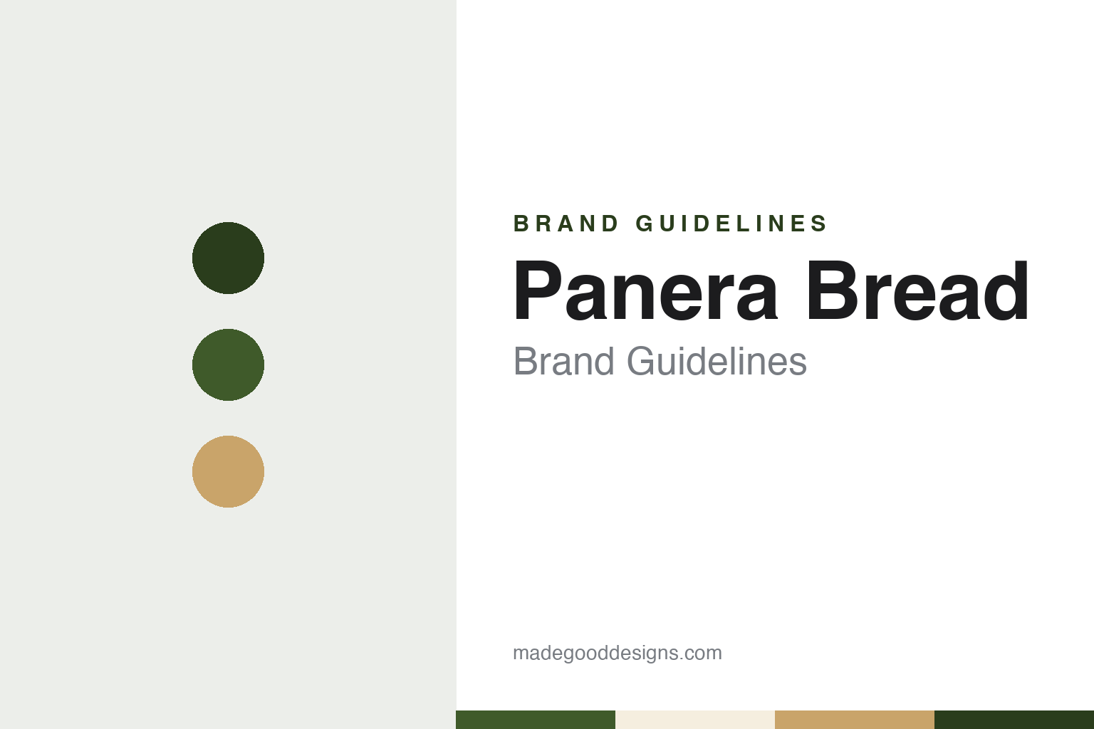
Panera Bread Brand Guidelines
The St. Louis bakery-café whose name means breadbasket.
Aa
Two constants: a basket green, crust wheat and flour cream palette and a warm bakery serif register. Abstract homage — not a Panera Bread product or mark; no logo, figure or sign is reproduced.
St. Louis Bread
A sourdough café, a Boston bakery chain and a Latin name.
Panera Bread began in Missouri under a different name. English Wikipedia says Ken and Linda Rosenthal founded the St. Louis Bread Company in 1987, opening their first bakery-café in Kirkwood, a suburb of St. Louis. Ken Rosenthal had learned sourdough baking at La Boulanger, a bakery-café in San Francisco, where he trained under its owner, Roger Brunello, after a visit his brother had urged him to make.
In 1993 the company was bought by Au Bon Pain Co., the Boston bakery-café operator. The Washington Report, the newsletter of the National Chicken Council, set out the line of descent in November 2017: Ron Shaich created Au Bon Pain Co. with his partner Louis Kane in 1981, the company went public in 1991, acquired Saint Louis Bread Company in 1993 and renamed it Panera, and later sold Au Bon Pain so that its resources could go into the younger chain. Shaich, the newsletter reported, was Panera’s founder, chairman and chief executive at the time.
The new name arrived in 1997. Wikipedia says Au Bon Pain changed the company name to Panera, a word with roots in the Latin for “breadbasket” and identical to the word for breadbasket in Spanish and Catalan. The original name was kept for the cafés in Missouri, and the St. Louis bakery-cafés were renovated in the same year. In May 1999 Au Bon Pain Co. sold the Au Bon Pain chain to the investment firm Bruckmann, Rosser, Sherrill & Co. to concentrate on the Panera Bread chain, Wikipedia says, and from then on the company carried the Panera Bread name.
The company stayed in the St. Louis area. Wikipedia records a move of its headquarters to Richmond Heights, Missouri, in 2000, a further move to Sunset Hills in November 2010, and a move to a smaller office in Fenton, Missouri, in mid-2023. In October 2008 the chain crossed into Canada with cafés in the Greater Toronto Area, in Richmond Hill, Thornhill, Oakville and Mississauga. It also absorbed a western bakery-café brand: Panera bought a stake in Paradise Bakery & Café, based around Phoenix, in 2007, took the rest in 2009, and in September 2015 rebranded every Paradise location as Panera Bread.
Colour
JAB Holding, Panera Brands and a city with two names.
Panera left the stock market in 2017. JAB Holding Company, the investment group of Germany’s Reimann family, acquired it on 11 July 2017, Wikipedia says, and The Washington Report confirmed in November that year that Panera had gone private in July through its purchase by JAB, which also owned Caribou Coffee, Krispy Kreme, Keurig Green Mountain and Peet’s Coffee & Tea. JAB has owned Panera since 2017. The same report said Shaich would step down as chief executive from 1 January 2018 and remain chairman, with Blaine Hurst taking over as president and chief executive.
The 2017 report also covered a reunion. Panera agreed in November 2017 to acquire Au Bon Pain Holding Co., the Boston bakery-café chain that had once owned it. “With the acquisition we are announcing today, we are bringing Au Bon Pain and Panera together again,” Shaich said in a statement quoted by the newsletter, which added that Panera saw the deal as a way into hospitals, universities, transportation centres and urban sites. Wikipedia says Panera sold Tatte Bakery & Café, a Boston-area chain it had bought into in 2015, to Shaich’s Act III Holdings in January 2018.
A wider group followed. Wikipedia says that on 25 August 2021 Panera merged with Caribou Coffee and Einstein Bros. Bagels to form Panera Brands. Restaurant Business reported in March 2025 that Panera Brands, the fast-casual group that includes Panera Bread, Caribou Coffee and Einstein Bros. Bagels, is owned by Luxembourg-based JAB Holding, and that Paul Carbone, the group’s former chief financial officer, had been named permanent chief executive. NBC News, carrying a CNBC report, had said in January 2025 that the previous chief executive, José Alberto Dueñas, was stepping down and that Carbone would serve in the interim.
St. Louis kept its own name for the chain for decades. In September 2022, Wikipedia says, Panera announced that legacy St. Louis Bread Co. locations outside St. Louis City and St. Louis County would be rebranded as Panera when remodelled, while cafés in the inner core of the metropolitan area would keep the Bread Co. name. One location in St. Louis County carries the Panera name because it is a prototype of the “Next Gen” restaurant design.
Typography
Design and documentation.
A sit-down or entertainment restaurant brand is carried less by one product than by a whole room. Its name appears first on a roadside sign, a roof line or a canopy over the door, then again on the menu, the server’s apron, the glassware and the receipt. Each of those surfaces asks something different of a logo: a pole sign has to work from a moving car at night, a laminated menu has to hold a long list of item names in a readable order, and a mark printed on a cup or a game card has to survive being very small.
The interior is part of the identity too. Booths, counters, buffet sneeze guards, carpet patterns, lighting and the colour of the walls all set a register before anyone reads a word, and a chain that renovates its dining rooms is changing its brand as surely as one that redraws its logo. Arcades and bars inside a restaurant add screens, prize counters and their own signage to that mix.
Each guide that follows records who founded the brand, who has owned it since, and how its name, sign and rooms have been documented over time, separating independent reporting from what the company says about itself.
Aa
A warm bakery serif — the register of a chalkboard, a bread bag and a café sign. (Specimen set in Fraunces, a serif STAND-IN; NOT the Panera Bread logo or wordmark.)
Panera Bread
Mother Bread, an oven-shaped frame and a handwritten name.
The figure at the centre of the Panera logo is a woman with long hair holding a loaf, known as Mother Bread. In 2021 the London agency BrandOpus redrew her. Creative Boom, reporting on 21 May 2021, said the agency was briefed to increase the brand’s relevance with consumers, that its research pointed to a need for a more “abundant and welcoming” feeling, and that the new logo showed Mother Bread breaking bread towards guests to “symbolise warmth, generosity and bringing people together,” in BrandOpus’s words. The agency described her hair as flowing “wild and free.”
The frame changed as well. According to the same report, BrandOpus replaced the earlier square holding shape with a new one, hand-drawn to reflect a bread oven, and redrew the wordmark so that it reads more like handwriting, “evoking a sense of passion, naturalness and authenticity,” the agency said. The previous colour palette was retained but evolved and expanded to give a “fresher” and more “energised” feel. Creative Boom said the logo and other new design elements would roll out across Panera’s packaging, restaurant décor, signage, website and app during the year. Nir Wegrzyn, BrandOpus’s chief executive, said the hardest part was preserving the memory structures from Panera’s heritage while adding new associations.
The buildings followed. Nation’s Restaurant News reported on 18 November 2021 that Panera’s next-generation café design had opened in Ballwin, Missouri. It brought a double drive-thru with a dedicated pickup lane, contactless ordering and updated kiosks, and moved the bakery ovens to the front of the store so guests could watch baked goods being made. The design also added “clear and concise wayfinding” signs separating rapid pickup areas from the queue for in-store ordering. The magazine noted that in May Panera had unveiled the new logo with Mother Bread cradling a loaf, “a nod to the chain’s roots as a bread bakery.” Eduardo Luz, then Panera’s chief brand and concept officer, spoke of “a warm, inviting environment” in the statement announcing the design.
For a design guide, Panera Bread shows how a single drawn figure, a Latin-rooted name and a regional alias can sit together in one identity, with the oven, the bread counter and the signage all pointing back to the loaf. Compare it with Caribou Coffee, its sister brand in Panera Brands, and Chipotle, another fast-casual chain built around a counter. For this guide we use basket green, crust wheat and flour cream with a serif, an unofficial interpretation; no product or logo is reproduced.
Explore & save
Keep Panera Bread’s identity on hand — save it to a board in the Made Good inspiration library.
Panera Bread identity set
Pin the Panera Bread basket green, crust wheat and flour cream palette and the warm bakery serif register to your own board.