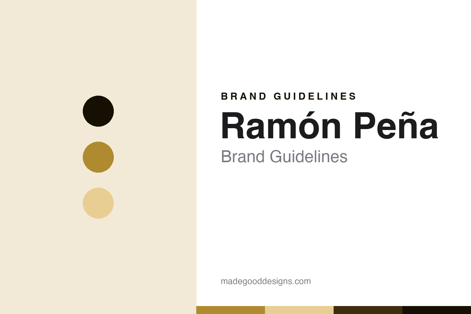
Ramón Peña Brand Guidelines
The gold-tin house of Galicia.
Aa
Two constants: a tin-gold palette and a gold-tin-sans register. Abstract homage — not a Ramón Peña product or mark.
The gold-tin house of Galicia
Ramón Peña is the Galician conservas house of Rías Baixas shellfish — presented in its premium gold tin.
Ramón Peña brings the round its Galician shellfish — the conservas house from the Rías Baixas, founded in 1920, known for mussels, clams, cockles and razor clams from the Galician rías, presented in its distinctive premium gold tin. Ramón Peña makes premium Galician tinned seafood, and its answer to a round about the art of the tin is provenance and presentation: the shellfish of the rías, hand-packed, in a gold tin. A brand, from the rías.
Its identity is the gold-tin house of Galicia. Ramón Peña’s Rías Baixas shellfish, its 1920 heritage and its gold tin are the story here. A brand, Galician. The gold-tin house of Galicia.
(Honest notes, so the story stays precise. Ramón Peña — at conservasramonpena.com, its live current site, not the dead ramonpena.com — makes a broad premium range of Galician tinned seafood: mussels, including a protected-origin mussel line, clams, cockles, razor clams, scallops, sardines and bonito. It was founded in 1920 in Galicia, with its home in Ribadumia, in Pontevedra, in the Rías Baixas region, near Cambados, so we say Rías Baixas and Ribadumia, not O Grove. Its famous gold tins are genuine and prized, but its own site organises products by species rather than a named line, so we describe the gold-tin premium presentation rather than asserting a Serie Oro or Gold Line as an official product name. On where it is made — a theme of this round — the Galician and Rías Baixas provenance and the artisanal, hand-packed process are confirmed. On ownership, the site speaks of generations of professionals, so we say it is widely regarded as a family-run Galician house, framed softly, since a specific ownership structure is not stated. Its name, logo and gold-tin trade dress are IP we describe but do not reproduce; there is no official brand hex; these tones are an unofficial interpretation. This is design commentary, not promotion.)
Colour
Ramón Peña lives in a tin gold. Click a swatch to copy the hex.
Ramón Peña’s identity is Galician, premium and gold-toned — a tin gold, an ink, a wheat, a deep gold, and a paper. The palette leans tin gold and wheat: a warm, premium register that nods to a gold tin and the rías rather than a loud palette. It signals a premium Galician conservas house. The honest caveat: with no published brand hex, these values are an original, unofficial interpretation, not first-party colours.
The lesson is a tin gold signals a Galician, premium identity. Ramón Peña’s world is a premium, made object. For designers, it is a reminder that a warm gold and a soft wheat can carry a food brand — the tone of a premium tin. Because these tones can fail as small text, keep type dark and let the colour live in the accents, palette and band. The takeaways: own a provenance like the rías; make presentation part of the product; be honest about a line name; and treat any single hex as unofficial.
Typography
The register is a gold-tin sans — Galician, premium, plain.
Ramón Peña’s identity carries a Galician, premium, plain spirit — a shellfish house, not a fashion. A gold-tin sans captures the mood: clean, warm and confident, the register of a premium conservas maker. Set in a tin-gold palette, the gold-tin sans feels Galician and premium — exactly the personality Ramón Peña carries. It is a provenance rather than a logo, mirroring a gold tin and the rías. (Ramón Peña’s real logo and gold-tin trade dress are things we describe but do not reproduce, and the exact typeface is not ours to use.) Because it is not ours to use, the honest description is “a gold-tin-sans spirit,” shown here in a stand-in. The type behaves like the brand: Galician, premium and plain.
Aa
A gold-tin-sans spirit — Galician and premium. (Specimen set in Work Sans, a gold-tin-sans STAND-IN; NOT the Ramón Peña logo.)
The art of the tin
Ramón Peña stands for the gold-tin house of Galicia.
Ramón Peña brings the round its Galician shellfish. A tin-gold palette, a gold-tin sans and a Rías Baixas provenance make one thing — the gold-tin house of Galicia — the whole identity: Galician, premium and gold-toned. The rías shellfish is the differentiator, and the gold tin is the presentation. The point is a Galician house, founded in 1920, whose mussels, clams and cockles from the rías are hand-packed and presented in a premium gold tin.
Put to work, the identity is a provenance-and-presentation heritage told straight, as design. A maker in this spirit would own a provenance, make presentation part of the product, and be honest about a line name. A reader in this spirit would keep the facts right: Ramón Peña was founded in 1920 in Galicia, based in Ribadumia, Pontevedra, in the Rías Baixas; it makes mussels, clams, cockles, razor clams, scallops, sardines and bonito; its gold tins are a premium presentation, not an official Serie Oro line name; its provenance and hand-packing are confirmed; and it is widely regarded as family-run, framed softly. Ramón Peña sits in the round’s Iberian heritage span with Ortiz and Nuri, and its where-made thread is a genuine Galician provenance. The honest editorial moves are to cite the live site, to say Ribadumia not O Grove, to describe the gold tin without a line name, and to frame ownership softly. The lesson Ramón Peña teaches is that provenance and presentation can be a whole identity, and honesty about the details keeps it credible.
For designers and brand-builders, Ramón Peña continues the art of the tin: own a provenance — and make presentation part of the product. The lessons: build on a named region like the rías; let presentation, the gold tin, carry premium meaning; describe a trade dress without inventing a line name; frame ownership softly when it is implied not stated; and never reproduce a logo. It is also a reminder to stay precise: Ramón Peña is the Galician conservas house of Rías Baixas shellfish and the premium gold tin — with the palette here an unofficial interpretation. Read that way, Ramón Peña is less a tin than a ría: a Galician house from the shellfish waters. The lesson for a brand is that provenance and presentation reinforce each other, and citing the live site keeps the story earned. Ramón Peña made the-gold-tin-house-of-Galicia the identity — proof that a ría can define a brand.
Explore & save
Keep Ramón Peña’s identity on hand — save it to a board in the Made Good inspiration library.
Ramón Peña identity set
Pin the tin-gold palette and the gold-tin-sans register to your own board.


