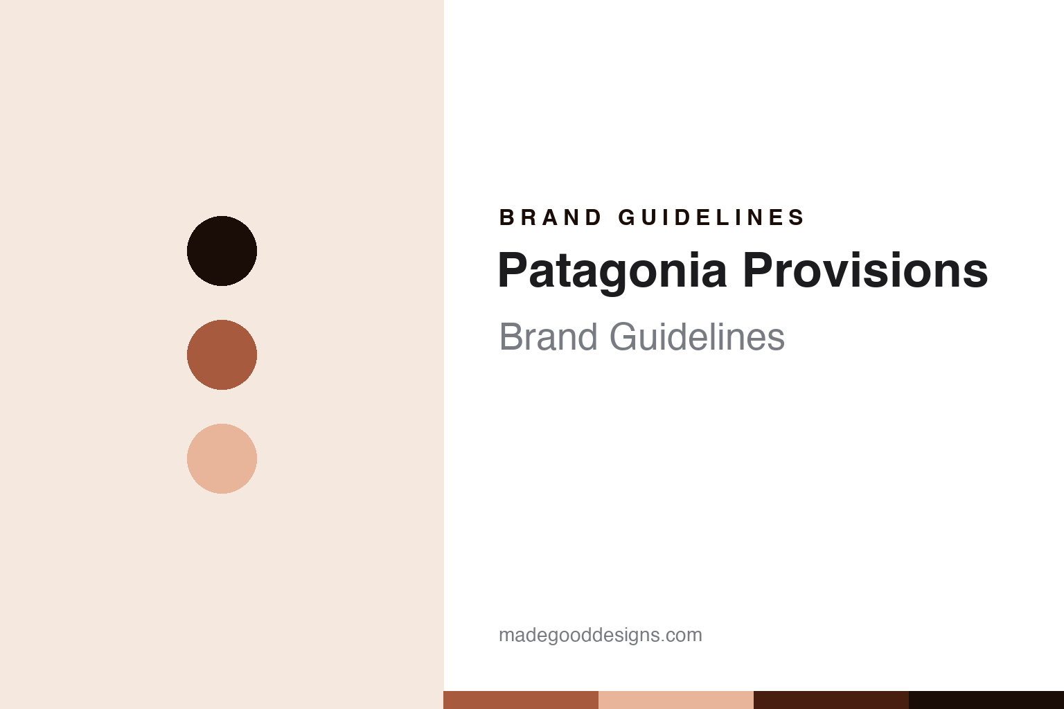
Patagonia Provisions Brand Guidelines
The mission on the tin.
Aa
Two constants: an earth-rust palette and an editorial-sans register. Abstract homage — not a Patagonia Provisions product or mark.
The mission on the tin
Patagonia Provisions is the mission-driven food arm of Patagonia — owned within its Purpose Trust structure.
Patagonia Provisions brings the round its mission — the food division of the outdoor company Patagonia, launched in 2012, whose tinned mussels, mackerel, anchovies and sardines carry the same regenerative, responsibly-sourced ethos as its parent. Patagonia Provisions makes tinned seafood and other foods, and its answer to a round about the art of the tin is a mission on the label: food as an extension of an environmental company. A brand, on a mission.
Its identity is the mission on the tin. Patagonia Provisions’ sourcing ethos, its Patagonia parent and its Purpose Trust ownership are the story here. A brand, mission-driven. The mission on the tin.
(Honest notes, so the story stays precise. Patagonia Provisions is the food arm of Patagonia, Inc., and its store now lives within patagonia.com, at the shop provisions path, after its own domain began redirecting there. It makes tinned seafood, mussels, mackerel, anchovies and sardines, plus grains, soups and snacks, with a regenerative and responsibly-sourced positioning; we frame the specific range at a general level, since we could not re-verify the live product list. It was created in 2012 as a division of Patagonia, which was founded in 1973 in Ventura, California by Yvon Chouinard. On where it is made — a theme of this round — the regenerative and responsibly-sourced ethos is central, but a specific packed-in-Spain or European-partner sourcing we could not verify, so we keep it general. On ownership, in 2022 Yvon Chouinard restructured Patagonia so that voting stock went to the Patagonia Purpose Trust and non-voting stock to the Holdfast Collective, a nonprofit, with profits funding environmental causes, and Provisions is owned within that structure; the Earth is now our only shareholder line is the brand’s framing, and the family retains control through the trust. Its name, wordmark and Fitz Roy mountain-skyline mark are IP we describe but do not reproduce, and Patagonia is a real trans-national region we do not imply the brand speaks for; there is no official brand hex; these tones are an unofficial interpretation. This is design commentary.)
Colour
Patagonia Provisions lives in an earth rust. Click a swatch to copy the hex.
Patagonia Provisions’ identity is mission-driven, earthy and editorial — an earth rust, an ink, a clay, a deep rust, and a paper. The palette leans earth rust and clay: a warm, natural register that nods to soil, sea and a clean editorial layout rather than a loud palette. It signals a mission-driven food brand. The honest caveat: with no published brand hex, these values are an original, unofficial interpretation, not first-party colours.
The lesson is an earth rust signals a mission-driven, editorial identity. Patagonia Provisions’ world is a considered, made object. For designers, it is a reminder that an earth rust and a soft clay can carry a food brand — the tone of soil and sea. Because these tones can fail as small text, keep type dark and let the colour live in the accents, palette and band. The takeaways: put a mission on the label; source responsibly; be honest about ownership; and treat any single hex as unofficial.
Typography
The register is an editorial sans — mission-driven, clean, plain.
Patagonia Provisions’ identity carries a mission-driven, clean, plain spirit — a food arm of an environmental company, not a fashion. An editorial sans captures the mood: clean, natural and confident, the register of a mission-driven brand. Set in an earth-rust palette, the editorial sans feels mission-driven and clean — exactly the personality Patagonia Provisions carries. It is a mission rather than a logo, mirroring tin and oil. (Patagonia’s real Fitz Roy mark is a thing we describe but do not reproduce, and the exact typeface is not ours to use.) Because it is not ours to use, the honest description is “an editorial-sans spirit,” shown here in a stand-in. The type behaves like the brand: mission-driven, clean and plain.
Aa
An editorial-sans spirit — mission-driven and clean. (Specimen set in Manrope, an editorial-sans STAND-IN; NOT the Patagonia Provisions logo.)
The art of the tin
Patagonia Provisions stands for the mission on the tin.
Patagonia Provisions brings the round its mission. An earth-rust palette, an editorial sans and a sourcing ethos make one thing — the mission on the tin — the whole identity: mission-driven, earthy and editorial. The regenerative sourcing is the differentiator, and food as an extension of an environmental company is the meaning. The point is the food arm of Patagonia, launched in 2012, whose tins carry the same ethos as its parent.
Put to work, the identity is a mission told straight, as design. A maker in this spirit would put a mission on the label, source responsibly, and be honest about ownership. A reader in this spirit would keep the facts right: Patagonia Provisions was created in 2012 as a division of Patagonia, founded 1973 in Ventura by Yvon Chouinard; it makes tinned seafood and other foods with a regenerative, responsibly-sourced ethos, framed generally; its store now lives within patagonia.com; and in 2022 Patagonia’s ownership was restructured into the Patagonia Purpose Trust and the Holdfast Collective, with Provisions owned within that structure and the family retaining control through the trust. Patagonia Provisions sits in the round’s modern span with Fishwife, the two mission-and-design American brands, and its where-made thread is a responsibly-sourced ethos rather than a single country. The honest editorial moves are to date the division to 2012, to keep the sourcing general, to explain the 2022 trust structure precisely, and to not reproduce the Fitz Roy mark. The lesson Patagonia Provisions teaches is that a mission can be a whole identity, and honesty about the ownership keeps it credible.
For designers and brand-builders, Patagonia Provisions continues the art of the tin: put a mission on the label — and be honest about ownership. The lessons: extend a parent brand’s ethos into food; lead with regenerative sourcing; explain an unusual ownership structure precisely; respect a geographic name you did not coin; and never reproduce a mark. It is also a reminder to stay precise: Patagonia Provisions is the mission-driven food arm of Patagonia, owned within its Purpose Trust — with the palette here an unofficial interpretation. Read that way, Patagonia Provisions is less a tin than a mission: a food brand that funds a cause. The lesson for a brand is that a mission and honest ownership reinforce each other, and explaining the trust keeps the story earned. Patagonia Provisions made the-mission-on-the-tin the identity — proof that a mission can define a brand.
Explore & save
Keep Patagonia Provisions’s identity on hand — save it to a board in the Made Good inspiration library.
Patagonia Provisions identity set
Pin the earth-rust palette and the editorial-sans register to your own board.