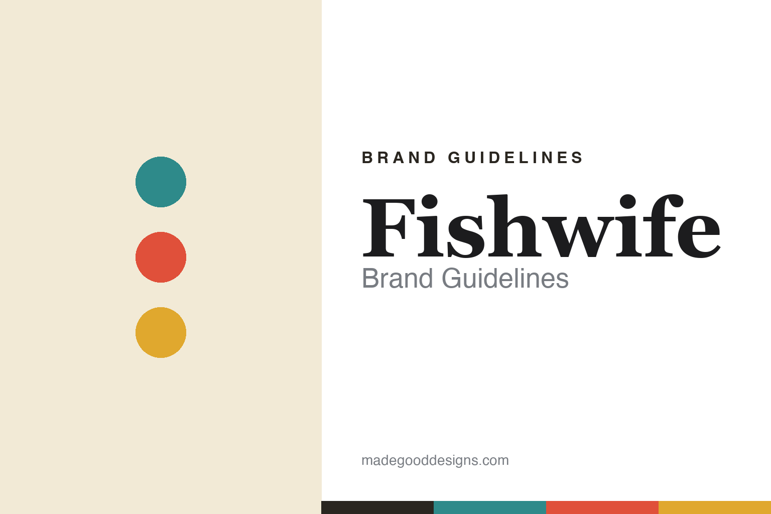
Fishwife Brand Guidelines
Tinned fish, illustrated.
Aa
Two constants: a bold, illustrated per-tin palette and a characterful serif spirit. Abstract homage — not the Fishwife tins or artwork.
Tinned fish, made cool
Fishwife illustrated its way into the cupboard.
Fishwife is a lesson in illustration as the whole brand. Founded in 2020 in Los Angeles by Becca Millstein and Caroline Goldfarb, it makes premium, ethically-sourced tinned (canned) seafood — smoked salmon, sardines, trout, tuna — and became a leader of the modern “tinned fish renaissance,” with a mission to make tinned seafood “a staple in every cupboard.”
What made it cool was the design: bold, colourful, retro-maximalist illustrated tins by artist Danny Miller (who works as “Danbo Draws”), full of characterful hand-drawn fish, women, waves and pattern, with a distinct colour world per product. It turned a humble tin into something giftable and collectible. (Fun thread: Danny Miller also illustrates Aura Bora.)
(Honest notes: Fishwife is independent and VC-backed. Its “ethically/sustainably sourced” positioning is the brand’s own claim rather than an independently audited fact. And its celebrated Fly By Jing collaboration is on smoked salmon, not tuna. No official brand hex is published.)
Colour
Fishwife lives in bold, illustrated colour. Click a swatch to copy the hex.
Fishwife’s identity is bold, colourful and illustrated — a teal, a tomato red, a mustard, a cream, and an ink. Rather than one house colour, it uses vivid, retro-maximalist per-tin palettes drawn from its illustrations. It signals playful, artful, giftable food rather than clinical “gourmet” minimalism. The honest caveat: with no published brand hex, these tones are an original, unofficial interpretation, not first-party values.
The lesson is bold illustration makes a humble product covetable. Fishwife’s world is a vintage illustrated tin. For designers, it is a reminder that rich, characterful illustration — with vivid per-product colour — can transform an unglamorous category (tinned fish) into something collectible and gift-worthy. The takeaways: lead with illustration; give each product its own vivid colour world; and treat any single hex as unofficial — using a deep tomato for small text so the palette stays bold.
Typography
The wordmark spirit is a characterful serif — bold and retro.
Fishwife’s identity carries a bold, characterful, retro spirit — richly illustrated tins in vivid colour. A characterful, slightly retro serif captures the mood: it is warm and expressive, the register of a nostalgic-but-modern illustrated label. Set against bold, illustrated colour, the serif feels characterful and retro — exactly the illustrated-tin personality Fishwife carries. It is expressive rather than minimal, mirroring hand-drawn artwork. (Fishwife’s real tins and artwork — illustrated by Danny Miller — are trademarks and trade dress we describe but do not reproduce, and the exact typeface is not published, so we don’t assert it.) Because the specific mark is not ours to use, the honest description is “a characterful serif spirit,” not the Fishwife logo. The type behaves like the brand: bold, characterful and retro.
Aa
A characterful serif spirit — bold and retro. (Specimen set in Fraunces, a characterful serif; NOT the Fishwife artwork, which is a trademark.)
The tin as canvas
Fishwife stands for the illustrated tin.
Fishwife is a lesson in turning packaging into art. Bold, characterful illustration made tinned fish — long a purely functional product — into something covetable, giftable and collectible. The illustration is the differentiator. The differentiator is illustration-led, retro-maximalist packaging.
For designers and brand-builders, Fishwife offers a clear takeaway: illustration can elevate a humble category. The lessons: treat the package as a canvas; give each product a vivid colour world; and let a distinctive illustrator define the brand. It is also a reminder to stay accurate: Fishwife is independent and VC-backed, its ethical-sourcing is a brand claim, and its Fly By Jing collab is on smoked salmon — with the palette here an unofficial interpretation. Fishwife made the tin a canvas — proof that illustration can be the difference.
Explore & save
Keep Fishwife’s identity on hand — save it to a board in the Made Good inspiration library.
Fishwife identity set
Pin the bold illustrated palette and the characterful-serif spirit to your own board.