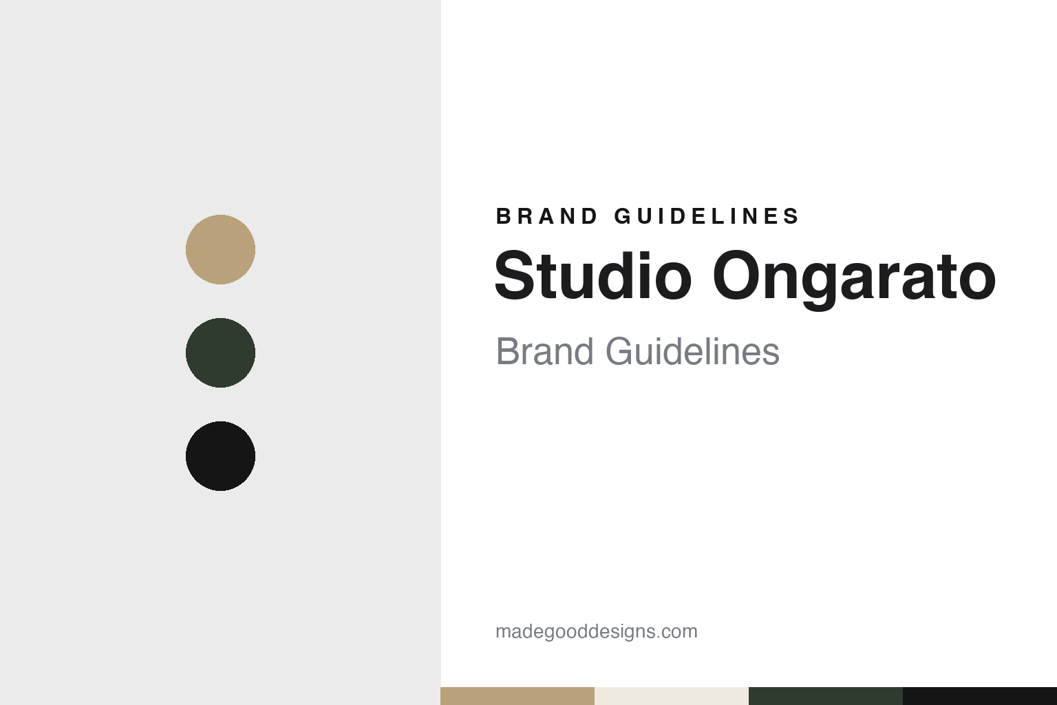
Studio Ongarato Brand Guidelines
One founder’s name on the door, then the studio’s.
Aa
Two constants: a gum-leaf green, brass and gallery black palette and a display serif register. Abstract homage — not a Studio Ongarato asset or mark; no logo, icon or wordmark is reproduced.
Fabio Ongarato Design, Melbourne
Two partners, one name on the door.
Studio Ongarato is a Melbourne design studio that traded for 25 years under a different name. The National Gallery of Victoria’s artist page for its Melbourne Now exhibition says the studio was founded in 1993 in Melbourne by creative director Fabio Ongarato and director Ronnen Goren, and describes its field as branding, wayfinding and placemaking, with projects mainly in hospitality, hotels, property, arts and culture. Until its 25th year the business was called Fabio Ongarato Design.
The partnership began through a project rather than a plan. Communication Arts, in a feature by Tonya Turner published in May 2019, says Ongarato studied visual communication at RMIT University, where Goren completed a degree in architecture. A friend recommended Ongarato to Goren when Goren was working on an exhibition about postwar Jewish architecture, and the two soon decided to team up. The magazine says they began working from the stockroom of a contemporary art gallery, surrounded by paintings by emerging artists, designing catalogues, books and publications. Work in fashion followed.
The timing mattered to how the studio saw itself. Communication Arts says the pair carved out a niche during a recession, as an alternative to the big branding studios of the time. Goren told the magazine that they were “a new generation that wanted a sense of independence”, with a view that was less about graphic design and more culturally diverse. He also named the Bauhaus and the work of Charles and Ray Eames as shared interests, describing the Eameses as designers who saw design as problem solving and storytelling.
Ongarato gave a similar account in Architecture & Design on 6 November 2018. He said the partners “weren’t so much concerned with the traditional idea of a design studio”, and that Australia at the time offered room to push existing paradigms and shape their own idea of what a design studio could be. The same article describes collaboration as central to the studio’s practice and ethos over its 25 years.
That collaborative habit appears throughout the studio’s record. Communication Arts says the studio built much of its reputation on early and continuing work with contemporary artists, writers, illustrators, architects and cultural organisations, and dates one long-running relationship back to a 1997 campaign for the fashion house Scanlan Theodore made with the photographer Bill Henson.
Colour
A rename around the 25th year, and a return to Prahran.
The name changed as the studio reached its 25th year. Architecture & Design reported on 6 November 2018, under the headline “Fabio Ongarato and Ronnen Goren celebrate 25 years of design”, that the business was “now renamed Studio Ongarato”, and that it had been led throughout by its two founders. By May 2019 Communication Arts was calling it the pair’s “newly named” firm, and said they had then been in business together for 26 years, with Ongarato as creative director and Goren as head of strategy.
Communication Arts gives the reason for the change in the studio’s own words. It says three staff members had been appointed to a new leadership team, and that this prompted the new name. The magazine tells the story that Ongarato registered the original business name while Goren was still out partying, and quotes Ongarato: “It never should’ve been just me.” It adds, as a studio joke, that anyone who used the old name had to put money in an “F” jar. The new name kept the founder’s surname and added the word “Studio”.
The studio’s address is part of the same story. Communication Arts says the studio in Prahran, an inner-city Melbourne suburb, was the partners’ third. After twelve years in another Melbourne suburb, they had moved back about ten years before the article to the area where the company began. Goren told the magazine that the earlier location had felt “a bit soulless” and that Prahran had a more eclectic energy. The article describes the studio as an incognito warehouse, near the Chapel Street strip with its markets, theatres, art colleges and fashion boutiques.
The rename also came as the studio’s geography widened. Architecture & Design said in 2018 that the Melbourne studio had a growing international presence, listing projects for W Hotels Worldwide, the Sharjah Collection and Dubai Marina, and that China and the Middle East had become increasingly important to it. Communication Arts said in 2019 that the studio worked with offices in Hong Kong and Dubai. The NGV’s later Melbourne Now page names offices in Hong Kong and the Americas.
Goren tied this to the studio’s outlook in the 2018 article, saying that despite a shifting design landscape and the effects of globalisation, the studio had managed to remain current within international graphic design. Ongarato, in the same piece, put the studio’s continuity down to combining design practices and a continuing commitment to cultural discourse, and said the aim for the next 25 years was to keep realising the unexpected through art and design.
Typography
A founder’s name widened to a studio’s name.
Design studios in Latin America and Australia build their own identities from a small set of surfaces. The first is the name. Some studios carry a founder’s name, which puts a person at the front of the business; others choose a short invented word or a pair of letters, which leaves room for new partners, new offices and changes of ownership. When a founder’s name is later shortened or reframed, the change itself becomes part of the studio’s story.
The second surface is language. Studios that work across borders often publish their websites in two languages, and the choice of which language comes first, and how the two sit side by side, says something about the audience a studio expects. A short coined name tends to read the same in Spanish, Portuguese and English, which is one reason such names travel well.
The third surface is the work. Case studies on a studio’s website, studio books and printed publications act as portfolio and advertising at once. How a studio photographs, writes up and orders its client projects often says more about its identity than its own logo does.
Aa
A high-contrast display serif — after a studio that works across art, hotels and publications. (Specimen set in Bodoni Moda, a serif STAND-IN; NOT the Studio Ongarato logo or any studio typeface.)
Studio Ongarato
Hotels, museums and workplaces, as dated projects.
Hotels recur in the studio’s published work. Communication Arts said in May 2019 that for the Jackalope Hotel on Victoria’s Mornington Peninsula the studio developed the brand identity, wayfinding signage and art curation, built around the theme of “alchemy” to reflect the hotel’s vineyard setting. It commissioned the artist Emily Floyd to make a tall sculpture of the mythical creature for the entrance, and designed a lighting installation for the restaurant, a cloud of suspended glass bulbs that refers to fermentation. The same article lists W Hotels in Brisbane, Shanghai and Hong Kong and QT Hotels across Australia among the studio’s hotel clients.
Art is often part of the brief. Communication Arts said the studio included selected works by Bill Henson in the Melbourne residential development 85 Spring Street, and curated works by the Japanese photographer Nobuyoshi Araki for the Kisumé restaurant in Melbourne. The NGV’s Melbourne Now page describes the Kisumé work as pairing Japanese precision with Western flair, through a radial moiré graphic language, the Araki works, colour accents, uniforms and commissioned sneakers.
The NGV page also documents workplace, museum and precinct projects. For Arup’s Melbourne headquarters, the studio designed a signage and environmental graphics system based on the idea of “Testing Grounds”, with LED displays in purpose-made supports controlled by custom software, and a metric grid applied to glass partitions, timber screens and moulded panels to mark out the labs in an open-plan office. For Eucalyptusdom, a 2022 exhibition at the Powerhouse Museum in Sydney about Australia’s relationship with the gum tree, the studio designed the identity, campaign, titles and publication around a single colour palette. At the 447 Collins precinct in Melbourne, a mixed-use development, it handled signage, wayfinding and placemaking, including three-dimensional street numbers.
Communication Arts also names Aesop, Medibank and the Australian Centre for Contemporary Art among organisations the studio has worked with. Ongarato told the magazine that the studio had never seen a project “as just a logo”, and that it approached brands in a more filmic way, looking for the less obvious details and amplifying them.
For a design guide, Studio Ongarato shows how a studio can change its name without losing its history: a founder’s name in 1993, the same surname framed as a studio around 2018, and a body of work that runs from gallery catalogues to hotel and museum identities. Compare Hulsbosch and Frost*collective, two other Australian studios in this collection. For this guide we use gum-leaf green, brass and gallery black with a display serif, an unofficial interpretation; no product or logo is reproduced.
Explore & save
Keep Studio Ongarato’s identity on hand — save it to a board in the Made Good inspiration library.
Studio Ongarato identity set
Pin the Studio Ongarato gum-leaf green, brass and gallery black palette and the display serif register to your own board.


