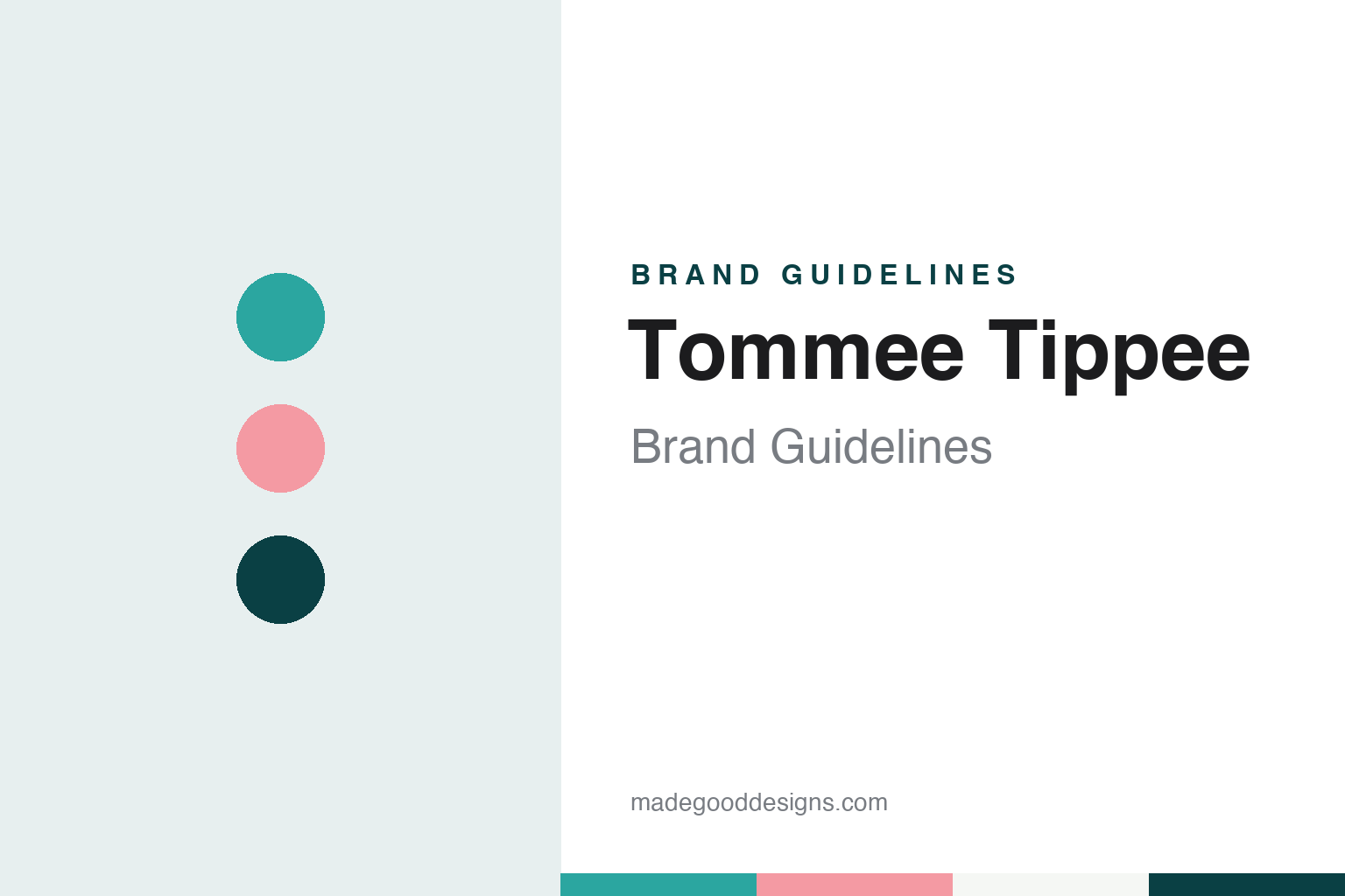
Tommee Tippee Brand Guidelines
A weighted cup from 1965, named after a dog, that grew into a British parenting brand.
Aa
Two constants: a cup teal, deep teal and soft coral palette and a rounded playful sans register. Abstract homage — not a Tommee Tippee product or mark; no cup, bottle or logo is reproduced.
A cup that would not tip
Three brothers, a weighted base and a dog called Tommee.
Tommee Tippee is a brand of baby bottles, cups and parenting products owned by the British company Mayborn Group, and it takes its name from a dog. Mayborn tells the story on its website. “In 1965,” it says, “the Tommee Tippee story officially began.” The first product was a cup: three brothers, the company says, designed a cup for babies with “a weighted base so that it wouldn’t tip over.” They named it, according to Mayborn, “after their beloved dog, Tommee.”
The brand then found its backer. “A British businessman loved the cup so much that he invested in their idea,” the company says. Mayborn’s “Our Story” page frames the whole business the same way, describing more than sixty years of “solving real issues faced by real parents,” “starting with a simple idea for a weighted baby cup that wouldn’t tip over.”
Mayborn calls Tommee Tippee “the global Parent-care brand,” and it states the brand’s purpose as “to liberate and amplify the intuition of newborn parents with empathetic design.”
Mayborn has a history outside the nursery, too. English Wikipedia records that the Dylon range of household fabric dyes was founded by Mayborn Group in 1946, and that Mayborn sold Dylon International to the European homecare company Spotless Group in 2008. Wikipedia adds that Dylon’s former London factory was later redeveloped as the Dylon Works. Mayborn’s website today presents Tommee Tippee as its brand.
The company register gives the group’s own timeline. Companies House records that the business was incorporated on 19 September 1946 as Mayborn Products Limited, that it became Mayborn Group PLC on 1 November 1984, and that it has traded as Mayborn Group Limited since 20 July 2006, the year of the 3i purchase. Its registered office is in Newcastle upon Tyne. English Wikipedia names the businessman and philanthropist Michael Samuel as a former chief executive of the group.
Colour
Private equity, then a Chinese owner.
Ownership of the business has changed twice in two decades. English Wikipedia records that the British private equity firm 3i acquired the business in 2006. In May 2016, Insurance Business reported that “Ping An Insurance’s investment vehicle Jahwa Group will buy Mayborn Group, the owner of the Tommee Tippee brand,” from 3i. The same report said the chief executive, Steve Parkin, would continue to lead the company and that its headquarters would stay in Cramlington, Northumberland. The 3i period therefore ran from 2006 to 2016. English Wikipedia now describes Mayborn Group as owned by Ping An Insurance, the Chinese insurance group.
In October 2026, Mayborn’s website named its global headquarters as Mayborn House in Newcastle upon Tyne. The same site lists offices in Hong Kong, Shenzhen, Australia, France, Italy, Germany and Stamford, Connecticut, in the United States.
Mayborn also says where its products are made. Its website says the company’s own manufacturing facilities “are based in Tangier, Morocco, Guang Dong, China and Mansfield, UK.” The site names the operating companies at each: Mayborn Morocco in Tangier, Jackel International China in Dongguan and Sangenic International in Mansfield.
Outside commentators place the brand among the larger names in feeding. English Wikipedia describes Tommee Tippee as a feeding bottle and child care brand “known for its spill-proof cups,” a description that reaches back to the weighted cup of 1965, and it names Pigeon, Medela, Philips Avent and Munchkin among the brands it competes with. Mayborn’s own pages tell the story the same way, returning to the weighted cup of 1965 as the point where the brand began.
Typography
Design and documentation.
Baby-feeding brands sell some of the most closely handled objects in a household: bottles, teats, cups, soothers and the containers and pails that sit beside them. Some of these names began as small family firms or around a single product, and some now belong to much larger consumer-goods or electronics groups, so the name on the pack and the company behind it are often not the same.
A feeding brand’s identity can rest on a short name, a recognisable product shape and its packaging as much as on any single logo, and the same name may pass through several owners while the products on the shelf look much the same. That makes the plain questions behind each name worth asking: who started it, who owns it now, and where its products are actually made.
Each guide separates what independent, dated sources record from what the company says about itself — its founding story, its owners over time and where it makes its products — and makes no claims about what any product does.
Aa
A rounded, playful sans for a brand named after a family dog. (Specimen set in Fredoka, a sans-serif STAND-IN; NOT the Tommee Tippee logo.)
Tommee Tippee
Slogans in the voice of a friend.
The brand speaks in short, direct lines. Mayborn lists three of its slogans: “Smart solutions. Simpler parenting.”, “You’ve got this. We’ve got you.” and “Equipment for the naturally equipped.” In October 2026 the second of those lines formed the title of the Tommee Tippee website. Mayborn describes the brand as the place “where decades of heritage meet innovative and stylish design,” and the products it highlights on its own pages carry compact invented names, among them Dreammaker, PerfectPrep and the NightGlow Pod. Its list of recent products also includes the Natural Start bottles, the PerfectPrep Pro and the StayPut soothers with their StayPut Pocket.
The corporate language is just as plain. Mayborn’s “Our Story” page sets out the group’s purpose as helping “mums and dads enjoy and embrace the rollercoaster ride of bringing up baby,” and it lists five company values in the same clipped style: Respect Each Other, In It Together, Play To Win, Take Pride and Be Bold. The same page describes listening to parents as central to the company’s work, and it says its design approach aims at practical, thoughtful products intended to make the early years of parenting a little less chaotic.
For a design guide, Tommee Tippee shows how a playful name drawn from a family pet can outlast its first product and give a whole range a friendly voice. Compare Dr. Brown’s, an American feeding brand that also began with one reworked product, and Philips Avent, another feeding-bottle brand. For this guide we use a cup teal and a soft coral with a rounded sans, an unofficial interpretation; no product or logo is reproduced.
Explore & save
Keep Tommee Tippee’s identity on hand — save it to a board in the Made Good inspiration library.
Tommee Tippee identity set
Pin the Tommee Tippee cup teal, deep teal and soft coral palette and the rounded playful sans register to your own board.


