Uber Eats Brand Guidelines
Uber’s lunch experiment that became a food-delivery brand.
Aa
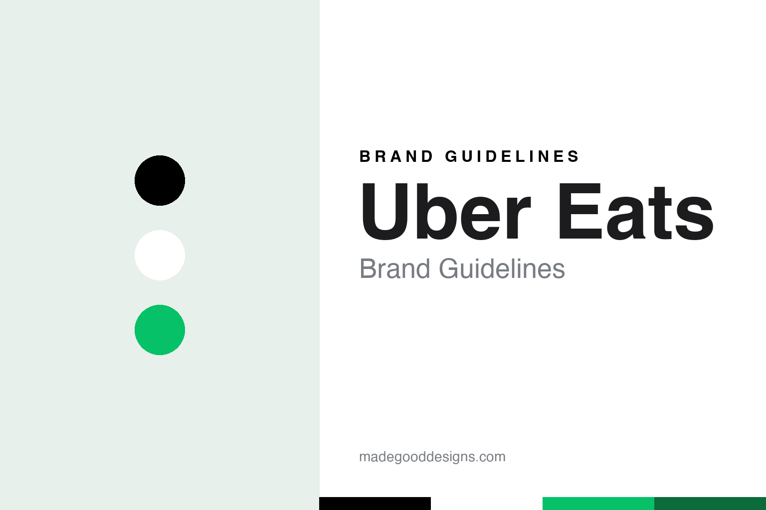
Two constants: an Uber Eats black, white and green palette and a transit sans register. Abstract homage — not an Uber Eats asset; no logo, app icon or delivery bag is reproduced.
UberFRESH
A lunch toggle in the Uber app.
Uber Eats began as an experiment inside another app. Uber, the ride-hailing company that English Wikipedia says was founded in 2009 by Garrett Camp and Travis Kalanick, started testing a lunch service called uberFRESH in Santa Monica, California, on 26 August 2014, TechCrunch reported that day. Darrell Etherington wrote that it offered a set lunch menu that changed daily and was refreshed weekly, served on weekdays in a trial area of the city, and that customers found it as one more toggle on the slider at the bottom of the existing Uber app, alongside the car options. Drivers handed the food over at the kerb rather than coming to the door. The trial was scheduled to run until 5 September 2014, and Uber said it could be extended if people responded well.
English Wikipedia says the food business was led by Jason Droege, who stayed at its head until he stepped down in February 2020.
The test spread through Los Angeles that autumn. Eater Los Angeles, writing on 4 May 2015, recalled that in November 2014 the service had reached Beverly Hills and West Hollywood, with Uber’s black cars collecting a short menu from local restaurants and delivering it to the door; early partners included Fundamental LA, with its fried-chicken sandwich, and Bludso’s, with brisket sandwiches and macaroni cheese. The same report noted that from its opening cities of Los Angeles and Barcelona the service had moved into parts of New York and Chicago.
Colour
From UberFRESH to UberEATS to a standalone app.
That second word changed in spring 2015. Eater Los Angeles reported on 4 May 2015 that UberFRESH had been renamed UberEATS at the end of April, calling the new name “much more on-the-nose.” The capitalised second half kept the house style of Uber’s other experiments of the period, such as UberRUSH, the courier service The Verge mentioned later that year.
The food service left the main app in December 2015. On 9 December 2015 The Verge, citing Wired, reported that Uber was launching a stand-alone UberEATS app in Toronto, initially for iPhone users only. Until then, Andrew J. Hawkins wrote, UberEATS had been a feature reached from inside the regular Uber app with a short daily choice of meals; the new app let people in Toronto order from the full menus of participating restaurants. Bowie Cheung, the general manager of what Uber then called UberEverything in Toronto, announced the launch in a blog post quoted by the site.
From there the brand travelled. English Wikipedia says the service began operating in London and Paris in 2016. In March 2018, it says, Uber sold its ride-hailing and Uber Eats operations in Southeast Asia to Grab in return for a stake in the company; in January 2020 Zomato agreed to take over Uber Eats in India, and Uber left India’s food-delivery market entirely in August 2022. Elsewhere, the same article says, the service withdrew from several countries in 2020, handing its operations in the United Arab Emirates and Saudi Arabia to Careem, a ride-hailing company owned by Uber.
In December 2021, English Wikipedia says, Uber Eats sent a food delivery to the International Space Station with the Japanese entrepreneur Yusaku Maezawa.
In April 2020, the same article says, New York residents filed an antitrust suit, Davitashvili v. Grubhub, naming Uber Eats alongside DoorDash, Grubhub and Postmates.
Typography
Icons, bags and decals.
A delivery app’s brand lives in more places than its home screen. The app icon is the smallest and most-repeated version of the identity: a square tile that has to read at thumbnail size beside dozens of others, so it usually reduces the brand to one letter, one symbol or one flat field of colour. Inside the app, that same colour tends to carry buttons, map pins and order-status screens, which is why delivery identities lean on a single owned hue rather than a full palette.
Off the phone, the brand travels with the courier. Insulated bags, backpacks and jackets turn the mark into street signage, and they are often seen from behind, in motion and in poor light, so a bold wordmark or symbol on a plain ground works better than fine detail. Restaurants add a third layer: window and door decals, counter stickers and tablet stands that tell passers-by which apps a shop takes orders from.
For a designer, the useful lesson is consistency across scale — the same colour and symbol should hold up on a phone icon, a courier bag and a shopfront sticker.
Aa
A plain sans after transport signage. (Specimen set in Archivo, a sans STAND-IN; NOT the Uber Eats logo or the Uber Move typeface.)
Uber Eats
Two words in Uber Move.
The identity was redrawn in September 2018 as part of a rebrand of Uber as a whole. Android Police reported on 13 September 2018 that the Uber and Uber Eats apps had been updated with new logos set in a proprietary typeface called Uber Move, days after Uber hired Rebecca Messina, formerly of Coca-Cola, as its chief marketing officer. Uber told Adweek, the site said, that the previous logo, introduced only a few years earlier, had been dropped because some customers did not connect it with the company — and that some drivers had turned their windshield decals round to show the “UBER” lettering on the back instead. The new mark, Android Police wrote, is a simple wordmark; Uber Move was inspired by sans serifs on transport signs around the world, and owning it removes the licence fees the company had paid for other fonts.
Messina’s arrival and the new lettering came together: Android Police described the logos as part of “a complete rebrand,” announced just as she joined. The name is now written as two words, Uber Eats, set in the same Uber Move letters as the parent’s own wordmark.
In 2020 the family grew. CNN Business reported on 6 July 2020 that Uber had agreed to buy Postmates, calling it “highly complementary” to Uber Eats, and Supermarket News reported on 1 December 2020 that the purchase had closed, with Uber saying both apps would continue to run separately on a combined merchant and delivery network. In July 2021 The Rideshare Guy reported that would-be Postmates couriers were being sent to the Uber Eats sign-up page. Uber has owned Uber Eats since launching it in 2014, and Postmates since December 2020.
For a design guide, Uber Eats shows how a sub-brand can grow out of a parent’s typeface and name without a separate symbol. Compare its parent, Uber, which shares the Uber Move wordmark, and DoorDash, a rival delivery app. For this guide we use black, white and a green with a sans, an unofficial interpretation; no product or logo is reproduced.
Explore & save
Keep Uber Eats’s identity on hand — save it to a board in the Made Good inspiration library.
Uber Eats identity set
Pin the Uber Eats black, white and green palette and the transit sans register to your own board.