University of Michigan Brand Guidelines
Maize, blue and one solid block letter.
Aa
Two constants: a maize and blue palette and a blocky sans register. Abstract homage — not a University of Michigan mark; no Block M, seal or wordmark is reproduced.
Artes, Scientia, Veritas
A Detroit schoolhouse and a Greek-Latin name.
The University of Michigan traces itself to 1817 and to Detroit, not to the college town it now fills. English Wikipedia gives August 26, 1817, as the establishment date and records the original name: the Catholepistemiad, or University of Michigania, used until 1821. The word was a coinage blending Greek and Latin roots, loosely translated as “school of universal knowledge,” and the institution was modelled, Wikipedia says, on the imperial university set up in France a decade earlier under Napoleon. The cornerstone of its original building, on Bates Street in Detroit across from the Ste. Anne church, was laid on September 24, 1817.
The move came with statehood. After Michigan joined the Union in 1837, an organic act, passed on March 18, 1837, reorganised the university under a board of regents. The regents met in Ann Arbor and accepted the town’s offer of farmland for a new campus, and English Wikipedia says classes began there in 1841. The same act created the Board of Regents that still governs the university.
The motto, given on the university seal, is Artes, Scientia, Veritas — arts, knowledge, truth. The seal sits at the top of a small, strict hierarchy. In its brand guidelines, archived in 2024 and 2025, the university said it has four official marks: the primary logo, the horizontal logo, the secondary mark — which it calls the Block ‘M’ — and the University Seal. The guidelines reserved the seal for presidential and regental use only, and kept the horizontal logo, the Block M and the seal for more selective use than the primary logo.
Everything else is built from the letter. The guidelines said the University of Michigan logo was designed on the proportions of the copyrighted Block M, with each element sized, placed and coloured for visibility and legibility, and warned against changing the size, position, colour or relationship of any part. A logo generator lets university staff create unit logos for schools, colleges and departments, each one made up of the Block M and the unit’s name; access is handled by a “logo gatekeeper” in each unit. Commercial products using the marks are licensed through IMG Licensing, the university’s licensing partner, the guidelines said.
Colour
A shade Nike called “Amarillo.”
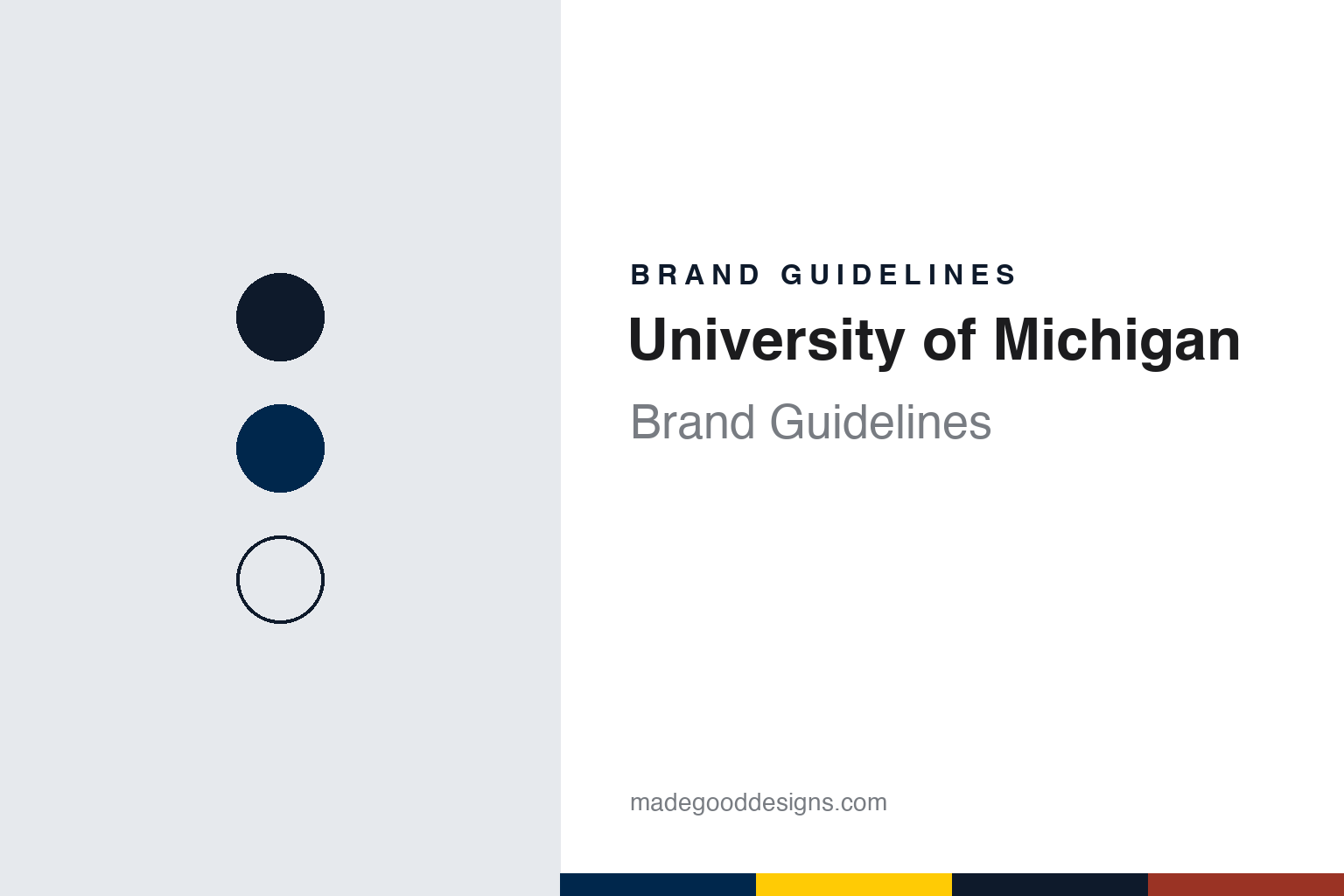
English Wikipedia gives the colours simply as maize and blue, citing a 1942 university history. The brand guidelines turn that pair into numbers. The university calls the two its signature palette and specifies Maize as PMS 7406 (hex #FFCB05) and Blue as PMS 282 (hex #00274C), to be used both for large areas of colour and as accents. Its accessibility chart pairs maize text with blue and blue text with maize or white.
The precise shade of the yellow has been a point of design attention in its own right. The Detroit Free Press reported in July 2016, as Nike took over as the athletic department’s apparel supplier, that Nike had tweaked the maize used on many Michigan products and was calling the colour “Amarillo,” Spanish for yellow. The paper said the shade was technically PMS 7406, and quoted Scott Hirth, co-owner of the M Den, the university’s official merchandise outlet, who likened it to the yellow of an earlier, successful era of the football programme. The same report described the change to a crewneck sweater: in place of a narrow Block M in the middle, the new version placed a Block M below one shoulder and Nike’s Jumpman logo below the other.
Around the two signature colours the university keeps a long supporting palette, and the names read like a campus map. In the 2024 guidelines they included Tappan Red, Ross Orange, Rackham Green, Wave Field Green, Taubman Teal, Arboretum Blue, A2 Amethyst, Matthaei Violet, UMMA Tan, Burton Tower Beige, Angell Hall Ash, Law Quad Stone and a metallic called Diag M, each with a Pantone reference. The university described them as recommended rather than mandated, to complement but never replace maize and blue, and offered a downloadable list of matching Sherwin-Williams paint colours for anyone painting an office.
The Michigan Daily asked in December 2007 why the university has no mascot. The athletic department’s spokesman, Bruce Madej, told the paper there was no appetite among administrators or athletes for one. The paper recounted that in 1927, after lobbying by former football coach Fielding H. Yost, two live wolverines from the Detroit Zoo were carried around Michigan Stadium in cages on game days, and that a plush wolverine costume appeared in the mid-1980s and mid-1990s before being retired; many people, Madej said, thought it looked more like a dog or a fox.
Typography
Design and documentation.
University identities tend to be built from a small, repeatable kit. A torch, a seal or a shield carries the formal voice: it appears on diplomas, official documents, building plaques and the covers of commencement programmes, and it changes rarely because its job is continuity. Alongside it, a simpler wordmark or monogram does the everyday work on websites, signage, letterheads and merchandise, where a detailed seal would blur at small sizes or on a phone screen.
Colour does a surprising amount of the lifting. Many institutions are recognised by a single hue that runs through athletics kit, banners, lanyards and digital templates, and identity manuals usually fix that hue in print and screen values so it reproduces the same way on a sweatshirt as on a slide. A secondary palette of neutrals and accents then gives designers room without diluting the core colour.
Mascots form a third layer. Sports programmes often commission their own marks, with a more playful drawing style and separate usage rules, so a campus may run a formal seal, a clean academic wordmark and an animated athletics character side by side. Reading a university brand well means understanding how those layers divide the work between ceremony, administration and the playing field.
Aa
A blocky sans for a university built on one letter. (Specimen set in Montserrat, a Google font on the university’s recommended list — a STAND-IN; NOT the proprietary Victors font or a University of Michigan logo.)
University of Michigan
A font made for three words.
The wordmark has its own typeface, and it is not for general use. The university’s typography guidelines describe a proprietary font called Victors, developed by Michigan Creative, the in-house studio in the Office of the Vice President for Communications. The font was optimised specifically for the words “University of Michigan,” the guidelines say, and was not designed for long-form reading, so it is not distributed for other work.
For everything else, the university gives advice rather than a single mandated family. Its typography page sets out principles of legibility and readability — conventional letterforms, generous spacing, a tall x-height, ragged-right setting and line spacing greater than the point size — and then recommends free typefaces: the IBM Plex super family, Montserrat, Nunito Sans and Merriweather for general use, with Playfair Display and Oswald for display. It also highlights Atkinson Hyperlegible, the Braille Institute’s typeface for readers with low vision, as a recent addition.
Accessibility runs through the colour guidance too. The colours page sets the web palette against the WCAG 2.0 level AA standard — a contrast ratio of at least 4.5:1 for normal text and 3:1 for larger text — and publishes a chart of approved combinations showing which colours can carry text on a light background and which should serve only as a background.
The Block M appears on its own as the secondary mark, as the basis of the primary logo’s proportions, inside every unit logo and, as the 2016 Free Press report showed, on the chest or shoulder of licensed sportswear.
For a design guide, the University of Michigan shows how one solid letter and two precisely specified colours can carry a whole identity, with a palette of campus-named supporting tones held in reserve. Compare UC Berkeley and Princeton. For this guide we use maize and blue with a sans, an unofficial interpretation; no product or logo is reproduced.
Explore & save
Keep University of Michigan’s identity on hand — save it to a board in the Made Good inspiration library.
University of Michigan identity set
Pin the University of Michigan maize and blue palette and the blocky sans register to your own board.