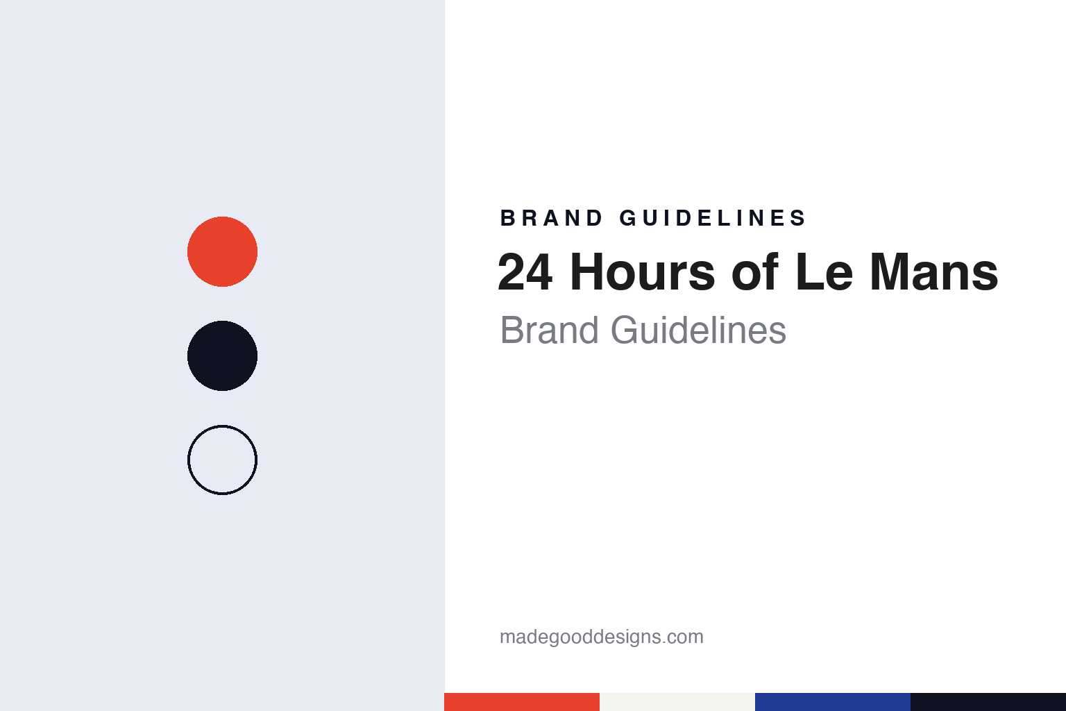
24 Hours of Le Mans Brand Guidelines
A race that runs from one afternoon to the next.
Aa
Two constants: a signal red, Sarthe blue and night palette and a condensed timing sans register. Abstract homage — not a 24 Hours of Le Mans product or mark; no logo, poster or trophy is reproduced.
Automobile Club de l’Ouest
A motoring club, a town and a day-and-night race.
The 24 Hours of Le Mans belongs to the Automobile Club de l’Ouest (ACO), and its story starts with the club. English Wikipedia says the ACO was founded in 1906 by car-building and racing enthusiasts, and that its ancestor was the Automobile Club de la Sarthe, set up in the town of Le Mans. That year the group, which included Amédée Bollée and Paul Jamin, worked with the larger Automobile Club de France to stage the Grand Prix de l’ACF on public roads, a triangular course linking Le Mans with Saint-Calais and La Ferté-Bernard.
The idea for a round-the-clock race came after the First World War. Wikipedia credits it to three people: the club’s chief secretary Georges Durand, the magazine editor Charles Faroux of La Vie Automobile, and the tyre manufacturer Emile Coquille. The first race was run on 26 and 27 May 1923 on public roads around the town. It was originally conceived as part of a three-year contest, the Rudge-Whitworth Triennial Cup, in which the winner would be the car that went furthest over three consecutive 24-hour races; Wikipedia says that idea was dropped in 1928.
The race takes its setting from its region. The Circuit de la Sarthe is named after the French department that contains Le Mans, and it combines a permanent track with public roads that are closed for practice and the race and reopened soon after. Wikipedia notes that safety barriers on the public sections are put up and taken down every year. The long straight known in French as the Ligne droite des Hunaudières is often called the Mulsanne Straight in English, after the village it leads to.
The calendar is part of the identity too. The race is normally held in mid-June, near the summer solstice, starting in mid-afternoon and finishing at the same hour the next day. The result is decided by the distance covered in 24 hours, not by the time taken over a fixed distance. Wikipedia records that the circuit was occupied in 1940, first by the Royal Air Force and then by German forces, and that it was almost five years after the liberation of Le Mans in August 1944 before the race was held again.
Le Mans has also sat inside wider championships. Wikipedia lists it as part of the World Sportscar Championship from 1953 to 1992, with some gaps, part of the Intercontinental Le Mans Cup in 2011, and a round of the FIA World Endurance Championship since 2012. The same year the organisers opened a place on the grid, known as Garage 56, for experimental cars that demonstrate new technology.
Colour
A running start, a tricolour mark and a hidden 4.
Before it had a logo worth discussing, the race had a ritual that carried its name. Wikipedia describes the Le Mans start: cars were lined up along the pits, the starting drivers stood on the opposite side of the front straight, and when the French flag dropped they ran across, climbed in and drove away. Until 1962 the cars were lined up by engine capacity; from 1963 qualifying times set the order. The procedure was changed for 1970, with drivers already strapped in when the tricolour fell, and since 1971 the race has used a rolling start. The image of drivers sprinting to their cars still appears throughout the race’s visual history, long after the procedure itself was retired.
The modern graphic identity has two clear dates. Motorsport.com, in a report dated 13 February 2014, said that the ACO had presented a new logo for the race that day, designed by the Leroy Tremblot agency, replacing a mark that dated from 1978. The report described the older logo as the traditional red, white and blue design. Creative Bloq, on the same date, called the previous mark French-themed and said it had been in use for 36 years.
Creative Bloq singled out one feature of the new design: a “4” formed in negative space, the shape read out of the gap between other elements rather than drawn as a solid figure. Both reports quoted the organiser’s explanation that the race rested on its legend, built since 1923 on four values — innovation, popularity, performance and variety — and that the new logo was meant to carry those values while turning the event’s identity into a brand concept.
The timing was not accidental. Motorsport.com reported that the new logo was presented alongside the entry list for the 82nd race, held on 14–15 June 2014, and new technical regulations for the top prototype class that cut fuel use. Creative Bloq made the same link, describing the rebrand as coinciding with an overhaul of the race rules. In other words, the club used the change of rules as the moment to change the face of the event, so that a new technical era would be read through a new mark on tickets, signage and broadcast graphics.
Typography
Design and documentation.
A sporting event has no factory and no product on a shelf, so its identity lives almost entirely in graphics and objects that return on a calendar. The annual logo is a visible piece: many events keep a permanent mark and add a dated edition lockup each year, so a single season can be identified at a glance on tickets, programmes and merchandise. Posters do similar work in a looser register; some organisers commission a different artist every year, which turns the poster series into a running record of illustration and type styles across decades.
Trophies are the physical centre of the identity. Their silhouette, material and engraving are often fixed for long periods, and photographs of the presentation moment carry that shape far beyond the venue. Venue marks add a third layer: signage, painted grass or tarmac, gates and grandstand lettering that fix the event to a particular place.
Broadcast graphics complete the set. Score bugs, timing towers, lower thirds and title sequences are redesigned every few seasons, and they are where viewers meet the event’s typefaces and colours. Read together, these layers show how an event keeps a stable core while letting each edition look like its own year.
Aa
A condensed timing sans — the register of a pit board and a timing screen. (Specimen set in Barlow Condensed, a sans-serif STAND-IN; NOT the 24 Hours of Le Mans logo.)
24 Hours of Le Mans
From a logo to a visual language.
The latest step came in 2026. In a press release dated 24 April 2026, the ACO said it was introducing new branding for the 24 Hours of Le Mans, designed with frog, the creative consultancy that is part of Capgemini. The organiser says the identity is built around “La Trace”, a visual language meant to express motion, emotion and the rituals of the event, and is carried by the message “Drive your destiny”. The release quotes the ACO’s president, Pierre Fillon, saying the club was not changing what the race is but revealing what it has become.
The same release quotes Elisabeth Jamot, frog’s head of brand creative, and Olivier Picard, its head of creation, design and innovation, describing the line as an evocation of an event where every second counts. The ACO says the new system is meant to work across physical and digital touchpoints before, during and after the race, and that it sits within a wider plan that includes modernising the circuit and adding off-track events.
Read in sequence, the three identities follow a familiar arc for sporting events. The 1978 logo spoke in national colours, matching a start signalled by the French flag. The 2014 mark kept the number at its centre but hid it in negative space, a device that asks for a second look. The 2026 branding, as the ACO describes it, is a visual language rather than a single symbol, meant to run across physical and digital touchpoints.
The number itself does a lot of the work. A 24-hour race is defined by its duration, and the 2014 mark built its central idea on the 4 of 24. That gives designers a simple test for any Le Mans material: whether the clock, rather than any single car or team, is the subject.
For a design guide, the 24 Hours of Le Mans shows how an event can carry a regional name and a national palette into an international championship by letting a number become the mark. Compare it with Formula 1, which introduced a new logo in 2017, and the Daytona 500, another race whose name is a figure as much as a place. For this guide we use signal red, Sarthe blue and night with a sans, an unofficial interpretation; no product or logo is reproduced.
Explore & save
Keep 24 Hours of Le Mans’s identity on hand — save it to a board in the Made Good inspiration library.
24 Hours of Le Mans identity set
Pin the 24 Hours of Le Mans signal red, Sarthe blue and night palette and the condensed timing sans register to your own board.