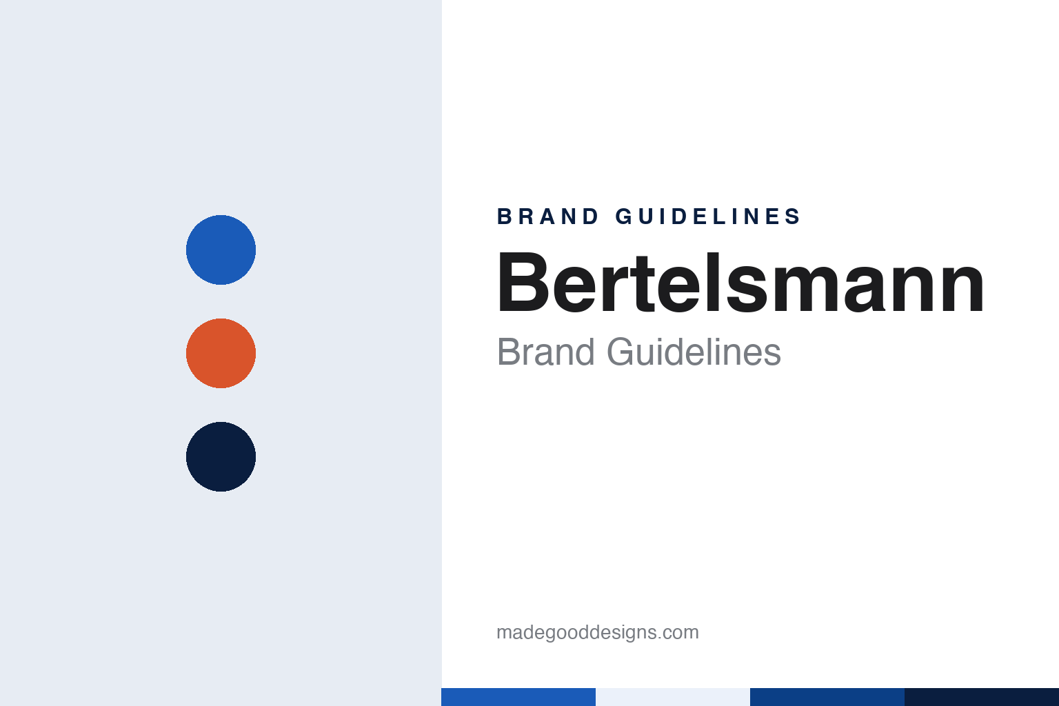
Bertelsmann Brand Guidelines
A Gütersloh press, a book club and one word in blue.
Aa
Two constants: a blue, deep blue and orange palette and a Bold grotesque sans register. Abstract homage — not a Bertelsmann asset or mark; no logo, icon or wordmark is reproduced.
A Gütersloh publishing house
Gütersloh, 1835–1969.
Bertelsmann began as a single publishing house in a Westphalian town. Wikipedia says the nucleus of the group is the C. Bertelsmann Verlag, established on 1 July 1835 by Carl Bertelsmann in Gütersloh. Carl Bertelsmann belonged to the Minden-Ravensberg Protestant revival movement and published its writings, and the house began with theological literature before adding school books and textbooks. The group’s full name today is Bertelsmann SE & Co. KGaA, and it is still based in Gütersloh.
The business passed through the family by marriage. German Wikipedia says Carl’s son Heinrich Bertelsmann ran the firm from 1849, and that Heinrich’s daughter married Johannes Mohn, who took over the management in 1887. From then on the publishing house kept the Bertelsmann name while the family that led it was called Mohn. German Wikipedia says Reinhard Mohn took over the C. Bertelsmann Verlag in 1947, and English Wikipedia says that under his leadership the company grew from a medium-sized publisher into a group offering television, radio, music, magazines and services as well as books.
The house had an emblem long before it had a corporate design. An image on English Wikipedia shows the original C. Bertelsmann Verlag company logo as it appears on Carl Bertelsmann’s tomb in Gütersloh, and German Wikipedia captions the same picture as the firm’s signet. It is an early sign that the name of the publisher and the name of the founder were treated as one.
The expansion that followed was driven by mail-order clubs. German Wikipedia says the Bertelsmann Lesering book club started in 1950 to increase sales, and that the concept was extended in the 1950s with a record club; English Wikipedia dates the Schallplattenring to 1956 and the launch of the Ariola label and the Sonopress pressing plant to 1958. In 1964, Wikipedia says, Bertelsmann bought the already broken-up UFA from Deutsche Bank, and in 1969 it acquired its earliest shares in the magazine publisher Gruner + Jahr, the same year the Lesering branches were renamed Club-Center.
Colour
Blue lettering, orange elsewhere.
The legal shape of the group changed twice in living memory. Wikipedia says Bertelsmann operated as a joint-stock company, Bertelsmann AG, from 1971 to 2012, and was then turned into a partnership limited by shares, Bertelsmann SE & Co. KGaA, whose general partner is a European company. Its head office, the Bertelsmann Corporate Center in the Gütersloh district of Avenwedde, was built in 1976 and expanded in 1990, according to Wikipedia.
The present mark arrived in the summer of 2011. The marketing weekly Horizont reported on 18 July 2011, in an article by Marco Saal, that Bertelsmann was replacing its logo with a striking word mark and appearing in public with a changed corporate design. The new look, the paper said, had been developed with the Hamburg agency Peter Schmidt Group. In future the blue logo would appear in a single colour, as a pure word mark in distinctive lettering, while the orange that had also been part of the logo was to be used elsewhere in the design in a modernised form.
Horizont also described the reasons and the reach of the change. The aim, it said, was to underline the company’s strength and creative aspiration and to reflect the development of its strategy and business. A slogan, “Creativity meets Entrepreneurship”, was to support the positioning, but would not become part of the logo; it was meant to be used flexibly in image communication. The paper said the subsidiaries Random House and Arvato would adapt their own logos to match, while the logos of RTL Group and Gruner + Jahr would stay unchanged. Bertelsmann’s chief executive at the time was Hartmut Ostrowski.
The result is a wordmark that does the work an emblem once did. Wikipedia’s infobox describes the present mark as the logo used since 2011. Where the old signet on the founder’s tomb combined the name with ornament, the 2011 design reduces the identity to the single word Bertelsmann in one colour, leaving the second colour, orange, to the wider design system around it.
Typography
Founders, initials and family names.
Group identities in beauty and media work on two levels at once. On the shelf or the newsstand, a reader meets a lipstick, a fragrance, a newspaper or a television channel, each with its own name, typeface and colours. Behind those labels and mastheads sits a parent name that appears in smaller type: on the back of a carton, in the legal line under an advertisement, in the corner of a website footer or on a stock-market listing. The parent identity has a different job. It speaks to investors, employees, regulators and partners rather than to the shopper or the reader, so it tends to be quieter, more typographic and more stable than the brands it carries.
Those parent names also change more often than the labels below them. Groups merge, split into separately listed companies, sell divisions and take new names, and each change brings a new wordmark, a new set of corporate colours and, sometimes, a name chosen to sound neutral across many languages. A house colour can work in both directions: on packaging it can tie a range of products together, while on mastheads it can mark a title as part of a wider family. Reading a group identity well means looking at both layers and at the dates when each one changed.
Aa
A bold grotesque sans — after a media group’s single-colour wordmark. (Specimen set in Archivo, a sans STAND-IN; NOT the Bertelsmann logo or any Bertelsmann typeface.)
Bertelsmann
Television, music and a merged publisher.
Many of the names the public meets belong to Bertelsmann’s companies rather than to the group itself. Wikipedia says that under chief executive Mark Wössner, who took over in 1983, Bertelsmann took a stake in the private broadcaster RTL plus, and that in 1986 it acquired a majority in RCA Records and merged its music activities into the Bertelsmann Music Group. In 2000, Wikipedia says, Bertelsmann and Pearson formed the RTL Group from their television subsidiaries, and Bertelsmann later secured a majority. In 2013 the group floated part of its RTL Group shares on the stock exchange. The music rights company BMG, based in Berlin, was created in 2008.
Books returned to the centre through a merger. Wikipedia says Bertelsmann took over the American publisher Random House in 1998. Business Today, carrying a Reuters report on 1 July 2013, said that Random House and Penguin Group had completed their planned merger, with the parent companies Bertelsmann and Pearson signing the final contracts to create Penguin Random House. Random House chief executive Markus Dohle became chief executive of the new group, based in New York, and Penguin’s chief executive John Makinson became chairman. Wikipedia says Bertelsmann has owned Penguin Random House outright since 2020, and that it took over Gruner + Jahr completely in 2014.
Ownership stayed close to the founding family’s line. Wikipedia says the Mohn family built up the Bertelsmann Stiftung foundation in the 1970s and 1980s, that the foundation has held the majority of the shares since 1993, and that the family holds the rest. Reinhard Mohn moved to the supervisory board in 1981, and Wikipedia names Thomas Rabe as chairman and chief executive since 2012.
For a design guide, Bertelsmann shows how a group named after a nineteenth-century publisher can keep the founder’s surname as its whole identity, set it in one colour and let its broadcasters, publishers and music companies keep their own marks. Compare Vivendi, a French media group with its own portfolio of separate names, and Schibsted, a Norwegian media group that also began with a nineteenth-century publisher. For this guide we use blue, deep blue and orange with a sans, an unofficial interpretation; no product or logo is reproduced.
Explore & save
Keep Bertelsmann’s identity on hand — save it to a board in the Made Good inspiration library.
Bertelsmann identity set
Pin the Bertelsmann blue, deep blue and orange palette and the Bold grotesque sans register to your own board.