M+ Brand Guidelines
A museum, and more.
Aa
Two constants: a green, blue, orange and grey palette and a Grotesque sans register. Abstract homage — not an M+ asset or mark; no logo or wordmark is reproduced.
A museum and more
West Kowloon, a name and a collection of visual culture.
M+ is a museum of visual culture on the Victoria Harbour waterfront in Hong Kong’s West Kowloon Cultural District. Wikipedia says its collections focus on twentieth- and twenty-first-century visual culture across design and architecture, moving image and visual art, together with a thematic strand on Hong Kong visual culture. The museum is administered by the West Kowloon Cultural District Authority, and Wikipedia says Suhanya Raffel has led it as museum director since January 2019.
The name is the brand’s shortest statement. Wikipedia says the inaugural director, Lars Nittve, explained that it was drawn from the concept of a “museum and more”, and that his team wanted to move beyond the usual model of an art museum, for example by showing architecture, film and all kinds of moving image, including animation and video games, alongside art. The museum’s web address spells the sign out as “mplus”.
The museum sits inside a larger plan. Wikipedia says the masterplan for the West Kowloon Cultural District was designed by Foster + Partners, and that the M+ architects proposed using the underground “found space” around the Airport Railway tunnels that run beneath the site as an exhibition and performance area.
Opening day came on 12 November 2021. Dezeen, reporting on 15 November 2021, said the building had opened to the public on Friday 12 November with six exhibitions of art, design and architecture from the region and beyond. Among the opening commissions it listed a calligraphic work by Tong Yang-Tze on the large structural columns of the Main Hall and installations by Chen Zhen and Danh Vo in the Found Space. The magazine quoted Raffel saying that the museum’s vision was to build a community of learning through visual culture for all its audiences.
Colour
An inverted T with a screen for a façade.
The building came out of an architectural competition. Wikipedia says six finalist teams were announced in 2012, and that in June 2013 the West Kowloon Cultural District Authority announced the winning design by the Swiss practice Herzog & de Meuron with the architecture firm Farrells.
Dezeen’s opening report described the form. The building consists of two volumes, one long and flat and one tall and thin, which intersect to form an inverted T. Many of the public areas, including galleries, screening rooms and a learning hub, are in the lower horizontal section, while the tower holds a research centre, offices, a members’ room and restaurants. Wikipedia adds that the main horizontal slab is lifted off the ground so that people can walk underneath it.
The façade doubles as a display. Dezeen said one side of the building is taken up entirely by an LED display screen showing M+ artworks, intended as a creative retort to the city’s commercial billboards, and in a later report on the identity, dated 18 October 2022, it said the screen is visible across the harbour.
Below ground, the site’s constraint became a gallery. Dezeen reported that the excavated “Found Space” was formed by the concrete shelf covering two metro tunnels that run through the museum, and quoted Herzog & de Meuron describing it as a feature that was initially an obstacle that complicated planning but became the reason for the project; the architects also said the space quite literally anchors the entire building in the ground. Inside, the magazine noted the bamboo-clad Courtyard Galleries and a Main Hall with apertures that look down into the Found Space, and a second floor with galleries in four quadrants opening off a central atrium.
Typography
Monograms, buildings and the shop.
A design museum carries its identity across more surfaces than most institutions. The first is usually a wordmark or monogram: a short name, an abbreviation or a pair of initials that has to work at the size of a ticket stub and at the scale of a banner hung down a façade. Because these marks are so compact, the choice of letterforms, the spacing between them and any joining device such as an ampersand or a plus sign tend to carry most of the character.
The second surface is the building. Architecture gives a museum a silhouette that photographs, posters and souvenirs repeat, so the building often works as an informal second logo alongside the official one. Entrances, signage and wayfinding then translate the graphic identity into the physical space.
Third come exhibition graphics: titles, wall texts, posters and campaigns that change with every show while sitting inside a fixed system of type, grid and colour. Finally, the shop and the catalogue act as brand surfaces in their own right. Bags, book jackets, postcards and printed guides travel far beyond the galleries, and for many people they are the most frequent contact with a museum’s visual language.
Aa
A grotesque sans — after a two-character name set over a colour system of neon tones and grey. (Specimen set in Space Grotesk, a sans STAND-IN; NOT the M+ logo or any M+ typeface.)
M+
A logo by North, colour by Thonik.
M+ has an identity made by two studios. Dezeen reported on 18 October 2022, in an article by Alyn Griffiths, that the Dutch design agency Thonik, based in Amsterdam, had created a visual identity for the museum, used in conjunction with a logo designed by the British design firm North. The magazine said the integrated design system would be used for the museum’s online, offline and onsite communication, and that it was intended to be recognisable, practical and representative of the institution’s intercultural focus.
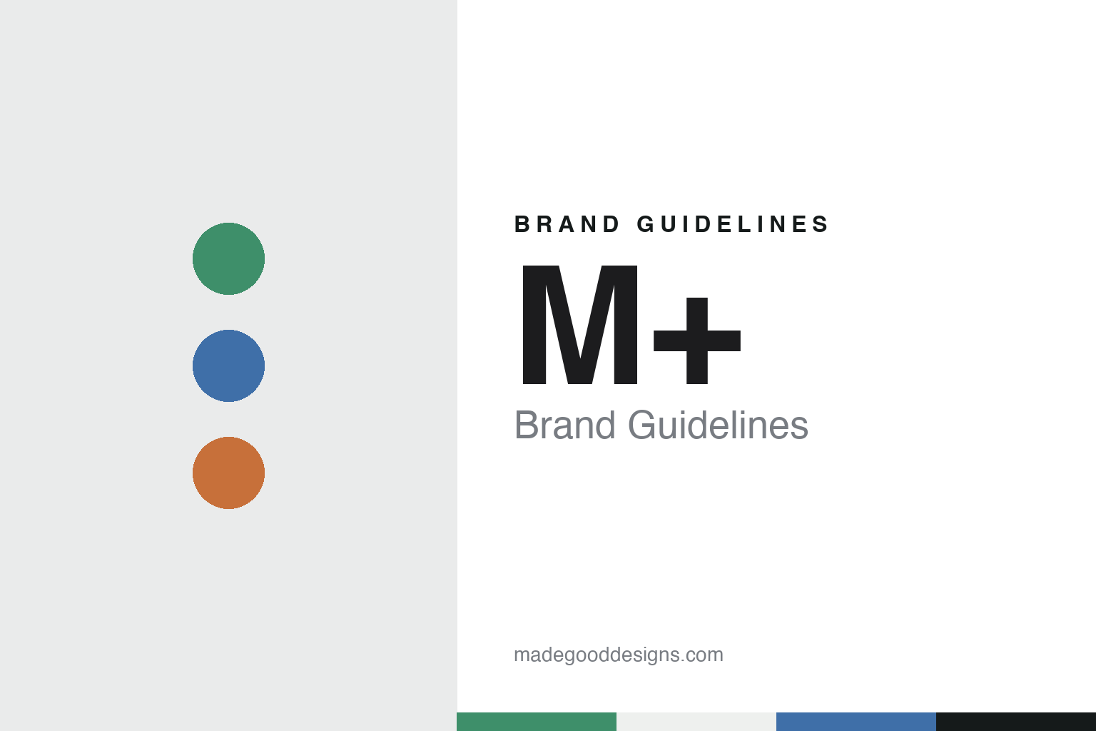
Colour carries the system. Dezeen said the system uses a range of mid-tone colours that recall Hong Kong’s urban fabric, including the neon signs and screens used by advertisers. Thonik described the set as bridging vibrant green, blue and orange with softer tones and grey, matching the neon of the city with the grey of its high-rises. The colours are produced by combining red-green-blue hues with a fixed proportion of black for tonal consistency, so that black or white lettering stays legible when the colours are used as backgrounds for text.
Thonik linked the concept to the optical science of how the human eye works, and Dezeen said the studio was also influenced by the experiments of the colour theorist and Bauhaus teacher Johannes Itten. The studio described the identity as fitting the museum’s vision, its architecture and the specifics of Hong Kong.
The magazine listed where the system appears: the museum’s façade, the website, social media, wayfinding and a promotional campaign on billboards and other outdoor advertising. It is also applied to printed maps and guides, and to a special M+ product line sold in the museum’s shop.
For a design guide, M+ shows how a two-character name, a separate logo and a colour system can be split between studios and still read as one museum. Compare the architects in Herzog & de Meuron, another museum identity in MoMA, and a fellow design museum in Cooper Hewitt. For this guide we use neon green, harbour blue, sign orange and high-rise grey with a sans, an unofficial interpretation; no product or logo is reproduced.
Explore & save
Keep M+’s identity on hand — save it to a board in the Made Good inspiration library.
M+ identity set
Pin the M+ green, blue, orange and grey palette and the Grotesque sans register to your own board.