Kellogg’s Brand Guidelines
A red signature scrawled across a cereal box — and one of the earliest anti-counterfeiting guarantees in branding.
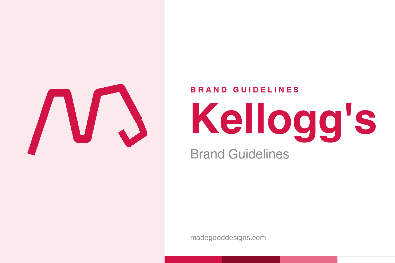
An abstract signature flourish in red — the handwriting idea, not the mark. Deliberately not the Kellogg’s script.
A logo you could forge — on purpose
Kellogg’s mark is a real man’s signature, used to prove authenticity.
The famous red “Kellogg’s” script isn’t a font — it’s the actual signature of Will Keith (W.K.) Kellogg, used on packaging from around 1906. And it was there for a shrewd reason. In Battle Creek, Michigan, dozens of copycat cereal makers were selling imitation corn flakes, so Kellogg started signing every box, with the guarantee “The original bears this signature.” The handwritten name was, in effect, an anti-counterfeiting device — a personal promise that this box was the genuine article. It’s one of the earliest and cleverest uses of a signature as a trust mark, turning the founder’s own hand into a seal of authenticity. Our homage keeps an abstract signature flourish, not the Kellogg’s lettering.
The power of a human hand
A signature says ‘a real person stands behind this’.
Signature logos — Kellogg’s, Ford, Disney, Cadbury — all trade on the same deep instinct: a person’s handwriting feels personal, human and accountable in a way typeset letters never quite do. A signature implies a named individual willing to put their name to the product, staking their reputation on it. For a food company in an age of anxiety about adulterated and imitation goods, that reassurance was priceless. The flowing red script gave Kellogg’s a warmth and a personality that a mechanical logo would have lacked — it’s friendly, confident and unmistakably somebody’s. More than a century later, that human quality still works: the signature reads as heritage and honesty, a promise handed down from the founder himself.
Born in Battle Creek
Kellogg’s grew out of one of the strangest booms in food history.
Kellogg’s was founded in 1906 in Battle Creek, Michigan — then the epicentre of a health-food craze centred on the Battle Creek Sanitarium, where W.K. Kellogg and his brother John Harvey Kellogg had developed flaked cereals. Will Keith turned the idea into the Battle Creek Toasted Corn Flake Company and built it into a global empire. The signature dates from those scrappy early days, when being the original mattered intensely because so many rivals were selling near-identical flakes. That competitive origin is baked into the logo: the red script isn’t just decoration, it’s a survivor of a cereal war, the mark that said “accept no imitations.” Knowing that history makes the friendly signature feel a little more like a battle standard.
One signature, many brands
The Kellogg’s script became a master mark over a huge portfolio.
Over the decades the red signature grew into a masterbrand, sitting atop a vast range of cereals — Corn Flakes, Frosties, Rice Krispies, Special K — each with its own identity but unified by that one piece of handwriting. It became a badge of trust across the breakfast table worldwide, one of the most recognised food logos on earth. In 2023 the company split (into WK Kellogg Co and Kellanova), but the script endured as the thread tying the heritage together.
That’s the enduring lesson of the Kellogg’s mark: a signature is a remarkably durable brand asset. Because it’s tied to a real founder and a real promise, it resists trend and ages into ever-deeper heritage — the older it gets, the more authentic it feels. It has been redrawn and refined, but never fundamentally replaced, because you can’t improve on “the founder personally guarantees this.” From an anti-imitation trick in a crowded 1906 market to a global masterbrand a century later, W.K. Kellogg’s red signature is proof that sometimes the strongest logo a company can have is simply someone’s honest name, written by hand.
What lingers, in the end, is how much a single well-made mark can carry. Kellogg s demonstrates that an identity is not just a label on a product but a compressed story — of values, of heritage, of a promise to the people who encounter it. When that story is clear and the symbol that tells it is distinctive and consistent, the brand gains something durable: instant recognition, and the trust that travels with it. The craft lies in choosing the right idea in the first place, then having the patience to let it slowly become iconic.
Type & the wordmark
A flowing red script, straight from a signature.
The Kellogg’s wordmark is a flowing cursive script derived from W.K. Kellogg’s own signature — personal, warm, and instantly legible in red. The specimen below stands in with an italic serif (not the Kellogg’s script).
The original
Flowing, personal, warm — a wordmark that signs the box by hand. (Specimen set in italic Newsreader, a neutral stand-in.)
Kellogg’s red
One warm, appetising red. Click a swatch to copy the hex.
The Kellogg’s script lives in a warm red #D31245 (Pantone 1935 C), over white. Lead with the red below.
Explore & save
Keep the signature idea on hand — save the flourish homage and the red to a board.
Kellogg’s identity set
Pin the signature-flourish homage, Kellogg’s red and the signature-as-trust idea to your own board.