Peugeot Brand Guidelines
A lion that began life advertising the sharpness of saw blades — one of the oldest badges on any road.
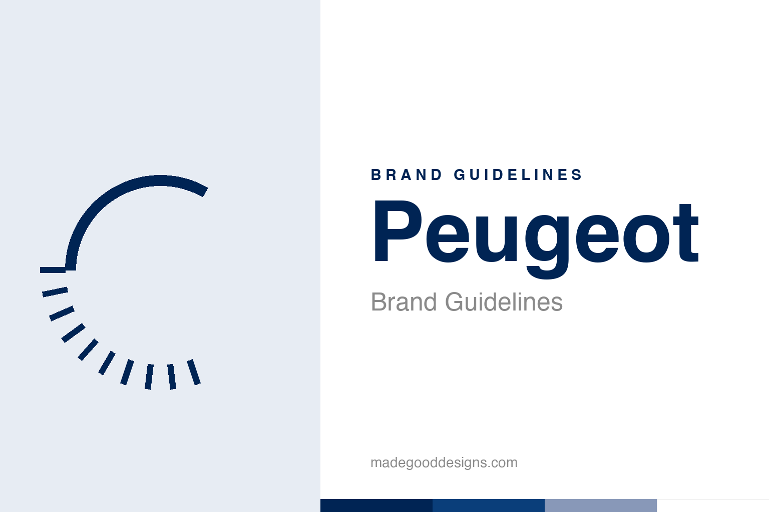
An abstract toothed saw blade — the origin idea, not the lion. Deliberately not the Peugeot lion.
A lion for a saw blade
Peugeot’s lion started with tools, not cars.
The Peugeot lion is one of the oldest surviving commercial emblems in the world, registered in 1858 — decades before Peugeot made a single car. Back then, Peugeot was a maker of steel and tools, and the lion was chosen to advertise the quality of its saw blades. The symbolism was precise: the lion represented the strength of the teeth, the flexibility of the blade (like a lion’s supple spine), and the speed of the cut (a lion’s pounce). It’s a wonderful, almost-forgotten origin — a car badge that began as a guarantee about how well a saw would slice. Our homage nods to that root with an abstract toothed saw blade rather than the lion.
From blades to automobiles
The lion made an unusually smooth leap between industries.
When Peugeot moved into automobiles in the late 19th century (Automobiles Peugeot was founded in 1896), the lion came along, and its meaning transferred beautifully. The very qualities it once claimed for saw blades — strength, agility, quality — are exactly what you want to associate with a car. That’s a rare and lucky thing in branding: a symbol whose original meaning survives a complete change of business intact. The lion didn’t need reinterpreting; it just kept meaning “powerful, well-made, fast.” Over 165 years it has been redrawn countless times — standing rampant on a pedestal, roaring, reduced to a head — but it has always been a lion, threading Peugeot’s identity from the age of hand tools to the age of electric cars.
Two centuries of Peugeot
The badge sits on one of industry’s longest continuous stories.
The Peugeot family business dates all the way back to around 1810, when the family ran a steel foundry and made everything from tools and coffee grinders to corset frames and bicycles before ever building cars. That’s more than two centuries of continuous industrial history under one family name — an extraordinary lineage that gives the lion genuine gravitas. When a badge has been in use since 1858 and the company behind it since 1810, the logo isn’t a marketing device, it’s a historical artefact. Few brands on the road can claim anything like that depth, and Peugeot’s identity draws real strength from it: the lion carries the weight of one of the oldest manufacturing dynasties in the world.
2021: back to the head
Peugeot’s latest lion looks forward by looking back.
In 2021, Peugeot unveiled its most significant rebrand in years: a return to a lion’s-head crest, a bold, upright, heraldic mark that deliberately echoes a version the company used in the 1960s. It was the first time since 1975 that the lion appeared as just a head rather than a full body, and it signalled a move upmarket as Peugeot pushed into premium and electric vehicles. The choice is telling: rather than invent something new, Peugeot reached into its own archive for a more assertive, timeless form.
That’s a smart play for a heritage brand, and a recurring theme in this series: when you have 165 years of equity in a symbol, the way to feel fresh is usually to refine and re-emphasise the symbol, not abandon it. The 2021 crest looks modern precisely because it’s rooted — it borrows the confidence of a lion that has meant “quality” since the age of saw blades. Peugeot’s identity is a masterclass in continuity: one animal, one idea (strength and craftsmanship), carried faithfully across two centuries and every technological revolution in between. The lion has outlasted saws, bicycles and petrol engines; it will comfortably outlast this one too.
Seen in the round, Peugeot’s identity rewards the same discipline every strong brand demands: decide what you stand for, express it in the simplest, most distinctive form you can, and then apply that form with almost stubborn consistency until its meaning compounds. The temptation is always to add, to chase trends, to complicate; the harder and more valuable choice is to protect a clear idea over years. That patience is what turns a mark from mere decoration into a genuine asset — recognised, trusted, and impossible to confuse with anyone else.
Type & the wordmark
A clean, confident sans beneath the crest.
Modern Peugeot pairs the lion’s-head crest with a clean, contemporary sans wordmark — upmarket and precise. The specimen below stands in with a neutral sans.
Unboring the future
Even, precise, upmarket — type tuned to carry a 165-year-old lion into the electric age. (Specimen set in Archivo, a neutral stand-in.)
Peugeot blue
One deep, premium blue. Click a swatch to copy the hex.
Peugeot’s modern identity centres on a deep blue #002454 (a Prussian-style “brand blue”), with white and metallic accents. Lead with the blue below.
Explore & save
Keep the lion idea on hand — save the saw-blade homage and the blue to a board.
Peugeot identity set
Pin the saw-blade homage, Peugeot blue and the heritage-continuity lesson to your own board.