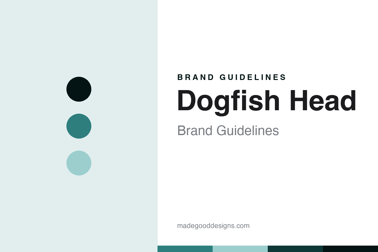
Dogfish Head Brand Guidelines
The off-centered brewery.
Aa
Two constants: an off-centered-teal palette and an off-centered-sans register. Abstract homage — not a Dogfish Head product or mark.
The off-centered brewery
Dogfish Head is the Delaware brewery of “off-centered ales” — now a founder-led brand under Boston Beer.
Dogfish Head brings the round its experiment — the Delaware brewery whose “off-centered ales for off-centered people,” from continuously hopped IPAs to culinary and historical beers, made experimentation the brand. Dogfish Head makes craft beer and spirits, and its answer to a round about the craft beer icons is a philosophy of difference: off-centered, culinary, founder-driven, and now part of a larger family. A beer, brewed sideways.
Its identity is the off-centered brewery. Dogfish Head’s off-centered ales, its 90 Minute IPA and its founder story are the story here. A beer, off-centered. The off-centered brewery.
(Honest notes, so the story stays precise. Dogfish Head Craft Brewery, at dogfish.com, was founded in June 1995 in Milton, Delaware, originally in Rehoboth Beach, by Sam and Mariah Calagione, under the tagline “off-centered ales for off-centered people.” It is known for continuously hopped IPAs, the 60, 90 and 120 Minute IPA, with the 90 Minute a flagship, plus SeaQuench, Midas Touch and a microdistillery making spirits. On where it is made — a theme of this round — it brews in the US, in Milton, Delaware. On ownership, the key fact of this round: Dogfish Head merged with the Boston Beer Company, maker of Samuel Adams, in 2019, so it is a founder-led brand under a larger parent rather than independent, and Sam Calagione remains involved with the brand, which we state without specifying a current title. Its shark-fin logo and off-centered tagline are IP we describe but do not reproduce, and the brand itself pairs its ethos with a call to drink responsibly, which we mirror. There is no official brand hex here; these tones are an unofficial interpretation. This is design commentary, not a promotion.)
Colour
Dogfish Head lives in an off-centered teal. Click a swatch to copy the hex.
Dogfish Head’s identity is experimental, culinary and founder-driven — an off-centered teal, an ink, a sea, a deep teal, and a paper. The palette leans off-centered teal and sea: a distinctive, coastal register that nods to a Delaware beach brewery and an off-centered ethos rather than a conventional palette. It signals an experimental maker. The honest caveat: with no published brand hex, these values are an original, unofficial interpretation, not first-party colours.
The lesson is an off-centered teal signals an experimental, culinary identity. Dogfish Head’s world is an experimental, brewed object. For designers, it is a reminder that a distinctive teal and a soft sea tone can carry a beer brand — the tone of the off-centered. Because these tones can fail as small text, keep type dark and let the colour live in the accents, palette and band. The takeaways: make difference the brand; brew culinary and experimental; be honest about the parent; and treat any single hex as unofficial.
Typography
The register is an off-centered sans — experimental, warm, plain.
Dogfish Head’s identity carries an experimental, warm, plain spirit — an off-centered brewery, not a conventional one. An off-centered sans captures the mood: friendly, inventive and a little quirky, the register of a beer that brews sideways. Set in an off-centered-teal palette, the off-centered sans feels experimental and warm — exactly the personality Dogfish Head carries. It is an ethos rather than a logo, mirroring hops and culinary ingredients. (Dogfish Head’s real wordmark and shark-fin are things we describe but do not reproduce, and the exact typeface is not ours to use.) Because it is not ours to use, the honest description is “an off-centered-sans spirit,” shown here in a stand-in. The type behaves like the beer: experimental, warm and plain.
Aa
An off-centered-sans spirit — experimental and warm. (Specimen set in Work Sans, an off-centered-sans STAND-IN; NOT the Dogfish Head logo.)
The craft beer icons
Dogfish Head stands for the off-centered brewery.
Dogfish Head brings the round its experiment. An off-centered-teal palette, an off-centered sans and a continuously hopped IPA make one thing — the off-centered brewery — the whole identity: experimental, culinary and founder-driven. The off-centered ethos is the differentiator, and the 90 Minute IPA is the signature. The point is a Delaware brewery that made experimentation and culinary brewing its brand, and became a founder-led name within a larger family.
Put to work, the identity is off-centered thinking told straight, as design. A maker in this spirit would make difference the brand, brew experimentally, and be honest about the parent. A reader in this spirit would keep the facts right: Dogfish Head was founded in June 1995 in Milton, Delaware by Sam and Mariah Calagione; its continuously hopped 60, 90 and 120 Minute IPAs, with the 90 Minute a flagship, and its microdistillery define it; it brews in the US in Milton; and it merged with the Boston Beer Company in 2019, so it is a founder-led brand under a parent, with Sam Calagione still involved. Dogfish Head sits in the round’s who-owns-craft thread at the craft-parent point, between the minority-stake Brooklyn and the macro-owned Beavertown, and in the 90s-craft-boom cohort with Stone. The honest editorial moves are to date the founding to 1995, to credit both Calagiones, to state the Boston Beer ownership, and to reproduce no marks. The lesson Dogfish Head teaches is that being off-centered can be a whole identity, and honesty about the Boston Beer parent keeps the ethos credible.
For designers and brand-builders, Dogfish Head continues the craft beer icons: make difference the brand — and be honest about the parent. The lessons: build a brand on genuine difference; brew or make experimentally; say when you have joined a larger family; keep a responsible tone with alcohol; and never reproduce a logo. It is also a reminder to stay precise: Dogfish Head is the Delaware brewery of off-centered ales, now a founder-led brand under Boston Beer — with the palette here an unofficial interpretation, and the piece a design commentary, not a promotion. Read that way, Dogfish Head is less a beer than a philosophy: the off-centered ale, still brewed in Delaware under a larger roof. The lesson for a brand is that difference and honest ownership reinforce each other, and naming Boston Beer keeps the ethos earned. Dogfish Head made the-off-centered-brewery the identity — proof that difference can define a beer.
Explore & save
Keep Dogfish Head’s identity on hand — save it to a board in the Made Good inspiration library.
Dogfish Head identity set
Pin the off-centered-teal palette and the off-centered-sans register to your own board.


