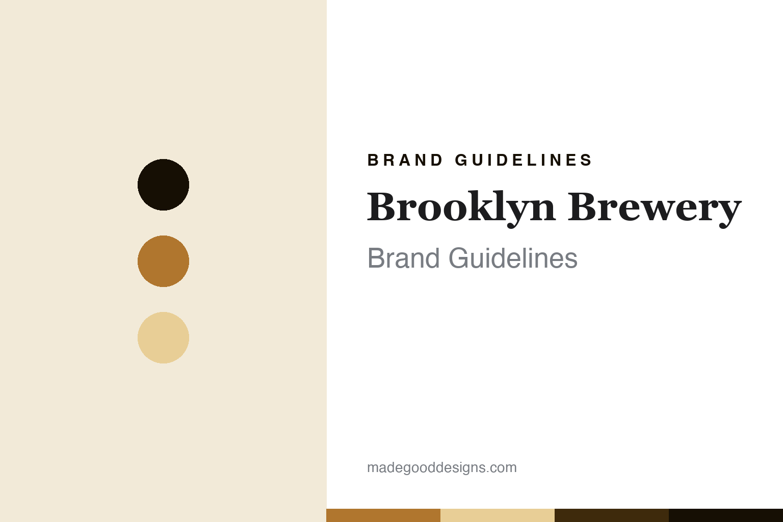
Brooklyn Brewery Brand Guidelines
The Milton Glaser beer identity.
Aa
Two constants: a lager-amber palette and a borough-serif register. Abstract homage — not a Brooklyn Brewery product or mark.
The Milton Glaser beer identity
Brooklyn Brewery is the NYC craft brewery whose logo was designed by Milton Glaser — creator of I♥NY.
Brooklyn Brewery brings the round its design landmark — the New York craft brewery whose identity was created by Milton Glaser, the legendary designer of the I love New York logo, in a story where the designer took equity in the brewery in return for the work. Brooklyn Brewery makes craft beer, and its answer to a round about the craft beer icons is a graphic-design landmark: an identity by one of America’s great designers, on a Brooklyn Lager. A beer, with a designer’s mark.
Its identity is the Milton Glaser beer identity. Brooklyn Brewery’s Glaser-designed identity, its Brooklyn Lager and its Williamsburg roots are the story here. A beer, designed by a legend. The Milton Glaser beer identity.
(Honest notes, so the story stays precise. Brooklyn Brewery — at brooklynbrewery.com, now redirecting to a .world domain — was founded in 1988 by Steve Hindy and Tom Potter, and is based in Williamsburg, Brooklyn, in a former matzo factory. Its founders hired the graphic designer Milton Glaser, creator of the 1977 I love New York logo, to design the company identity, and Glaser took a share in the company in return, making the Brooklyn identity a documented landmark of American brand design; its flagship is Brooklyn Lager, a Vienna lager, alongside a Pilsner and IPAs. On where it is made — a theme of this round — not all Brooklyn beer is brewed in Brooklyn: much has historically been contract-brewed at the F.X. Matt brewery in Utica, New York, with a Williamsburg expansion in 2009, so we frame it as brewed in Brooklyn and by partners. On ownership, the Japanese brewer Kirin acquired a minority stake of about a quarter in 2016, so the brewery is majority-independent, and its international distribution runs through Carlsberg. Milton Glaser died in 2020, and we treat him respectfully; his I love New York and Brooklyn marks are IP we describe but do not reproduce. There is no official brand hex here; these tones are an unofficial interpretation. This is design commentary, not a promotion — please enjoy responsibly.)
Colour
Brooklyn Brewery lives in a lager amber. Click a swatch to copy the hex.
Brooklyn Brewery’s identity is designed, NYC and iconic — a lager amber, an ink, a barley, a deep amber, and a paper. The palette leans lager amber and barley: a warm, classic register that nods to a Vienna lager and a designed identity rather than a loud palette. It signals a design-landmark brewery. The honest caveat: with no published brand hex, these values are an original, unofficial interpretation, not first-party colours — and no borrow of the Glaser marks is intended.
The lesson is a lager amber signals a designed, iconic identity. Brooklyn Brewery’s world is a designed, brewed object. For designers, it is a reminder that a warm amber and a soft barley can carry a beer brand — the tone of a Vienna lager. Because these tones can fail as small text, keep type dark and let the colour live in the accents, palette and band. The takeaways: hire a great designer; give the identity room to last; be honest where it is brewed; and treat any single hex as unofficial.
Typography
The register is a borough serif — designed, classic, considered.
Brooklyn Brewery’s identity carries a designed, classic, considered spirit — a design-landmark brewery, not a fashion. A borough serif captures the mood: confident, elegant and a little classic, the register of a beer with a great designer’s identity. Set in a lager-amber palette, the borough serif feels designed and classic — exactly the personality Brooklyn Brewery carries. It is a designed mark rather than a logo we can show, mirroring amber glass and barley. (Brooklyn Brewery’s real identity, by Milton Glaser, is a thing we describe but do not reproduce, and the exact typeface is not ours to use.) Because it is not ours to use, the honest description is “a borough-serif spirit,” shown here in a stand-in. The type behaves like the beer: designed, classic and considered.
Aa
A borough-serif spirit — designed and classic. (Specimen set in Playfair Display, a borough-serif STAND-IN; NOT the Brooklyn Brewery logo.)
The craft beer icons
Brooklyn Brewery stands for the Milton Glaser beer identity.
Brooklyn Brewery brings the round its design landmark. A lager-amber palette, a borough serif and a Vienna lager make one thing — the Milton Glaser beer identity — the whole identity: designed, NYC and iconic. The Glaser identity is the differentiator, and the design-landmark status is the meaning. The point is a Williamsburg brewery whose identity, by the designer of I love New York, is one of the most celebrated brand-design stories in beer.
Put to work, the identity is a design landmark told straight, as design. A maker in this spirit would hire a great designer, give the identity room to last, and be honest where it is brewed. A reader in this spirit would keep the facts right: Brooklyn Brewery was founded in 1988 by Steve Hindy and Tom Potter in Williamsburg; Milton Glaser designed the identity and took equity in return; not all its beer is brewed in Brooklyn, much historically at F.X. Matt in Utica; Kirin holds a minority stake from 2016, so it is majority-independent; and Milton Glaser died in 2020. Brooklyn Brewery anchors the round’s design-showcase thread with Beavertown, Omnipollo and Northern Monk, and its who-owns-craft position is the minority-stake middle, between the independents and the fully acquired. The honest editorial moves are to credit Glaser and the equity story, to say brewed-in-Brooklyn-and-by-partners, to state the Kirin minority, and to reproduce none of the Glaser marks. The lesson Brooklyn Brewery teaches is that a designer’s identity can be a whole brand, and honesty about the brewing and the minority stake keeps the landmark credible.
For designers and brand-builders, Brooklyn Brewery continues the craft beer icons: hire a great designer — and let the identity last. The lessons: commission real design talent; let an identity endure for decades; be candid about contract brewing and a minority investor; honour a designer’s legacy without borrowing the marks; and never reproduce a logo. It is also a reminder to stay precise: Brooklyn Brewery is the NYC craft brewery whose logo was designed by Milton Glaser, creator of I love New York — with the palette here an unofficial interpretation, and the piece a design commentary, not a promotion. Read that way, Brooklyn Brewery is less a beer than a design story: a Vienna lager wearing a legend’s mark. The lesson for a brand is that great design and honest disclosure reinforce each other, and crediting Glaser without copying him keeps the landmark earned. Brooklyn Brewery made the-Milton-Glaser-beer-identity the identity — proof that a designer can define a beer.
Explore & save
Keep Brooklyn Brewery’s identity on hand — save it to a board in the Made Good inspiration library.
Brooklyn Brewery identity set
Pin the lager-amber palette and the borough-serif register to your own board.