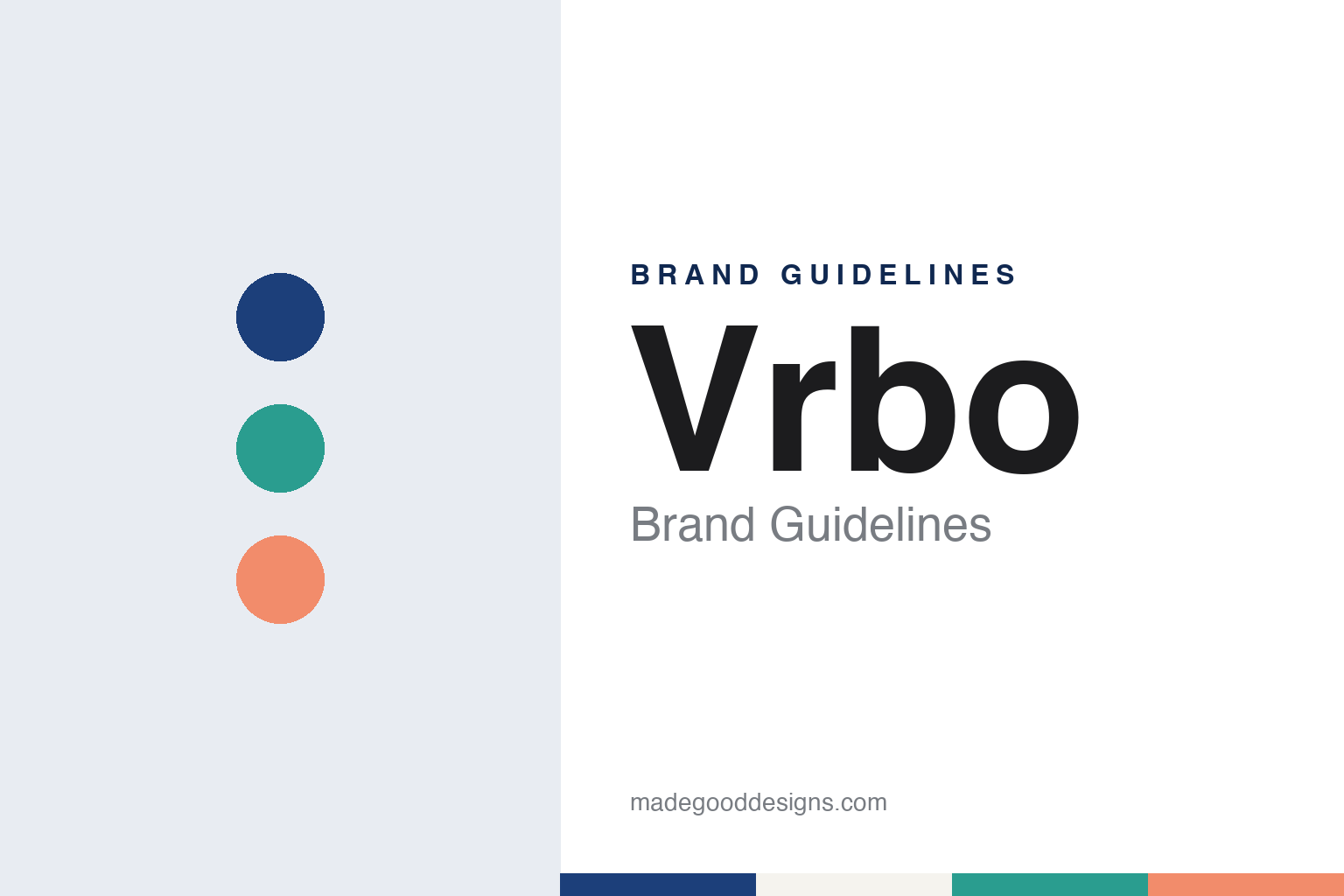
Vrbo Brand Guidelines
Vacation Rentals by Owner, renamed and re-pronounced in 2019.
Aa
Two constants: a lake navy, pine teal and porch coral palette and a friendly geometric sans register. Abstract homage — not a Vrbo product or mark; no striped logo or wordmark is reproduced.
Vrbo
A ski condo, an acronym and a family of owners.
Vrbo started as one owner’s solution to one problem. English Wikipedia says the website was created in 1995 by David Clouse, a programmer in Aurora, Colorado, who wanted to rent out his condominium at the Breckenridge ski resort. Other homeowners who wanted to rent out their own places soon used the site to list their own properties for short stays, and the name described exactly what it offered: Vacation Rentals by Owner, shortened to the initials VRBO.
The early business model was simple. Wikipedia says owners paid an annual subscription fee to list a property, and travellers then contacted them to arrange a stay. The listings were holiday homes offered directly by the people who owned them, and later coverage of the brand still describes it as connecting owners who rent out homes, cabins and condos with travellers.
Ownership changed twice. Wikipedia says VRBO was acquired by HomeAway, an Austin, Texas, vacation-rental company, in 2006. On 4 November 2015 Expedia announced that it would acquire HomeAway, including VRBO, and the transaction closed in early 2016. Expedia Group has owned the brand since then, and Wikipedia describes Vrbo today as an American online marketplace for vacation rentals, primarily based in Austin, with Expedia Group as its owner. In May 2019, Wikipedia says, the group decided to streamline its vacation-rental portfolio, naming Vrbo its main vacation-rental brand and retiring the HomeAway name, so a site that began as an acronym ended up as the name over its former parent’s business.
Colour
New capitals, a new logo and a new way to say it.
The rename came in March 2019. ShortTermRentalz reported on 27 March 2019 that Vrbo had undergone a brand and website makeover and revealed a new way to say its name, and quoted HomeAway president John Kim on Expedia Group’s commitment to helping owners connect with travellers. The capital letters gave way to Vrbo, with a single initial capital, and the company said the name should now be pronounced “VER-boh”, which it described as easier to say and remember than spelling out the four letters.
The same report described the new logo. According to ShortTermRentalz, it is an intertwined series of stripes that form the brand’s name, meant to represent bringing people together on vacation and the variety of trips people take, and its colours are adaptable so that they can represent different people, countries and causes.
Advertising followed within days. MediaPost reported on 3 April 2019 that Vrbo, then a HomeAway division of Expedia Group, had launched a campaign built around the new pronunciation. The spot was directed by Todd Strauss-Schulson of Prettybird and set to a Broadway tune, with an opening line that played on the new way to say the name, and it showed groups of family and friends being matched with homes suited to them. MediaPost said it would begin airing on 15 April 2019 on national networks and on cable channels such as HGTV, Travel Channel and TLC, alongside a new feature called Trip Boards that let groups save, comment on and vote for properties. The report said the commercial was also scheduled to appear during Good Morning America, the Today show and Saturday Night Live, and that the wider push included search and retargeting advertising online.
Typography
Design and documentation.
Travel sites live on small screens as much as large ones, so their identities are tested at very different sizes. A wordmark that reads well across the top of a desktop search page has to survive as a home-screen app icon, a favicon in a browser tab and a tiny badge on a booking confirmation email. Many travel brands answer that problem with a compact symbol or a single letter that can stand alone when the full name will not fit, and keep the wordmark for larger placements.
Colour does a lot of work in this category. A consistent brand colour helps a user spot the right app among dozens on a phone and recognise the brand inside a crowded comparison results page. Mascots and characters play a similar role: an animal, a figure or a costumed spokesperson can carry a brand across television, social video and outdoor advertising without relying on the name alone.
Television spokespeople and recurring advertising characters have long been part of the travel-site playbook, giving a web service a face and a voice. When a company refreshes its identity, these elements are often redrawn, retired or brought back, so it is worth checking the date of any logo, icon or campaign before treating it as current.
Aa
A friendly geometric sans — the register of a listing card and a group chat. (Specimen set in Plus Jakarta Sans, a sans-serif STAND-IN; NOT the Vrbo logo.)
Vrbo
Togetherness as a brand idea.
Since the rename, the Vrbo identity has kept returning to a single idea: the shared trip. The striped logo, as described in 2019, was meant to stand for people coming together, and the Trip Boards feature launched with the new name was built for groups deciding together. The advertising has followed the same line. English Wikipedia says that in 2022 Expedia Group and the agency Wieden+Kennedy made a Vrbo commercial called “A Place for Together”, which aired during the Super Bowl pre-game show and used the song “Right Where I Belong” from the 1984 film The Muppets Take Manhattan. In the same year, Wikipedia says, Vrbo became a multi-year title sponsor of the Fiesta Bowl college football game, putting the name in front of a national television audience each winter.
The brand has also been drawn closer to its sister sites. Wikipedia says that in 2023 Vrbo’s consumer front end moved onto the same technology as the Expedia brand, and that Vrbo joined the One Key loyalty programme shared with Expedia and Hotels.com in the United States that year, with other countries following in 2024. ShortTermRentalz noted in 2019 that the group tools came with app push notifications, so each member of a travel party could choose to hear about new votes or comments straight away, and that Vrbo described itself then as part of HomeAway and the Expedia Group family. Today a vacation-rental brand with its own name and logo sits inside a shared set of account, reward and app conventions while keeping the striped name it adopted in 2019.
The pronunciation itself came from customers. MediaPost described the change as matching the nickname consumers had given the brand years earlier, so the new spelling, the new sound and the striped mark arrived together in one launch at the end of March 2019, with the television campaign following in April.
For a design guide, Vrbo shows how an acronym can be turned into a pronounceable word, and how a logo can be built to change colour while keeping its shape. Compare Airbnb, a home-sharing brand with its own custom symbol, and its sister brand Expedia. For this guide we use lake navy, pine teal and porch coral with a sans, an unofficial interpretation; no product or logo is reproduced.
Explore & save
Keep Vrbo’s identity on hand — save it to a board in the Made Good inspiration library.
Vrbo identity set
Pin the Vrbo lake navy, pine teal and porch coral palette and the friendly geometric sans register to your own board.