Abitare Brand Guidelines
A verb for living, set as a masthead.
Aa
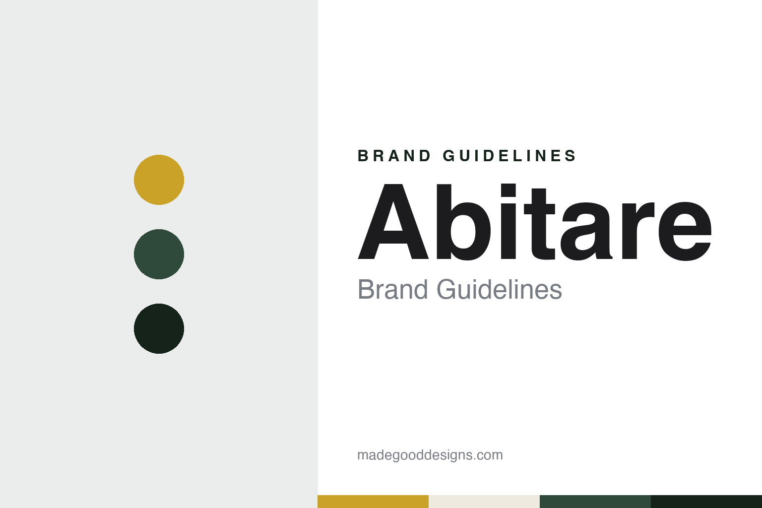
Two constants: an ochre, green and night palette and a grotesque sans register. Abstract homage — not an Abitare asset or mark; no logo, cover or masthead is reproduced.
A magazine named after a verb
Piera Peroni’s Milan monthly and its renaming.
Abitare is an Italian verb meaning to live in, or to dwell, and English Wikipedia glosses the title in exactly those terms. The magazine did not start with that name. Italian Wikipedia says it was founded in 1961 by Piera Peroni and was originally called Casa Novità, becoming Abitare from its sixth issue. English Wikipedia says it was launched in Milan in 1961 and published in both Italian and English, and that it covered architecture, interior design, furniture, product design and the graphic arts.
Metalocus, the Spanish architecture site, gave the same outline in a report by José Juan Barba dated 20 January 2014: Abitare was launched in Milan in 1961, was published in Italian and English, and covered architecture, design, art and graphics. The report also listed the magazine’s editors up to that point, naming Piera Peroni, Franca Santi, Italo Lupi and Stefano Boeri before the architect Mario Piazza, who was then in charge.
English Wikipedia says that shortly after the founding the postwar architect Eugenio Gentili Tedeschi joined Peroni, wrote for the magazine, and later served as acting de facto editor-in-chief together with Franca Santi. Italian Wikipedia says that in 1974 the direction of the magazine passed, by Peroni’s own wish, to Franca Santi Gualteri, a journalist who had worked on the project since its start, and that Santi Gualteri directed Abitare from 1974 to 1992, a span of eighteen years.
Ownership changed early in her tenure. English Wikipedia says that in 1976 the magazine was sold to the Segesta publishing group. Italian Wikipedia gives the detail: in 1976 the title was acquired by Renato Minetto, who made it the core of his new company, Editrice Abitare Segesta. The magazine’s name thus became part of its publisher’s name.
The same company ran Abitare for almost three decades. Italian Wikipedia says that in 1995 Roberto Minetto, Renato’s son, became managing director and Antonella Minetto took on editorial direction, and that in 1997 the company launched a second title, Case da Abitare, edited by Silvia Latis.
Colour
Lupi, Boeri, Piazza and a paused press.
The graphic designer Italo Lupi shaped Abitare twice. Italian Wikipedia says he was the monthly’s art director from 1975 to 1985, and that in 1992, when Franca Santi Gualteri left after eighteen years, he was appointed its editor. He held the post for fifteen years, until 2007. In the interval between those two roles Lupi worked on the rival Milan monthly: English Wikipedia’s article on Domus says that when Mario Bellini became its editor with the March 1986 issue, he engaged Lupi for a new graphic design.
The publisher changed during Lupi’s editorship. Italian Wikipedia says that in 2005 Editrice Abitare Segesta was acquired by the RCS group, and Abitare joined the family of titles of Rcs Periodici. English Wikipedia also says the magazine became part of the RCS Group and began to be published by RCS MediaGroup. RCS has owned Abitare since 2005.
The next editor came from Domus. Italian Wikipedia says that in 2007 Lupi was succeeded by the architect Stefano Boeri, who had previously edited Domus, and that in 2011 Boeri handed the editorship to his co-editor, Mario Piazza. English Wikipedia lists Chiara Maranzana and Maria Giulia Zunino among the magazine’s other editors-in-chief.
A redesign followed in 2012. Italian Wikipedia says the magazine was restyled in both its graphics, with a renewed cover and logo, and its content, with each issue built around a project that explored a theme, an object or a building in nested layers, like a matryoshka doll.
Then the press stopped. Metalocus reported on 20 January 2014 that Abitare’s printed edition would end with issue A537, that the Italian media group RCS was ending the print edition in March, and that, according to the Italian news site of La Stampa, Abitare would continue to publish content online. The same report noted that Joseph Grima, who edited Domus from 2011 to 2013, had been a special correspondent for Abitare.
The pause was temporary. English Wikipedia says print publication ceased in March 2014 while the online version continued, and that the magazine was relaunched in October 2014 with a new format and new graphics under the direction of Silvia Botti. Italian Wikipedia puts the suspension at about eight months, with the magazine back on newsstands in October under Botti.
Typography
A verb for living, a renamed title and a designer as editor.
A magazine’s masthead can stay in one plain serif and still change in small steps. Jeremy Leslie of magCulture wrote in September 2015 that the Fantastic Man logo is set in Times Roman, that the earlier covers carried a stacked, centred version of it, and that issue No. 21 broke away from that arrangement before No. 22 returned to it. In No. 22 the magazine also introduced Founders Grotesk, by Kris Sowersby, as a new headline sans. Leslie described pages built on strict typographic rules, with little decoration beyond the fonts, and a look based on an approach rather than a fixed set of devices. It’s Nice That described the same magazine in October 2015 as mostly black and white, with rule lines, two columns and long passages of text.
Other titles put more of the identity into the cover image itself. AnOther says the first cover of AnOther Magazine, in 2001, was a photograph by Nick Knight of two young lovers cast as Adam and Eve, and that Jefferson Hack’s foreword framed it as the magazine’s statement for that season. For its fifteenth anniversary in 2016, It’s Nice That reported, AnOther made a limited edition with a 3D hologram cover of Karl Lagerfeld, made by the holographer Rob Munday, alongside covers of other subjects in the same issue. When reading a magazine’s identity, look at how the masthead is set and how often it moves, which typefaces carry the headlines, and whether the cover photograph or the cover object carries the brand.
Aa
A grotesque sans — the register of a Milan monthly edited by a graphic designer. (Specimen set in Archivo, a sans STAND-IN; NOT the Abitare logo or any Abitare typeface.)
Abitare
A one-word title that moved from magazine to publisher and back.
Abitare’s identity starts with a renaming. The magazine began in 1961 as Casa Novità and took the name Abitare with its sixth issue, according to Italian Wikipedia, and that single verb has carried it through a change of editor in 1974, a change of owner in 1976, the move to RCS in 2005, a redesign in 2012 and a relaunch in 2014.
The word also spread to the company and its titles. Renato Minetto’s publishing house, founded around the magazine in 1976, was named Editrice Abitare Segesta, and its second magazine of 1997 was called Case da Abitare, according to Italian Wikipedia. When RCS acquired the company in 2005, the magazine kept its title inside Rcs Periodici.
Designers have held the masthead. Italian Wikipedia says the graphic designer Italo Lupi was art director from 1975 to 1985 and editor from 1992 to 2007. The restyling of 2012, under Mario Piazza, renewed both the cover and the logo, and the relaunch of October 2014 under Silvia Botti came with new graphics and a new format, according to English Wikipedia.
The same people moved between Abitare and its Milan neighbour. Lupi designed Domus under Mario Bellini from 1986, Stefano Boeri edited Domus before taking over Abitare in 2007, and Metalocus noted on 20 January 2014 that Joseph Grima, an Abitare correspondent, had edited Domus from 2011 to 2013.
For a design guide, Abitare shows how a magazine can take its name from a verb, lend that name to its publisher and a sister title, and hand its editorship to a graphic designer who had earlier served as its art director. Compare Domus, the Milan monthly that shared Lupi and Boeri, or Dezeen, a London architecture and design publication. For this guide we use ochre, green and night with a sans, an unofficial interpretation; no product or logo is reproduced.
Explore & save
Keep Abitare’s identity on hand — save it to a board in the Made Good inspiration library.
Abitare identity set
Pin the Abitare ochre, green and night palette and the grotesque sans register to your own board.