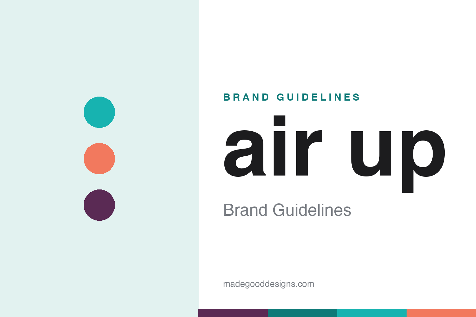
air up Brand Guidelines
Flavour by smell — plain water that tastes of fruit through your nose, born from a German design-school thesis.
Aa
Two constants: a fresh, playful turquoise-and-coral palette and a friendly, rounded sans. Abstract homage — not the air up wordmark.
Flavour by smell
air up flavours water through your nose.
air up is a lesson in a scientific insight becoming a product. The German company (air up GmbH, based in Munich) grew out of a product-design project — the scent concept was developed in 2016 during the product-design studies of founders including Lena Jüngst and Tim Jäger (a story often told as beginning with a design-school thesis) — with the company founded in 2018 and launched around 2019. Its core is a genuinely clever idea: you drink plain water, but a scented flavour “pod” (ring) clipped onto the top of the bottle tricks your brain, via retronasal smell, into perceiving fruit flavour. (Two honest notes: the water itself stays completely unflavoured — the flavour is perceived through smell — and no official brand hex or typeface is published.)
The science is the hook. When you drink through the pod, aromas travel from the back of your mouth up to your nose (retronasal olfaction), and your brain interprets that smell as taste — so water can seem to taste of peach, cola or berry with zero sugar, zero calories and zero additives in the water. It’s a legitimate, well-established mechanism of flavour perception, cleverly applied. The product is a bottle plus swappable scent pods, sold largely on a subscription model for the pods — a razor-and-blades business built around a patented idea.
air up became a phenomenon through social media — huge TikTok and Instagram virality, especially with Gen Z, spreading across Europe and then into the US. Its sustainability angle (cutting sugary drinks and single-use bottles by re-flavouring tap water) reinforced the appeal. The identity is fresh, playful and modern — a lowercase “air up” wordmark and a bright, youthful palette. It’s privately held and venture-backed. Flavour, delivered by smell.
Colour
air up lives in a fresh, playful palette. Click a swatch to copy the hex.
air up’s identity is fresh, playful and youthful — bright turquoises, corals and fruit-forward accents that feel light, modern and appetising. The palette matches a brand aimed at Gen Z that turns plain water into a fun, flavourful ritual: it reads as healthy and energetic rather than sporty or clinical, and the fruit-coded colours echo the scent pods’ flavours. Like many modern DTC drinkware brands, air up uses colour as expression and appetite appeal, refreshed to feel current. The honest caveat: air up publishes no official brand hex, so the turquoise and coral here are an original, unofficial interpretation, not first-party values.
The lesson is a fresh, appetising palette can sell a sensory product. air up’s bright, fruit-coded colours make water feel flavourful and fun. For designers, it’s a reminder that colour can cue taste and appetite for a sensory brand. The takeaways: use fresh, appetising colour for a flavour/sensory product; colour-code by flavour for instant legibility; and treat specific hexes as unofficial when the palette is expressive.
Typography
The wordmark is a friendly rounded sans — fresh and youthful.
air up’s identity carries a friendly, rounded, youthful spirit — a lowercase “air up” wordmark whose soft, approachable letterforms read as fresh, modern and fun. The friendly type matches a playful, Gen-Z-facing brand built on a delightful sensory trick, and it invites curiosity rather than seriousness. Set against a bright, fruit-coded palette, the type feels light and inviting — exactly the fresh, playful personality air up cultivates. It’s soft and modern rather than technical or rugged, mirroring the fun product. Because the exact wordmark face isn’t publicly documented, the honest description is “a friendly rounded sans spirit,” not a named font. The type behaves like the brand: fresh, friendly and youthful.
Aa
A friendly rounded sans spirit — fresh and youthful. (Specimen set in Quicksand, a friendly rounded sans in the spirit of the air up identity; the real face is undocumented.)
A trick of the senses
air up turned science into a brand.
air up is a lesson in turning a scientific insight into a brand. The whole company rests on one counter-intuitive truth about perception — that most of “flavour” is actually smell — and productises it: flavour the air you breathe while drinking, and plain water can taste of fruit with nothing added to it. That’s a genuinely novel, defensible, patented idea, and it gives air up a story that’s both scientific and delightful (a magic trick that’s real). It also builds a durable business model — the reusable bottle is the razor, the scent pods are the blades, sold by subscription — and a sustainability narrative (less sugar, fewer single-use bottles). The honest discipline is precision: the water is genuinely unflavoured, and the flavour is perceived via retronasal smell, so the brand should explain the mechanism rather than overclaim. It’s proof that a real, surprising insight — clearly explained and cleanly designed — can become a distinctive brand that spreads by word of mouth (and TikTok). Productise the insight, and the wonder sells it.
For designers and brand-builders, air up offers a clear takeaway: a genuine, surprising insight can become a distinctive, shareable brand. The lessons: build on a real mechanism and explain it honestly (retronasal smell, unflavoured water); design a business model around it (bottle + subscription pods); and let the wonder drive word-of-mouth (the TikTok virality). It’s also a reminder to keep the facts precise — air up is a Munich-based German company that grew from a product-design project (founders including Lena Jüngst and Tim Jäger), founded in 2018 and launched around 2019, flavouring water via retronasal smell with zero additives in the water. air up turned science into a brand — proof that a real insight, well told, can spread.
Explore & save
Keep air up’s identity on hand — save it to a board in the Made Good inspiration library.
air up identity set
Pin the fresh, playful palette and the rounded-sans spirit to your own board.


