Chilly’s Brand Guidelines
A bottle as a lifestyle object — British design, endless pattern collaborations, and the anti-plastic wave.
Aa
Two constants: a soft, rotating pastel/pattern palette and a clean, lifestyle sans. Abstract homage — not the Chilly’s wordmark.
The design-led bottle
Chilly’s made the bottle a lifestyle object.
Chilly’s is a lesson in design and collaboration as the differentiator. It was founded in 2010 in London by James Butterfield (who was around 21 at the time); co-founder Tim Bouscarle joined as a director in 2016. (An honest nuance: both are widely called co-founders, but Butterfield founded it in 2010 and Bouscarle joined six years later — and 2010 is the correct founding year, even though the brand really scaled from around 2016–2018.) The product is a design-led, double-wall vacuum-insulated stainless-steel reusable bottle, sold as a fashion and lifestyle accessory. (Two honest notes: no official brand hex is published, and the wordmark typeface is undocumented.)
Chilly’s timing was perfect. As the UK’s anti-single-use-plastic movement surged (amplified by Blue Planet II in late 2017), the reusable bottle became a statement object — and a 2018 partnership with Pret A Manger helped push it onto the high street. The classic Original bottle carried the familiar “cold 24h / hot 12h” promise (newer models now claim much more), but the real magic was positioning: Chilly’s made a water bottle something you chose to match your style.
The engine is design collaborations and prints. Chilly’s has partnered with the likes of Emma Bridgewater, House of Sunny, RÆBURN and Chopova Lowena, plus artists and illustrators, turning bottles into collectible, fashion-led drops. It’s a certified B Corp with a sustainability focus (a take-back scheme, recycled-body claims). A quick myth-corrector: despite a common rumour, public records show no acquisition by Zwilling (or any group) — Chilly’s remains founder-owned and independent. Its identity evolved “from bottles to a lifestyle brand,” with a lowercase “Chilly’s” wordmark and campaign lines like “Find Your Flow.” A bottle, made a lifestyle object.
Colour
Chilly’s lives in soft pastels and patterns. Click a swatch to copy the hex.
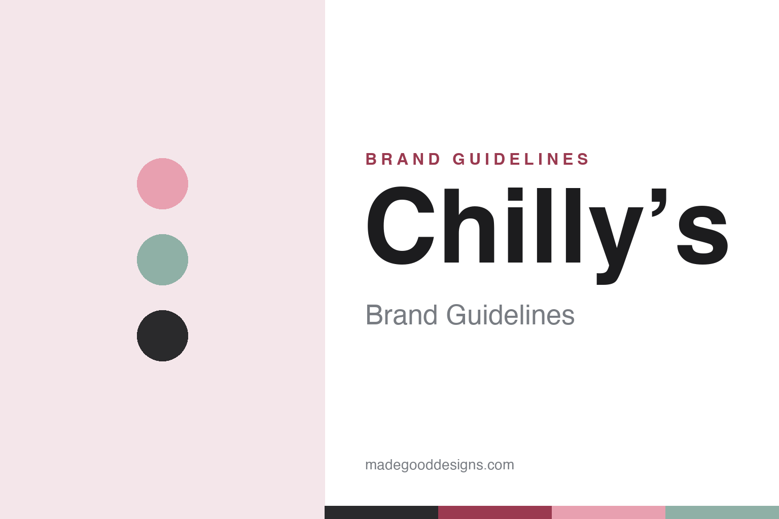
Chilly’s identity is built on a soft, rotating palette of pastels, monochromes and printed patterns rather than one signature colour. Blush pinks, sage greens, muted neutrals and bold collaboration prints let the bottle read as a fashion accessory that you match to your style — exactly the lifestyle positioning at the brand’s core. The colour and pattern are the product: they’re what turned a steel bottle into a collectible, design-led object and powered the collaboration drops. It’s a chic, contemporary palette, refreshed like a fashion line. The honest caveat: Chilly’s publishes no official brand hex, so the blush and sage here are an original, unofficial interpretation of its rotating range, not first-party values.
The lesson is a rotating pastel-and-pattern palette can be the identity. Chilly’s competes on colour, print and collaboration, refreshed like fashion. For designers, it’s a reminder that in a design-led brand the seasonal palette and prints themselves can be the differentiator. The takeaways: treat colour and pattern as the product in a lifestyle brand; power growth with collaboration drops; and treat specific hexes as unofficial when the palette rotates.
Typography
The wordmark is a clean lifestyle sans — chic and contemporary.
Chilly’s identity carries a clean, contemporary, lifestyle spirit — a friendly modern sans-serif wordmark (lowercase “Chilly’s”) that reads as chic, approachable and design-led. The clean type matches a brand that sells drinkware as a fashion accessory and leans on prints and collaborations, and it keeps the identity flexible enough to sit beside endless patterns. Set against a soft pastel-and-pattern palette, the type feels stylish and modern — exactly the lifestyle personality Chilly’s cultivates. It’s clean and contemporary rather than rugged or ornate, mirroring the design-led bottles. Because the exact wordmark face isn’t publicly documented, the honest description is “a clean lifestyle sans spirit,” not a named font. The type behaves like the brand: chic, contemporary and design-led.
Aa
A clean lifestyle sans spirit — chic and contemporary. (Specimen set in Hanken Grotesk, a clean lifestyle sans in the spirit of the Chilly’s identity; the real face is undocumented.)
Collaboration as growth
Chilly’s grew through collaboration.
Chilly’s is a lesson in using collaboration and design as the growth engine. A vacuum-insulated steel bottle is a commodity — so Chilly’s competed on design, and specifically on a relentless stream of prints and collaborations (Emma Bridgewater, House of Sunny, RÆBURN, Chopova Lowena, artists and illustrators) that turned each release into a collectible, fashion-led drop. That strategy does three things: it keeps the product feeling fresh and newsworthy, it borrows cultural cachet from partners, and it reframes a utilitarian object as a personal style statement you buy more than once. Chilly’s rode a real cultural wave (the UK anti-plastic movement) and a high-street moment (Pret, 2018) to scale, then deliberately shifted “from bottles to a lifestyle brand.” The honest part of the story includes staying independent and founder-owned (despite acquisition rumours) and backing the sustainability positioning with B Corp certification. It’s proof that collaboration and design can be a genuine growth engine in a commodity category. Collaborate relentlessly, and the bottle becomes fashion.
For designers and brand-builders, Chilly’s offers a clear takeaway: design collaborations can be a real growth engine, not just decoration. The lessons: compete on print and collaboration in a commodity category (the endless drops); ride genuine cultural waves (the anti-plastic movement, the Pret moment); and back the positioning with substance (B Corp, take-back). It’s also a reminder to keep the facts precise — Chilly’s was founded in 2010 in London by James Butterfield (Tim Bouscarle joined in 2016), is a certified B Corp, and remains founder-owned and independent (no Zwilling acquisition). Chilly’s grew through collaboration — proof that design can drive a category.
Explore & save
Keep Chilly’s’s identity on hand — save it to a board in the Made Good inspiration library.
Chilly’s identity set
Pin the pastel-and-pattern palette and the lifestyle-sans spirit to your own board.