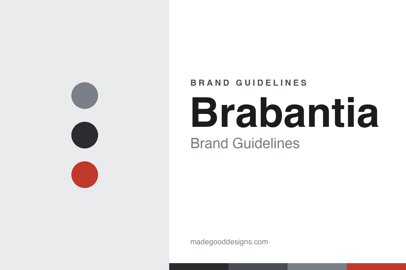
Brabantia Brand Guidelines
A century of solid making — Dutch design, the iconic pedal bin, long guarantees, and quiet quality.
Aa
Two constants: a refined matt-steel-and-charcoal palette with a red accent and a clean, modern sans. Abstract homage — not the Brabantia wordmark.
A century of solid making
Brabantia builds Dutch design to last.
Brabantia is a lesson in quiet, durable design over a century. It was founded in 1919 in the Netherlands by the van Elderen family as “Van Elderen & Co,” a sheet-metal fabrication workshop making practical goods like milk pails and buckets. The name comes from the Dutch province of North Brabant (“Brabantia” is the Latin/heraldic form). (An honest note to avoid a common trap: the company was founded in the small Dutch village of Aalst in North Brabant — not the Belgian city of Aalst — and Brabantia is a Dutch company, HQ in Valkenswaard, despite long-standing Belgian operations. Two more: no official brand hex is published, and the wordmark typeface is undocumented.)
Over a century, Brabantia grew into a design-led household name — most iconically for its stylish pedal bins (it has been making them since 1952; the newIcon, Bo and retro lines are modern favourites), alongside rotary washing lines, ironing boards, and kitchen products (bread bins, canisters, the Sort & Go recycling bins). Its reputation rests on quality, considered design and durability — backed by long guarantees (10 years on some products). (An honest note: Brabantia is the iconic maker of the pedal bin and the rotary dryer, but didn’t invent them — the foot-pedal bin is generally credited to Lillian Gilbreth, and the rotary clothesline is Australian in origin.)
Brabantia is still privately, family-owned by the van Elderen family (CEO Tijn van Elderen). It pairs its heritage with a genuine sustainability commitment — long-life, circular products, and a donation to The Ocean Cleanup for every bin sold. Its identity is refined and Dutch-modern: a clean wordmark, a palette of matt steels and neutrals (its bins come in finishes like Matt Steel and Passion Red). Its mission phrase is “Designed for Living,” and it frames its sustainability positioning around being a “Solid Company.” A century of solid making.
Colour
Brabantia lives in refined matt steel and charcoal. Click a swatch to copy the hex.
Brabantia’s identity leans on a refined, Dutch-modern palette — matt steels, charcoals and neutral whites, with a considered accent (its bins famously come in finishes like Matt Steel and Passion Red). The palette reads as clean, quality and design-led: understated and grown-up rather than loud, matching a century-old maker known for durable, well-designed household objects. The matt-steel tones signal the metal heritage and the premium, engineered feel of the products. The honest caveat: Brabantia publishes no official brand hex, and its product finishes (Matt Steel, Passion Red) are colourways rather than a documented brand palette — so the steel and charcoal here are an original, unofficial interpretation, not first-party values.
The lesson is a refined, neutral palette can signal quality and durability. Brabantia’s matt-steel world reads as premium and design-led — matching well-made, long-lasting household objects. For designers, it’s a reminder that restrained, material-honest colour can communicate quality. The takeaways: use refined, neutral tones for a quality design brand (matt steel, charcoal); add a considered accent (a Passion Red); and treat specific hexes as unofficial when product finishes aren’t a brand palette.
Typography
The wordmark is a clean Dutch-modern sans — refined and quality-led.
Brabantia’s identity carries a clean, refined, Dutch-modern spirit — a considered sans-serif wordmark whose even letterforms read as quality, design-led and quietly premium. The clean type matches a century-old maker of durable, well-designed household objects, and the restraint signals substance and craft over flash. Set against a matt-steel-and-charcoal palette, the type feels refined and engineered — exactly the quality, design-and-durability personality Brabantia cultivates. It’s clean and refined rather than loud or ornate, mirroring the well-made products. Because the exact wordmark face isn’t publicly documented, the honest description is “a clean Dutch-modern sans spirit,” not a named font. The type behaves like the brand: refined, quality-led and considered.
Aa
A clean Dutch-modern sans spirit — refined and quality-led. (Specimen set in Bricolage Grotesque, a clean modern grotesque in the spirit of the Brabantia identity; the real face is undocumented.)
Design and durability
Brabantia makes everyday objects better.
Brabantia is a lesson in elevating the most ordinary household objects through design and durability. A bin, a washing line, an ironing board — about as unglamorous as products get — and Brabantia’s whole brand is built on making them genuinely well-designed, long-lasting and even desirable. The iconic pedal bin is the emblem: a piece of everyday utility turned into a considered, quality object you’re happy to have on display, backed by a 10-year guarantee. That combination — thoughtful design plus real durability, sustained over a century of family ownership — is the brand, and it’s reinforced by a credible sustainability stance (long-life products, the Ocean Cleanup donation) rather than disposability. The lesson is that even the humblest household category rewards genuine design and build quality: make the ordinary object better and longer-lasting, and you earn premium positioning and lasting trust. It’s the quiet, durable opposite of fast, disposable goods. Design the everyday well, and make it last.
For designers and brand-builders, Brabantia offers a clear takeaway: design and durability can elevate the most ordinary household objects into a premium, trusted brand. The lessons: apply genuine design to unglamorous categories (the pedal bin, the rotary dryer); back it with real durability and guarantees (10-year); and align it with a credible sustainability stance (long life, the Ocean Cleanup). It’s also a reminder to keep the facts precise — Brabantia was founded in 1919 in the Netherlands by the van Elderen family, is the iconic maker (not inventor) of the pedal bin, has made pedal bins since 1952, and is still family-owned. Brabantia makes everyday objects better — proof that design and durability can be the brand.
Explore & save
Keep Brabantia’s identity on hand — save it to a board in the Made Good inspiration library.
Brabantia identity set
Pin the matt-steel palette and the Dutch-modern-sans spirit to your own board.


