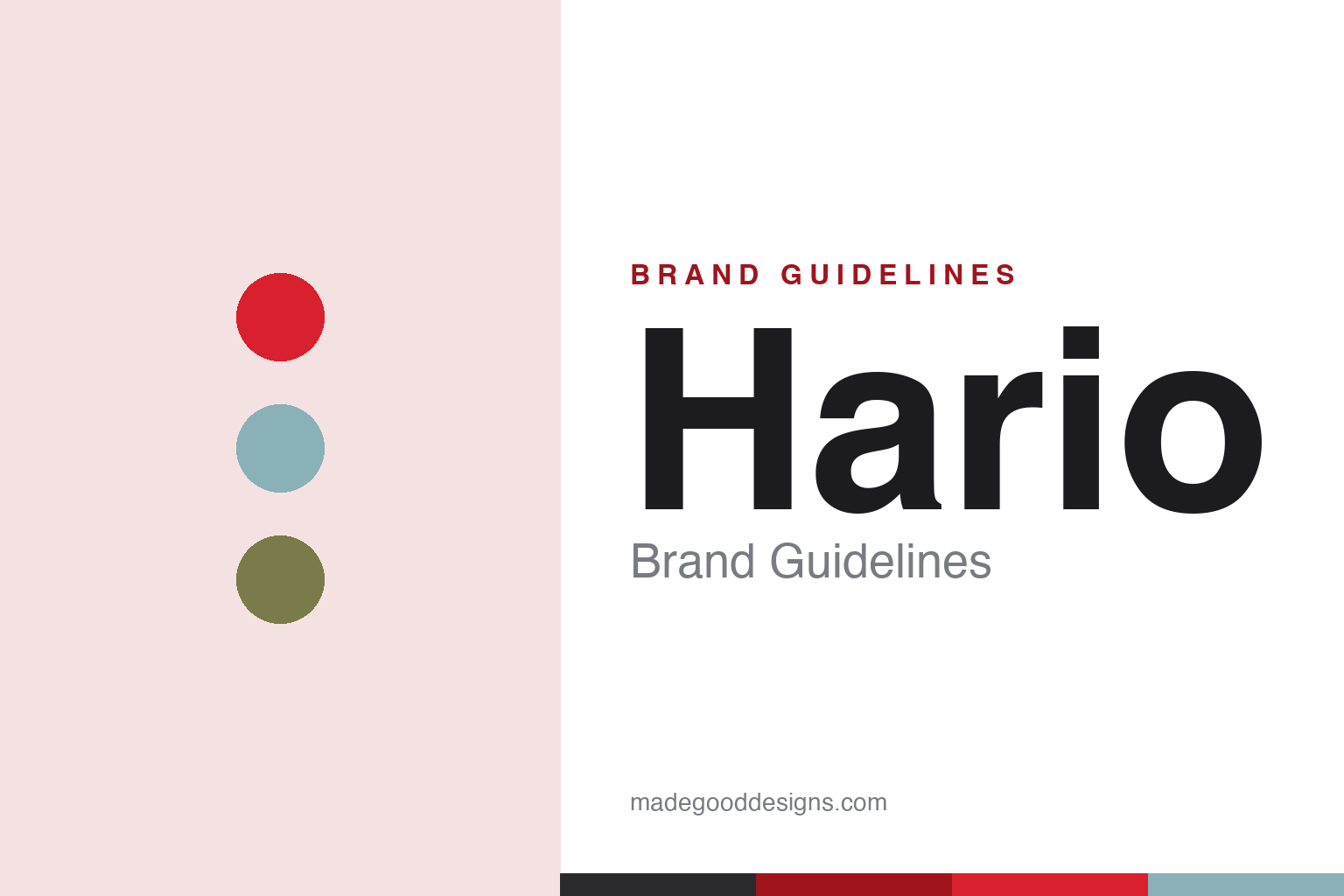
Hario Brand Guidelines
The Glass King — a century of Japanese heatproof glass, and the V60 cone that reshaped pour-over coffee.
Aa
Two constants: a warm red-and-glass palette and a friendly, rounded Japanese sans. Abstract homage — not the Hario wordmark.
The Glass King
Hario is a glass-maker first.
Hario is a lesson in heritage craft finding a modern icon. Hario was founded in October 1921 in Tokyo (by the Shibata family) — originally, and still, a heatproof-glass manufacturer, making laboratory glassware like beakers, flasks and condensers. It’s often described as Japan’s only domestic heatproof-glass manufacturer, and it still makes lab and industrial glass. (Two honest notes: the current corporate entity dates to a 1999 reorganisation, so “founded 1921” is heritage, not the age of today’s company; and it wasn’t originally called “Hario.”)
The name is beautiful: “Hario” means “Glass King” (玻璃王) — 玻璃 (hari) is an old, almost Buddhist word for glass/crystal (one of the traditional “seven treasures”), and 王 (ō) means king. So the brand is, literally, the king of glass. That glass heritage is the foundation for everything, including its most famous product. (Two more honest notes: no official brand hex is published, and the wordmark typeface is undocumented.)
The icon is the Hario V60 — a cone-shaped pour-over dripper that became a global specialty-coffee standard. The “60” is the 60-degree cone angle and the “V” is the V-shape (not, despite a popular myth, “vector”); inside, spiral ribs lift the paper off the wall so air can escape, and a single large hole lets the brewer — not the cone — control the flow. Introduced around 2004–2005, it won a Good Design Award and became a competition favourite. Beyond it, Hario makes the Buono gooseneck kettle, siphon/vacuum brewers (its first consumer product was a coffee siphon in 1948), the Mizudashi cold-brew pot, hand grinders and glass teaware. It’s privately held and still Shibata-family-led (factory in Ibaraki). The Glass King.
Colour
Hario lives in a warm red and glass tones. Click a swatch to copy the hex.
Hario’s identity pairs a recognisable warm “Hario red” (the wordmark) with the cool clarity of glass and natural olive/wood tones. The red reads as confident and warm — a mark carried across a century of glass-making — while the glass tones nod to the heatproof-glass heritage at the brand’s core, and the natural accents suit its craft, kitchen-and-lab character. It’s a warm, craft-forward palette rather than a slick modern one, fitting a hundred-year-old maker. The honest caveat: Hario publishes no official brand hex, so the red, glass and olive tones here are an original, unofficial interpretation, not first-party values.
The lesson is a warm mark-colour plus material tones can carry a heritage craft brand. Hario’s red-and-glass world reflects both its identity and its material. For designers, it’s a reminder that a signature colour plus a product’s own material can express a craft heritage. The takeaways: pair a confident mark-colour with the product’s material tones (red plus glass); keep it warm and craft-forward for a heritage maker; and treat specific hexes as unofficial when no official spec is published.
Typography
The wordmark is a friendly rounded Japanese sans — warm and crafted.
Hario’s identity carries a warm, crafted, approachable spirit — a feel befitting a century-old Japanese glass-maker whose products live in both the lab and the kitchen. A friendly rounded Japanese sans captures it well: the soft, humane letterforms read as warm, careful and craft-made, matching a brand built on meticulous glass-making and everyday coffee-and-tea rituals, and the friendliness suits the approachable, enthusiast-loved V60. Set against a red-and-glass palette, the type feels warm and considered — exactly the crafted, heritage personality Hario cultivates. It’s friendly and crafted rather than austere, mirroring the glass products. Because the exact wordmark face isn’t publicly documented, the honest description is “a friendly rounded Japanese sans spirit,” not a named font. The type behaves like the brand: warm, crafted and approachable.
Aa
A friendly rounded Japanese sans spirit — warm and crafted. (Specimen set in Zen Maru Gothic, a friendly rounded Japanese sans in the spirit of the Hario identity; the real face is undocumented.)
From lab glass to a global icon
Hario turned glass craft into an icon.
Hario is a lesson in deep material craft producing a breakout icon. For a century, Hario’s real business has been heatproof glass — unglamorous, precise, industrial, the same craft behind laboratory beakers and flasks. That mastery of a single material is the foundation, and it quietly enabled a global phenomenon: the V60, a simple, brilliant piece of glass-and-geometry that reshaped how the world makes pour-over coffee. The lesson is that genuine, deep expertise in a fundamental craft (here, precision heatproof glass) can, when applied to the right everyday ritual, produce an icon that reaches far beyond the original business — and that the heritage authenticates the product (a coffee dripper from Japan’s only domestic heatproof-glass maker carries real credibility). It’s a reminder that mastering the fundamentals — a material, a process — is what makes a breakout product possible in the first place. Master the craft, and the icon can follow.
For designers and brand-builders, Hario offers a clear takeaway: deep mastery of a fundamental craft can authenticate and enable a breakout product. The lessons: build on genuine, deep material expertise (a century of heatproof glass); apply it to a meaningful everyday ritual (pour-over coffee, via the V60); and let the heritage authenticate the product. It’s also a reminder to keep the facts precise — Hario was founded in 1921 in Tokyo as a heatproof-glass maker, its name means “Glass King,” and the V60’s “60” is the 60-degree cone angle. Hario turned glass craft into an icon — proof that mastering the fundamentals enables breakout design.
Explore & save
Keep Hario’s identity on hand — save it to a board in the Made Good inspiration library.
Hario identity set
Pin the red-and-glass palette and the rounded-Japanese-sans spirit to your own board.


