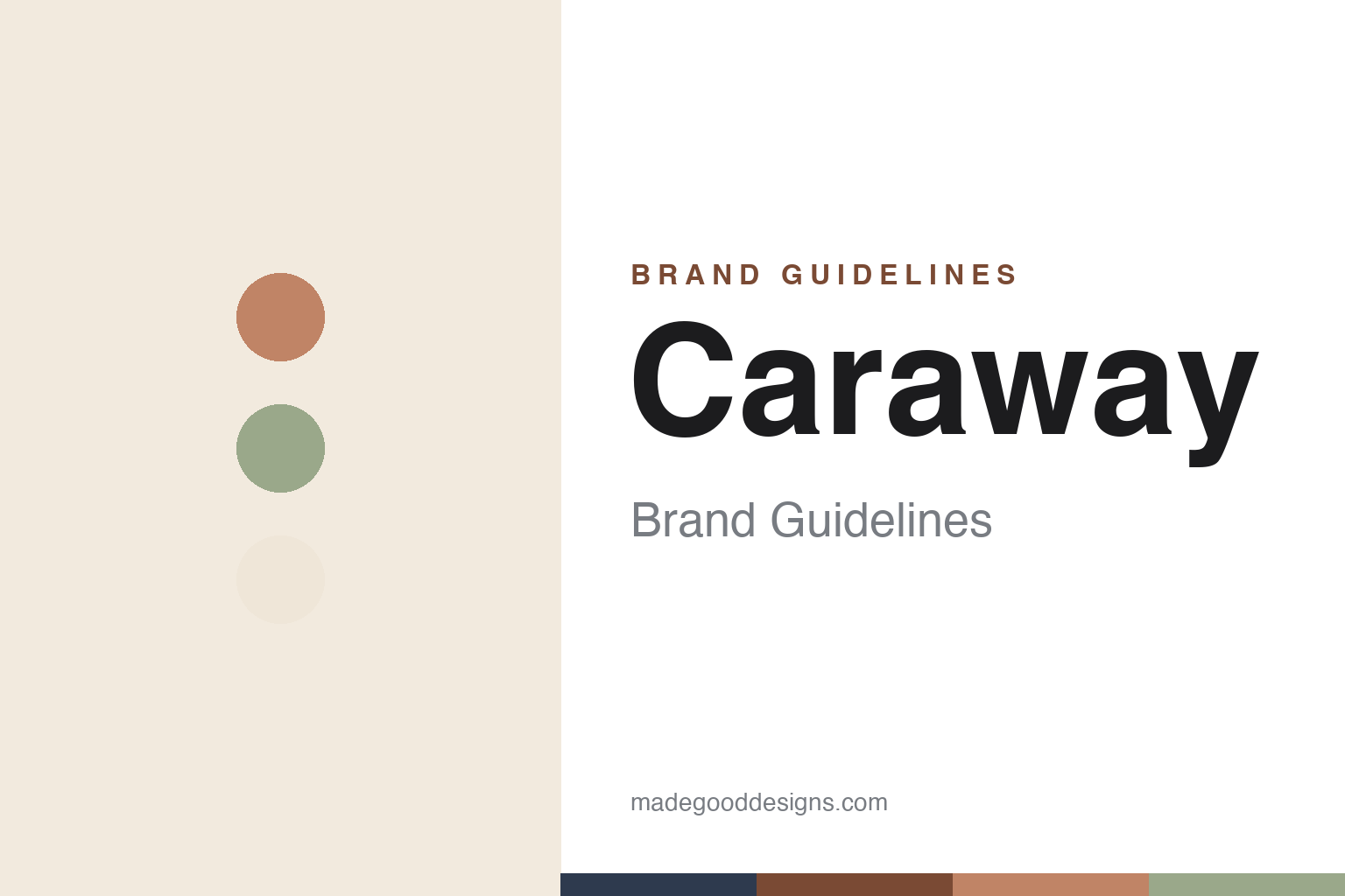
Caraway Brand Guidelines
Non-toxic and display-worthy — ceramic-coated cookware in muted pastels, engineered to be seen, not hidden.
Aa
Two constants: a muted pastel palette (Perracotta, Sage, Cream) and a clean, modern sans. Abstract homage — not the Caraway wordmark.
Non-toxic, made beautiful
Caraway made non-toxic cookware chic.
Caraway is a lesson in making a functional benefit beautiful. It was founded in 2019 by Jordan Nathan (CEO) and is New York-based. The origin is a genuine scare: Nathan accidentally overheated a conventional non-stick pan and became ill from the fumes, which drove him to build a non-toxic alternative. (An honest note: the brand’s own telling is “got sick from the fumes” — avoid asserting a diagnosed “Teflon flu.” Two more: no official brand hex is published, and the wordmark typeface is undocumented.)
Caraway’s product is ceramic-coated aluminium cookware — and the coating chemistry is the whole pitch. Crucially, its non-stick is a mineral-based ceramic coating, not a PTFE (Teflon-type) fluoropolymer — the key differentiator to get right. It’s marketed as free of PFAS (the brand cites testing for 200+ PFAS types) and heavy metals like lead and cadmium (claims best attributed to the brand, not stated as an independent scientific verdict). But the reason Caraway went viral isn’t only the chemistry — it’s the design: chic, muted colourways, and clever magnetic pan-organising racks and a canvas lid holder that make the sets display-worthy and Instagram-ready. Merchandising is part of the product.
Caraway grew fast, direct-to-consumer, on heavy influencer and social marketing, and expanded from cookware into bakeware, food storage and small appliances. It’s privately held and venture-backed (best left without specific figures). The palette is central and named — Cream, Sage, Navy, Marigold and its terracotta-toned “Perracotta” (a deliberate play on the brand name, and spelled that way — not “Terracotta”). The identity is clean and modern, with a lowercase “caraway” wordmark. Non-toxic, made beautiful.
Colour
Caraway lives in muted pastels. Click a swatch to copy the hex.
Caraway’s identity is its muted, chic pastel palette — soft creams, sages, navies, marigolds and its terracotta-toned “Perracotta,” each a named colourway. The palette is central to the brand’s whole proposition: cookware designed to be beautiful enough to leave on display, not hidden in a cupboard, which is exactly what fuelled its social-media virality. The muted, grown-up tones read as calm, tasteful and design-led — matching a wellness-minded, non-toxic positioning without feeling clinical. It’s a considered, rotating palette (with seasonal and limited shades). The honest caveat: Caraway publishes no official brand hex, so the perracotta and sage here are an original, unofficial interpretation of its named colourways, not first-party values.
The lesson is a chic, muted palette can turn function into desire. Caraway’s pastels made non-toxic cookware something people want on display. For designers, it’s a reminder that colour can turn a functional benefit into an aesthetic one. The takeaways: use muted, tasteful colour to make function desirable; name shades memorably (Perracotta); and treat specific hexes as unofficial when the palette rotates.
Typography
The wordmark is a clean modern sans — chic and calm.
Caraway’s identity carries a clean, modern, calm spirit — a simple lowercase “caraway” sans-serif wordmark whose restrained letterforms read as chic, tasteful and wellness-minded. The clean type matches a brand built on muted colour and a non-toxic, design-led proposition, and the calm restraint lets the colourways and the cookware’s form take centre stage. Set against a muted pastel palette, the type feels contemporary and considered — exactly the chic, grown-up personality Caraway cultivates. It’s clean and calm rather than loud or ornate, mirroring the tasteful products. Because the exact wordmark face isn’t publicly documented, the honest description is “a clean modern sans spirit,” not a named font. The type behaves like the brand: chic, modern and calm.
Aa
A clean modern sans spirit — chic and calm. (Specimen set in Schibsted Grotesk, a clean modern sans in the spirit of the caraway identity; the real face is undocumented.)
Function, made desirable
Caraway made safety aspirational.
Caraway is a lesson in making a functional benefit aspirational. Plenty of brands sell non-toxic or ceramic cookware; Caraway’s insight was that the benefit alone wasn’t enough — so it wrapped a genuine functional differentiator (a PFAS-free ceramic coating) in design that people actively want to show off. The muted, tasteful colourways, the magnetic storage racks, the canvas lid holder — all turn a health-and-safety purchase into an aesthetic, display-worthy, Instagram-ready object. That reframing is the whole strategy: it takes a slightly dry, wellness-driven reason to buy and makes it desirable, which is what powered explosive DTC growth. The honest discipline is keeping the health claims attributed and specific (PFAS-free, ceramic not PTFE, third-party tested) rather than overclaiming. The lesson is that a real functional benefit plus genuinely covetable design can beat either one alone — safety becomes aspirational when it looks this good on the stove. Make the function beautiful, and people will want it.
For designers and brand-builders, Caraway offers a clear takeaway: wrapping a real functional benefit in covetable design can turn a dry purchase into a desirable one. The lessons: pair a genuine differentiator with beauty (PFAS-free ceramic + chic colourways); design the whole experience, including storage and display (magnetic racks, lid holder); and keep health claims specific and attributed. It’s also a reminder to keep the facts precise — Caraway was founded in 2019 by Jordan Nathan in New York, uses a ceramic (not PTFE) coating marketed as PFAS-free, and made its name on display-worthy design. Caraway made safety aspirational — proof that beautiful function can be the brand.
Explore & save
Keep Caraway’s identity on hand — save it to a board in the Made Good inspiration library.
Caraway identity set
Pin the muted pastel palette and the modern-sans spirit to your own board.