Made In Brand Guidelines
Where it’s made matters — pro-grade cookware from heritage makers, priced direct, trusted in Michelin kitchens.
Aa
Two constants: a confident red-and-black palette and a clean, modern grotesque. Abstract homage — not the Made In wordmark.
Where it’s made matters
Made In sells provenance, direct.
Made In is a lesson in provenance plus direct-to-consumer value. It was founded in 2017 by Chip Malt (co-founder and CEO) and Jake Kalick (co-founder and president). (An honest note: they founded it in Boston and relocated to Austin, Texas in 2018 — so it’s Austin-based but not Austin-founded.) The heritage that gives the brand its credibility belongs to Jake Kalick’s family: four generations in the restaurant and kitchen-supply business, dating to 1929, when his grandfather founded Boston’s Harbour Food Service Equipment. (An honest correction: that ~century-long heritage is Kalick’s family, not both founders’ — Chip Malt came from apparel marketing. Two more: no official brand hex is published, and the wordmark typeface is undocumented.)
Made In’s model is the DTC playbook — inspired by Warby Parker and Casper — applied to cookware: professional-grade tools at lower prices by cutting out the middleman, sourced from heritage makers. The range is broad and provenance-led: 5-ply bonded “Stainless Clad,” Blue Carbon Steel, non-stick, copper, enamelled cast iron, and knives. And the sourcing is the story: the knives are forged in Thiers, France — the historic capital of French cutlery (roughly 70% of the country’s production) — while copper and enamelled cast iron come from France, stainless and non-stick from the USA and Italy, and more from across Europe. (An honest note: it’s Thiers, not “Thonet,” which is a furniture maker.)
What gives Made In its credibility is professional adoption: its cookware is used in thousands of restaurants, including dozens of Michelin-starred kitchens (Le Bernardin among the named users) — a genuine pro-kitchen halo rather than just marketing. (Best hedged as “thousands, including dozens of Michelin-starred restaurants,” since the count keeps growing.) Chef Tom Colicchio is a partner and investor, and there have been collaborations like one with Nancy Silverton. The name plays on the “Made in [France/Italy/USA]” provenance stamp, and it’s privately held and venture-backed. The identity is confident and clean — a red-and-black “Made In®.” Where it’s made matters.
Colour
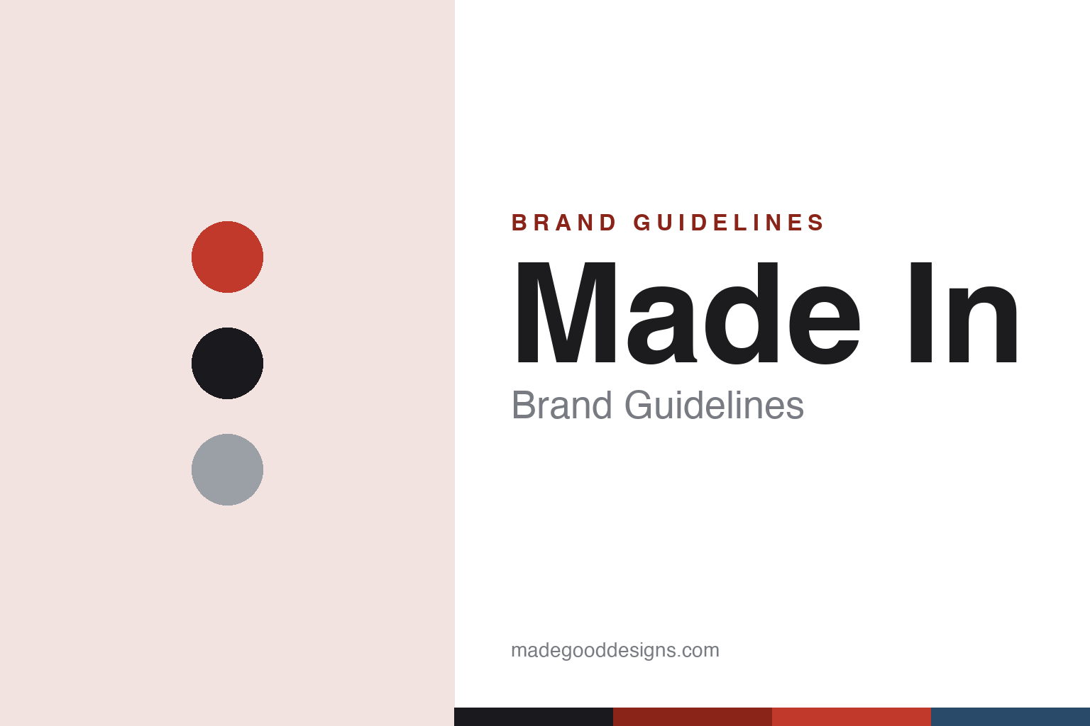
Made In lives in confident red and black. Click a swatch to copy the hex.
Made In’s identity leans on a confident red with black and white — an assured, appetite-forward palette that reads as professional, modern and food-focused. The red brings energy and warmth (fitting for a kitchen brand) while the black-and-white keeps the look clean, serious and premium, matching a brand that sells pro-grade tools used in the world’s best restaurants. It’s a no-nonsense, chef-adjacent palette — bolder and warmer than a purely industrial look, but still restrained and credible. The honest caveat: Made In publishes no official brand hex, so the red and black here are an original, unofficial interpretation, not first-party values.
The lesson is a confident, warm palette can read as professional and appetising. Made In’s red-and-black world feels credible and food-focused — matching pro-grade cookware. For designers, it’s a reminder that a warm primary can signal energy and appetite while staying premium. The takeaways: use a confident, warm primary for a food/kitchen brand (red); keep supporting tones clean and serious (black, white); and treat specific hexes as unofficial when no brand spec is published.
Typography
The wordmark is a clean modern grotesque — confident and credible.
Made In’s identity carries a clean, confident, credible spirit — a modern grotesque “Made In®” wordmark (the ® used prominently) whose assured letterforms read as professional, contemporary and trustworthy. The clean type matches a brand built on provenance and pro-kitchen credibility, and the confidence signals seriousness without heritage fussiness. Set against a red-and-black palette, the type feels credible and food-focused — exactly the professional, provenance-led personality Made In cultivates. It’s clean and confident rather than ornate, mirroring the pro-grade tools. Because the exact wordmark face isn’t publicly documented, the honest description is “a clean modern grotesque spirit,” not a named font. The type behaves like the brand: confident, credible and modern.
Aa
A clean modern grotesque spirit — confident and credible. (Specimen set in Albert Sans, a clean modern grotesque in the spirit of the Made In wordmark; the real face is undocumented.)
Provenance as proof
Made In sells where and how.
Made In is a lesson in provenance and professional proof as the brand. In a crowded cookware market, Made In built credibility on two hard-to-fake things: where its products are made (heritage makers — knives forged in Thiers, copper and cast iron from France, bonded steel from the USA and Italy) and who uses them (thousands of restaurants, including dozens of Michelin-starred kitchens). That combination — genuine provenance plus real professional adoption — is powerful proof that cuts through marketing claims: the name itself (“Made In”) foregrounds the provenance, and the Michelin-kitchen halo signals quality no ad can. Layered on top is a DTC value model (pro-grade tools without the retail markup) and an authentic family heritage in the trade (Kalick’s four generations). The lesson is that provenance and third-party professional validation can be a more convincing brand than any slogan — proof, not promises. Show where it’s made and who cooks with it, and credibility follows.
For designers and brand-builders, Made In offers a clear takeaway: provenance plus professional validation can be more persuasive than marketing claims. The lessons: foreground genuine provenance (heritage makers, named towns like Thiers); earn and cite real professional adoption (Michelin kitchens, chef partners); and pair it with an honest value model (DTC pro-grade). It’s also a reminder to keep the facts precise — Made In was founded in 2017 by Chip Malt and Jake Kalick (Boston, then Austin), the four-generation kitchenware heritage is Kalick’s family, the knives are forged in Thiers (not “Thonet”), and its pro-kitchen adoption is real but growing. Made In sells where and how — proof that provenance can be the brand.
Explore & save
Keep Made In’s identity on hand — save it to a board in the Made Good inspiration library.
Made In identity set
Pin the red-and-black palette and the modern-grotesque spirit to your own board.