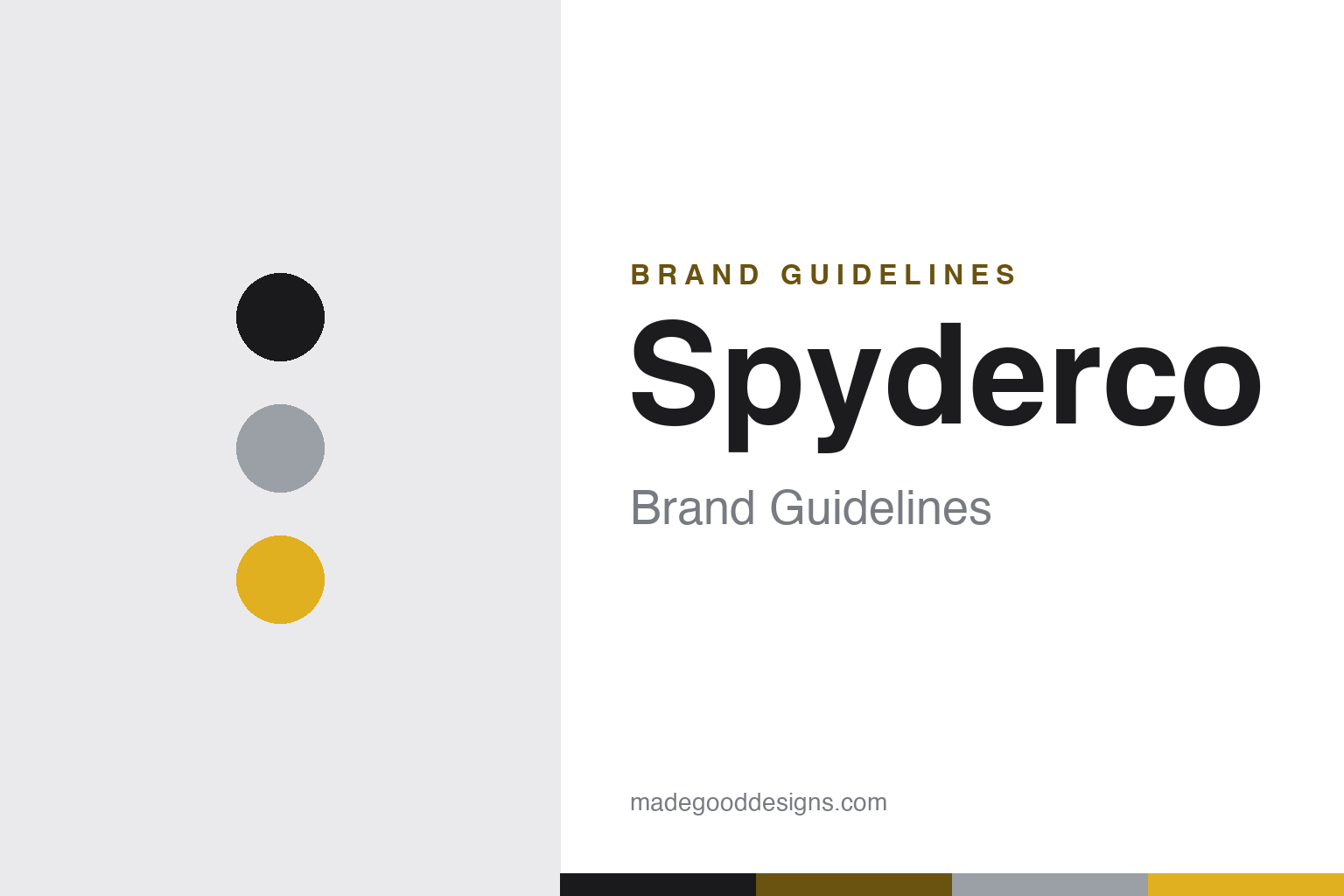
Spyderco Brand Guidelines
Function first — the round hole that changed the folding knife, the pocket clip, and design led by use.
Aa
Two constants: a functional black-steel-and-gold palette and a geometric, function-first sans. Abstract homage — no spider, not the Spyderco mark.
The round hole that changed knives
Spyderco put a hole in the blade.
Spyderco is a lesson in function-first design as a brand. It was founded in 1976 by Sal Glesser and his wife Gail — travelling pitchmen who worked shows from a converted bread-delivery truck — and settled in Golden, Colorado, in 1978. (An honest note: “founded 1976, settled in Golden 1978” — some sources list 1978 as the founding.) Their first product, the Portable Hand (1976), wasn’t a knife or a sharpener at all — it was a helping-hands clamp device (angles, ball joints and alligator clips) for jewellers and small-parts work. Their first knife-related product was the Tri-Angle Sharpmaker (1978). (Two more honest notes: no official brand hex is published, and the wordmark typeface is undocumented.)
Spyderco’s first folding knife, the C01 Worker (1981), introduced two features that became industry standards. The first is the round “Trademark Round Hole” in the blade, for fast, ambidextrous one-handed opening — now a registered Spyderco trademark. The second is the pocket clip for top-of-pocket carry, which Spyderco pioneered/popularised on production folders. It followed in 1982 with the serrated “SpyderEdge.” These weren’t styling flourishes — they were functional innovations that reshaped the modern folding knife.
A myth worth correcting: the name “Spyderco” does not come from the round hole resembling a spider. Sal Glesser coined it after high-performance “Spyder” sports cars, to signify high-performance cutting tools (the “co” is “company”); the spider association is a popular but incorrect back-story. Spyderco’s catalogue uses a C-numbering system (C01 Worker onward); famous models include the lightweight Delica and Endura (from around 1990) and the Paramilitary 2. It was also the first maker to collaborate with independent custom knifemakers for factory production, and a pioneer in production knife steels. It’s privately held and family-owned (the Glesser family), in Golden. The tagline: “First we made things sharp… Then we made sharp things.” A hole that changed knives.
Colour
Spyderco lives in functional black, steel and gold. Click a swatch to copy the hex.
Spyderco’s identity is functional and unfussy — a near-black and steel base (the honest colours of a working tool), with a functional gold/amber accent that nods to the bright FRN handle colours Spyderco is known for. The palette reads as purposeful, engineered and no-nonsense: it’s the look of gear designed around use, not decoration, matching a brand whose whole ethos is function-first ergonomic design. It’s practical and confident rather than luxurious. The honest caveat: Spyderco publishes no official brand hex, so the black, steel and gold here are an original, unofficial interpretation, not first-party values — and no spider logo is reproduced.
The lesson is a functional palette can express a function-first brand. Spyderco’s purposeful black-and-steel world matches gear built around use. For designers, it’s a reminder that an honest, working-tool palette can communicate a function-first ethos. The takeaways: use practical, working-tool tones for a function-first brand (black, steel); add a functional accent (the bright handle colour); and treat specific hexes as unofficial when no brand spec is published.
Typography
The wordmark is a geometric, function-first sans — purposeful and modern.
Spyderco’s identity carries a purposeful, geometric, function-first spirit — a wordmark whose clean, engineered letterforms read as practical, modern and use-driven. The geometric type matches a brand built on functional innovation (the round hole, the pocket clip) and ergonomic, sometimes unconventional design, and it signals purpose over polish. Set against a black-steel-and-gold palette, the type feels engineered and no-nonsense — exactly the function-first personality Spyderco cultivates. It’s geometric and purposeful rather than decorative, mirroring the working-tool ethos. Because the exact wordmark face isn’t publicly documented, the honest description is “a geometric function-first sans spirit,” not a named font. The type behaves like the brand: purposeful, modern and functional.
Aa
A geometric function-first sans spirit — purposeful and modern. (Specimen set in Jura, a geometric sans in the function-first spirit of the Spyderco identity; the real face is undocumented.)
Function as the brand
Spyderco led with function.
Spyderco is a lesson in function-first innovation as the brand. Where many knife brands lead with heritage or looks, Spyderco led with use: it asked how a folding knife could work better, and answered with genuine, category-changing innovations — the round hole for one-handed opening, the pocket clip for ready carry, prominent serrations, and a long record of pioneering new blade steels and collaborating with custom makers. Those functional firsts are the brand; the identity, ergonomics and even the sometimes-unconventional shapes all follow from putting function first. That gave Spyderco a devoted following among people who value what a tool does over how it poses. The lesson is that relentless, genuine functional innovation — solving real problems better than anyone else — can itself be a powerful, defensible brand, earning loyalty through utility rather than image. And even the name reinforces it (performance, from the “Spyder” sports cars, not a decorative spider). Lead with function, and the innovations become the brand.
For designers and brand-builders, Spyderco offers a clear takeaway: genuine, relentless functional innovation can be a brand in itself. The lessons: solve real use-problems with category-changing features (the round hole, the pocket clip); let function drive the design and identity (ergonomic, purposeful forms); and build credibility through firsts (custom-maker collaborations, new steels). It’s also a reminder to keep the facts precise — Spyderco was founded in 1976 by Sal and Gail Glesser, introduced the round hole and pocket clip on the 1981 C01 Worker, and is named after high-performance sports cars (not the spider-hole myth). Spyderco led with function — proof that innovation can be the brand. This piece is editorial and non-promotional.
Explore & save
Keep Spyderco’s identity on hand — save it to a board in the Made Good inspiration library.
Spyderco identity set
Pin the functional black-and-steel palette and the geometric-sans spirit to your own board.


