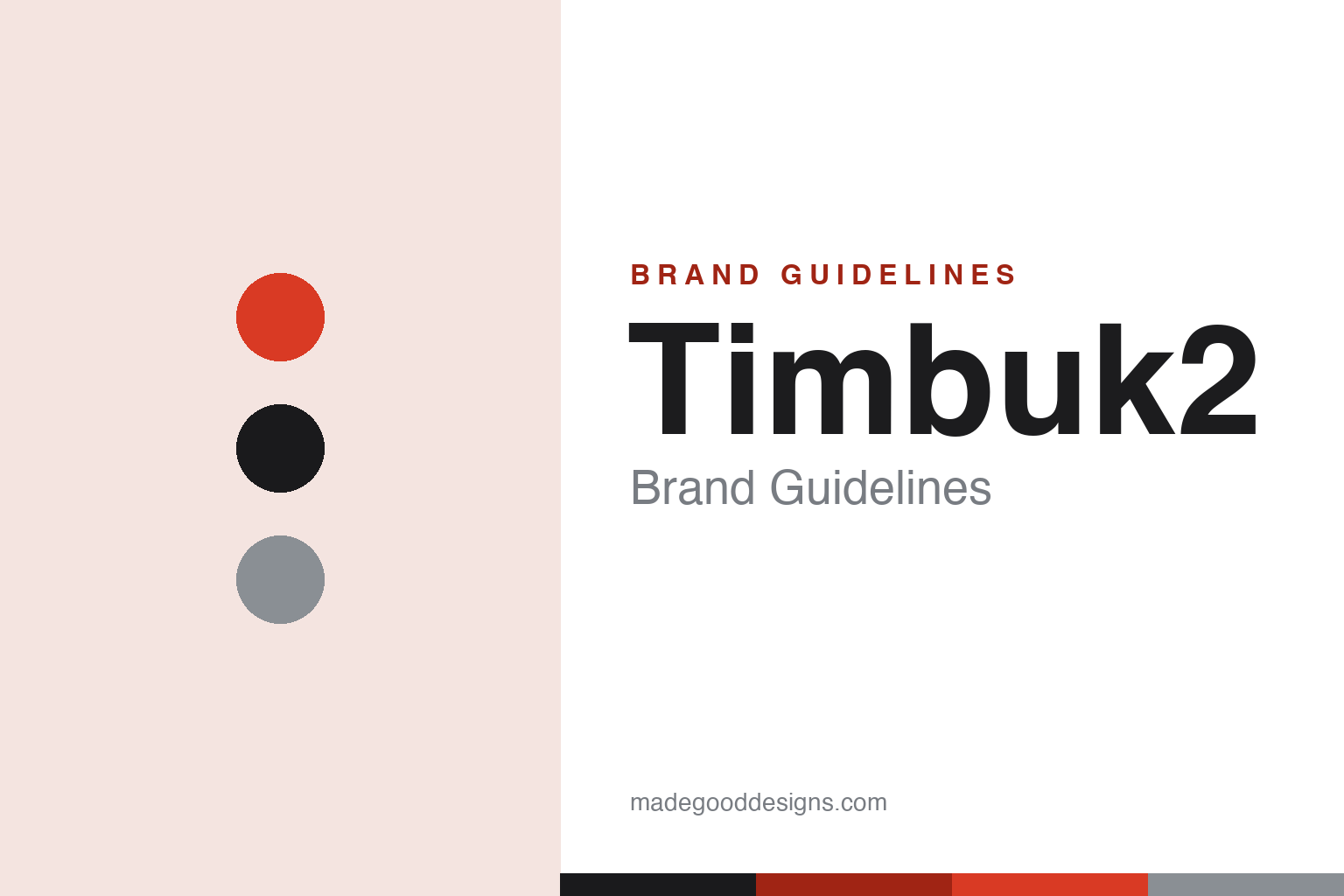
Timbuk2 Brand Guidelines
It was never really about the bags — a bike-messenger messenger bag, built to order, in mix-your-own colour.
Aa
Two constants: a signal-red-and-black palette and a modern, urban grotesque. Abstract homage — not the Timbuk2 wordmark.
It was never really about the bags
Timbuk2 came off a bike.
Timbuk2 is a lesson in an authentic subculture origin. It was founded in 1989 in San Francisco’s Mission District — in a garage, by Rob Honeycutt, a working bike messenger. He developed the bag pattern himself (inspired by Toyota’s “just-in-time” manufacturing) to fill custom orders, sewing bags to order. (Two honest notes: no official brand hex is published, and the wordmark typeface is undocumented.)
The name has a great arc: the company was originally called “Scumbags,” and Honeycutt renamed it “Timbuk2 Designs” in 1990. (An honest note: the “2” isn’t simply “Timbuktu” with a swapped letter — the name was inspired in part by the rock band Timbuk3, with the far-flung “Timbuktu” association coming downstream.) The logo is the “swirl,” designed by Honeycutt to mimic the rotation of a bike wheel. (An honest note: it’s a spinning-wheel swirl, not a “peace,” “eye” or “three-eyed” symbol, even if people read a face into it.)
The signature product is the Classic Messenger Bag, and the brand’s defining idea is the build-your-own customizer — mix and match panel colours into “billions of combinations,” a made-to-order model that traces directly to that original just-in-time pattern. (An honest note on manufacturing: custom bags were famously hand-built in Timbuk2’s San Francisco factory, with other lines made overseas — but the brand no longer advertises current SF/USA production, so that’s best framed historically.) Timbuk2 backs its bags with a lifetime “Forever” warranty. Ownership has passed through several hands since 1989 — a venture firm (2005), a private-equity group (2006), and, since 2019, Exemplis (part of the Compass Diversified group). Its own brand line puts it well: “It was never really about the bags.”
Colour
Timbuk2 lives in a signal-red-and-black palette. Click a swatch to copy the hex.
Timbuk2’s identity leans on an urban, high-contrast palette — a signature signal red/orange, deep black and steel greys, plus the huge rotating range of bright panel colours the build-your-own model is famous for. The core reads as bold, city-ready and utilitarian — the look of bike-messenger gear built for streets and weather — while the customizer turns colour into personal expression. It’s a punchy, functional palette that matches an authentic urban-mobility brand. The honest caveat: Timbuk2 publishes no official brand hex, so the signal red, black and steel here are an original, unofficial interpretation, not first-party values.
The lesson is a bold, high-contrast palette signals urban utility. Timbuk2’s red-and-black world reads as city-ready messenger gear. For designers, it’s a reminder that a punchy palette plus customer-chosen colour can be both functional and personal. The takeaways: use bold, high-contrast colour for urban utility; let customers mix their own; and treat specific hexes as unofficial when the palette is customizable.
Typography
The wordmark is a modern urban grotesque — bold and utilitarian.
Timbuk2’s identity carries a bold, urban, utilitarian spirit — a “Timbuk2” wordmark paired with the bike-wheel swirl, whose confident, modern letterforms read as city-ready, functional and no-nonsense. The urban type matches a brand born from bike-messenger culture and built on durable, made-to-order bags, and it keeps the personality bold and practical rather than precious. Set against a signal-red-and-black palette, the type feels bold and utilitarian — exactly the authentic, urban-mobility personality Timbuk2 cultivates. It’s modern and grounded rather than ornate, mirroring the tough messenger bags. Because the exact wordmark face isn’t publicly documented, the honest description is “a modern urban grotesque spirit,” not a named font. The type behaves like the brand: bold, urban and utilitarian.
Aa
A modern urban grotesque spirit — bold and utilitarian. (Specimen set in Space Grotesk, a modern urban grotesque in the spirit of the Timbuk2 identity; the real face is undocumented.)
Authenticity as the brand
Timbuk2 sold the street.
Timbuk2 is a lesson in an authentic subculture origin as a durable brand asset. Timbuk2 wasn’t designed by a committee to look edgy — it was literally founded by a San Francisco bike messenger sewing bags in a garage to fill custom orders, and that genuine origin gave it something a marketing brief can’t manufacture: credibility. The messenger bag was real gear for a real job, the build-your-own customizer came straight from the founder’s just-in-time production hack, and even the logo (a spinning bike wheel) and the name arc (from “Scumbags” to Timbuk2) carry the scrappy, authentic energy of the subculture. That authenticity is the brand’s core, and it’s why the bags read as tough, functional and cool rather than costume. Backed by real substance — a lifetime “Forever” warranty and decades of durable, made-to-order product — the story holds up. The lesson is that a genuine origin in a real subculture, expressed honestly through product and design, can be a brand’s most durable and un-copyable asset. Come from somewhere real, and it shows.
For designers and brand-builders, Timbuk2 offers a clear takeaway: a genuine subculture origin, honestly expressed, is an un-copyable asset. The lessons: let the real origin lead (a bike messenger sewing bags in a garage); turn a production reality into a brand idea (just-in-time → build-your-own); and back it with durable product and a real guarantee (the “Forever” warranty). It’s also a reminder to keep the facts precise — Timbuk2 was founded in 1989 in San Francisco by bike messenger Rob Honeycutt, was renamed from “Scumbags” in 1990, uses a bike-wheel swirl logo, and is famous for its build-your-own messenger bag. Timbuk2 sold the street — proof that authenticity can be the brand.
Explore & save
Keep Timbuk2’s identity on hand — save it to a board in the Made Good inspiration library.
Timbuk2 identity set
Pin the signal-red palette and the urban-grotesque spirit to your own board.


