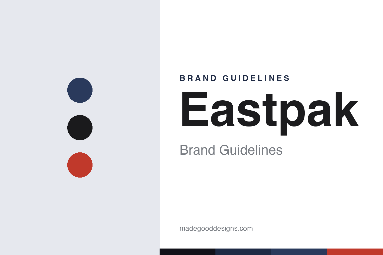
Eastpak Brand Guidelines
Built to resist — an Army-supplier origin, the padded backpack, a 30-year warranty, and an American brand run from Europe.
Aa
Two constants: a navy-black-and-red palette and a heavy, resilient display sans. Abstract homage — not the Eastpak wordmark.
Built to resist
Eastpak came from the Army.
Eastpak is a lesson in durability as a brand promise. It was founded in 1952 in Boston, Massachusetts by Monte Goldman, originally as “Eastern Canvas Products” — and for roughly two decades it made bags and gear for the U.S. Army before ever selling a consumer backpack. (An honest, important note: 1952 is the military-supplier origin; the consumer “Eastpak” brand launched in the mid-1970s — around 1976–77, driven by Monte’s son Mark Goldman — so don’t say the consumer brand dates to 1952. Two more notes: no official brand hex is published, and the wordmark typeface is undocumented.)
That military-grade heritage became the brand’s whole positioning: durable, everyday, school-and-city backpacks, summed up by the long-running tagline “Built to Resist.” The hero product is the iconic Padded Pak’r backpack. Eastpak backs its bags with a 30-year warranty — a “lifetime” guarantee legally capped at 30 years, covering manufacturing defects (not normal wear or misuse) — which reinforces the “resist” ethos.
Two facts define Eastpak’s modern identity. First, ownership: Eastpak is a VF Corporation brand, acquired in 2000 (the same year VF bought The North Face) — making it a sibling of JanSport (VF since 1986), The North Face and Vans. (An honest note: the acquisition years differ — JanSport 1986, Eastpak 2000 — and Dickies, once a VF sibling, was sold off in 2025.) Second, geography: though American-founded, Eastpak is run largely as a European brand, headquartered in Bornem, Belgium, with Europe (especially France) as its core market — it only relaunched US e-commerce in 2021. It’s known for many fashion collaborations (Raf Simons, Walter Van Beirendonck, Kris Van Assche). Built to resist.
Colour
Eastpak lives in a navy-black-and-red palette. Click a swatch to copy the hex.
Eastpak’s identity leans on a durable, everyday palette — navy and denim blues, black and grey, plus a signature signal red and the bold accent colours and prints it’s introduced since the mid-1980s. The core reads as tough, dependable and unpretentious — the look of a pack built to survive years of school, city and travel — while bright accents and collaborations add personality. It’s a resilient, functional palette that matches the “Built to Resist” ethos. The honest caveat: Eastpak publishes no official brand hex, so the navy, black and red here are an original, unofficial interpretation, not first-party values.
The lesson is a durable palette signals resilience. Eastpak’s navy-black-and-red world reads as tough and dependable. For designers, it’s a reminder that an unpretentious, functional palette (with bold accents) can reinforce durability. The takeaways: use tough, dependable colour for everyday gear; add bold accents and collaborations for personality; and treat specific hexes as unofficial when there’s no published spec.
Typography
The wordmark is a heavy display sans — resilient and bold.
Eastpak’s identity carries a bold, resilient, unpretentious spirit — a solid “Eastpak” wordmark whose heavy, grounded letterforms read as tough, dependable and built-to-last. The heavy type matches a brand built on military-grade durability and the “Built to Resist” promise, and it keeps the personality bold and practical rather than delicate. Set against a navy-black-and-red palette, the type feels resilient and bold — exactly the everyday, last-for-years personality Eastpak cultivates. It’s heavy and grounded rather than refined, mirroring the hard-wearing packs. Because the exact wordmark face isn’t publicly documented, the honest description is “a heavy display sans spirit,” not a named font. The type behaves like the brand: bold, resilient and unpretentious.
Aa
A heavy display sans spirit — resilient and bold. (Specimen set in Anton, a heavy display sans in the spirit of the Eastpak identity; the real face is undocumented.)
Resistance as the promise
Eastpak sold durability.
Eastpak is a lesson in a single durable promise as a brand. Eastpak took its literal origin — making tough gear for the U.S. Army — and turned it into one clear, ownable brand promise: Built to Resist. Everything reinforces it: the military-grade heritage, the simple hard-wearing Padded Pak’r, the 30-year warranty that puts the company’s money behind the durability claim, and even the bold, no-nonsense identity. That focus on resilience made Eastpak a trusted default for school and city bags across Europe, and it’s a durable position precisely because it’s backed by real product and a real guarantee, not just a slogan. The brand kept the promise fresh with bold colours, prints and high-fashion collaborations (Raf Simons and others), showing that “tough” and “stylish” aren’t mutually exclusive. The lesson is that a single, credible, well-backed promise — here, resistance — can anchor a brand for decades, as long as the product and the guarantee actually deliver it. Make one promise, and build everything to keep it.
For designers and brand-builders, Eastpak offers a clear takeaway: a single, well-backed promise can anchor a brand for decades. The lessons: turn a real origin into a clear promise (Army-grade durability → “Built to Resist”); back it with product and a guarantee (the Padded Pak’r, the 30-year warranty); and keep it fresh (bold colours, high-fashion collaborations). It’s also a reminder to keep the facts precise — Eastpak was founded in 1952 in Boston as Eastern Canvas Products (a US Army supplier), launched its consumer brand in the mid-1970s, is famous for “Built to Resist” and the Padded Pak’r, and has been a VF Corporation brand (and JanSport sibling) since 2000. Eastpak sold durability — proof that one well-kept promise can be the brand.
Explore & save
Keep Eastpak’s identity on hand — save it to a board in the Made Good inspiration library.
Eastpak identity set
Pin the resilient palette and the heavy-display-sans spirit to your own board.