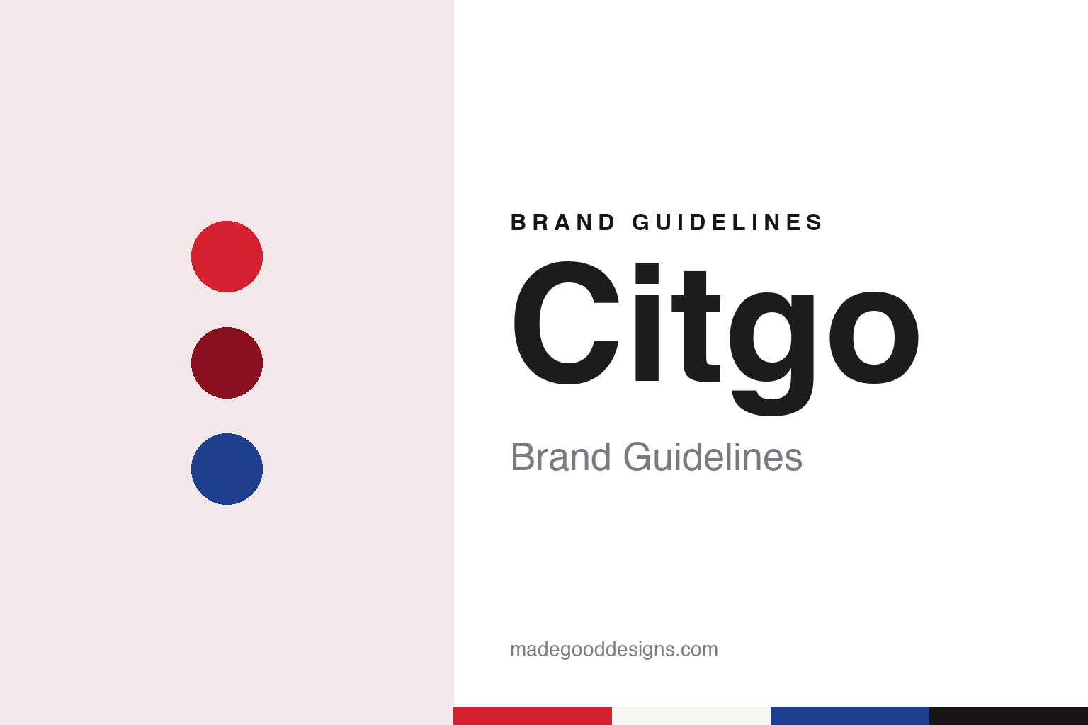
Citgo Brand Guidelines
Arthur King’s Trimark and the sign above Kenmore Square.
Aa
Two constants: a Citgo red, orange and blue palette and a Square-set sans register. Abstract homage — not a Citgo product or mark; no sign, logo or station element is reproduced.
Cities Service
A green-and-white trefoil, lost in the foliage.
Citgo — styled CITGO — is a name created in 1965 for an older company. Its predecessor, Cities Service, was founded in 1910 by Henry L. Doherty; CStore Decisions gave the date as September 2, 1910, in a 2020 profile of the brand. English Wikipedia describes Doherty’s Cities Service Gas Development Company of 1910 as a business supplying gas and electricity to small public utilities, which then moved into oil and gas production, pipelines and refining.
The old identity was green and white. The University of Vermont’s Landscape Change Program says the Cities Service trefoil logo, in green and white, was trademarked in 1940. CStore Decisions described the original Cities Service logo as the company name inside a trefoil shape. In Boston, the Boston Globe Magazine reported in August 2016, a large Cities Service sign stood from 1940 on top of the company’s divisional headquarters in Kenmore Square: big and white, with lettering and a border in dark green.
By the early 1960s, the Globe reported, Cities Service had become mainly an oil refiner and retailer, and the old look no longer fitted. The company hired the New York firm Lippincott & Margulies to design something new, and the team was led by Arthur King, a designer born in Pittsfield, Massachusetts. Over a design process of roughly 15 months, King and his colleagues drove through several states visiting Cities Service stations and photographing them. “As you went down the road, you could not see the old Cities Service sign. It was in green outlined on white, weak graphically, and often lost in the foliage,” King told the Globe. “The sign needed more energy, which is the business they’re in.”
Colour
The Trimark, and a name that ends in GO.
King built the new mark from the old one. The Cities Service logo, he told the Globe, had featured a simple triangle outline as a design element: “I built on that. It was a bridge from the old to the new.” The result was a triangle divided into parts and set against a square background, the mark the company calls the Trimark. King specified graded shades of red to give the triangle a raised, pyramidal look — “I try to put something in my logos that are 3-D and dynamic,” he said — and the colours were tested with formal focus groups and with shoppers stopped in malls, the Globe reported. The University of Vermont’s Landscape Change Program describes the Trimark as red, orange and blue, and says it evolved from the green-and-white trefoil.
The name had a process of its own. According to the Globe, the task fell to a computer, programmed to generate short names that evoked Cities Service and did not suggest an offensive word in any language; after weeks of winnowing, the finalists were Citco and Citgo, and an objection from lawyers for the New York financial firm CIT settled the choice. A 2005 CSP Daily News report on the brand’s 40th anniversary said instead that the names were proposed by members of the company and the public, and that the new name kept the first syllable of the old one and ended with “GO” to suggest power, energy and progressiveness. The same report dated the national unveiling of the brand to May 16, 1965.
The company itself kept its old name for years. English Wikipedia says Citgo remained a trademark rather than a company name until 1983, when Occidental Petroleum, which had acquired Cities Service in 1982, sold the refining, marketing and transportation business, as Citgo Petroleum Corporation, to the Southland Corporation, owner of the 7-Eleven stores. It says Petróleos de Venezuela (PDVSA) bought half of Citgo in 1986 and the rest in 1990.
Typography
The forecourt.
A fuel brand is met mostly at the roadside, and much of its identity is built for people moving at speed. The canopy over the pumps is a large branded surface, carrying a band of colour and a name or mark along its edge so that it reads from the road and at night under its own lights.
The tall sign at the entrance, often called a price pylon or price sign, does two jobs: it carries the brand’s mark at the top and a set of changeable figures below it. In a brand system the mark and the frame stay fixed while the figures change, so the sign is designed around the space the numbers will take.
At the pump itself the brand appears again on toppers, panels and nozzle labels, at a scale meant for someone standing beside the car. Forecourt colour ties these pieces together: the same hues on canopy, pumps, kiosk and sign let a station read as one place from a distance.
Each guide looks at how one name has carried its mark across those surfaces, who has owned it and how its signs have changed, and marks plainly what rests on the company’s own word.
Aa
A square-set sans — a name built to sit under a triangle. (Specimen set in Work Sans, a sans STAND-IN; NOT the Citgo logo.)
Citgo
A sign above Kenmore Square.
In Boston, the Trimark sits on a rooftop. The Globe reported that the Citgo sign above Kenmore Square was switched on in December 1965, in the place the Cities Service sign had occupied on the same building; MLB.com puts it at about 60 feet by 60 feet, behind the Green Monster wall at Fenway Park. Milton Glaser, the designer of “I ♥ NY,” told the Globe that the white framing of the triangle accounts for its impact: “If that entire [white background] was filled with a color, the red triangle would disappear into the mass of other rectangles” formed by the buildings around it.
The sign went dark from 1979 to 1982, during the oil crisis that followed the Iranian revolution, and was relit on August 10, 1983, MLB.com reported. In 2018 Boston’s mayor, Marty Walsh, vetoed the Boston Landmarks Commission’s vote to make it an official city landmark, and Citgo and the building’s developer signed an agreement to keep it in Kenmore Square for decades to come, according to MLB.com.
At the pumps, Citgo introduced a new street image in 2010. CSP Daily News reported on September 1, 2010 that its central element was a predominantly red “triform” on the canopy, the pump and the Quick Lube building, tested at beta sites from Katy, Texas, to Bristol, Connecticut, and offered to new Citgo locations from that month. In 2020 CStore Decisions reported that this “Centennial Image” was being updated through an Illuminate programme, adding brushed aluminium cladding, eyebrow lighting and reflective paint under the canopy around the Trimark and the channel letters.
Citgo Petroleum Corporation is based in Houston. On November 25, 2025, Judge Leonard Stark of the federal court in Delaware approved a bid by Amber Energy, an affiliate of Elliott Investment Management, in the court-organized auction of Citgo’s parent, PDV Holding, Pipeline & Gas Journal reported, citing Reuters, with the sale still awaiting approval from the US Treasury’s Office of Foreign Assets Control.
For a design guide, Citgo shows how a mark drawn to be seen from a moving car became part of a city’s skyline. Compare 7-Eleven, whose parent Southland owned Citgo from 1983, and Shell, whose pecten is another forecourt symbol. For this guide we use Trimark reds, an orange and a blue with a sans, an unofficial interpretation; no product or logo is reproduced.
Explore & save
Keep Citgo’s identity on hand — save it to a board in the Made Good inspiration library.
Citgo identity set
Pin the Citgo red, orange and blue palette and the Square-set sans register to your own board.