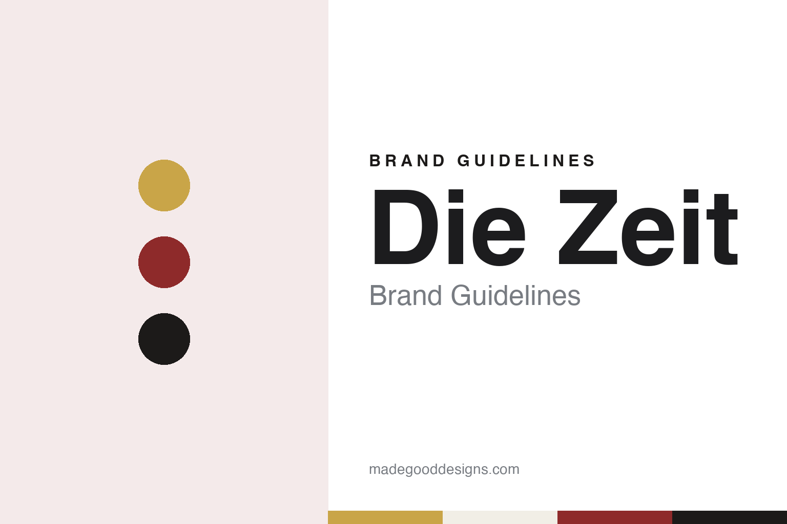
Die Zeit Brand Guidelines
A Hamburg weekly that wears Bremen’s key.
Aa
Two constants: a gold, red and black palette and a high-contrast serif register. Abstract homage — not a Die Zeit asset or mark; no logo, key, crown or masthead is reproduced.
A weekly licensed in 1946
Four publishers in Hamburg and a long line of editors.
Die Zeit means “the time”, and the paper writes its own name as DIE ZEIT in capitals. English Wikipedia says the opening issue was published in Hamburg on 21 February 1946, and that the founding publishers were Gerd Bucerius, Lovis H. Lorenz, Richard Tüngel and Ewald Schmidt di Simoni. German Wikipedia says the opening issue was published under licence No. 6 of the military government of the British zone of occupation.
taz marked the date in a short piece published on 22 February 1991, the day after the paper’s forty-fifth birthday. It said the Hamburg weekly appeared on 21 February 1946 as a newspaper of the British zone, and it told the story of how its masthead changed in the early months, which is set out in the next section.
The editors form a long, dated list. English Wikipedia names Ernst Samhaber as editor-in-chief in 1946, followed by Richard Tüngel from 1946 to 1955, Josef Müller-Marein from 1957 to 1968, Marion Gräfin Dönhoff from 1968 to 1972, Theo Sommer from 1973 to 1992, Robert Leicht from 1992 to 1997, Roger de Weck from 1997 to 2001, Josef Joffe and Michael Naumann jointly from 2001 to 2004, and Giovanni di Lorenzo since 2004. Dönhoff had joined the paper as an editor in March 1946, the same article says, and later became its publisher.
The paper keeps a weekly rhythm and a large sheet. English Wikipedia says Die Zeit is published on Thursdays and describes its physical format as the Nordic format, known for its size, with long and detailed articles. German Wikipedia says the Nordic format has long been a target of jokes in literature and cabaret, and that a change to a tabloid format was discussed in 2018 but not carried out for the time being. The publisher, Zeitverlag Gerd Bucerius, still carries the founder’s name, and German Wikipedia says the website, now Zeit.de and earlier Zeit Online, has been online since 1996.
Colour
Czeschka’s lettering, a refused crest and a borrowed key.
The masthead was drawn by a Viennese artist working in Hamburg. German Wikipedia says the lettering of the title was designed in 1946 by Carl Otto Czeschka, a Jugendstil artist from Vienna, in an elegant face with a white inline running through the letters. English Wikipedia says Czeschka took his model from the London daily The Times, which places the British royal arms between the two words of its title, and that the arrangement also reflected the founder’s idea of the paper, set out in Bucerius’s editorial “Unsere Aufgabe” (“Our Mission”) of 21 February 1946.
The device between the words did not survive its opening spring. English Wikipedia says Czeschka’s opening version, with a Hamburg crest held by lions, ran from issue 1 to issue 12, dated 9 May 1946, and that its crest added small hearts to the peacock feathers of the helmet. The Hamburg Senate treated it as the city’s great coat of arms, a state emblem. A revised version with an open gate, meant to stand for the port city’s openness to the world, was printed in issues 13 to 18, and the Senate turned that down as well.
taz told the rest of the story on 22 February 1991. It said Bucerius had wanted the Hamburg arms to shine in the masthead as the city’s gate to the world, that the Senate objected firmly, and that the graphic artists’ compromise of opening the gate also failed. Bucerius then asked the mayor of Bremen, Wilhelm Kaisen, for permission to use the Bremen key as the paper’s sign. Kaisen replied on 12 June 1946 that, after consulting his colleagues in the Senate, he was glad to give it.
The key appeared on 27 June 1946. taz said the paper carried it that day with the bit turned upward and the bow rounded, and that the same issue told readers the change of an ornament had no bearing on the paper’s contents. German Wikipedia says the masthead has shown the Bremen key and the golden crown from the Bremen arms since issue 19 of that date, that the arrangement was brokered by Josef Müller-Marein, later the paper’s editor-in-chief, and that the graphic with the key was also drawn by Czeschka. It is used today as the logo of the whole publishing group, the same article says.
The pages had their own designer. German Wikipedia says the Hamburg artist Alfred Mahlau designed the entire opening issue to Ernst Samhaber’s instructions, with a five-column make-up in a classical, sober style, printed at the Broschek press in Hamburg, and that Czeschka also drew headings for the various sections in the early period. For its Hamburg supplement, the same article says, the paper uses a freely usable Hamburg symbol in place of the key while keeping the crown.
Typography
A Times-style masthead with a device between the words.
A newspaper can change its typefaces without touching its name. English Wikipedia says the South China Morning Post, a Hong Kong broadsheet founded in 1903, was given new fonts in a facelift on 26 March 2007, and that a redesign in 2011 set its headlines in Farnham and Amplitude, its body text in Utopia and its section headers in Freight. The title on the front page stayed the same through both changes.
The name itself can also change. English Wikipedia says The Straits Times, founded in Singapore on 15 July 1845 as The Straits Times and Singapore Journal of Commerce, was renamed The Shonan Times on 20 February 1942, and then appeared as The Syonan Times, the Syonan Sinbun from 8 December 1942 and the Syonan Shimbun from 8 December 1943, before the earlier title returned. When reading a newspaper’s identity, look at how long its title has stayed fixed, which typefaces set its headlines and text, and when those faces were last changed.
Aa
A high-contrast serif — the register of a Hamburg weekly with an inline masthead. (Specimen set in Playfair Display, a serif STAND-IN; NOT the Die Zeit masthead lettering or any Die Zeit typeface.)
Die Zeit
Two words, a key between them and a publisher in one family.
The ownership moved to the Holtzbrinck family’s companies in two steps. German Wikipedia says the Zeitverlag, and with it Die Zeit, was taken over in 1996 by the Verlagsgruppe Georg von Holtzbrinck, and that since 2009 it has been held in equal halves by that group and DvH Medien, the company of Dieter von Holtzbrinck. HORIZONT, in a dpa report dated 24 September 2026, gave the same dates: the Zeitverlag has belonged to the Holtzbrinck group since 1996, and Dieter von Holtzbrinck Medien took half the shares in 2009.
That arrangement is now ending. The same HORIZONT report said the Bundeskartellamt, Germany’s competition authority, had cleared the Verlagsgruppe Georg von Holtzbrinck to take over the half held by Dieter von Holtzbrinck Medien, that Dieter von Holtzbrinck is to leave the weekly on 1 January 2027, and that the Verlagsgruppe Georg von Holtzbrinck will then hold sole control. The companies had announced the change in June 2026, the report said, and no financial details were given. It added that the Zeitverlag also publishes the magazines Zeit Campus, Zeit Wissen and Zeit Leo, and that Dieter von Holtzbrinck Medien’s titles include the Handelsblatt and the Berlin Tagesspiegel group.
The masthead has outlasted every change of editor and owner. Its pieces are dated precisely: Czeschka’s lettering in 1946, the Hamburg crest until 9 May 1946, the open-gate version in issues 13 to 18, Kaisen’s letter of 12 June 1946 and the key and crown from 27 June 1946. German Wikipedia says the key graphic now serves as the logo of the whole publishing group, so the device chosen to settle a dispute over a city crest now marks a family of magazines as well as the weekly.
The model is also part of the story. English Wikipedia says Czeschka looked to The Times and its arms set between the two words of the title, and German Wikipedia records the white inline that runs through his letters. The paper’s own note of June 1946, as quoted by taz, played the change down as a matter of ornament rather than content.
For a design guide, Die Zeit shows how a masthead can borrow a structure from another paper, keep its lettering for decades and still swap the emblem at its centre when a crest cannot be used. Compare Financial Times, a London business paper, or The Guardian, a London daily. For this guide we use gold, red and black with a serif, an unofficial interpretation; no product or logo is reproduced.
Explore & save
Keep Die Zeit’s identity on hand — save it to a board in the Made Good inspiration library.
Die Zeit identity set
Pin the Die Zeit gold, red and black palette and the high-contrast serif register to your own board.