Louisiana Museum of Modern Art Brand Guidelines
A borrowed name, a covered stroll through a park and whitewashed pavilions above the Sound.
Aa
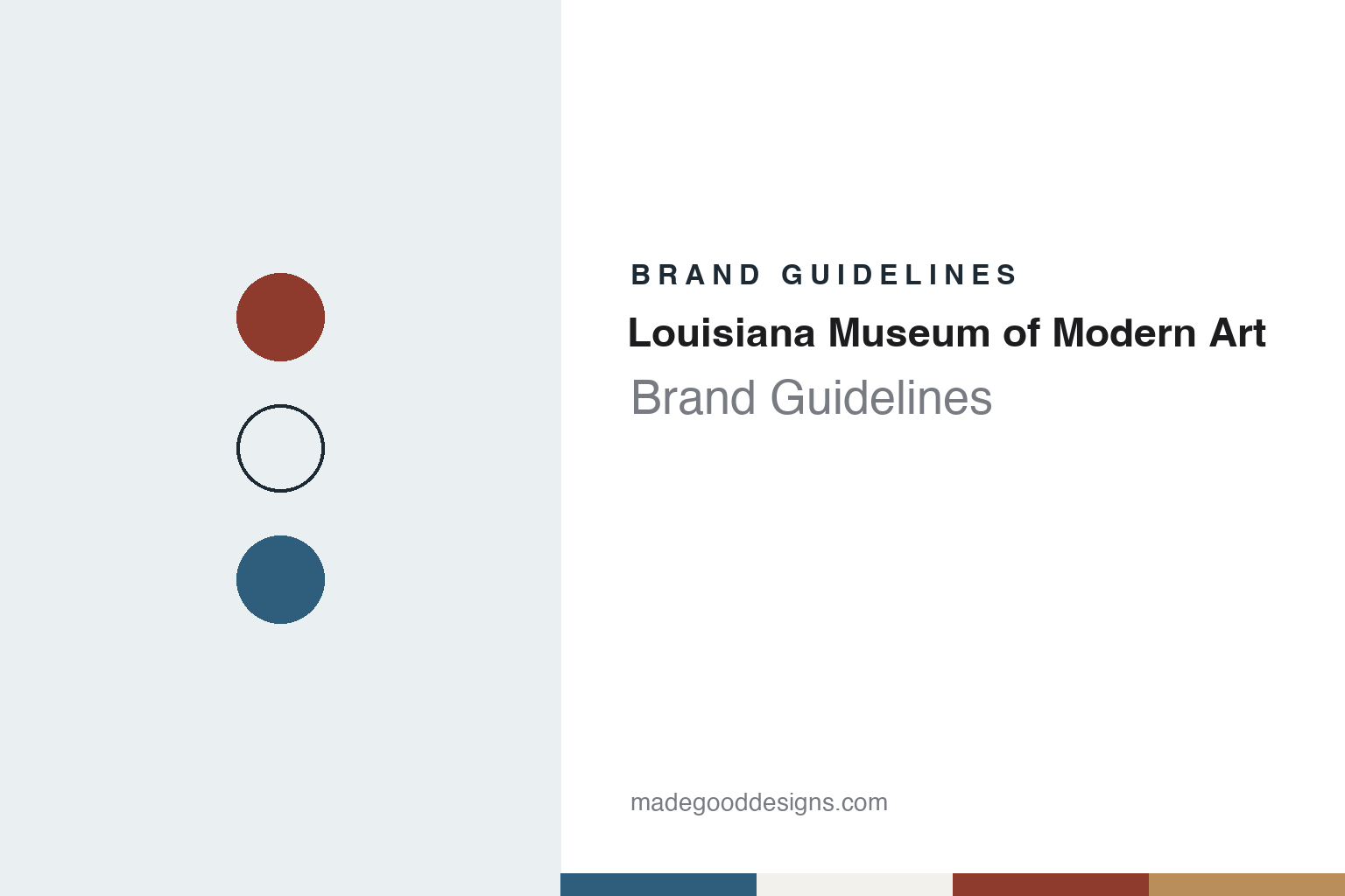
Two constants: an Øresund blue, whitewash, tile red and laminated pine palette and a Scandinavian humanist sans register. Abstract homage — not a Louisiana Museum of Modern Art asset or mark; no logo, photograph, artwork or museum lettering is reproduced.
A villa, three Louises and a museum for modern art
A coastal estate at Humlebæk, a municipal plan and a collector’s purchase, 1854–1968.
The Louisiana Museum of Modern Art takes its name from a house. It stands on the Øresund coast at Humlebæk, north of Copenhagen, and both English and Danish Wikipedia say the name goes back to Alexander Brun, a master of the royal hunt, who built the villa in 1855 and named the estate after his three wives, each of them called Louise. Arkitekten, the journal of the Danish Association of Architects, adds in a book review dated 1 July 2018 that Brun bought the property in 1854, that he planted rare trees imported from Japan, Morocco, Tibet and Serbia, and that the park drew tourists in the early 1900s.
The estate passed through heirs and other owners until, Arkitekten says, the local municipality took it over in 1954, with plans to extend the churchyard into Brun’s park, turn the old house into a care home and build a sewage works in the fern-filled ravine. The businessman and collector Knud W. Jensen bought the property in 1955. The review quotes his diary: walking into the grounds was like entering the garden around Sleeping Beauty’s castle. English Wikipedia quotes Jensen on the name itself. He could hardly call the place the Humlebæk Museum of Modern Art or the Jensen Museum, he wrote, so he kept “the curious and poetic name”, which he noted many people connected with the American state.
Jensen wanted a museum where Danes could actually see modern art, which, the museum says, was hardly represented in other Danish museums in the 1950s. Arkitekten says he regarded the Statens Museum for Kunst of the time as forbidding, and English Wikipedia says he took inspiration from American museums such as the Museum of Modern Art. The Louisiana opened in 1958. Until 1959 it showed mainly Danish art; English Wikipedia says that after Jensen saw works by Alberto Giacometti, Alexander Calder and Henry Moore at Documenta II in Kassel, he persuaded his board to turn to international art, and that exhibitions such as Vitality in Art and Movement in Art, composed by Willem Sandberg, followed. Wikipedia says the Louisiana became a state-authorised museum in 1968.
Jensen led the museum into the 1990s, and both Wikipedias list Poul Erik Tøjner as director since 2000.
Colour
Bo and Wohlert’s pavilions, glass corridors and seven extensions, 1956–1994.
Jensen’s initial approach was to Jørn Utzon. Arkitekten, reviewing Michael Sheridan’s book Louisiana – Arkitektur og landskab, published by the museum in 2017, says Utzon declined because he had set aside the whole of 1956 for the competition for a new opera house in Sydney. The commission went instead to two young architects, Jørgen Bo and Vilhelm Wohlert. Both had studied under Kay Fisker, the review says, and by separate routes both reached California, where they met the work of architects such as Neutra, Eames and Schindler. Sheridan treats Rudolph Schindler’s Kings Road House in Hollywood of 1922 as a key source for the 1958 building, and lists Richard Neutra’s Bailey House in Pacific Palisades of 1948 among its references.
The museum says Jensen at one point imagined the old villa plus a separate exhibition pavilion at the edge of the cliff, but with Bo and Wohlert he arrived at a plan in which the buildings were linked, so that visitors would feel they were on a “covered stroll” through the park. Construction began in mid-1956. When the museum opened it consisted of glass corridors and three pavilions connecting the villa to a cafeteria with a view across the water to Sweden; this section, with the Giacometti and Jorn galleries, is now called the North Wing. The museum describes the original idiom as long whitewashed walls, exposed structure, laminated wooden ceilings and deep-red tiled floors, with large glass panels opening onto the landscape. The museum quotes Jensen, writing at the fortieth anniversary, that the site “made its own demands and became in a sense our employer”.
The museum says all seven extensions and alterations since then were carried out by Bo and Wohlert, with Claus Wohlert joining them from the East Wing onwards; Inexhibit, in a museum profile dated 31 October 2014, likewise counts seven expansions, all by the same pair. The two floors of the West Wing came in 1966 and 1971, and the Concert Hall, with seats designed for the room by Poul Kjærholm, in 1976. The South Wing of 1982 added higher rooms built into the terrain to keep the low profile; Arkitekten describes it as a turn, under Jørgen Bo, to closed walls and an inward-looking white cube. The underground East Wing, completed in 1991, joined the buildings into a rough circle that visitors can walk all the way round; the museum says it is also known as the Graphics Wing, because drawings and prints shown there must be kept out of daylight. A Children’s Wing followed in 1994.
Typography
A villa entrance, whitewashed pavilions and red tile underfoot above the Sound.
Some art institutions hand their identity to artists rather than to a design agency. A painter or sculptor may draw the logotype, letter the façade or design a run of posters, and the mark then carries the hand of a particular person instead of a neutral corporate typeface. Others work the other way round and build an in-house studio: a small team of designers who sit beside the curators and produce the invitations, wall labels, catalogues and screens across the year. A team that close to the programme can follow it show by show, shifting colour and imagery from one season to the next while holding on to a few fixed rules, such as a single typeface, a poster grid or a set position for the name.
The façade is where passers-by meet that work. Banners hung between columns or across a glass front announce the current exhibition at street scale, and their size forces a plain layout: a name, a pair of dates and one image or a field of colour. Temporary architecture does similar work inside, where scenographers build walls, platforms and display furniture for each show and so change the character of the rooms from one exhibition to the next. Print workshops add another layer. A centre with its own press, screen-printing table or duplicator can make small editions, zines and posters with visiting artists, and those objects, with their limited inks and visible textures, come to stand for the institution as much as any logo does.
Aa
Scandinavian humanist sans — after the plain, low-key lettering of Danish modernist buildings. (Specimen set in Figtree, a sans STAND-IN; NOT the Louisiana logo or any museum lettering.)
Louisiana
A park that slopes to the Øresund, about fifty sculptures and a channel of artist films.
The park is the other half of the plan. Arkitekten credits the landscape architect Ole Nørgaard, quoting Sheridan that the museum’s expansion began not with a building but with an unusual union of art and landscape. The museum names Ole and Edith Nørgaard as responsible for the general outlines of the original park, and says Lea Nørgaard and Vibeke Holscher later shaped the terrain around the new extensions. About 50 sculptures stand in the park, the museum says, among them Henry Moore’s Reclining Figure No. 5 by the cliff with the Sound behind it, and site-specific works acquired for their placements, such as Richard Serra’s The Gate in the Gorge and George Trakas’ Self Passage.
Indoors, the museum says its collection comprises a good 4,000 works from 1945 to the present, shown mostly in rotating presentations, with the Giacometti Gallery, the Asger Jorn Gallery and Yayoi Kusama’s installation Gleaming Lights of the Souls almost always on view.
The museum’s public voice now reaches beyond Humlebæk. English Wikipedia says the literature festival Louisiana Literature began in 2010, with writers appearing on stages around the museum and in the sculpture park, and that Louisiana Channel, a non-profit web channel based at the museum, launched in 2012. The museum says the channel posts new videos on art and culture every week, many of them featuring artists represented in the collection, along with a series of writers reading their own texts about works in it.
For a design guide, the Louisiana shows an identity carried by a place: a nineteenth-century name kept on purpose, low whitewashed pavilions joined by glass corridors, red tile underfoot and a park that runs down to the water. Compare the Kröller-Müller Museum and Stedelijk Museum guides. For this guide we use Øresund blue, whitewash, tile red and laminated pine with a sans, an unofficial interpretation; no product or logo is reproduced.
Explore & save
Keep Louisiana Museum of Modern Art’s identity on hand — save it to a board in the Made Good inspiration library.
Louisiana Museum identity set
Pin the Louisiana Øresund blue, whitewash, tile red and laminated pine palette and the Scandinavian humanist sans register to your own board.