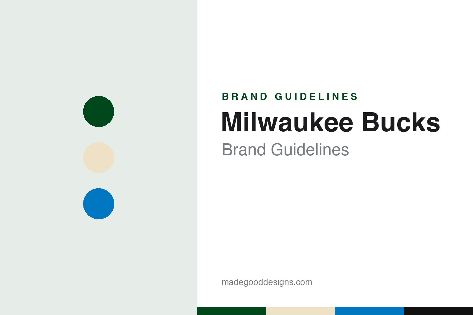
Milwaukee Bucks Brand Guidelines
A deer, a brick colour and a lake-blue accent for the Good Land.
Aa
Two constants: a Good Land green, Cream City cream and Great Lakes blue palette and a heavy athletic sans register. Abstract homage — not a Milwaukee Bucks mark; no logo, jersey or wordmark is reproduced.
Spirited, good jumpers
A judges’ choice, a hunter green uniform and a deer’s head.
The Milwaukee Bucks date from 22 January 1968, when, according to English Wikipedia, the National Basketball Association awarded a franchise to Milwaukee Professional Sports and Services, a group headed by Wesley Pavalon and Marvin Fishman. The new club brought the NBA back to Milwaukee after the Hawks had left for St. Louis in 1955, and it played its first regular-season game in October 1968 against the Chicago Bulls at the Milwaukee Arena.
The name was chosen through a fan contest. Wikipedia says the fans’ favourite entry was “Robins,” after Wisconsin’s state bird, but the judges picked the runner-up, “Bucks,” a reference to the state’s official wild animal, the white-tailed deer. One fan, R. D. Trebilcox, won a new car for his explanation of why Bucks was a good name: bucks, he wrote, were “spirited, good jumpers, fast and agile.”
The first uniforms set the palette. Wikipedia says the Bucks entered the league in hunter green and white with red trim. The white uniform read “Bucks” in green serifed letters with red trim and block numbers, the green uniform read “Milwaukee” in white serifed letters, and both carried the deer head logo on the left leg of the shorts. From 1971–72 the white jersey switched to red letters with green trim in a block style, and in 1973 the green road set took a script “Milwaukee” in red with white trim. In 1975–76 the white uniform took a script “Bucks” with the number on the left chest.
A Milwaukee artwork shaped the next look. Wikipedia says the Bucks redesigned their uniforms for 1977–78, the season that introduced Robert Indiana’s MECCA court design, adding side stripes in kelly, lime and hunter green that fans called the “Irish Rainbows.” Both jerseys used the streamlined “Bucks” lettering from the team logo. Wikipedia says that for much of the 1970s the colours were forest green, deep red and white, that more shades of green arrived in 1978, and that red was removed before the 1985–86 season, with lime green promoted to accent.
The mascot dates from the same season. Wikipedia says Bango has been the official mascot since 18 October 1977, the home opener of the 1977–78 season. The word was coined by the broadcaster Eddie Doucette, who used it whenever a Bucks player hit a long-range shot, and it won the contest to name the mascot. Bango’s first costume was a green wool sweater with a “B” on the front; since the 1990s he has worn a Bucks uniform with the number 68, for the club’s inaugural season.
Colour
Purple, a realistic deer and a package from the NBA.
The Milwaukee businessman Herb Kohl, later a United States senator, bought the Bucks in 1985, according to Wikipedia, amid concern that out-of-town investors might buy the team and move it.
The club’s 25th anniversary brought a full visual overhaul. Wikipedia says that after 1993 the Bucks overhauled logo and uniforms for the 1993–94 season: the cartoon-like deer was replaced by a more realistic one, purple took red’s place, and silver was added as an accent. Green was relegated to a trim colour, and purple road uniforms replaced the green ones. Wikipedia cites the former NBA creative director Tom O’Grady, who said the purple and green scheme was inspired by a package he received in 1992 containing a dark green cap and a purple shirt with the Wimbledon Championships logo, along with a handwritten letter from the Bucks general manager Mike Dunleavy Sr. A hunter green alternate with a white-to-silver “Bucks” script followed in 1995–96.
Green returned to the front for 2006–07. Wikipedia says the new home uniform was white with hunter green side stripes holding a thinner red stripe, the road uniform was hunter green, and both jerseys read “BUCKS” in beveled block letters with the “B” and “S” slightly larger than the rest. A red alternate followed in 2008–09.
Ownership changed in 2014. Wikipedia says that on 16 April 2014 Herb Kohl agreed to sell a majority interest to the investment managers Wes Edens and Marc Lasry, with Kohl keeping a minority stake, and that the NBA’s owners approved the sale in May. The current ownership group also includes Jimmy and Dee Haslam, the owners of the NFL’s Cleveland Browns, whom Wikipedia says bought Lasry’s interest in 2023.
The new owners moved quickly on the identity. Paul Lukas, writing for ESPN.com in April 2015, reported that Alex Lasry, Marc Lasry’s son, had told a friend the team was unhappy with proposals from two design firms, and that the friend suggested Doubleday & Cartwright, a Brooklyn creative studio co-founded in 2009 by Christopher Isenberg and Kimou Meyer. Lukas wrote that Meyer, a designer from Geneva, oversaw the project, and that the studio’s managing creative director Justin Kay, a Bucks fan from Milwaukee, was a key member of the team. Because of the NBA’s deadlines, Lukas reported, the studio had a few weeks to prepare its presentation.
Typography
Design and documentation.
A team name is often the first piece of a basketball identity to be settled, and some clubs hand that choice to the public. A name-the-team contest or regional vote gives residents a sense of ownership before a game is played, and the shortlist usually leans on local wildlife, weather, landscape or industry so the name can be drawn as well as spoken. Once chosen, the name sets the direction for everything that follows: the animal or symbol in the primary logo, the colours and the tone of the wordmark.
Rebrands tend to arrive in cycles. A club may simplify an older, more illustrated mark into a flatter emblem that reproduces cleanly on screens, shorts and court paint, then add alternate logos, monograms and secondary badges that can stand in where space is tight. Arena names add another layer, because naming rights change hands over the years and the building’s signage, centre-court graphics and ticketing all have to follow. Colours and typefaces often stay steadier than either, carrying the identity from one logo and one arena name to the next.
Aa
A heavy athletic sans — the register of a gym wall and a varsity jacket. (Specimen set in Archivo Black, a heavy sans STAND-IN; NOT the Milwaukee Bucks logo or wordmark.)
Milwaukee Bucks
Rebuild: green kept, red dropped, cream from the city’s bricks.
The colour story is the heart of the 2015 rebrand. Lukas reported for ESPN.com that the Bucks wanted to keep green as their primary colour but stop using red; the team’s vice president of marketing, Dustin Godsey, told him red alongside green produced a Christmas effect. The studio chose cream as the secondary colour, citing Milwaukee’s nickname, the Cream City, which comes from the pale bricks used in many of its buildings, and Wisconsin’s dairy identity. Team executives asked for blue as well, to stand for Lake Michigan and the state’s rivers, and black was added as an accent. Meyer told Lukas that the studio’s preferred, darker green and its blue had to be chosen from shades the league could supply in time.
The deer was redrawn rather than replaced. According to Lukas, the team said the deer’s head was the one part of its old visual package it liked, and asked for a more modern, tougher version. The designers studied photographs of deer, tested the slant of the eyes and the shape of the ears and nose, and noticed that the inner antlers in some sketches began to suggest the pattern of a basketball; they developed the idea, and the ball became the basis of the secondary logo. The team also asked for a tertiary mark that would appeal to the whole state and nod to Wisconsin’s college sports heritage.
Wikipedia records the result. On 13 April 2015 the Bucks unveiled new primary and secondary logos with the official colours Good Land green, named for an Algonquian word often said to be the root of “Milwaukee” and meaning “the good land”; Cream City cream; Great Lakes blue; black; and white. An April Fool’s game earlier that month had teased orange uniforms as a joke. New home and road uniforms followed on 6 June 2015, replacing red with cream, returning “Milwaukee” to the road set and adding a “Cream City Rainbow” colour block on the sides as a homage to the Irish Rainbow stripes. A black “Fear the Deer” alternate arrived in October 2015.
Later City uniforms have kept returning to the same themes. Wikipedia lists a cream “Cream City” set for 2017–18, a 2018–19 design based on Robert Indiana’s MECCA court, a 2019–20 cream set with a stylised “Cream City” wordmark that came back for 2025–26, a Great Lakes blue design for 2020–21, a Bronzeville tribute for 2022–23 and, for 2023–24, a blue set whose cream stripes recalled the architecture of Fiserv Forum.
For a design guide, the Milwaukee Bucks show how a city’s building material can become a team colour, with a deer, an antler basketball and a cream field doing the talking. Compare the Chicago Bulls, the Bucks’ opponent in their opening game, and the Cleveland Browns, the football team of Bucks co-owners Jimmy and Dee Haslam. For this guide we use Good Land green, Cream City cream and Great Lakes blue with a heavy sans, an unofficial interpretation; no product or logo is reproduced.
Explore & save
Keep Milwaukee Bucks’s identity on hand — save it to a board in the Made Good inspiration library.
Milwaukee Bucks identity set
Pin the Milwaukee Bucks Good Land green, Cream City cream and Great Lakes blue palette and the heavy athletic sans register to your own board.
