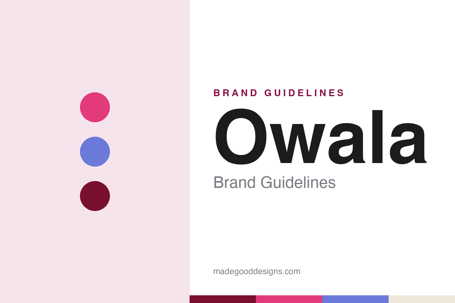
Owala Brand Guidelines
Where boring ends — the patented FreeSip lid, playful named colourways, and Gen-Z hype done right.
Aa
Two constants: a playful, multi-colour palette and a rounded, friendly sans. Abstract homage — not the Owala wordmark.
The lid that won
Owala turned a lid into a brand.
Owala is a lesson in a single feature carrying a brand. Owala launched in 2020 as a brand of Trove Brands, the Lehi, Utah company that originated as BlenderBottle (the protein-shake shaker). Its signature is the patented FreeSip® lid: a dual-mode design that lets you sip through a built-in straw or swig from a wider spout by tipping the bottle back — one lid, two ways to drink. (Two honest notes: it’s in Lehi, Utah, not Salt Lake City; and there’s a genuine turnaround story — the FreeSip first launched under the BlenderBottle name, flopped, was pulled, and only succeeded after relaunching as Owala.)
Owala paired that functional hook with a playful, Gen-Z-savvy brand personality. Its colourways carry fun, quirky names — Tutti Frutti, Shy Marshmallow, Lightly Toasted, Rose Quartz — and the brand runs limited-edition “Color Drops” that borrow the scarcity playbook of sneaker and streetwear culture. That combination — a genuinely useful lid plus collectible, personality-driven colour — is what made Owala catch on with a young audience, and it’s widely discussed alongside Stanley and Hydro Flask in the insulated-drinkware boom (fair as cultural framing, not as hard market-share data).
Owala is privately and family-held: it’s a brand of Trove Brands, LLC, a family company founded by Kim and Steve Sorenson, with son Michael Sorenson as CEO — no public parent or PE owner. The identity is friendly and fun — a simple, rounded lowercase “owala” wordmark, a deliberately multi-colour palette, and the taglines “Where boring ends” and “Everyday essentials, reimagined.” One shaker company, two eras of hydration. The lid that won.
Colour
Owala lives in playful, multi-colour. Click a swatch to copy the hex.
Owala’s identity is built on a bright, playful, deliberately multi-colour palette rather than one signature hue — hot pinks, periwinkle blues, deep burgundies and creams, refreshed constantly through limited “Color Drops” with quirky names. The colour reads as fun, youthful, expressive and a little irreverent — exactly matching a brand whose tagline is “Where boring ends.” Like several modern drinkware brands, Owala treats colour as a hype and collectibility engine: scarce, named, seasonal drops that turn a water bottle into a personal, of-the-moment object. The honest caveat: Owala publishes no single official brand hex — the identity is intentionally multi-colour, so the pink, periwinkle and burgundy here are observed approximations, not first-party values.
The lesson is colour and personality can turn a commodity into a collectible. Owala pairs a genuinely useful lid with a playful, ever-rotating palette and named drops. For designers, it’s a reminder that a strong functional hook plus an expressive, fun identity can win a young audience. The takeaways: anchor on one clear functional benefit (the FreeSip lid); use playful, named, limited colour to build hype and collectibility; and treat specific hexes as approximate when the identity is deliberately multi-colour.
Typography
The wordmark is a rounded, friendly sans — fun and approachable.
Owala’s identity carries a rounded, friendly, playful spirit — a simple lowercase “owala” wordmark whose soft, approachable letterforms read as fun, youthful and a little irreverent. The friendly type matches a brand built on playful colour, quirky colourway names and a “where boring ends” attitude, and it invites personalisation and self-expression. Set against a bright, multi-colour palette, the type feels warm and energetic — exactly the fun, Gen-Z personality Owala cultivates. It’s soft and approachable rather than corporate or rugged, mirroring the playful bottles. Because the exact wordmark face isn’t publicly documented, the honest description is “a rounded friendly sans spirit,” not a named font. The type behaves like the brand: fun, friendly and expressive.
Aa
A rounded friendly sans spirit — fun and approachable. (Specimen set in Grandstander, a rounded playful sans in the spirit of the owala wordmark; the real face is undocumented.)
One feature, one personality
Owala led with a lid and a wink.
Owala is a lesson in leading with one clear feature and one clear personality. In a crowded insulated-drinkware market, Owala didn’t try to out-spec everyone — it built the whole brand around a single, easy-to-grasp benefit (the FreeSip lid: sip or swig) and a single, consistent attitude (playful, fun, “where boring ends”). That focus makes the brand instantly legible: you can explain the product in one sentence and feel the personality in one glance at a colourway named “Shy Marshmallow.” The turnaround backstory reinforces the lesson — the same lid flopped under the BlenderBottle name and only succeeded once it was given its own fun, ownable brand world as Owala. It’s proof that a sharp functional hook plus a distinctive, likeable personality can beat a longer spec sheet, especially with a young audience that buys identity as much as utility. Lead with the lid; sell the wink.
For designers and brand-builders, Owala offers a clear takeaway: a single clear feature plus a strong personality can carry a brand. The lessons: pick one legible benefit and make it the hero (the FreeSip lid); wrap it in a consistent, likeable attitude (playful, “where boring ends”); and use named, limited colour drops to build hype and belonging. It’s also a reminder to keep the facts precise — Owala launched in 2020 as a brand of Trove Brands (from BlenderBottle) in Lehi, Utah; the FreeSip lid first flopped under BlenderBottle before succeeding as Owala; the company is privately, family-held; and its Stanley rivalry is cultural framing, not market data. Owala led with a lid and a wink — proof that focus plus personality can win.
Explore & save
Keep Owala’s identity on hand — save it to a board in the Made Good inspiration library.
Owala identity set
Pin the playful multi-colour palette and the rounded-sans spirit to your own board.