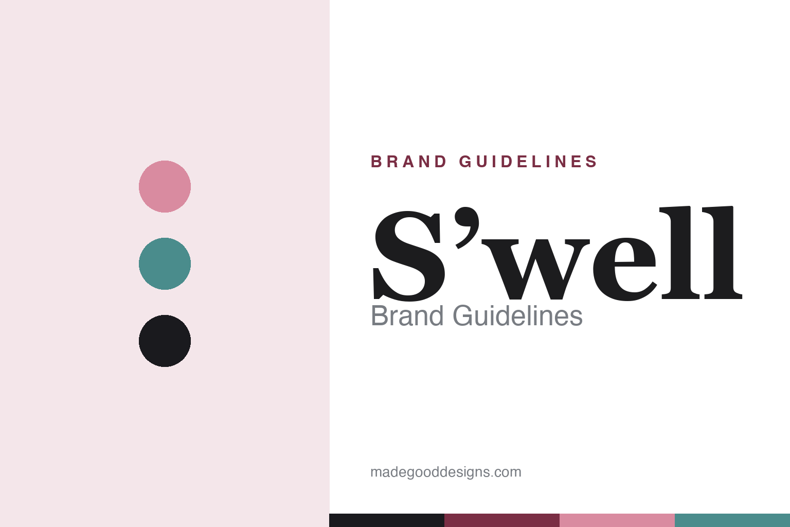
S’well Brand Guidelines
The bottle that became a fashion accessory — a slender teardrop, seasonal prints, and a design-first reusable.
Aa
Two constants: a chic, seasonal palette of prints and an elegant fashion serif spirit. Abstract homage — not the S’well wordmark.
The fashion water bottle
S’well made a bottle a fashion object.
S’well is a lesson in reframing a commodity as fashion. It was founded in 2010 in New York City by Sarah Kauss — a former CPA (she worked at Ernst & Young) with a Harvard MBA. The signature anecdote: she conceived the idea in 2009 while hiking in Arizona with her mother, wanting a reusable bottle stylish enough to carry like an accessory, and started with about $30,000 of personal savings, motivated by displacing single-use plastic. (Two honest notes: no official brand hex is published — S’well is print/collection-driven — and the wordmark typeface is undocumented.)
S’well’s breakthrough was design. The tall, slender, tapered “teardrop” silhouette — triple-wall vacuum-insulated stainless steel that S’well claims keeps drinks cold ~24 hours / hot ~12 — was sold not as gear but as a fashion object, in seasonal prints, marble, wood and metallic finishes with names like Onyx and Eucalyptus. A feature in O, The Oprah Magazine about a year after launch was the inflection point that turned S’well into a phenomenon: from a $30K start it exceeded $100M in sales by 2016, and Forbes ranked it the #1 fastest-growing women-led company. It reached mainstream retail via Starbucks (~3,300 stores) and the value “S’ip by S’well” line at Target.
An honest chronology note: S’well did not come “before Hydro Flask” — Hydro Flask was founded in 2009, a year earlier. What S’well pioneered was the fashion/style positioning of the premium reusable bottle, whereas Hydro Flask’s mass-culture moment came later (~2019). And S’well is no longer independent: founder Sarah Kauss stepped down as CEO in February 2020 (Hugh Rovit succeeded her), and in 2022 S’well was acquired by Lifetime Brands (home of KitchenAid, Farberware and Mikasa licences). Kauss is now an investor and mentor. A bottle, made fashionable.
Colour
S’well lives in seasonal prints. Click a swatch to copy the hex.
S’well’s identity isn’t one signature colour — it’s a deliberately seasonal, print-and-collection-driven palette. Dusty roses, eucalyptus teals, onyx black, marble, wood-grain and metallics rotate constantly, each finish given an evocative name, so the bottle reads as a fashion accessory that changes with the season rather than a fixed-brand object. The colour and pattern are the product: they’re what let S’well sell a steel bottle in fashion retailers and style features. It’s an elegant, considered palette — chic and grown-up rather than loud. The honest caveat: S’well publishes no official brand hex, so the rose, teal and onyx here are observed approximations of its collections, not first-party values.
The lesson is a rotating seasonal palette can be the identity. S’well competes on prints, finishes and colour names, refreshed like a fashion line. For designers, it’s a reminder that in a design-led brand the seasonal palette itself — not a single corporate colour — can be the differentiator. The takeaways: treat colour and pattern as the product in a fashion-led brand; rotate and name finishes like a fashion house; and treat specific hexes as approximate when the palette is deliberately seasonal.
Typography
The wordmark is an elegant fashion serif spirit — chic and considered.
S’well’s identity carries an elegant, fashion-forward serif spirit — a refined, editorial feel befitting a brand that sells drinkware as a style object. The graceful letterforms read as chic, grown-up and considered, matching a house built on seasonal prints and fashion-retail placement rather than rugged function, and the restraint lets the finishes and colour lead. Set against a rotating seasonal palette, the type feels like a fashion label — exactly the design-first personality S’well cultivates. It’s elegant and editorial rather than sporty, mirroring the chic bottle. Because the exact wordmark face is undocumented, the honest description is “a fashion serif spirit,” not a named font. The type behaves like the brand: chic, elegant and considered.
Aa
A fashion serif spirit — chic and considered. (Specimen set in Prata, an elegant fashion serif in the spirit of the S’well identity; the real wordmark is undocumented.)
Design as the product
S’well sold design, not hydration.
S’well is a lesson in competing on design in a commodity category. A vacuum-insulated steel bottle is functionally similar across dozens of brands — so S’well didn’t compete on physics; it competed on style: an elegant teardrop silhouette, seasonal prints and finishes, evocative colour names, and placement in fashion retailers and style magazines. That reframed a utilitarian object as a personal fashion accessory, and an Oprah feature turned it into a phenomenon that scaled from $30K to over $100M in a few years. The lesson is that when core function is commoditised, the differentiator can move to design, colour and cultural positioning — the parts customers wear and identify with. S’well’s arc also shows the ordinary maturation of a breakout DTC brand: founder-led growth, a professional CEO, then an acquisition (Lifetime Brands, 2022) that folds the fashion-led brand into a larger housewares portfolio. Sell the design, and the bottle becomes fashion.
For designers and brand-builders, S’well offers a clear takeaway: design and cultural positioning can be the whole competitive advantage in a commodity category. The lessons: compete on silhouette, print and finish, not spec (the teardrop, the seasonal palette); earn cultural validation (the Oprah effect, fashion-retail placement); and keep the identity elegant so the design leads. It’s also a reminder to keep the facts precise — S’well was founded in 2010 by Sarah Kauss (not before Hydro Flask, which predates it); it pioneered the fashion positioning of the premium bottle; and it has been owned by Lifetime Brands since 2022. S’well sold design, not hydration — proof that style can be the advantage.
Explore & save
Keep S’well’s identity on hand — save it to a board in the Made Good inspiration library.
S’well identity set
Pin the seasonal palette and the fashion-serif spirit to your own board.