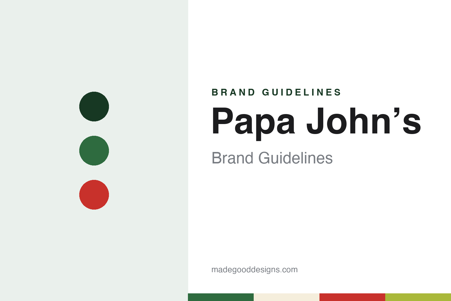
Papa John’s Brand Guidelines
The Jeffersonville pizza that dropped its apostrophe.
Aa
Two constants: a basil green, marinara red and dough palette and a heavy grotesque sans register. Abstract homage — not a Papa John’s product or mark; no box, pizza or logo is reproduced.
Jeffersonville
A broom closet, a tavern and a nickname.
Papa John’s began in 1984 in Jeffersonville, Indiana, across the Ohio River from Louisville. English Wikipedia says John Schnatter, known as “Papa” John, installed a pizza oven in a broom closet at the back of his father’s tavern, Mick’s Lounge, and began selling pizzas to the bar’s customers from the converted closet; a year later he moved into an adjoining space. USA Today, reporting on his change of role in December 2017, confirmed that Schnatter founded the chain in 1984 and described him as one of the last chief executives who also served as his brand’s advertising pitchman.
That pitch became the brand line. USA Today wrote in 2017 that Schnatter had built the chain as a challenger to established rivals such as Domino’s and Pizza Hut. The founder’s nickname was the brand name itself: a possessive, “Papa John’s”, that tied the pizza to a person.
The business grew through franchising and the stock market. Wikipedia says the company went public in 1993 on Nasdaq under the ticker PZZA, and the company is Papa John’s International, Inc., the name Nation’s Restaurant News used for it in 2020 and 2021. Wikipedia says the restaurants mainly take carryout and delivery orders, though some have tables and chairs for customers who eat in. Its headquarters grew up in the Louisville area; Wikipedia places the long-standing head office in Jeffersontown, Kentucky, and NRN described the chain in 2020 as Louisville-based.
Colour
A founder steps back, a second headquarters and a new chief executive.
The founder’s role changed in two steps. USA Today reported on 21 December 2017 that Schnatter would step down as chief executive with effect from 1 January 2018, remaining chairman, and that the company’s president, Steve Ritchie, would replace him. In July 2018 Schnatter resigned as chairman after acknowledging that he had used a racial slur during a conference call that May, the BBC reported. Wikipedia says the activist investor Starboard Value took a stake in 2019, that Schnatter later left the board under a settlement, and that Rob Lynch, previously president of Arby’s, became chief executive in August 2019.
Under Lynch the company opened a second head office. On 17 November 2020 Nation’s Restaurant News reported that Papa John’s International had confirmed a new global headquarters at Three Ballpark Center at The Battery Atlanta, in the Atlanta metropolitan area, due to open by summer 2021 with a test kitchen. The new office would bring together marketing, communications, customer experience and investor relations, while the IT, supply chain and legal teams stayed in Louisville. Lynch said in a statement quoted by NRN that the move was the outcome of a process begun in late 2019.
The company has had a new chief executive since August 2024. Nation’s Restaurant News reported on 6 August 2026 that Todd Penegor, who joined in August 2024, had launched a “transformation strategy” soon after arriving, and quoted him on the company’s loyalty programme, Papa Rewards, and its plans for more targeted offers and a rebuilt pipeline of new products. Wikipedia records that Papa Johns suspended its corporate operations in Russia in March 2022, while independent franchisee-owned restaurants there stayed open.
Typography
Design and documentation.
A pizza chain’s identity is carried by a handful of everyday objects more than by any single advert: the box that leaves the counter, the sign above the door, the shape of the building itself and, for some names, a character who stands in for the company. Each of these is a surface that the brand reaches customers through, often far from any office where the identity was drawn.
The box is the piece most people handle. It travels home, sits on a table and is printed in large numbers, so its lid tends to carry the name, a colour scheme and sometimes a slogan or illustration. Storefront signs do similar work at street level, in shopping centres and in food courts, where a name and a colour have to be read quickly and from a distance.
Buildings and mascots add a further layer. A distinctive roofline, an interior theme or a costumed figure can become part of how a chain is recognised, and those elements may be kept, revised or dropped as owners change. Each guide that follows records who started the chain, who has owned it over time and how its name, signs and marks have been presented, separating what independent sources report from what the company says about itself.
Aa
A heavy grotesque sans — the register of a delivery box and a storefront fascia. (Specimen set in Archivo Black, a sans-serif STAND-IN; NOT the Papa John’s logo.)
Papa Johns
A refresh named “Hungry for Better” and a missing apostrophe.
A brand refresh came on 16 November 2021. That day Nation’s Restaurant News reported that Papa John’s International had announced a refreshed logo and colour scheme, together with a new restaurant design with an open floor plan and easier pickup for orders placed online. The company called the brand evolution “Hungry for Better”, and NRN said it emphasised a more modern, customer-centred look built around the simplicity of its ingredients and the stories of its people.
Another change concerned punctuation. NRN reported that the chain had quietly dropped the apostrophe from its name, becoming Papa Johns without the possessive. In a statement, the company said that “the removal of the apostrophe from the names of brands is not abnormal”, and pointed to other brands that had done the same, including the grocer Wegmans and the craft retailer Michaels. The corporate name, Papa John’s International, Inc., kept its apostrophe.
The refresh came with named colours. NRN said the new palette was inspired by the colours of the company’s products: basil green, marinara red and an off-white dough, with a yellow-green chosen to represent the pepperoncini the chain adds as a finishing touch. Inside the new restaurants, large murals of high-definition close-ups of pizza ingredients were to cover the walls. Kate Carpenter, senior director of brand advertising and design, told NRN that the space included handcrafted details and personalisation meant to reflect the craft and care that go into the products. The redesign was to roll out gradually with an emphasis on new restaurants, NRN said, and existing restaurants could choose whether to update their signage.
A company spokesperson told NRN that “better” had always been at the core of what Papa Johns stands for, a word that links the 2021 refresh back to the founding slogan.
For a design guide, Papa Johns shows how a brand can keep a founder’s name and slogan while changing the single character that made the name a possessive, and how a palette can be described in the language of the menu. Compare it with Domino’s and Pizza Hut, the rivals USA Today set it against in 2017. For this guide we use basil green, marinara red and dough with a sans, an unofficial interpretation; no product or logo is reproduced.
Explore & save
Keep Papa John’s’s identity on hand — save it to a board in the Made Good inspiration library.
Papa John’s identity set
Pin the Papa John’s basil green, marinara red and dough palette and the heavy grotesque sans register to your own board.