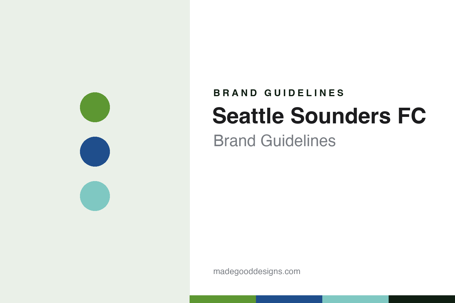
Seattle Sounders FC Brand Guidelines
A tower on a green shield, and a year from the club’s own past.
Aa
Two constants: a forest green, sound blue and aqua wash palette and a condensed terrace sans register. Abstract homage — not a Seattle Sounders FC product or mark; no crest, shirt or logo is reproduced.
A name from 1974
Three leagues, one name and a vote that went off-script.
The name is older than the league the club plays in. English Wikipedia says the original Seattle Sounders of the North American Soccer League were named in a public contest, with “Sounders” announced as the winner on 22 January 1974. The name refers to Puget Sound, the inlet on which the city sits. After that league folded in the 1980s, later Sounders teams played in lower divisions, including the A-League and the USL First Division, and the name stayed with them.
The Major League Soccer club came together in 2007. Wikipedia records that Adrian Hanauer, who owned the lower-division Sounders, teamed up with the Hollywood producer Joe Roth, and that Paul Allen, owner of the Seattle Seahawks, joined the group. At a press conference on 13 November 2007 the league announced that Seattle had been awarded an expansion team owned by Hanauer, Roth, Allen and the television host Drew Carey. The club began play in MLS in 2009.
Choosing the name was not straightforward. Wikipedia says fans were asked to pick from three options in an online poll at the end of March 2008, and that the list deliberately left out “Sounders” in favour of Seattle FC, Seattle Republic and Seattle Alliance. After a public backlash, a write-in option was added. On 7 April 2008 the club announced the name Seattle Sounders FC, along with its logo, colours and badge, with Hanauer saying the team at the top level in the region had always been called Sounders.
Ownership has since shifted toward local investors. Wikipedia says Roth was majority owner from 2007 to 2015, when the role passed to Hanauer. The Seattle Times reported on 13 August 2019 that a group of Seattle-area families had formed Seattle Futbol Club LLC and partially bought out Roth’s stake, that Hanauer had increased his majority stake, and that Carey and Jody Allen, representing the Allen estate, remained in the group.
Colour
Sound, forest and mountain.
The 2008 identity was built from landscape. Wikipedia, citing the club’s own badge and colours fact sheet of April 2008, describes the original badge as a heraldic shield in two layers, meant to represent the partnership between owners, community, players and fans. At its centre stood the Space Needle, the 1962 observation tower. The club named three official colours: Sounder Blue for the waters of Puget Sound, Rave Green for the forests of the Pacific Northwest and Cascade Shale for the mountain range east of the city. A banner across the shield carried the full club name.
That badge lasted until 26 September 2023, when the club unveiled a new crest and brand ahead of its 50th anniversary season. The Seattle Times reported that the Space Needle remained the centrepiece but that the banner reading “Seattle Sounders FC” was removed, and that the tower is now flanked by the numbers “19” and “74” for the year the original club was founded. ESPN, writing on 27 September 2023, described the result as a stripped-down version of the previous logo, with the blue half of the two-part shape removed and the Space Needle set on a familiar green shape.
The colours were tuned rather than replaced. ESPN said Rave Green stays dominant, with accent colours called Pacific Blue and Heritage Aqua. The Seattle Times wrote that Heritage Aqua pays homage to the club’s inaugural palette of 1974 and was added to allow more subtle merchandise, and that the shading still reflects the supporters’ refrain “Eternal Blue, Forever Green”.
The process was long and consultative. The Seattle Times quoted Taylor Graham, the club’s chief revenue and marketing officer and a former Sounders player, as saying the work took two years and involved three different design firms, with fans, community members and other stakeholders surveyed for direction. On the day of the reveal, a flag with the new crest was raised from the top of the Space Needle.
Typography
Design and documentation.
North American soccer clubs build their identities from a small set of recurring parts: a crest, a pair or trio of colours, a wordmark, and the supporter scarf that carries all three into the stands. Crests in the league tend to favour simple outlines, such as shields, circles and roundels, that can be stitched onto a shirt, printed on a ticket and shown at small size on a phone screen without losing their shape. Colour choices often borrow from a city’s landscape, history or older sports teams, and clubs often give their main shade its own name in brand materials.
Scarves sit at the centre of supporter culture. Fan groups commission their own designs, hold them aloft during anthems, and use banners, flags and choreographed displays to turn a stand into a large-scale graphic surface. Many clubs share stadiums with football, baseball or other tenants, so signage, seat colours and temporary dressing must switch between teams from one week to the next. Expansion launches add another layer: a new club usually reveals its name, crest and colours months before its first match, often after supporter consultation, and the reveal itself becomes a design event.
Aa
A condensed terrace sans — the register of a shirt number and a stand banner. (Specimen set in Barlow Condensed, a sans-serif STAND-IN; NOT the Seattle Sounders FC logo.)
Seattle Sounders FC
A family of marks, and kits that tell local stories.
The 2023 rebrand added secondary marks that draw on older Sounders teams. The Seattle Times reported that SFC became an official abbreviation of the club’s name, that an orca cradling a ball with its tail returned from the logo of the APSL and A-League era, and that the wavy streak through the “Sounders” wordmark from that period came back. ESPN described the new wordmark as a modern take on the 1970s logo, which evoked the water of Puget Sound. A new mark shows a carnation between the numbers of the founding year. The Seattle Times linked it to the club’s early days at Memorial Stadium, when players handed carnations to fans after matches; ESPN said the custom of giving fans carnations at the last home match of the season dates back to the NASL era.
On the field, the club has usually worn a Rave Green home shirt. Wikipedia records a run of secondary kits built around local subjects: a throwback design in 2017 carrying the NASL logo; a black-and-pink kit in 2019 inspired by a sunset during a 2014 match against the Portland Timbers; a dark purple shirt in 2021 designed with the family of the Seattle musician Jimi Hendrix; and a red kit in 2023 honouring the martial artist Bruce Lee, who lived in Seattle. The 2024 home shirt, called the Anniversary Kit, put aqua pinstripes on green. In 2025 the secondary Salish Sea Kit used blue triangular patterns designed with three Coast Salish artists and carried a Southern Lushootseed phrase meaning “water is sacred”, and a purple Orca Kit recalled the 1995 A-League shirt.
The home ground is shared. Wikipedia says the club plays at Lumen Field, also home to the Seattle Seahawks, and that during the early years the two teams shared staff and some business operations, an arrangement that ended in 2014. Kits across the league are supplied by Adidas.
For a design guide, Seattle Sounders FC shows how a club can rebuild a crest by subtraction, keeping one landmark and adding a date, while letting secondary marks carry history. Compare the city’s other teams in Seattle Seahawks Brand Guidelines and Seattle Mariners Brand Guidelines, or the league itself in MLS Brand Guidelines. For this guide we use forest green, sound blue and aqua wash with a condensed sans, an unofficial interpretation; no product or logo is reproduced.
Explore & save
Keep Seattle Sounders FC’s identity on hand — save it to a board in the Made Good inspiration library.
Seattle Sounders FC identity set
Pin the Seattle Sounders FC forest green, sound blue and aqua wash palette and the condensed terrace sans register to your own board.