Atlanta United FC Brand Guidelines
A circle, a letter and five stripes, coloured for a city of rails.
Aa
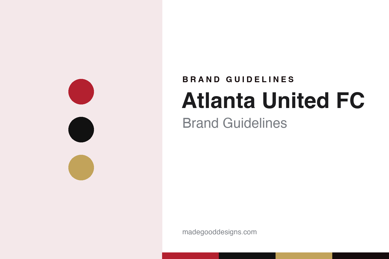
Two constants: a Victory red, stripe black and spike gold palette and a condensed stadium sans register. Abstract homage — not an Atlanta United FC product or mark; no crest, shirt or logo is reproduced.
An expansion team for Atlanta
A football owner, a new stadium and a soccer tenant.
Atlanta United FC grew out of a stadium project. English Wikipedia says that talk of an MLS team in the city restarted in 2011, after the NHL’s Atlanta Thrashers were sold and moved to Winnipeg. It also says that while the Atlanta Falcons’ proposed new stadium was going through approvals in 2012, the team’s owner Arthur Blank, co-founder of Home Depot, told season-ticket holders that the building could help attract a Major League Soccer club. Sports Illustrated reported on 16 April 2014 that MLS had awarded an expansion franchise to Atlanta, to begin play in 2017 at the downtown stadium being built for Blank’s Falcons.
Blank promised that supporters would help shape the result. Wikipedia says he told reporters in 2014 that fans would be involved in choosing the name, the logo and a colour scheme that would work with red and black alongside gold, the colours the Falcons used when they launched in 1966. Sports Illustrated reported on 25 June 2015 that, according to multiple sources, the club would be called Atlanta United FC, and that the name would be introduced officially on 7 July with a logo thought to feature a prominent “A” and red, gold and black colours; the hashtag for the reveal event was #bringyourAgame. Wikipedia says the club’s president, Darren Eales, explained that the name came from a survey of supporters and used words that supporters linked positively with the team.
Ownership has not changed since. Wikipedia describes the club as part of AMB Sports & Entertainment, a unit of the Blank Family of Businesses that also includes the Falcons and the stadium itself. Construction delays meant the team spent the opening months of its 2017 debut season at Bobby Dodd Stadium, the Georgia Tech football ground, before moving into Mercedes-Benz Stadium, where it plays in a reduced seating configuration alongside the Falcons.
Colour
A seal, an A and five pillars.
The crest was unveiled on 7 July 2015 with the name and colours. Wikipedia, drawing on the league’s announcement that day, describes a circle reminiscent of the city seal and Atlanta’s Olympic heritage, with a bold “A” at its centre. Behind the letter sit five stripes in black and red. The club says the stripes stand for five pillars: unity, determination, community, excellence and innovation.
The colours carry their own explanations, again in the club’s words. Wikipedia, citing the club, lists black for strength and power, red, which the club calls Victory Red, for pride and passion, and gold for a commitment to excellence. The combination echoes the Falcons, whose launch colours were the same red and black, while the gold gives the soccer club a separate accent.
The stripes became a nickname. Wikipedia says the team is unofficially known as “The Five Stripes”, after the five broad stripes across the front of its inaugural home kits. Fans as a whole are called the “17s”, after the club’s debut year, and supporter jerseys carry the number 17 with either “Atlanta” or the supporter’s own name across the back.
The city’s railway past runs through the supporter groups as well as the club. Wikipedia says the group Terminus Legion was created in March 2011 by a local graphic designer, during the early campaign for an MLS team, and named after Terminus, the original name of the settlement that became Atlanta. Its logo uses a locomotive cow catcher and railroad ties. Another group, Footie Mob, takes its name from the Atlanta hip-hop group Goodie Mob and is known for bringing the city’s music into its matchday routine. Resurgence was founded by friends at a local soccer bar, The Faction formed during the 2015 Women’s World Cup, La 12 de Atlanta celebrates Latino culture in the game, and All Stripes, an LGBTQ+ group set up in 2017, became an officially recognised group in 2022.
Typography
Design and documentation.
North American soccer clubs build their identities from a small set of recurring parts: a crest, a pair or trio of colours, a wordmark, and the supporter scarf that carries all three into the stands. Crests in the league tend to favour simple outlines, such as shields, circles and roundels, that can be stitched onto a shirt, printed on a ticket and shown at small size on a phone screen without losing their shape. Colour choices often borrow from a city’s landscape, history or older sports teams, and clubs often give their main shade its own name in brand materials.
Scarves sit at the centre of supporter culture. Fan groups commission their own designs, hold them aloft during anthems, and use banners, flags and choreographed displays to turn a stand into a large-scale graphic surface. Many clubs share stadiums with football, baseball or other tenants, so signage, seat colours and temporary dressing must switch between teams from one week to the next. Expansion launches add another layer: a new club usually reveals its name, crest and colours months before its first match, often after supporter consultation, and the reveal itself becomes a design event.
Aa
A condensed stadium sans — the register of a shirt number and a concourse sign. (Specimen set in Oswald, a sans-serif STAND-IN; NOT the Atlanta United FC logo.)
Atlanta United FC
Stripes on the shirt and a spike in the ground.
The kits have treated the stripes as a variable. Wikipedia says the inaugural home shirts carried five thick stripes, and that in February 2019 the club unveiled a primary kit nicknamed “Star and Stripes”, created by Adidas, which moved to nine thinner stripes, switched to red socks and placed a gold star above the crest. In February 2021 the club announced the “BLVCK” kit, an all-black primary design.
A matchday ritual is built around a piece of railway hardware. Wikipedia says that during the inaugural season the club introduced the Golden Spike, a nod to Atlanta’s railroad history. Before each home match, players and supporters sign a large golden railroad spike, which supporters carry into the stadium; a local guest then hammers it into a platform while the crowd chants “A-T-L!” After each win, the player voted man of the match hammers a spike too. Musicians, athletes and other public figures from the city have taken turns with the hammer, and Blank himself has done so. Wikipedia adds that the Atlanta rapper Archie Eversole, who took part in the ritual, later recorded a club anthem titled “United We Conquer”.
The stadium provides the frame. Sports Illustrated wrote in 2015 that the new retractable-roof building would house both the soccer club, in a downsized configuration, and the Falcons, both owned by Blank.
For a design guide, Atlanta United FC shows how a few geometric parts — a circle, a letter and a set of stripes — can be varied across kits while the crest stays fixed. Compare the city’s other teams in Atlanta Falcons Brand Guidelines and Atlanta Braves Brand Guidelines, or the league in MLS Brand Guidelines. For this guide we use Victory red, stripe black and spike gold with a condensed sans, an unofficial interpretation; no product or logo is reproduced.
Explore & save
Keep Atlanta United FC’s identity on hand — save it to a board in the Made Good inspiration library.
Atlanta United FC identity set
Pin the Atlanta United FC Victory red, stripe black and spike gold palette and the condensed stadium sans register to your own board.