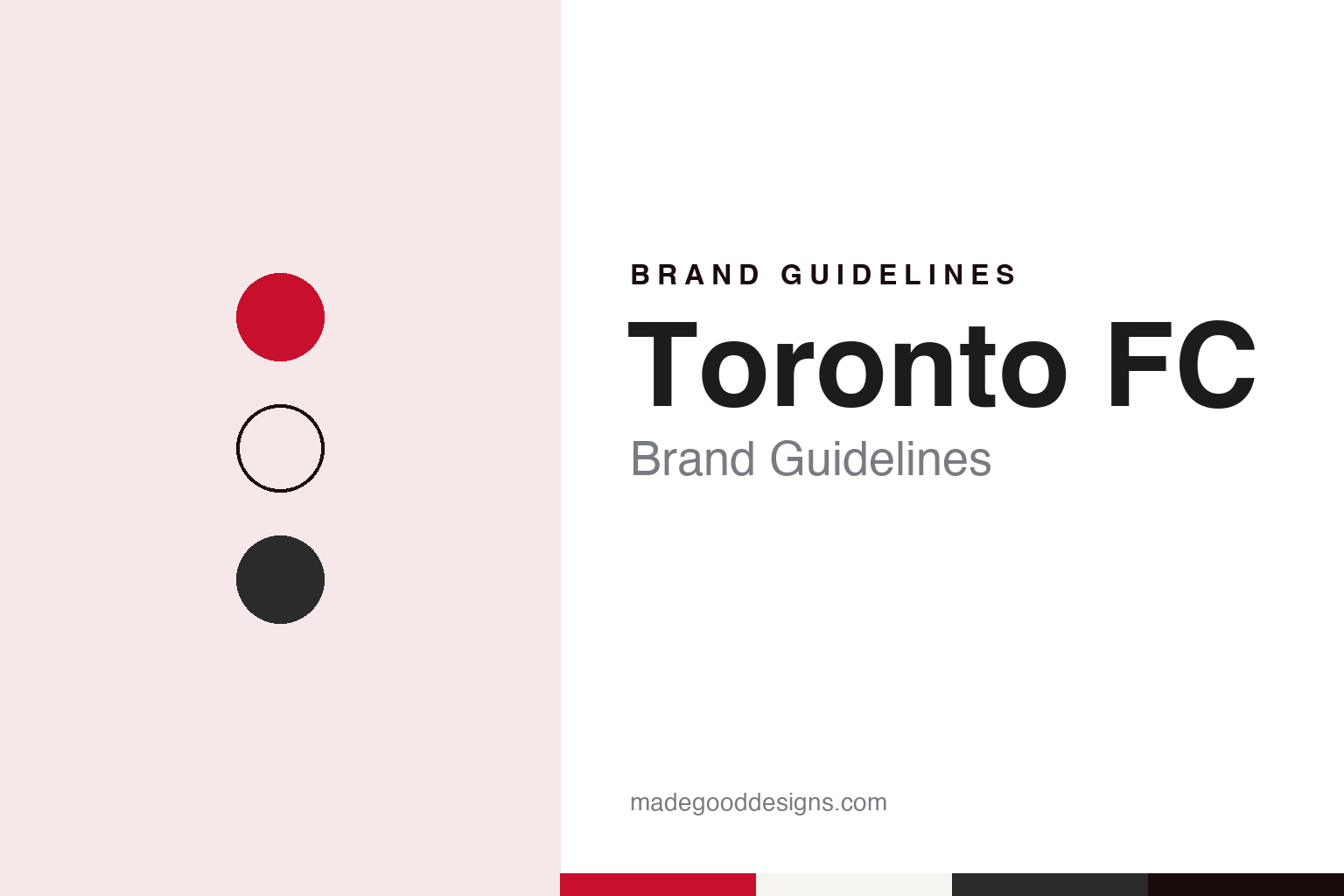
Toronto FC Brand Guidelines
A plain name, a red shirt and a stadium by the lake.
Aa
Two constants: a Reds red, paper white and onyx palette and a narrow club sans register. Abstract homage — not a Toronto FC product or mark; no crest, shirt or logo is reproduced.
A name left open on purpose
Four options, one plain answer and room for a nickname.
Toronto FC was set up by the company that already ran the city’s hockey and basketball teams. English Wikipedia says Major League Soccer awarded Toronto a team in 2005, with Maple Leaf Sports & Entertainment (MLSE) as owner, and that the club joined the league for the 2007 season. MLSE also operates the Toronto Maple Leafs, the Toronto Raptors and the Toronto Argonauts, as well as the reserve side Toronto FC II.
The name was settled by a public vote with a twist. Wikipedia says the name was announced on 11 May 2006, after an online consultation that offered four options: Toronto Northmen, Inter Toronto FC, Toronto Reds and Toronto FC. MLSE gave two reasons for its choice. The simple Toronto FC name had strong support in the vote, and the company hoped that a fairly generic name would let supporters give the club a nickname of their own, rather than having one imposed on them. In the years since, the club has been called “TFC” and “the Reds” by the media, the club and its fans. The “FC”, for Football Club, follows a convention used across European football. Wikipedia notes that one of the rejected options, Inter Toronto FC, was later taken up by a different club in the Canadian Premier League.
Ownership of MLSE has changed around the club. Wikipedia says the company’s partners were long the businessman Larry Tanenbaum and two rival media groups, Rogers Communications and Bell. The Canadian Press, in a report published by Global News on 1 October 2026, said Rogers had bought out Bell’s stake the previous year to become majority owner, and had now completed its purchase of Tanenbaum’s remaining stake through his holding company, Kilmer Sports, leaving Rogers as sole owner of MLSE and its teams, including Toronto FC. The report said Rogers planned a new business unit, Rogers Sports, to hold the MLSE properties alongside the Toronto Blue Jays.
Colour
Red and white, with black and grey in reserve.
Wikipedia lists red and white as the official primary colours, with black, grey and dark grey as secondary colours.
The home kit has been red throughout, with variations in pattern. Wikipedia describes a primary uniform in red with alternating lighter and darker horizontal bands, black sleeves with red trim and a black band running down each side. In 2013 and 2014 a shadow-print maple leaf appeared on the home shirt. The change kits have moved around more: Wikipedia says the club wore light and dark grey in its opening three seasons, then white for four seasons, and switched to onyx in 2014. One white change design carried a broad red band below a narrower blue one across the chest. As with every MLS club, the uniforms are made by Adidas, and the Bank of Montreal’s BMO mark has been on the shirt since the club was formed.
The club’s shield has also moved onto the shirt in new ways. Daily Hive reported on 15 February 2024 that the club’s white and red Community Kit, tied to a campaign called the Global Toronto Area, put the Toronto FC shield logo on the chest of a match shirt. The report said the crest would also be used to frame the flags of players’ home countries in digital and creative material, that a “Global Toronto Area” marking would sit on the jock tag, and that the club’s motto, “All For One”, was printed on the neck. It quoted Chris Shewfelt, the club’s vice-president of business operations, describing the design as a reflection of a diverse fan base.
Typography
Design and documentation.
North American soccer clubs build their identities from a small set of recurring parts: a crest, a pair or trio of colours, a wordmark, and the supporter scarf that carries all three into the stands. Crests in the league tend to favour simple outlines, such as shields, circles and roundels, that can be stitched onto a shirt, printed on a ticket and shown at small size on a phone screen without losing their shape. Colour choices often borrow from a city’s landscape, history or older sports teams, and clubs often give their main shade its own name in brand materials.
Scarves sit at the centre of supporter culture. Fan groups commission their own designs, hold them aloft during anthems, and use banners, flags and choreographed displays to turn a stand into a large-scale graphic surface. Many clubs share stadiums with football, baseball or other tenants, so signage, seat colours and temporary dressing must switch between teams from one week to the next. Expansion launches add another layer: a new club usually reveals its name, crest and colours months before its first match, often after supporter consultation, and the reveal itself becomes a design event.
Aa
A narrow club sans — the register of a stand sign and a shirt number. (Specimen set in Archivo Narrow, a sans-serif STAND-IN; NOT the Toronto FC logo.)
Toronto FC
A lakeside ground, supporters’ banners and a hawk.
The stadium was built for the club’s arrival. Wikipedia says construction of a new ground at Exhibition Place, by Lake Ontario, was completed before the 2007 season, and that the Bank of Montreal bought the naming rights in September 2006, giving it the name BMO Field. The city owns the stadium and MLSE operates it. The artificial turf was replaced with natural grass for 2010, and a renovation completed in 2016 added a second tier and a roof over the stands, with the Toronto Argonauts of the Canadian Football League moving in that year. The club has occasionally played elsewhere: at the Rogers Centre for a handful of matches in 2012 and 2013, and, during the COVID-19 border restrictions of 2020 and 2021, at stadiums in East Hartford, Connecticut, and Orlando, Florida.
Supporters supply much of the stadium’s imagery. Wikipedia lists the club’s recognised supporter groups as the Red Patch Boys, U-Sector, Kings in the North, Tribal Rhythm Nation and Original 109.
The closest thing to a mascot is a working bird. Wikipedia says a female Harris’s hawk, handled by falconry staff, has perched over the field since BMO Field opened in 2007 to keep gulls away, and that fans and the media treat her as the team’s mascot even though the club has made no official statement. In 2012 the club named the hawk the “symbolic overseer” of BMO Field, and a hawk appears in the official logo of the Toronto FC Academy.
For a design guide, Toronto FC shows how a deliberately plain name can leave room for supporters to supply the character, with a single colour doing much of the work. Compare the city’s other MLSE teams in Toronto Maple Leafs Brand Guidelines and Toronto Raptors Brand Guidelines, or the league in MLS Brand Guidelines. For this guide we use Reds red, paper white and onyx with a narrow sans, an unofficial interpretation; no product or logo is reproduced.
Explore & save
Keep Toronto FC’s identity on hand — save it to a board in the Made Good inspiration library.
Toronto FC identity set
Pin the Toronto FC Reds red, paper white and onyx palette and the narrow club sans register to your own board.