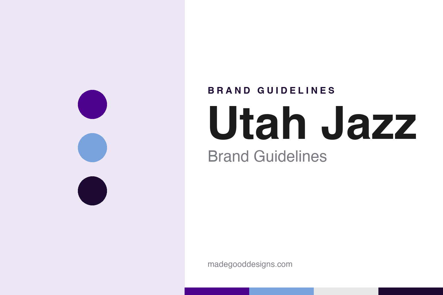
Utah Jazz Brand Guidelines
A Mardi Gras name carried to the mountains, and a colour the team kept coming back to.
Aa
Two constants: a mountain purple, sky blue and midnight palette and a condensed sports lettering register. Abstract homage — not a Utah Jazz mark; no music-note logo, mountain silhouette, jersey or wordmark is reproduced.
A New Orleans name in Salt Lake City
Sam Battistone, a dictionary definition and a move west.
The Utah Jazz carry a name that was chosen for another city. English Wikipedia says the New Orleans Jazz were admitted to the NBA as an expansion franchise on 7 June 1974, owned by a group led by Sam Battistone, and began play in the 1974–75 season. Team officials picked the name, Wikipedia says, because of its dictionary sense of collective improvisation, and the choice also paid tribute to New Orleans as the home of jazz music.
The first visual identity was built from the same source. Wikipedia says the original colours, purple, gold and green, are the colours associated with Mardi Gras in New Orleans, and that the logo turned the letter “J” of the wordmark into a musical note. In the New Orleans years the home uniform was white with gold trim, a purple “Jazz” script and purple numbers; the road uniform reversed it, purple with gold trim and white script and numbers. The team played first at the Municipal Auditorium and Loyola Field House, and Wikipedia describes venue problems throughout its time in the city.
In 1979 Battistone moved the team to Salt Lake City. Wikipedia says he decided the Jazz were no longer viable in New Orleans and settled on Utah after looking at several other cities, even though it was a smaller market; the league approved the move in June 1979. The franchise kept its name, Wikipedia says, because there was not enough time before the 1979–80 season to get league approval for a change. The name has stayed through every redesign since.
The colours travelled too. Wikipedia says the home uniforms stayed the same after the move, with the word “Utah” added to the chest logo in 1986–87. The road uniforms became dark green with gold numbers in 1981 and went back to purple in 1984–85, now with “Utah” worked into the logo, a set worn until 1995–96. The local car dealer Larry H. Miller bought half of the team in April 1985 and the remaining half in 1986, keeping it in Utah; his family owned the Jazz until 2020.
Colour
From the Miller family to Ryan Smith.
The present owner arrived in 2020. The Deseret News reported on 28 October 2020, the day the purchase was announced, that Ryan Smith, co-founder and chief executive of the software company Qualtrics, had acquired the Utah Jazz in a deal that also covered the team’s arena and the G League’s Salt Lake City Stars. The paper noted that Qualtrics had been founded in Provo in 2002 by Ryan Smith and his brother Jared, and that Smith already had a visible link to the team: from 2017, when the NBA approved sponsor patches on player jerseys, the Jazz wore the logo of 5 for the Fight, his cancer-research charity campaign, rather than a corporate brand. Wikipedia says Smith bought the team from the Miller family and agreed to honour the terms of the trust the family had set up, including the requirement to keep the club in Utah. In April 2021 the former player Dwyane Wade took a minority stake. Smith has owned the Jazz since 2020.
Before Smith, the identity had already been through three distinct eras. Wikipedia says that for the 1996–97 season the team overhauled its logos and uniforms with a new scheme of a lighter purple, copper and turquoise. The new uniforms placed a silhouette of the Wasatch Range, the mountains that rise above Salt Lake City, across the chest beneath a new “Jazz” script, and on the purple road jersey the white peaks faded into purple above the numbers. Wikipedia credits the logo to Tom O’Grady, a former NBA creative director, citing his studio, and says it was based on the logo of the 1993 All-Star Game. A black alternate without the mountains was added in 1998–99.
In 2004–05 the colours changed again, Wikipedia says, to navy blue, powder blue and silver, with purple kept only in the logos, while the mountain logo itself stayed substantially the same. Then on 15 June 2010 the team unveiled a new logo and colour scheme that revived the J-note together with gold and green, combined with the navy of the previous era. The new uniforms, shown on 16 August 2010, were close to the 1970s originals. On 12 May 2016 the Jazz made the wordmark, now with “Utah” above the two Zs, their primary logo, retired the mountain logo that had been used since 1996, and added a custom number font.
Typography
Design and documentation.
A professional basketball logo has to work at very different sizes: as a centre-court graphic seen from the rafters, as a small patch on a shorts leg and as a square icon on a phone. Clubs often keep a family of marks rather than a single emblem, pairing a primary logo with a wordmark, a monogram and a secondary badge that can stand in where space is tight. Redesigns usually adjust that family together, simplifying outlines, thickening strokes and limiting the colour list so the marks print cleanly on fabric and wood.
Uniform patterns carry much of a team’s personality. Pinstripes, side panels, gradient fills and skyline or landscape motifs give a jersey a recognisable silhouette even when the lettering cannot be read. Throwback or “classic” editions revive an older set for a season, often with its original typeface and trim, and they let a club test how fondly a past look is remembered before deciding whether to bring parts of it back permanently. Mascots add a third layer: a costumed character with its own colours and personality gives the identity a playful voice for younger audiences, community events and arena entertainment.
Aa
A condensed sports letter — the register of a jersey number and an arena scoreboard. (Specimen set in Oswald, a condensed sans STAND-IN; NOT the Utah Jazz logo or wordmark.)
Utah Jazz
Red rocks, a yellow detour and the purple mountains again.
The Nike City uniforms gave the team room to draw on Utah’s landscape. Wikipedia describes the “Red Rocks” uniform, worn from 2017 to 2022, as a gradient of gold, orange, burgundy and black inspired by the rock formations of southern Utah, later reissued with the gradient reversed.
The 2022 rebrand under Smith took a different route. Writing in The Salt Lake Tribune on 17 June 2022, the columnist Andy Larsen reported that Smith had first wanted the team to switch to plain black and white, but that the league office and Nike would not allow it because the San Antonio Spurs and Brooklyn Nets already used that scheme. The compromise required a third primary colour, and the team chose a bright yellow. Larsen noted that the team’s announcement led instead with purple, under the headline “Purple is Back for Utah Jazz in 2022-23 Season and Will Be Cornerstone Color Moving Forward”. Wikipedia says the 2022–23 set paired black, white and yellow primary uniforms with the classic 1996–2004 purple mountain uniform as the City edition, and that the white uniform carried only the J-note and the numbers.
Purple then took over in steps. Wikipedia says a “remixed” mountain uniform with updated gradients and a larger “Utah” wordmark became the City edition for 2023–24. During 2024–25 a black Statement uniform with the J-note in front of a grey Wasatch silhouette, trimmed in purple and sky blue, replaced the black and yellow one, and by 2025–26 the team had fully adopted the modernised purple mountains set. Wikipedia lists a new primary logo dated 2025 and gives the current colours as mountain purple, midnight black, sky blue and gray. The mascot, the Jazz Bear, has been part of the show since November 1994.
For a design guide, the Utah Jazz show how a team can carry a borrowed name for decades by pairing it with a picture of where it actually plays: a New Orleans music note on one side, a Utah mountain range on the other, and purple as the thread between them. Compare it with the NBA, whose uniform programme shaped each Jazz redesign, and the San Antonio Spurs, whose black and white scheme the league kept distinct. For this guide we use mountain purple, sky blue and midnight with a condensed sans, an unofficial interpretation; no product or logo is reproduced.
Explore & save
Keep Utah Jazz’s identity on hand — save it to a board in the Made Good inspiration library.
Utah Jazz identity set
Pin the Utah Jazz mountain purple, sky blue and midnight palette and the condensed sports lettering register to your own board.