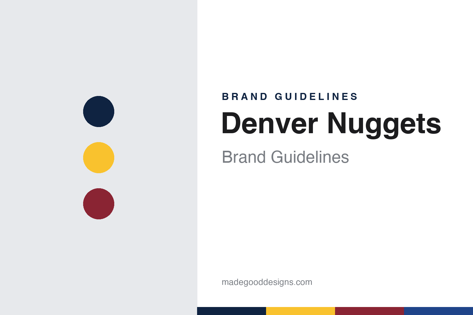
Denver Nuggets Brand Guidelines
A miner, a skyline and a pick-axe for the Mile High City.
Aa
Two constants: a midnight blue, sunshine yellow and flatirons red palette and a western slab serif register. Abstract homage — not a Denver Nuggets mark; no logo, jersey or wordmark is reproduced.
From trucks to gold
A trucking firm’s name, then a nod to an older Denver team.
The club now called the Denver Nuggets began in 1967 as a charter franchise of the American Basketball Association. English Wikipedia says the franchise was originally awarded to a group in Kansas City led by the businessman James Trindle, who could not find a suitable arena there and moved the team to Denver, where it was briefly named the Denver Larks after Colorado’s state bird. Before a game had been played, Wikipedia says, the Denver trucking businessman Bill Ringsby and his son took a controlling interest and renamed the team the Rockets, after the long-haul trucks of their Ringsby Rocket Truck Lines.
The early look was plain. According to Wikipedia, from 1967–68 through 1970–71 the Denver Rockets’ logos, uniforms and colours were black, orange and white. From 1971–72 the club switched to gold and purple, and its logo became a cartoon rocket bouncing a gold and purple basketball in front of a purple and white snow-capped mountain. Wikipedia adds that the change gave the team an identity of its own, away from a mark that had looked much like the trucking company’s.
Ownership moved on in the early 1970s. Wikipedia says Ringsby sold the team in 1972 to the San Diego businessmen Frank Goldberg and Bud Fischer. Two years later the club prepared for a move into the NBA and a new arena, McNichols Arena. The name Rockets was already taken in that league by Houston, so the franchise held a contest to choose a new nickname. The winner was Nuggets, chosen in honour of an earlier Denver Nuggets team that played from 1948 to 1950, and the change became official on 7 August 1974.
The new name came with a character. Wikipedia describes the logo of the Nuggets’ last two ABA seasons as a cartoon miner known as “Maxie the Miner,” with a large red beard, a pick-axe in one hand and a red and blue basketball in the other; Wikipedia says the new logo showed the miner “discovering” an ABA ball. The club entered the NBA in 1976 as part of the ABA–NBA merger and kept the pick-axe on its jerseys. Wikipedia says the 1976–77 home uniforms carried “Nuggets” in red with a red pick-axe inside a blue oval, while the blue road uniforms read “Denver.” From 1977 the set was simplified to a white home jersey with a “Nuggets” script in royal blue trimmed in gold, and a royal blue road jersey with “Denver” in white.
Wikipedia lists a run of owners through the NBA years: Red McCombs from 1978, Sidney Shlenker from 1985 and the satellite company COMSAT from 1989, whose sports holdings were later grouped under Ascent Entertainment.
Colour
Rainbow city, mountain peak and a western wordmark.
A new Nuggets look arrived in the early 1980s. According to Wikipedia, from 1982–83 through 1992–93 the team wore a Denver “rainbow city” skyline across the chest and back of both home and road uniforms. Wikipedia notes that some fans call it the “Tetris” logo because of those square buildings. The original version used navy and green trim with “Nuggets” and the numbers in gold; in 1985 the blue shifted to royal and the green was dropped, and in 1991 the “Nuggets” lettering turned white with royal blue and gold trim.
In 1993–94 the club changed course completely. Wikipedia says the rainbow gave way to a navy blue, metallic gold and maroon scheme, with a new logo showing a navy snow-capped mountain above an enlarged, western-style “Nuggets” wordmark and a curved maroon ribbon carrying the word “Denver.” The home jersey set “Nuggets” in a modified version of the slab-serif typeface Aachen, and the club wore that set for a decade.
The colours brightened again in 2003–04, when, according to Wikipedia, the Nuggets moved to powder blue, gold and royal blue, recolouring the mountain logo and keeping the Aachen-style lettering. In 2008 the royal blue was replaced by the navy of the 1990s set. In 2005 the club added an alternate logo: twin intersecting gold pick-axes inside a powder blue circle, with mountain peaks at the top and a basketball at the bottom. Wikipedia says the NBA’s director of creative services at the time, Tom O’Grady, had planned to introduce that mark as early as 1998, but it was shelved for seven years. From 2012–13 a gold alternate jersey brought back the rainbow skyline.
The ownership that runs the club today dates from 2000. Wikipedia says the real estate entrepreneur Stan Kroenke bought the Nuggets, the NHL’s Colorado Avalanche and the Pepsi Center arena in July of that year and later organised his sports holdings as Kroenke Sports & Entertainment. The arena has since been renamed Ball Arena, and Wikipedia says Josh Kroenke was named team president in 2010.
The club’s mascot belongs to the same mountain theme. Wikipedia says Rocky the Mountain Lion has been the official mascot since the 1990–91 season and was introduced to fans on 15 December 1990.
Typography
Design and documentation.
A professional basketball logo has to work at very different sizes: as a centre-court graphic seen from the rafters, as a small patch on a shorts leg and as a square icon on a phone. Clubs often keep a family of marks rather than a single emblem, pairing a primary logo with a wordmark, a monogram and a secondary badge that can stand in where space is tight. Redesigns usually adjust that family together, simplifying outlines, thickening strokes and limiting the colour list so the marks print cleanly on fabric and wood.
Uniform patterns carry much of a team’s personality. Pinstripes, side panels, gradient fills and skyline or landscape motifs give a jersey a recognisable silhouette even when the lettering cannot be read. Throwback or “classic” editions revive an older set for a season, often with its original typeface and trim, and they let a club test how fondly a past look is remembered before deciding whether to bring parts of it back permanently. Mascots add a third layer: a costumed character with its own colours and personality gives the identity a playful voice for younger audiences, community events and arena entertainment.
Aa
A western slab serif — the register of a mining-town sign and a gold-rush poster. (Specimen set in Alfa Slab One, a slab serif STAND-IN; NOT the Denver Nuggets logo or wordmark.)
Denver Nuggets
Evolve: one identity drawn from every era.
The current identity was revealed in June 2018. Writing for NBC Sports on 7 June 2018, Kurt Helin reported that the Nuggets had unveiled new logos the previous Wednesday night, during the NBA Finals, along with what the team called “evolved” uniforms. Helin quoted a statement from Josh Kroenke, then vice chairman of Kroenke Sports & Entertainment, the owner of the Nuggets, who presented the change as part of a history that ran from the ABA’s Denver Rockets to Maxie the Miner and beyond.
Wikipedia describes the result in detail. The circular pick-axe mark, an alternate since 2005, became the primary logo, replacing the mountain and wordmark design used in three versions since 1993. The new colour scheme named its shades after local landmarks and themes: midnight blue, sunshine yellow, flatirons red and skyline blue, reserved for the Statement uniform and two alternate logos. Powder blue was dropped. The white Association jersey carries “Nuggets” in flatirons red, the midnight blue Icon jersey carries “Denver” in sunshine yellow, and both use mountain-peak striping on the shorts with the pick-axe on the waistband. The skyline blue Statement jersey wraps the words “Mile High City” around the number, with a modernised skyline logo at the waist.
Nike’s City uniforms have let the club revisit its archive. Wikipedia says the 2018–19 City set brought back the rainbow as a sublimated pattern, the 2019–20 version repeated it on a black base, and the 2020–21 set swapped the rainbow for a red, yellow and orange gradient inside the mountains. A 2021–22 mashup for the NBA’s 75th anniversary combined the 1980s “Nuggets” wordmark and rainbow, the stylised numbers of the 1990s set, Maxie the Miner and ABA-era striping, and the powder blue of the 2000s. Later City designs used “5280” as a headline, a reference to Denver’s high elevation.
For a design guide, the Denver Nuggets show how a club can treat its own past as a parts bin, keeping a pick-axe and a mountain as constants while rotating colours and lettering from each era. Compare the Denver Broncos, the city’s football team, and the NBA, the league the Nuggets joined in 1976. For this guide we use midnight blue, sunshine yellow and flatirons red with a slab serif, an unofficial interpretation; no product or logo is reproduced.
Explore & save
Keep Denver Nuggets’s identity on hand — save it to a board in the Made Good inspiration library.
Denver Nuggets identity set
Pin the Denver Nuggets midnight blue, sunshine yellow and flatirons red palette and the western slab serif register to your own board.